效果如下:
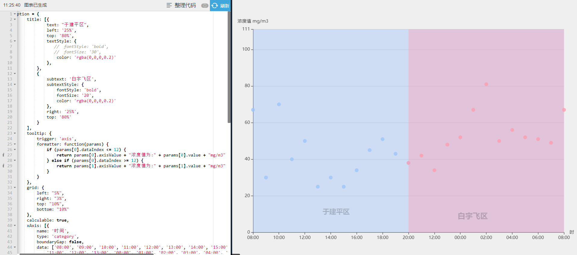
代码如下:
 option = {
     title: [{
             text: "于建平区",
             left: '25%',
             top: '80%',
             textStyle: {
                //  fontStyle: 'bold',
                //  fontSize: '30',
                 color: 'rgba(0,0,0,0.2)'
             },
         },
         {
             subtext: '白宇飞区',
             subtextStyle: {
                 fontStyle: 'bold',
                 fontSize: '20',
                 color: 'rgba(0,0,0,0.2)'
             },
             right: '25%',
             top: '80%'
         }
     ],
     tooltip: {
         trigger: 'axis',
         formatter: function(params) {
             if (params[0].dataIndex <= 12) {
                 return params[0].axisValue + "浓度值为:" + params[0].value + "mg/m3"
             } else if (params[0].dataIndex >= 12) {
                 return params[1].axisValue + "浓度值为:" + params[1].value + "mg/m3"
             }
         }
     },
     grid: {
         left: "5%",
         right: "3%",
         top: "10%",
         bottom: "10%"
     },
     calculable: true,
     xAxis: [{
         name: '时间',
         type: 'category',
         boundaryGap: false,
         data: ['08:00', '09:00', '10:00', '11:00', '12:00', '13:00', '14:00', '15:00', '16:00', '17:00', '18:00', '19:00', '20:00',
             '11:00', '12:00', '13:00', '00:00', '01:00', '02:00', '03:00', '04:00', '05:00', '06:00', '07:00', '08:00'
         ]
     }],
     yAxis: [{
         name: '浓度值 mg/m3',
         type: 'value',
         max: function(value) { //设置y轴最大值
             return value.max + 30;
         }
     }],
     series: [{
             type: 'scatter',
             color: "#9DC4FA", //折线图颜色,搭配markArea为面积图
             lineStyle: { //折线的颜色
                 color: "#3B9DFC"
             },
             smooth: true, //是否平滑处理值0-1,true相当于0.5
             data: [67, 30, 70, 40, 50, 25, 30, 25, 34, 45, 51, 43, 38,
                 null, null, null, null, null, null, null, null, null, null, null, null
             ],
             markArea: {
                 data: [
                     [{
                         xAxis: '08:00'
                     }, {
                         xAxis: '19:59'
                     }]
                 ]
             }
         },
         {
             type: 'scatter',
             color: "#FC9DB2", //折线图颜色,搭配markArea为面积图
             lineStyle: { //折线的颜色
                 color: "#FA5071"
             },
             smooth: true, //是否平滑处理值0-1,true相当于0.5
             data: [null, null, null, null, null, null, null, null, null, null, null, null, 38,
                 42, 34, 48, 52, 67, 81, 50, 56, 52, 51, 49, 67
             ],
             markArea: {
                 data: [
                     [{
                         xAxis: '20:00'
                     }, {
                         xAxis: '08:00'
                     }]
                 ]
             }
         }
     ]
 };
markArea参数data的数组每组值可以分别定义name属性及其他属性,以上代码中是在title定义中生效了。