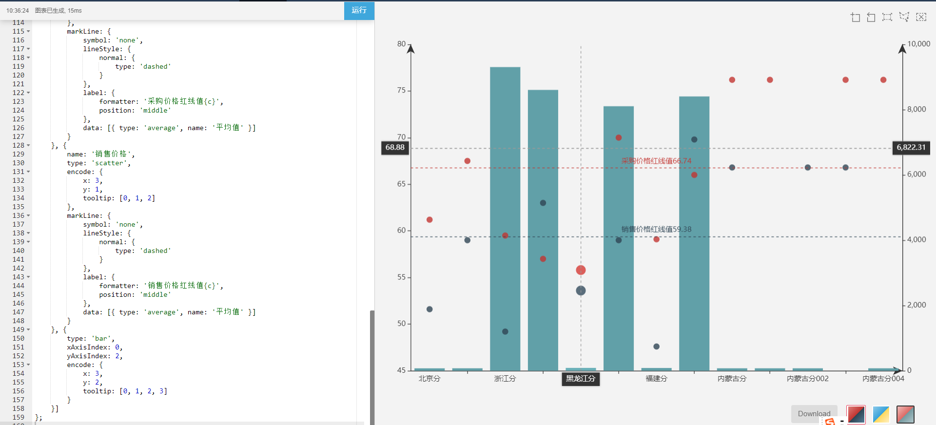
自己使用echarts4的dataset属性实现的一个双y轴的效果:
代码如下:
option = {
    dataset: {
        source: [
            [61.2, 51.6, 74, '北京分'],
            [67.5, 59, 75.3, '广州分'],
            [59.5, 49.2, 9305, '浙江分'],
            [57, 63, 8605, '石家庄分'],
            [55.8, 53.6, 87.2, '黑龙江分'],
            [70, 59, 8105, '河南分'],
            [59.1, 47.6, 84, '福建分'],
            [66, 69.8, 8405, '陕西分'],
            [76.2, 66.8, 75, '内蒙古分'],
            [76.2, null, 75, '内蒙古分001'],
            [null, 66.8, 75, '内蒙古分002'],
            [76.2, 66.8, null, '内蒙古分003'],
            [76.2, null, 75, '内蒙古分004']
        ],
        dimensions: ['采购价格', '销售价格', '销量', '分公司名称']
    },
    title: this.title,
    grid: [{
        left: '3%',
        bottom: '3%',
        right: '0%',
        containLabel: true
    }],
    tooltip: {
        // trigger: 'axis',
        showDelay: 0,
        axisPointer: {
            show: true,
            type: 'cross',
            lineStyle: {
                type: 'dashed',
                 1
            }
        }
    },
    toolbox: {
        feature: {
            dataZoom: {},
             {
                type: ['rect', 'polygon', 'clear']
            }
        }
    },
     {},
    legend: {
        data: ['女性', '男性'],
        left: 'center'
    },
    xAxis: [{
        type: 'category',
        scale: true,
        axisLabel: {
            formatter: '{value}'
        },
        axisLine: {
            symbol: ['none', 'arrow']
        },
        splitLine: {
            show: false
        }
    }, {
        type: 'category',
        scale: true,
        axisLabel: {
            formatter: '{value}'
        },
        axisLine: {
            symbol: ['none', 'arrow']
        },
        splitLine: {
            show: false
        }
    }],
    yAxis: [{
        type: 'value',
        scale: true,
        axisLine: {
            symbol: ['none', 'arrow']
        },
        splitLine: {
            show: false
        }
    }, {
        type: 'value',
        scale: true,
        axisLine: {
            symbol: ['none', 'arrow']
        },
        splitLine: {
            show: false
        }
    }, {
        type: 'value',
        scale: true,
        axisLine: {
            symbol: ['none', 'arrow']
        },
        splitLine: {
            show: false
        }
    }],
    series: [{
        name: '采购价格',
        xAxisIndex: 0,
        yAxisIndex: 0,
        type: 'scatter',
        encode: {
            x: 3,
            y: 0,
            tooltip: [0, 1, 2]
        },
        markLine: {
            symbol: 'none',
            lineStyle: {
                normal: {
                    type: 'dashed'
                }
            },
            label: {
                formatter: '采购价格红线值{c}',
                position: 'middle'
            },
            data: [{ type: 'average', name: '平均值' }]
        }
    }, {
        name: '销售价格',
        type: 'scatter',
        encode: {
            x: 3,
            y: 1,
            tooltip: [0, 1, 2]
        },
        markLine: {
            symbol: 'none',
            lineStyle: {
                normal: {
                    type: 'dashed'
                }
            },
            label: {
                formatter: '销售价格红线值{c}',
                position: 'middle'
            },
            data: [{ type: 'average', name: '平均值' }]
        }
    }, {
        type: 'bar',
        xAxisIndex: 0,
        yAxisIndex: 2,
        encode: {
            x: 3,
            y: 2,
            tooltip: [0, 1, 2, 3]
        }
    }]
};
效果图如下: