https://www.echartsjs.com/examples/en/editor.html?c=dataset-encode1
$.get(ROOT_PATH + 'data/asset/data/life-expectancy-table.json', function (data) {
console.log(data);
    var sizeValue = '57%';
    var symbolSize = 2.5;
    option = {
        legend: {},
        tooltip: {},
        toolbox: {
            left: 'center',
            feature: {
                dataZoom: {}
            }
        },
        grid: [
            {right: sizeValue, bottom: sizeValue},
            {left: sizeValue, bottom: sizeValue},
            {right: sizeValue, top: sizeValue},
            {left: sizeValue, top: sizeValue}
        ],
        xAxis: [
            {type: 'value', gridIndex: 0, name: 'Income', axisLabel: {rotate: 50, interval: 0}},
            {type: 'category', gridIndex: 1, name: 'Country', boundaryGap: false, axisLabel: {rotate: 50, interval: 0}},
            {type: 'value', gridIndex: 2, name: 'Income', axisLabel: {rotate: 50, interval: 0}},
            {type: 'value', gridIndex: 3, name: 'Life Expectancy', axisLabel: {rotate: 50, interval: 0}}
        ],
        yAxis: [
            {type: 'value', gridIndex: 0, name: 'Life Expectancy'},
            {type: 'value', gridIndex: 1, name: 'Income'},
            {type: 'value', gridIndex: 2, name: 'Population'},
            {type: 'value', gridIndex: 3, name: 'Population'}
        ],
        dataset: {
            dimensions: [
                'Income',
                'Life Expectancy',
                'Population',
                'Country',
                {name: 'Year', type: 'ordinal'}
            ],
            source: data
        },
        series: [
            {
                type: 'scatter',
                symbolSize: symbolSize,
                xAxisIndex: 0,
                yAxisIndex: 0,
                encode: {
                    x: 'Income',
                    y: 'Life Expectancy',
                    tooltip: [0, 1, 2, 3, 4]
                }
            },
            {
                type: 'scatter',
                symbolSize: symbolSize,
                xAxisIndex: 1,
                yAxisIndex: 1,
                encode: {
                    x: 'Country',
                    y: 'Income',
                    tooltip: [0, 1, 2, 3, 4]
                }
            },
            {
                type: 'scatter',
                symbolSize: symbolSize,
                xAxisIndex: 2,
                yAxisIndex: 2,
                encode: {
                    x: 'Income',
                    y: 'Population',
                    tooltip: [0, 1, 2, 3, 4]
                }
            },
            {
                type: 'scatter',
                symbolSize: symbolSize,
                xAxisIndex: 3,
                yAxisIndex: 3,
                encode: {
                    x: 'Life Expectancy',
                    y: 'Population',
                    tooltip: [0, 1, 2, 3, 4]
                }
            }
        ]
    };

    myChart.setOption(option);
});
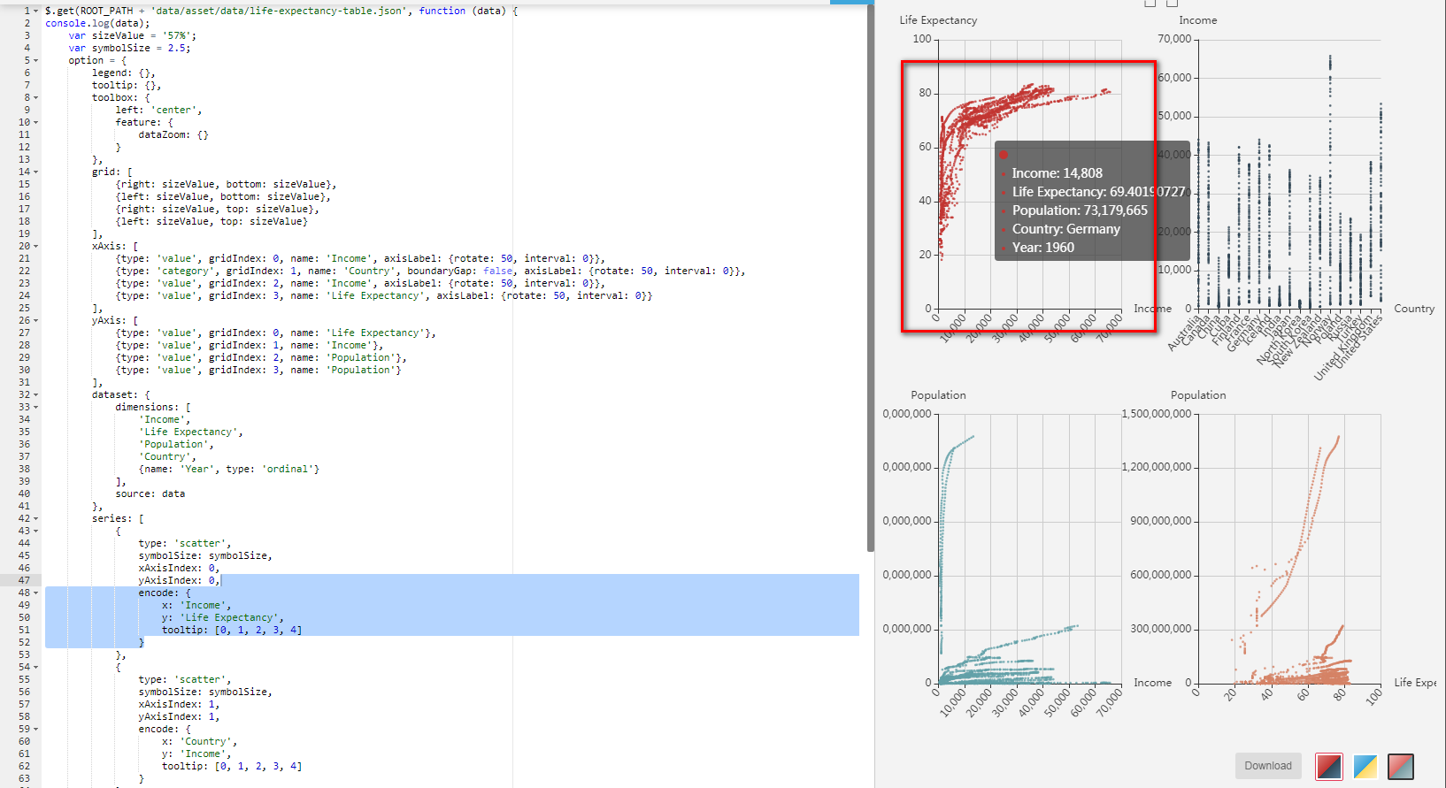
如图
encode: {
x: 'Income',
y: 'Life Expectancy',
tooltip: [0, 1, 2, 3, 4]
}
制定了x轴数据、轴数据及tooltip的数据来源;
考虑到数据都传自后台,未知
xAxisIndex: 0,
yAxisIndex: 0,
encode: {
x: 0,
y: 1,
tooltip: [0, 1, 2, 3, 4]
}
encode里的x可以改成0,y改成1,与截图的写法效果完全一致;