表单中常见的元素主要包括:文本输入框、下拉选择框、单选按钮、复选按钮、文本域和按钮等。
一、基础表单
1、初始化:对于基础表单,Bootstrap并未对其做太多的定制性效果设计,仅仅对表单内的fieldset、legend、label标签进行了定制。如:
fieldset {min- 0;padding: 0;margin: 0;border: 0;}
legend {display: block; 100%;padding: 0;margin-bottom: 20px;font-size: 21px;line-height: inherit;color: #333;border: 0;border-bottom: 1px solid #e5e5e5;}
label {display: inline-block;margin-bottom: 5px;font-weight: bold;}
2、通过定制了一个类名`form-control`
1、宽度变成了100%
2、设置了一个浅灰色(#ccc)的边框
3、具有4px的圆角
4、设置阴影效果,并且元素得到焦点之时,阴影和边框效果会有所变化
5、设置了placeholder的颜色为#999
二、水平表单
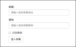
1、通过为表单添加 .form-horizontal 类,并联合使用 Bootstrap 预置的栅格类,可以将 label 标签和控件组水平并排布局。这样做将改变 .form-group 的行为,使其表现为栅格系统中的行(row),因此就无需再额外添加 .row 了。


<form class="form-horizontal">
  <div class="form-group">
    <label for="inputEmail3" class="col-sm-2 control-label">Email</label>
    <div class="col-sm-10">
      <input type="email" class="form-control" id="inputEmail3" placeholder="Email">
    </div>
  </div>
  <div class="form-group">
    <label for="inputPassword3" class="col-sm-2 control-label">Password</label>
    <div class="col-sm-10">
      <input type="password" class="form-control" id="inputPassword3" placeholder="Password">
    </div>
  </div>
  <div class="form-group">
    <div class="col-sm-offset-2 col-sm-10">
      <div class="checkbox">
        <label>
          <input type="checkbox"> Remember me
        </label>
      </div>
    </div>
  </div>
  <div class="form-group">
    <div class="col-sm-offset-2 col-sm-10">
      <button type="submit" class="btn btn-default">Sign in</button>
    </div>
  </div>
</form>
2、整体表单,文字部分添加 .input-group-addon
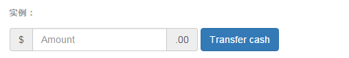
<form class="form-inline">
  <div class="form-group">
    <label class="sr-only" for="exampleInputAmount">Amount (in dollars)</label>
    <div class="input-group">
      <div class="input-group-addon">$</div>
      <input type="text" class="form-control" id="exampleInputAmount" placeholder="Amount">
      <div class="input-group-addon">.00</div>
    </div>
  </div>
  <button type="submit" class="btn btn-primary">Transfer cash</button>
</form>
三、内联表单
为 <form> 元素添加 .form-inline 类可使其内容左对齐并且表现为 inline-block 级别的控件。只适用于视口(viewport)至少在 768px 宽度时(视口宽度再小的话就会使表单折叠)。
四、表单控件大小
Bootstrap框架还提供了两个不同的类名,用来控制表单控件的高度。这两个类名是:
1、input-sm:让控件比正常大小更小
2、input-lg:让控件比正常大小更大
五、表单控件状态(焦点状态)
焦点状态是通过伪类“:focus”来实现。Bootstrap框架中表单控件的焦点状态删除了outline的默认样式,重新添加阴影效果。
.form-control:focus {border-color: #66afe9;outline: 0;
  -webkit-box-shadow: inset 0 1px 1pxrgba(0,0,0,.075), 0 0 8px rgba(102, 175, 233, .6);
box-shadow: inset 0 1px 1pxrgba(0,0,0,.075), 0 0 8px rgba(102, 175, 233, .6);
}
从源码中我们可以看出,要让控件在焦点状态下有上面样式效果,需要给控件添加类名“form-control”
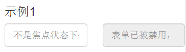
六、表单控件状态(禁用状态)
Bootstrap框架的表单控件的禁用状态和普通的表单禁用状态实现方法是一样的,在相应的表单控件上添加属性“disabled”。
使用方法为:只需要在需要禁用的表单控件上加上“disabled”即可:
<input class="form-control" type="text" placeholder="表单已禁用,不能输入" disabled>
七、表单控件状态(验证状态)
在制作表单时,不免要做表单验证。同样也需要提供验证状态样式,在Bootstrap框架中同样提供这几种效果。
1、.has-warning:警告状态(黄色)
2、.has-error:错误状态(红色)
3、.has-success:成功状态(绿色)
使用的时候只需要在form-group容器上对应添加状态类名。
添加额外的图标
你还可以针对校验状态为输入框添加额外的图标。只需设置相应的 .has-feedback 类并添加正确的图标即可。
<form role="form">
<div class="form-group has-success has-feedback">
  <label class="control-label" for="inputSuccess1">成功状态</label>
  <input type="text" class="form-control" id="inputSuccess1" placeholder="成功状态" >
</div>
<div class="form-group has-warning has-feedback">
  <label class="control-label" for="inputWarning1">警告状态</label>
  <input type="text" class="form-control" id="inputWarning1" placeholder="警告状态">
</div>
<div class="form-group has-error has-feedback">
  <label class="control-label" for="inputError1">错误状态</label>
  <input type="text" class="form-control" id="inputError1" placeholder="错误状态">
</div>
</form>
八、表单提示信息
1、在Bootstrap框架中也提供了这样的效果。使用了一个"help-block"样式,将提示信息以块状显示,并且显示在控件底部。
2、在Bootstrap V2.x版本中还提供了一个行内提示信息,其使用了类名“help-inline”。一般让提示信息显示在控件的后面,也就是同一水平显示。
九、按钮
1、Bootstrap框架V3.x版本的基本按钮和V2.x版本的基本按钮一样,都是通过类名“btn”来实现。
2、“.btn”定义了一个基础的按钮风格,然后通过“.btn-default”定义了一个默认的按钮风格。
3、多标签表示按钮,还可以使用<input type="submit">和<a>标签等。同样,唯一需要注意的是,要在制作按钮的标签元素上添加类名“btn”。如果不添加是不会有任何按钮效果。
4、多风格按钮,主要按钮.btn-primary;成功按钮.btn-success;警告按钮.btn-warning;信息按钮 。信息按钮 .btn-info ;危险按钮.btn-danger;链接按钮.btn-link

5、按钮的大小
大型按钮.btn-lg;小型按钮.btn-sm;超小型按钮.btn-xs

十、按钮状态(禁用)
在Bootstrap框架中,要禁用按钮有两种实现方式:
方法1:在标签中添加disabled属性
方法2:在元素标签中添加类名“disabled”
十一、图像
图像在网页制作中也是常要用到的元素,在Bootstrap框架中对于图像的样式风格提供以下几种风格:
1、img-responsive:响应式图片,主要针对于响应式设计
2、img-rounded:圆角图片
3、img-circle:圆形图片
4、img-thumbnail:缩略图片
<img  alt="140x140" src="http://placehold.it/140x140">
<img  class="img-rounded" alt="140x140" src="http://placehold.it/140x140">
<img  class="img-circle" alt="140x140" src="http://placehold.it/140x140">
<img  class="img-thumbnail" alt="140x140" src="http://placehold.it/140x140">
<img  class="img-responsive" alt="140x140" src="http://placehold.it/140x140">