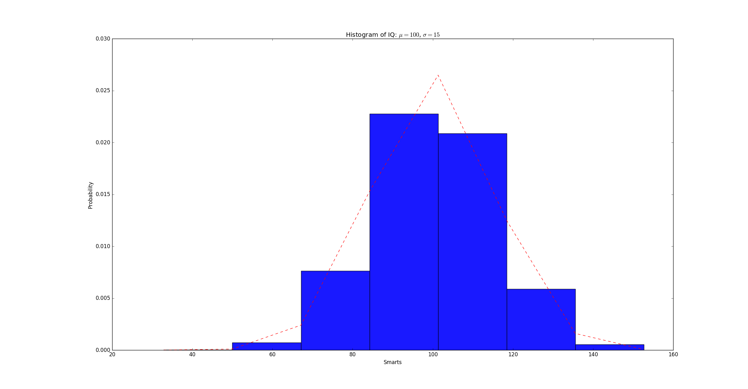
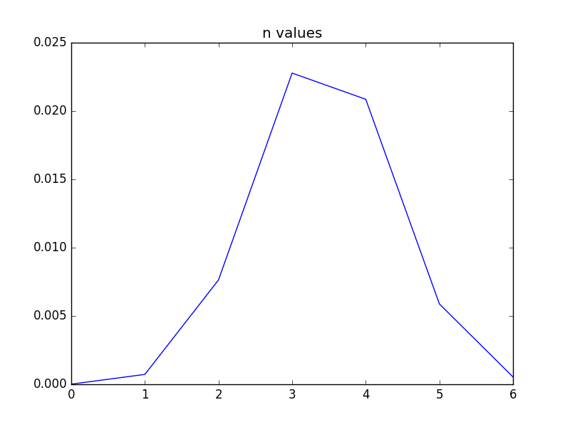
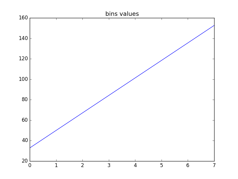
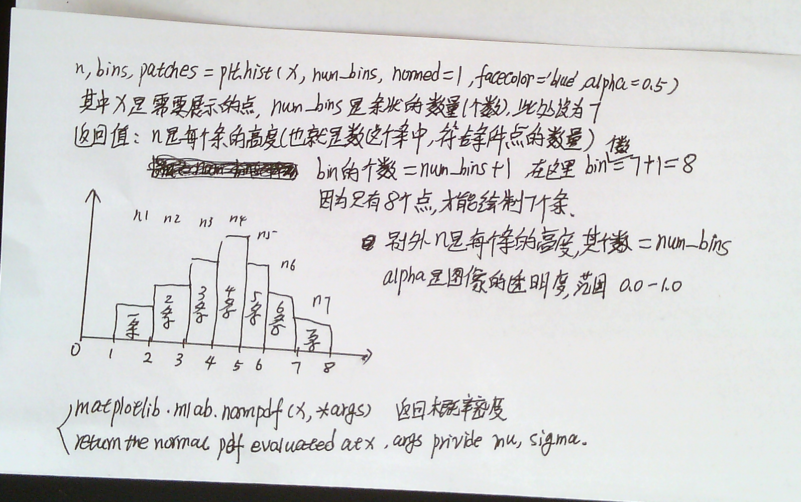
"""
Demo of the histogram (hist) function with a few features.

In addition to the basic histogram, this demo shows a few optional features:

    * Setting the number of data bins
    * The ``normed`` flag, which normalizes bin heights so that the integral of
      the histogram is 1. The resulting histogram is a probability density.
    * Setting the face color of the bars
    * Setting the opacity (alpha value).

x : (n,) array or sequence of (n,) arrays

这个参数是指定每个bin(箱子)分布的数据,对应x轴

bins : integer or array_like, optional

这个参数指定bin(箱子)的个数,也就是总共有几条条状图

normed : boolean, optional

If True, the first element of the return tuple will be the counts normalized to form a probability density, i.e.,n/(len(x)`dbin)

这个参数指定密度,也就是每个条状图的占比例比,默认为1

color : color or array_like of colors or None, optional

这个指定条状图的颜色

我们绘制一个10000个数据的分布条状图,共50份,以统计10000分的分布情况
"""

import numpy as np
import matplotlib.mlab as mlab
import matplotlib.pyplot as plt


# example data
mu = 100 # mean of distribution
sigma = 15 # standard deviation of distribution
x = mu + sigma * np.random.randn(10000)

num_bins = 7
# the histogram of the data
n, bins, patches = plt.hist(x, num_bins, normed=1, facecolor='blue', alpha=0.9)
# add a 'best fit' line
y = mlab.normpdf(bins, mu, sigma)
plt.plot(bins, y, 'r--')
plt.xlabel('Smarts')
plt.ylabel('Probability')
plt.title(r'Histogram of IQ: $mu=100$, $sigma=15$')

# Tweak spacing to prevent clipping of ylabel
plt.subplots_adjust(left=0.15)
plt.show()

plt.plot(n)
plt.title('n values')
plt.show()

plt.plot(bins)
plt.title('bins values')
plt.show()