justify-content属性:
用来表示可伸缩项目在主轴方向上的对齐方式;
取值范围为flex-start,flex-end,center,space-between,space-around;
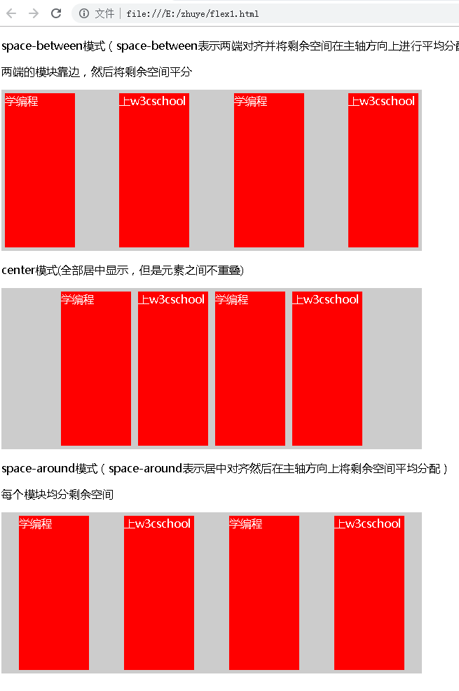
其中flex-start,flex-end,表示相对于主轴起点和终点对齐,center表示居中对齐,space-between表示两端对齐并将剩余空间在主轴方向上进行平均分配,space-around表示居中对齐然后在主轴方向上将剩余空间平均分配。
<!DOCTYPE html>
<html>

<head>
    <title>justify-content几个属性的学习</title>
</head>

<style>
    .flex-container1 {
        display: flex;
        width: 600px;
        height: 230px;
        background-color: #ccc;
        justify-content: space-between;
    }

    .flex-container2 {
        display: flex;
        width: 600px;
        height: 230px;
        background-color: #ccc;
        justify-content: center;
    }

    .flex-container3 {
        display: flex;
        width: 600px;
        height: 230px;
        background-color: #ccc;
        justify-content: space-around;
    }

    .flex-item {
        background-color: red;
        width: 100px;
        margin: 5px;
        color: #fff;
    }
</style>

<body>
    <p>space-between模式(space-between表示两端对齐并将剩余空间在主轴方向上进行平均分配)</p>
    <p> 两端的模块靠边,然后将剩余空间平分 </p>
    <div class="flex-container1">
        <div class="flex-item ">学编程</div>
        <div class="flex-item ">上w3cschool</div>
        <div class="flex-item ">学编程</div>
        <div class="flex-item ">上w3cschool</div>
    </div>
    <p>center模式(全部居中显示,但是元素之间不重叠)</p>
    <div class="flex-container2">
        <div class="flex-item ">学编程</div>
        <div class="flex-item ">上w3cschool</div>
        <div class="flex-item ">学编程</div>
        <div class="flex-item ">上w3cschool</div>
    </div>
    <p>space-around模式(space-around表示居中对齐然后在主轴方向上将剩余空间平均分配)</p>
    <p> 每个模块均分剩余空间 </p>
    <div class="flex-container3">
        <div class="flex-item ">学编程</div>
        <div class="flex-item ">上w3cschool</div>
        <div class="flex-item ">学编程</div>
        <div class="flex-item ">上w3cschool</div>
    </div>
</body>

</html>