在小程序中自定义组件可以通过新建components来实现 参考微信小程序自定义组件文档 https://developers.weixin.qq.com/miniprogram/dev/framework/custom-component/wxml-wxss.html
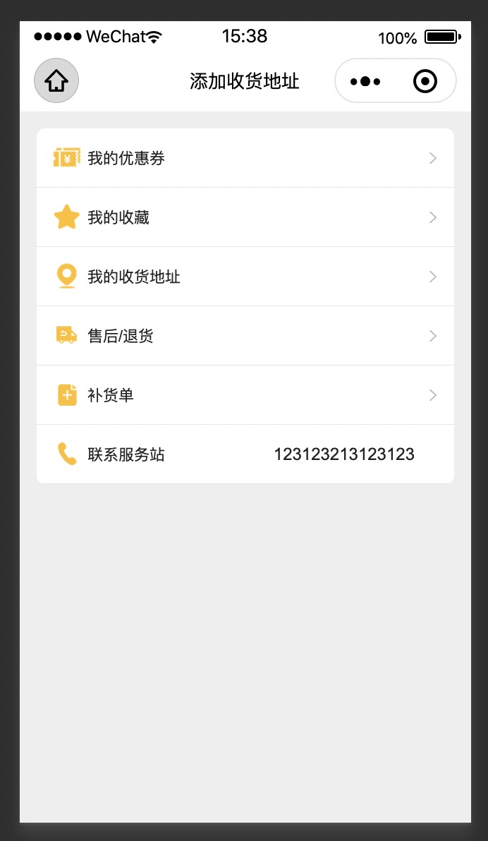
效果图如下:
一些细节:
自定义组件可以通过slot来实现插槽的效果
开启多slot插槽
addGlobalClass 是否允许外部class改变组件布局 如果addGlobalClass:true,外部将无法通过class设置组件样式
  options: {
    multipleSlots: true, // 在组件定义时的选项中启用多slot支持
    addGlobalClass: false
  },
relations组件间关系 设置组件间关系,才可以实现组件通讯
   /// 父组件
  relations: {
    '../kz-cell-item/kz-cell-item': {
      type: 'child', // 关联的目标节点应为父节点
      linked: function (target) {
        // 每次有kz-cell-group被插入时执行,target是该节点实例对象,触发在该节点attached生命周期之后
      },
      linkChanged: function (target) {
        // 每次有kz-cell-group被移动后执行,target是该节点实例对象,触发在该节点moved生命周期之后
      },
      unlinked: function (target) {
        // 每次有kz-cell-group被移除时执行,target是该节点实例对象,触发在该节点detached生命周期之后
      }
    }
  },
/// 子组件
 relations: {
    '../kz-cell-group/kz-cell-group': {
      type: 'parent', // 关联的目标节点应为子节点
      linked: function (target) {
        // 每次有kz-cell-item被插入时执行,target是该节点实例对象,触发在该节点attached生命周期之后
      },
      linkChanged: function (target) {
        // 每次有kz-cell-item被移动后执行,target是该节点实例对象,触发在该节点moved生命周期之后
      },
      unlinked: function (target) {
        // 每次有kz-cell-item被移除时执行,target是该节点实例对象,触发在该节点detached生命周期之后
      }
    }
  },
组件间通讯,在父组件onReady的时候,可以拿到其下所有子组件nodes,通过nodes可以设置子组件的各种属性和调用方法等
下面的例子通过getRelationNodes拿到所有子组件,拿到最后一个子组件并设置其属性,将分割线隐藏
  methods: {
    _getAllLi: function () {
      // 使用getRelationNodes可以获得nodes数组,包含所有已关联的custom-li,且是有序的
      var nodes = this.getRelationNodes('../kz-cell-item/kz-cell-item')
      try {
        const node = nodes.pop();
        if(node){
          node.setData({ splitLine: false });
        }
      } catch (error) {
        console.log(error);
      }
    }
  },
  ready: function () {
    this._getAllLi()
  }
})
全部代码
// components/kz-cell-group/kz-cell-group.js
Component({
  options: {
    addGlobalClass: false,
    multipleSlots: true
  },
  relations: {
    '../kz-cell-item/kz-cell-item': {
      type: 'child', // 关联的目标节点应为父节点
      linked: function (target) {
        // 每次有kz-cell-group被插入时执行,target是该节点实例对象,触发在该节点attached生命周期之后
      },
      linkChanged: function (target) {
        // 每次有kz-cell-group被移动后执行,target是该节点实例对象,触发在该节点moved生命周期之后
      },
      unlinked: function (target) {
        // 每次有kz-cell-group被移除时执行,target是该节点实例对象,触发在该节点detached生命周期之后
      }
    }
  },
  /**
   * 组件的属性列表
   */
  properties: {
  },

  /**
   * 组件的初始数据
   */
  data: {

  },

  /**
   * 组件的方法列表
   */
  methods: {
    _getAllLi: function () {
      // 使用getRelationNodes可以获得nodes数组,包含所有已关联的custom-li,且是有序的
      var nodes = this.getRelationNodes('../kz-cell-item/kz-cell-item')
      try {
        const node = nodes.pop();
        if(node){
          node.setData({ splitLine: false });
        }
      } catch (error) {
        console.log(error);
      }
    }
  },
  ready: function () {
    this._getAllLi()
  }
})


<!--components/kz-cell-group/kz-cell-group.wxml-->
<view>
<slot></slot>
</view>

// components/kz-cell-item/kz-cell-item.js
Component({
  //开启多slot支持
  options: {
    multipleSlots: true, // 在组件定义时的选项中启用多slot支持
    addGlobalClass: false
  },

  relations: {
    '../kz-cell-group/kz-cell-group': {
      type: 'parent', // 关联的目标节点应为子节点
      linked: function (target) {
        // 每次有kz-cell-item被插入时执行,target是该节点实例对象,触发在该节点attached生命周期之后
      },
      linkChanged: function (target) {
        // 每次有kz-cell-item被移动后执行,target是该节点实例对象,触发在该节点moved生命周期之后
      },
      unlinked: function (target) {
        // 每次有kz-cell-item被移除时执行,target是该节点实例对象,触发在该节点detached生命周期之后
      }
    }
  },
  /**
   * 组件的属性列表
   */
  properties: {
    title: {
      type: String,
      value: ''
    },
    titleSize:{
      type:Number,
      value:28
    },
    titleColor:{
      type:String,
      value:"#222"
    },
    arrow: {
      type: Boolean,
      value: true
    },
    height: {
      type: Number,
      value: 100,
    },
    titleWidth: {
      type: Number,
      value: 0,
    },
    backgroundColor: {
      type: String,
      value: '#fff'
    },
    splitLine: {
      type: Boolean,
      value: true
    }
  },

  lifetimes: {
    attached: function () {
      //重设style
      var { cellStyle, titleStyle, height, titleWidth, splitLine, backgroundColor,titleSize,titleColor} = this.data;
      cellStyle = `height:${height}rpx;line-height:${height}rpx;background-color:${backgroundColor};border-bottom:${splitLine ? '1rpx solid rgba(0,0,0,0.1)' : 'none'};`;
      titleStyle = `${titleWidth === 0 ? 'auto' : titleWidth}rpx;font-size:${titleSize}rpx;color:${titleColor}`;
      this.setData({ cellStyle, titleStyle });
    }
  },

  /**
   * 组件的初始数据
   */
  data: {
    cellStyle: '',
    titleStyle: '',
  },

  /**
   * 组件的方法列表
   */
  methods: {
    onCellItemTap(e){
      this.triggerEvent("onItemTap");
    }
  }
})

<!-- components/kz-cell-item/kz-cell-item.wxml -->

<view class="kz-cell-item" style="{{cellStyle}}" catch:tap="onCellItemTap">
    <!-- 最前面slot 可以是title Image -->
    <view class="left-side-container">
        <slot name="before"></slot>
        <view class="title" style="{{titleStyle}}">{{title}}</view>
        <slot name="input"></slot>
    </view>
    <view class="right-side-container">
        <slot name="after"></slot>
        <!-- 是否显示右箭头 -->
        <view wx:if="{{arrow}}">
            <image class="right-arrow" src="/images/icon_arrow_forward.png" mode="widthFix"></image>
        </view>
    </view>
</view>

/* components/kz-cell-item/kz-cell-item.wxss */
.kz-cell-item {
  display: flex;
  justify-content: space-between;
  align-items: center;
  background-color: white;
  padding-left: 28rpx;
  padding-right: 28rpx;
}
.kz-cell-item .left-side-container {
  display: flex;
  align-items: center;
}
.kz-cell-item .left-side-container .title {
  margin-left: 10rpx;
  margin-right: 10rpx;
  text-align: left;
  color: #333;
  font-size: 28rpx;
  flex-shrink: 0;
}
.kz-cell-item .right-side-container {
  display: flex;
}
.kz-cell-item .right-side-container .right-arrow {
  margin-left: 10rpx;
   20rpx;
}
使用
<kz-cell-group class="m-right m-left m-top radius">
    <block wx:for="{{datas}}" wx:key="title">
        <kz-cell-item title="{{item.title}}" mark:index="{{index}}" arrow="{{index !== datas.length-1}}" bind:onItemTap="onContentItemClick">
            <image slot="before" src="{{item.icon}}" class="cell-image"></image>
            <view wx:if="{{index === datas.length-1}}" slot="after" class="mobile">
                {{123123213123123}}
            </view>
        </kz-cell-item>
    </block>
</kz-cell-group>


kz-cell-group {
	display: flex;
	flex-direction: column;
}
.m-right {
	margin-right: 30rpx;
}
.m-top {
	margin-top: 30rpx;
}
.m-bottom {
	margin-bottom: 30rpx;
}
.m-left {
	margin-left: 30rpx;
}
.cell-image{
     50rpx;
    height: 50rpx;
}
.mobile{
    margin-right: 40rpx;
    font-size: 30rpx;
    color: var(--color-black);
}