怕自己忘了,也为一些刚刚接触WEB的同学分享一下才开始不久做项目的一些东西!
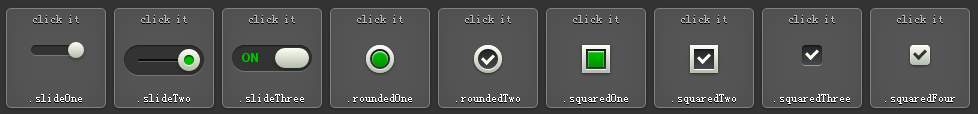
九款按钮
<!DOCTYPE html>
<html>
<head>
<meta charset="UTF-8">
<title>9款超炫的 CSS3 复选框(Checkbox) </title>
<link rel="stylesheet" href="assets/reset.css">
<style>/* .slideOne */
.slideOne {
50px;
height: 10px;
background: #333;
margin: 20px auto;
position: relative;
-moz-border-radius: 50px;
-webkit-border-radius: 50px;
border-radius: 50px;
-moz-box-shadow: inset 0px 1px 1px rgba(0, 0, 0, 0.5), 0px 1px 0px rgba(255, 255, 255, 0.2);
-webkit-box-shadow: inset 0px 1px 1px rgba(0, 0, 0, 0.5), 0px 1px 0px rgba(255, 255, 255, 0.2);
box-shadow: inset 0px 1px 1px rgba(0, 0, 0, 0.5), 0px 1px 0px rgba(255, 255, 255, 0.2);
}
.slideOne label {
display: block;
16px;
height: 16px;
position: absolute;
top: -3px;
left: -3px;
cursor: pointer;
background: #fcfff4;
background: -moz-linear-gradient(top, #fcfff4 0%, #dfe5d7 40%, #b3bead 100%);
background: -webkit-linear-gradient(top, #fcfff4 0%, #dfe5d7 40%, #b3bead 100%);
background: linear-gradient(to bottom, #fcfff4 0%, #dfe5d7 40%, #b3bead 100%);
-moz-border-radius: 50px;
-webkit-border-radius: 50px;
border-radius: 50px;
-moz-box-shadow: 0px 2px 5px 0px rgba(0, 0, 0, 0.3);
-webkit-box-shadow: 0px 2px 5px 0px rgba(0, 0, 0, 0.3);
box-shadow: 0px 2px 5px 0px rgba(0, 0, 0, 0.3);
-moz-transition: all 0.4s ease;
-o-transition: all 0.4s ease;
-webkit-transition: all 0.4s ease;
transition: all 0.4s ease;
}
.slideOne input[type=checkbox] {
visibility: hidden;
}
.slideOne input[type=checkbox]:checked + label {
left: 37px;
}
/* end .slideOne */
/* .slideTwo */
.slideTwo {
80px;
height: 30px;
background: #333;
margin: 20px auto;
position: relative;
-moz-border-radius: 50px;
-webkit-border-radius: 50px;
border-radius: 50px;
-moz-box-shadow: inset 0px 1px 1px rgba(0, 0, 0, 0.5), 0px 1px 0px rgba(255, 255, 255, 0.2);
-webkit-box-shadow: inset 0px 1px 1px rgba(0, 0, 0, 0.5), 0px 1px 0px rgba(255, 255, 255, 0.2);
box-shadow: inset 0px 1px 1px rgba(0, 0, 0, 0.5), 0px 1px 0px rgba(255, 255, 255, 0.2);
}
.slideTwo:after {
content: '';
position: absolute;
top: 14px;
left: 14px;
height: 2px;
52px;
background: #111;
-moz-border-radius: 50px;
-webkit-border-radius: 50px;
border-radius: 50px;
-moz-box-shadow: inset 0px 1px 1px rgba(0, 0, 0, 0.5), 0px 1px 0px rgba(255, 255, 255, 0.2);
-webkit-box-shadow: inset 0px 1px 1px rgba(0, 0, 0, 0.5), 0px 1px 0px rgba(255, 255, 255, 0.2);
box-shadow: inset 0px 1px 1px rgba(0, 0, 0, 0.5), 0px 1px 0px rgba(255, 255, 255, 0.2);
}
.slideTwo label {
display: block;
22px;
height: 22px;
cursor: pointer;
position: absolute;
top: 4px;
z-index: 1;
left: 4px;
background: #fcfff4;
-moz-border-radius: 50px;
-webkit-border-radius: 50px;
border-radius: 50px;
-moz-transition: all 0.4s ease;
-o-transition: all 0.4s ease;
-webkit-transition: all 0.4s ease;
transition: all 0.4s ease;
-moz-box-shadow: 0px 2px 5px 0px rgba(0, 0, 0, 0.3);
-webkit-box-shadow: 0px 2px 5px 0px rgba(0, 0, 0, 0.3);
box-shadow: 0px 2px 5px 0px rgba(0, 0, 0, 0.3);
background: -moz-linear-gradient(top, #fcfff4 0%, #dfe5d7 40%, #b3bead 100%);
background: -webkit-linear-gradient(top, #fcfff4 0%, #dfe5d7 40%, #b3bead 100%);
background: linear-gradient(to bottom, #fcfff4 0%, #dfe5d7 40%, #b3bead 100%);
}
.slideTwo label:after {
content: '';
10px;
height: 10px;
position: absolute;
top: 6px;
left: 6px;
background: #333;
-moz-border-radius: 50px;
-webkit-border-radius: 50px;
border-radius: 50px;
-moz-box-shadow: inset 0px 1px 1px black, 0px 1px 0px rgba(255, 255, 255, 0.9);
-webkit-box-shadow: inset 0px 1px 1px black, 0px 1px 0px rgba(255, 255, 255, 0.9);
box-shadow: inset 0px 1px 1px black, 0px 1px 0px rgba(255, 255, 255, 0.9);
}
.slideTwo input[type=checkbox] {
visibility: hidden;
}
.slideTwo input[type=checkbox]:checked + label {
left: 54px;
}
.slideTwo input[type=checkbox]:checked + label:after {
background: #00bf00;
}
/* end .slideTwo */
/* .slideThree */
.slideThree {
80px;
height: 26px;
background: #333;
margin: 20px auto;
position: relative;
-moz-border-radius: 50px;
-webkit-border-radius: 50px;
border-radius: 50px;
-moz-box-shadow: inset 0px 1px 1px rgba(0, 0, 0, 0.5), 0px 1px 0px rgba(255, 255, 255, 0.2);
-webkit-box-shadow: inset 0px 1px 1px rgba(0, 0, 0, 0.5), 0px 1px 0px rgba(255, 255, 255, 0.2);
box-shadow: inset 0px 1px 1px rgba(0, 0, 0, 0.5), 0px 1px 0px rgba(255, 255, 255, 0.2);
}
.slideThree:after {
content: 'OFF';
color: #000;
position: absolute;
right: 10px;
z-index: 0;
font: 12px/26px Arial, sans-serif;
font-weight: bold;
text-shadow: 1px 1px 0px rgba(255, 255, 255, 0.15);
}
.slideThree:before {
content: 'ON';
color: #00bf00;
position: absolute;
left: 10px;
z-index: 0;
font: 12px/26px Arial, sans-serif;
font-weight: bold;
}
.slideThree label {
display: block;
34px;
height: 20px;
cursor: pointer;
position: absolute;
top: 3px;
left: 3px;
z-index: 1;
background: #fcfff4;
background: -moz-linear-gradient(top, #fcfff4 0%, #dfe5d7 40%, #b3bead 100%);
background: -webkit-linear-gradient(top, #fcfff4 0%, #dfe5d7 40%, #b3bead 100%);
background: linear-gradient(to bottom, #fcfff4 0%, #dfe5d7 40%, #b3bead 100%);
-moz-border-radius: 50px;
-webkit-border-radius: 50px;
border-radius: 50px;
-moz-transition: all 0.4s ease;
-o-transition: all 0.4s ease;
-webkit-transition: all 0.4s ease;
transition: all 0.4s ease;
-moz-box-shadow: 0px 2px 5px 0px rgba(0, 0, 0, 0.3);
-webkit-box-shadow: 0px 2px 5px 0px rgba(0, 0, 0, 0.3);
box-shadow: 0px 2px 5px 0px rgba(0, 0, 0, 0.3);
}
.slideThree input[type=checkbox] {
visibility: hidden;
}
.slideThree input[type=checkbox]:checked + label {
left: 43px;
}
/* end .slideThree */
/* .roundedOne */
.roundedOne {
28px;
height: 28px;
position: relative;
margin: 20px auto;
background: #fcfff4;
background: -moz-linear-gradient(top, #fcfff4 0%, #dfe5d7 40%, #b3bead 100%);
background: -webkit-linear-gradient(top, #fcfff4 0%, #dfe5d7 40%, #b3bead 100%);
background: linear-gradient(to bottom, #fcfff4 0%, #dfe5d7 40%, #b3bead 100%);
-moz-border-radius: 50px;
-webkit-border-radius: 50px;
border-radius: 50px;
-moz-box-shadow: inset 0px 1px 1px white, 0px 1px 3px rgba(0, 0, 0, 0.5);
-webkit-box-shadow: inset 0px 1px 1px white, 0px 1px 3px rgba(0, 0, 0, 0.5);
box-shadow: inset 0px 1px 1px white, 0px 1px 3px rgba(0, 0, 0, 0.5);
}
.roundedOne label {
20px;
height: 20px;
cursor: pointer;
position: absolute;
left: 4px;
top: 4px;
background: -moz-linear-gradient(top, #222222 0%, #45484d 100%);
background: -webkit-linear-gradient(top, #222222 0%, #45484d 100%);
background: linear-gradient(to bottom, #222222 0%, #45484d 100%);
-moz-border-radius: 50px;
-webkit-border-radius: 50px;
border-radius: 50px;
-moz-box-shadow: inset 0px 1px 1px rgba(0, 0, 0, 0.5), 0px 1px 0px white;
-webkit-box-shadow: inset 0px 1px 1px rgba(0, 0, 0, 0.5), 0px 1px 0px white;
box-shadow: inset 0px 1px 1px rgba(0, 0, 0, 0.5), 0px 1px 0px white;
}
.roundedOne label:after {
content: '';
16px;
height: 16px;
position: absolute;
top: 2px;
left: 2px;
background: #00bf00;
background: -moz-linear-gradient(top, #00bf00 0%, #009400 100%);
background: -webkit-linear-gradient(top, #00bf00 0%, #009400 100%);
background: linear-gradient(to bottom, #00bf00 0%, #009400 100%);
filter: progid:DXImageTransform.Microsoft.Alpha(Opacity=0);
opacity: 0;
-moz-border-radius: 50px;
-webkit-border-radius: 50px;
border-radius: 50px;
-moz-box-shadow: inset 0px 1px 1px white, 0px 1px 3px rgba(0, 0, 0, 0.5);
-webkit-box-shadow: inset 0px 1px 1px white, 0px 1px 3px rgba(0, 0, 0, 0.5);
box-shadow: inset 0px 1px 1px white, 0px 1px 3px rgba(0, 0, 0, 0.5);
}
.roundedOne label:hover::after {
filter: progid:DXImageTransform.Microsoft.Alpha(Opacity=30);
opacity: 0.3;
}
.roundedOne input[type=checkbox] {
visibility: hidden;
}
.roundedOne input[type=checkbox]:checked + label:after {
filter: progid:DXImageTransform.Microsoft.Alpha(enabled=false);
opacity: 1;
}
/* end .roundedOne */
/* .roundedTwo */
.roundedTwo {
28px;
height: 28px;
position: relative;
margin: 20px auto;
background: #fcfff4;
background: -moz-linear-gradient(top, #fcfff4 0%, #dfe5d7 40%, #b3bead 100%);
background: -webkit-linear-gradient(top, #fcfff4 0%, #dfe5d7 40%, #b3bead 100%);
background: linear-gradient(to bottom, #fcfff4 0%, #dfe5d7 40%, #b3bead 100%);
-moz-border-radius: 50px;
-webkit-border-radius: 50px;
border-radius: 50px;
-moz-box-shadow: inset 0px 1px 1px white, 0px 1px 3px rgba(0, 0, 0, 0.5);
-webkit-box-shadow: inset 0px 1px 1px white, 0px 1px 3px rgba(0, 0, 0, 0.5);
box-shadow: inset 0px 1px 1px white, 0px 1px 3px rgba(0, 0, 0, 0.5);
}
.roundedTwo label {
20px;
height: 20px;
position: absolute;
top: 4px;
left: 4px;
cursor: pointer;
background: -moz-linear-gradient(top, #222222 0%, #45484d 100%);
background: -webkit-linear-gradient(top, #222222 0%, #45484d 100%);
background: linear-gradient(to bottom, #222222 0%, #45484d 100%);
-moz-border-radius: 50px;
-webkit-border-radius: 50px;
border-radius: 50px;
-moz-box-shadow: inset 0px 1px 1px rgba(0, 0, 0, 0.5), 0px 1px 0px white;
-webkit-box-shadow: inset 0px 1px 1px rgba(0, 0, 0, 0.5), 0px 1px 0px white;
box-shadow: inset 0px 1px 1px rgba(0, 0, 0, 0.5), 0px 1px 0px white;
}
.roundedTwo label:after {
content: '';
9px;
height: 5px;
position: absolute;
top: 5px;
left: 4px;
border: 3px solid #fcfff4;
border-top: none;
border-right: none;
background: transparent;
filter: progid:DXImageTransform.Microsoft.Alpha(Opacity=0);
opacity: 0;
-moz-transform: rotate(-45deg);
-ms-transform: rotate(-45deg);
-webkit-transform: rotate(-45deg);
transform: rotate(-45deg);
}
.roundedTwo label:hover::after {
filter: progid:DXImageTransform.Microsoft.Alpha(Opacity=30);
opacity: 0.3;
}
.roundedTwo input[type=checkbox] {
visibility: hidden;
}
.roundedTwo input[type=checkbox]:checked + label:after {
filter: progid:DXImageTransform.Microsoft.Alpha(enabled=false);
opacity: 1;
}
/* end .roundedTwo */
/* .squaredOne */
.squaredOne {
28px;
height: 28px;
position: relative;
margin: 20px auto;
background: #fcfff4;
background: -moz-linear-gradient(top, #fcfff4 0%, #dfe5d7 40%, #b3bead 100%);
background: -webkit-linear-gradient(top, #fcfff4 0%, #dfe5d7 40%, #b3bead 100%);
background: linear-gradient(to bottom, #fcfff4 0%, #dfe5d7 40%, #b3bead 100%);
-moz-box-shadow: inset 0px 1px 1px white, 0px 1px 3px rgba(0, 0, 0, 0.5);
-webkit-box-shadow: inset 0px 1px 1px white, 0px 1px 3px rgba(0, 0, 0, 0.5);
box-shadow: inset 0px 1px 1px white, 0px 1px 3px rgba(0, 0, 0, 0.5);
}
.squaredOne label {
20px;
height: 20px;
position: absolute;
top: 4px;
left: 4px;
cursor: pointer;
background: -moz-linear-gradient(top, #222222 0%, #45484d 100%);
background: -webkit-linear-gradient(top, #222222 0%, #45484d 100%);
background: linear-gradient(to bottom, #222222 0%, #45484d 100%);
-moz-box-shadow: inset 0px 1px 1px rgba(0, 0, 0, 0.5), 0px 1px 0px white;
-webkit-box-shadow: inset 0px 1px 1px rgba(0, 0, 0, 0.5), 0px 1px 0px white;
box-shadow: inset 0px 1px 1px rgba(0, 0, 0, 0.5), 0px 1px 0px white;
}
.squaredOne label:after {
content: '';
16px;
height: 16px;
position: absolute;
top: 2px;
left: 2px;
background: #00bf00;
background: -moz-linear-gradient(top, #00bf00 0%, #009400 100%);
background: -webkit-linear-gradient(top, #00bf00 0%, #009400 100%);
background: linear-gradient(to bottom, #00bf00 0%, #009400 100%);
-moz-box-shadow: inset 0px 1px 1px white, 0px 1px 3px rgba(0, 0, 0, 0.5);
-webkit-box-shadow: inset 0px 1px 1px white, 0px 1px 3px rgba(0, 0, 0, 0.5);
box-shadow: inset 0px 1px 1px white, 0px 1px 3px rgba(0, 0, 0, 0.5);
filter: progid:DXImageTransform.Microsoft.Alpha(Opacity=0);
opacity: 0;
}
.squaredOne label:hover::after {
filter: progid:DXImageTransform.Microsoft.Alpha(Opacity=30);
opacity: 0.3;
}
.squaredOne input[type=checkbox] {
visibility: hidden;
}
.squaredOne input[type=checkbox]:checked + label:after {
filter: progid:DXImageTransform.Microsoft.Alpha(enabled=false);
opacity: 1;
}
/* end .squaredOne */
/* .squaredTwo */
.squaredTwo {
28px;
height: 28px;
position: relative;
margin: 20px auto;
background: #fcfff4;
background: -moz-linear-gradient(top, #fcfff4 0%, #dfe5d7 40%, #b3bead 100%);
background: -webkit-linear-gradient(top, #fcfff4 0%, #dfe5d7 40%, #b3bead 100%);
background: linear-gradient(to bottom, #fcfff4 0%, #dfe5d7 40%, #b3bead 100%);
-moz-box-shadow: inset 0px 1px 1px white, 0px 1px 3px rgba(0, 0, 0, 0.5);
-webkit-box-shadow: inset 0px 1px 1px white, 0px 1px 3px rgba(0, 0, 0, 0.5);
box-shadow: inset 0px 1px 1px white, 0px 1px 3px rgba(0, 0, 0, 0.5);
}
.squaredTwo label {
20px;
height: 20px;
cursor: pointer;
position: absolute;
left: 4px;
top: 4px;
background: -moz-linear-gradient(top, #222222 0%, #45484d 100%);
background: -webkit-linear-gradient(top, #222222 0%, #45484d 100%);
background: linear-gradient(to bottom, #222222 0%, #45484d 100%);
-moz-box-shadow: inset 0px 1px 1px rgba(0, 0, 0, 0.5), 0px 1px 0px white;
-webkit-box-shadow: inset 0px 1px 1px rgba(0, 0, 0, 0.5), 0px 1px 0px white;
box-shadow: inset 0px 1px 1px rgba(0, 0, 0, 0.5), 0px 1px 0px white;
}
.squaredTwo label:after {
content: '';
9px;
height: 5px;
position: absolute;
top: 4px;
left: 4px;
border: 3px solid #fcfff4;
border-top: none;
border-right: none;
background: transparent;
filter: progid:DXImageTransform.Microsoft.Alpha(Opacity=0);
opacity: 0;
-moz-transform: rotate(-45deg);
-ms-transform: rotate(-45deg);
-webkit-transform: rotate(-45deg);
transform: rotate(-45deg);
}
.squaredTwo label:hover::after {
filter: progid:DXImageTransform.Microsoft.Alpha(Opacity=30);
opacity: 0.3;
}
.squaredTwo input[type=checkbox] {
visibility: hidden;
}
.squaredTwo input[type=checkbox]:checked + label:after {
filter: progid:DXImageTransform.Microsoft.Alpha(enabled=false);
opacity: 1;
}
/* end .squaredTwo */
/* .squaredThree */
.squaredThree {
20px;
position: relative;
margin: 20px auto;
}
.squaredThree label {
20px;
height: 20px;
cursor: pointer;
position: absolute;
top: 0;
left: 0;
background: -moz-linear-gradient(top, #222222 0%, #45484d 100%);
background: -webkit-linear-gradient(top, #222222 0%, #45484d 100%);
background: linear-gradient(to bottom, #222222 0%, #45484d 100%);
-moz-border-radius: 4px;
-webkit-border-radius: 4px;
border-radius: 4px;
-moz-box-shadow: inset 0px 1px 1px rgba(0, 0, 0, 0.5), 0px 1px 0px rgba(255, 255, 255, 0.4);
-webkit-box-shadow: inset 0px 1px 1px rgba(0, 0, 0, 0.5), 0px 1px 0px rgba(255, 255, 255, 0.4);
box-shadow: inset 0px 1px 1px rgba(0, 0, 0, 0.5), 0px 1px 0px rgba(255, 255, 255, 0.4);
}
.squaredThree label:after {
content: '';
9px;
height: 5px;
position: absolute;
top: 4px;
left: 4px;
border: 3px solid #fcfff4;
border-top: none;
border-right: none;
background: transparent;
filter: progid:DXImageTransform.Microsoft.Alpha(Opacity=0);
opacity: 0;
-moz-transform: rotate(-45deg);
-ms-transform: rotate(-45deg);
-webkit-transform: rotate(-45deg);
transform: rotate(-45deg);
}
.squaredThree label:hover::after {
filter: progid:DXImageTransform.Microsoft.Alpha(Opacity=30);
opacity: 0.3;
}
.squaredThree input[type=checkbox] {
visibility: hidden;
}
.squaredThree input[type=checkbox]:checked + label:after {
filter: progid:DXImageTransform.Microsoft.Alpha(enabled=false);
opacity: 1;
}
/* end .squaredThree */
/* .squaredFour */
.squaredFour {
20px;
position: relative;
margin: 20px auto;
}
.squaredFour label {
20px;
height: 20px;
cursor: pointer;
position: absolute;
top: 0;
left: 0;
background: #fcfff4;
background: -moz-linear-gradient(top, #fcfff4 0%, #dfe5d7 40%, #b3bead 100%);
background: -webkit-linear-gradient(top, #fcfff4 0%, #dfe5d7 40%, #b3bead 100%);
background: linear-gradient(to bottom, #fcfff4 0%, #dfe5d7 40%, #b3bead 100%);
-moz-border-radius: 4px;
-webkit-border-radius: 4px;
border-radius: 4px;
-moz-box-shadow: inset 0px 1px 1px white, 0px 1px 3px rgba(0, 0, 0, 0.5);
-webkit-box-shadow: inset 0px 1px 1px white, 0px 1px 3px rgba(0, 0, 0, 0.5);
box-shadow: inset 0px 1px 1px white, 0px 1px 3px rgba(0, 0, 0, 0.5);
}
.squaredFour label:after {
content: '';
9px;
height: 5px;
position: absolute;
top: 4px;
left: 4px;
border: 3px solid #333;
border-top: none;
border-right: none;
background: transparent;
filter: progid:DXImageTransform.Microsoft.Alpha(Opacity=0);
opacity: 0;
-moz-transform: rotate(-45deg);
-ms-transform: rotate(-45deg);
-webkit-transform: rotate(-45deg);
transform: rotate(-45deg);
}
.squaredFour label:hover::after {
filter: progid:DXImageTransform.Microsoft.Alpha(Opacity=50);
opacity: 0.5;
}
.squaredFour input[type=checkbox] {
visibility: hidden;
}
.squaredFour input[type=checkbox]:checked + label:after {
filter: progid:DXImageTransform.Microsoft.Alpha(enabled=false);
opacity: 1;
}
/* end .squaredFour */
* {
box-sizing: border-box;
}
body {
background: #333;
font-family: 'Open Sans', sans-serif;
font-weight: 300;
}
body h1, body h2 {
color: #eee;
font-size: 30px;
text-align: center;
margin: 60px 0 50px 0;
-webkit-font-smoothing: antialiased;
text-shadow: 0px 1px black;
}
body .ondisplay {
text-align: center;
/*border-bottom: 1px solid gray;*/
padding: 60px 0;
}
body .ondisplay section {
100px;
height: 100px;
background: #555;
display: inline-block;
position: relative;
text-align: center;
margin-top: 5px;
border: 1px solid gray;
-moz-border-radius: 5px;
-webkit-border-radius: 5px;
border-radius: 5px;
-moz-box-shadow: 0 1px 4px rgba(0, 0, 0, 0.3), 0 0 40px rgba(0, 0, 0, 0.1) inset;
-webkit-box-shadow: 0 1px 4px rgba(0, 0, 0, 0.3), 0 0 40px rgba(0, 0, 0, 0.1) inset;
box-shadow: 0 1px 4px rgba(0, 0, 0, 0.3), 0 0 40px rgba(0, 0, 0, 0.1) inset;
}
body .ondisplay section:before {
content: 'click it';
color: #bbb;
font-size: 12px;
font-weight: 400;
-webkit-font-smoothing: antialiased;
text-shadow: 0px 1px black;
}
body .ondisplay section:after {
content: attr(title);
position: absolute;
100%;
left: 0;
bottom: 3px;
color: #fff;
font-size: 12px;
font-weight: 400;
-webkit-font-smoothing: antialiased;
text-shadow: 0px 1px black;
}</style>
<script src="http://dreamsky.github.io/main/blog/common/jquery.min.js"></script>
<script src="http://dreamsky.github.io/main/blog/common/init.js"></script>
<script src="assets/prefixfree.min.js"></script>
</head>
<body>
<h1>9款超炫的 CSS3 复选框(Checkbox) </h1>
<div class="ondisplay">
<section title=".slideOne">
<!-- .slideOne -->
<div class="slideOne">
<input type="checkbox" value="None" id="slideOne" name="check" checked />
<label for="slideOne"></label>
</div>
<!-- end .slideOne -->
</section>
<section title=".slideTwo">
<!-- .slideTwo -->
<div class="slideTwo">
<input type="checkbox" value="None" id="slideTwo" name="check" checked />
<label for="slideTwo"></label>
</div>
<!-- end .slideTwo -->
</section>
<section title=".slideThree">
<!-- .slideThree -->
<div class="slideThree">
<input type="checkbox" value="None" id="slideThree" name="check" checked />
<label for="slideThree"></label>
</div>
<!-- end .slideThree -->
</section>
<section title=".roundedOne">
<!-- .roundedOne -->
<div class="roundedOne">
<input type="checkbox" value="None" id="roundedOne" name="check" checked />
<label for="roundedOne"></label>
</div>
<!-- end .roundedOne -->
</section>
<section title=".roundedTwo">
<!-- .roundedTwo -->
<div class="roundedTwo">
<input type="checkbox" value="None" id="roundedTwo" name="check" checked />
<label for="roundedTwo"></label>
</div>
<!-- end .roundedTwo -->
</section>
<section title=".squaredOne">
<!-- .squaredOne -->
<div class="squaredOne">
<input type="checkbox" value="None" id="squaredOne" name="check" checked />
<label for="squaredOne"></label>
</div>
<!-- end .squaredOne -->
</section>
<section title=".squaredTwo">
<!-- .squaredTwo -->
<div class="squaredTwo">
<input type="checkbox" value="None" id="squaredTwo" name="check" checked />
<label for="squaredTwo"></label>
</div>
<!-- end .squaredTwo -->
</section>
<section title=".squaredThree">
<!-- .squaredThree -->
<div class="squaredThree">
<input type="checkbox" value="None" id="squaredThree" name="check" checked />
<label for="squaredThree"></label>
</div>
<!-- end .squaredThree -->
</section>
<section title=".squaredFour">
<!-- .squaredFour -->
<div class="squaredFour">
<input type="checkbox" value="None" id="squaredFour" name="check" checked />
<label for="squaredFour"></label>
</div>
<!-- end .squaredFour -->
</section>
</div>
<div class="footer-banner" style="728px; margin:30px auto"></div>
</body>
</html>
仅供学习!