1.前言
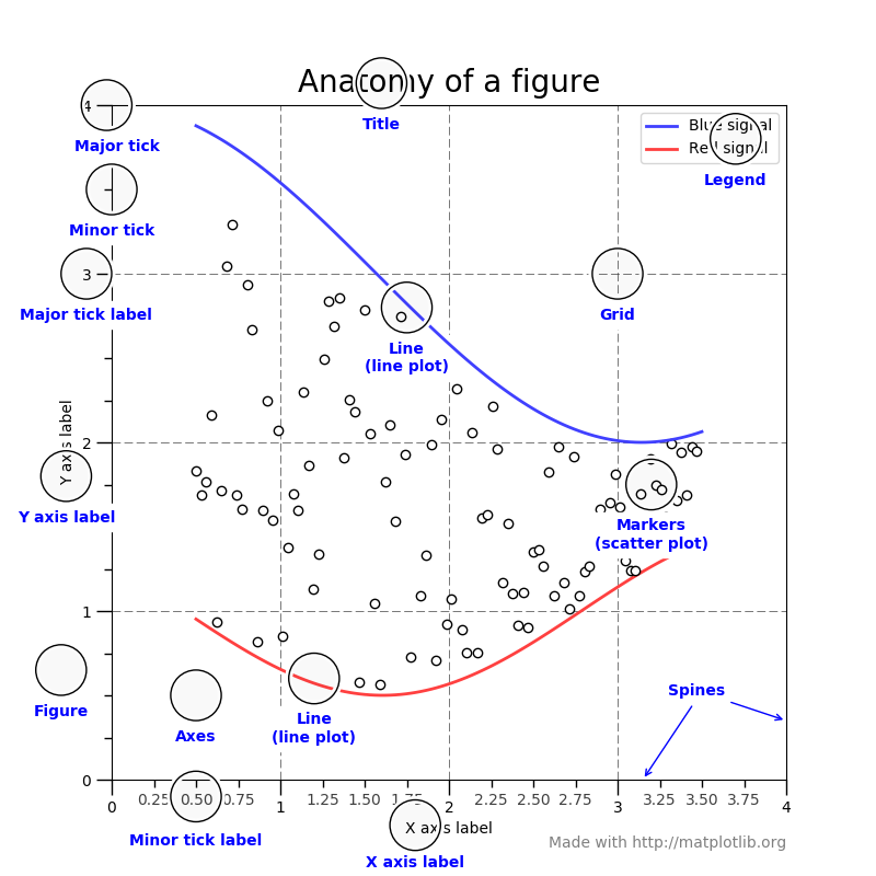
图表要素如下图所示
# sphinx_gallery_thumbnail_number = 3
import matplotlib.pyplot as plt
import numpy as np
2 画布(Figure)
https://matplotlib.org/api/figure_api.html#module-matplotlib.figure
这就类似于我们在电脑上画画一样,需要打开画图软件,创建一个空白的白板,这个白板就是我们后续画图的地方。

创建
fig = plt.figure() # an empty figure with no axes
3 直角坐标系(Axes)
https://matplotlib.org/api/axes_api.html#module-matplotlib.axes
This is what you think of as 'a plot', it is the region of the image with the data space.
3.1 add_subplot(1,1,1)
import matplotlib.pyplot as plt

fig = plt.figure(figsize=(6, 6))

fig.add_subplot(1,1,1)

plt.show()
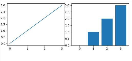
结果
3.2 subplot2grid
在使用 subplot2grid 函数创建直角坐标系的时候,不需要事先创建画布,可以直接使用创建,比如我们下面创建一个很简单的折线图和柱状图:
import matplotlib.pyplot as plt
import numpy as np

x = np.arange(4)
y = np.arange(4)

# 绘制折线图
plt.subplot2grid((2,2),(0,0))
plt.plot(x, y)

# 绘制柱状图
plt.subplot2grid((2,2),(0,1))
plt.bar(x, y)

plt.show()
3.3 subplot
同上面的 subplot2grid 一样,我们同样可以通过 subplot 来绘制直角坐标系,比如我们拿上面的例子再使用 subplot 写一遍:
import matplotlib.pyplot as plt
import numpy as np

x = np.arange(4)
y = np.arange(4)

# 绘制折线图
plt.subplot(221)
plt.plot(x, y)

# 绘制柱状图
plt.subplot(222)
plt.bar(x, y)

plt.show()
3.4 subplots
subplots 看起来和 subplot 很像,实际上也是非常像的,它和 subplot 的不同之处是 subplot 一次只能返回一个坐标系,而 subplots一次可以返回多个坐标系。
import matplotlib.pyplot as plt
import numpy as np

x = np.arange(4)
y = np.arange(4)

fig, axes = plt.subplots(2, 2)
# 绘制折线图
axes[0,0].plot(x,y)
# 绘制柱状图
axes[0,1].bar(x,y)
plt.show()
结果如下:
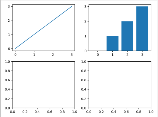
可以看到,我们虽然只使用到了两个坐标,但实际上 subplots 还是会帮我们将 4 个坐标全都创建出来。
4 坐标轴(Axis)
https://matplotlib.org/api/axis_api.html#module-matplotlib.axis
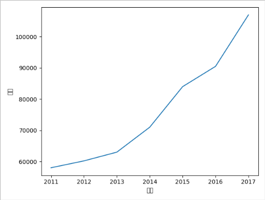
import matplotlib.pyplot as plt

x_data = ['2011','2012','2013','2014','2015','2016','2017']
y_data = [58000,60200,63000,71000,84000,90500,107000]

plt.xlabel('年份')
plt.ylabel('销量')

plt.plot(x_data, y_data)

plt.show()
4.1 坐标轴标题设置(axis label)
import matplotlib.pyplot as plt

plt.rcParams['font.sans-serif']=['SimHei']

x_data = ['2011','2012','2013','2014','2015','2016','2017']
y_data = [58000,60200,63000,71000,84000,90500,107000]

plt.xlabel('年份')
plt.ylabel('销量')

plt.plot(x_data, y_data)

plt.show()
我们还可以通过参数对文本的相关属性进行设置,下面看下一些常用的设置参数:
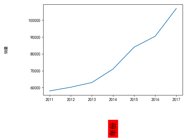
plt.xlabel('年份', labelpad=50, fontsize='xx-large', fontweight='bold', rotation='vertical', backgroundcolor='red')
plt.ylabel('销量', labelpad=50)
xlabel 中常用的一些参数:
- fontsize : 设置字体大小,默认12,可选参数 ['xx-small', 'x-small', 'small', 'medium', 'large','x-large', 'xx-large']
- fontweight : 设置字体粗细,可选参数 ['light', 'normal', 'medium', 'semibold', 'bold', 'heavy', 'black']
- fontstyle : 设置字体类型,可选参数[ 'normal' | 'italic' | 'oblique' ],italic斜体,oblique倾斜
- verticalalignment : 设置水平对齐方式 ,可选参数 : 'center' , 'top' , 'bottom' ,'baseline'
- horizontalalignment : 设置垂直对齐方式,可选参数:left,right,center
- rotation : (旋转角度)可选参数为:vertical,horizontal 也可以为数字
- alpha : 透明度,参数值0至1之间
- backgroundcolor : 标题背景颜色
- bbox : 给标题增加外框 ,常用参数如下:
- boxstyle 方框外形
- facecolor (简写fc)背景颜色
- edgecolor (简写ec)边框线条颜色
- edgewidth 边框线条大小
4.2 刻度设置(tick)
默认坐标轴是显示 x y 的值,但是也可以自定义显示不同的刻度,这里需要使用到的函数为 xticks 和 yticks 两个函数:
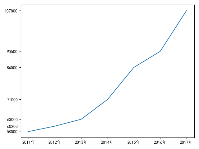
import matplotlib.pyplot as plt

plt.rcParams['font.sans-serif']=['SimHei']

x_data = [2011,2012,2013,2014,2015,2016,2017]
y_data = [58000,60200,63000,71000,84000,90500,107000]

plt.xticks(x_data, ['2011年','2012年','2013年','2014年','2015年','2016年','2017年'])
plt.yticks(y_data)

plt.plot(x_data, y_data)

plt.show()
有些时候,由于数据脱敏的需要,我们不要显示刻度,还可以这么写:
plt.xticks(x_data, [])
plt.yticks(y_data, [])
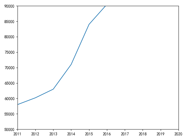
4.3 坐标轴范围设置
import matplotlib.pyplot as plt

plt.rcParams['font.sans-serif']=['SimHei']

x_data = [2011,2012,2013,2014,2015,2016,2017]
y_data = [58000,60200,63000,71000,84000,90500,107000]

plt.xlim(2011, 2020)
plt.ylim(50000, 90000)

plt.plot(x_data, y_data)

plt.show()
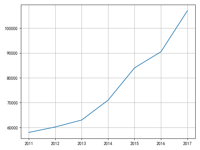
4.4 网格线设置(grid)
网格线默认是关闭的,我们可以通过函数 grid 修改参数 b 来开启网格线,如下:
import matplotlib.pyplot as plt

plt.rcParams['font.sans-serif']=['SimHei']

x_data = [2011,2012,2013,2014,2015,2016,2017]
y_data = [58000,60200,63000,71000,84000,90500,107000]

plt.plot(x_data, y_data)

plt.grid(b=True)

plt.show()
结果如下:
我们不仅可开启网格线,还可以通过参数 axis 来控制是开启哪个轴的网格线:
# 开启 x 轴网格线
plt.grid(b=True, axis='x')
# 开启 y 轴网格线
plt.grid(b=True, axis='y')
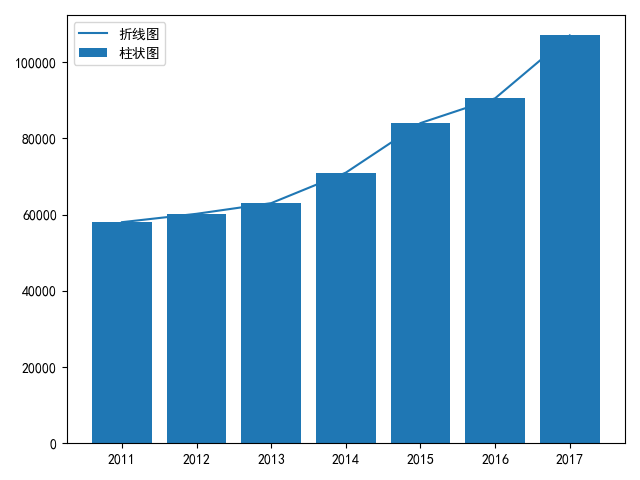
4.5 图例设置(legend)
https://matplotlib.org/tutorials/intermediate/legend_guide.html#legend-location
图例能对图表起到注释的作用,我们可以通过参数 label 对该图表的图例进行设置,示例如下:
import matplotlib.pyplot as plt

plt.rcParams['font.sans-serif']=['SimHei']

x_data = [2011,2012,2013,2014,2015,2016,2017]
y_data = [58000,60200,63000,71000,84000,90500,107000]

plt.plot(x_data, y_data, label = '折线图')
plt.bar(x_data, y_data, label = '柱状图')

plt.legend()

plt.show()
结果如下:
4.6 图表标题设置(Title)
图表标题是用来概括整张图表现的内容的,我们可以通过如下方式设置一张图的标题:
plt.title(label='xxx 公司 xxx 产品销量')
结果如下:

5 Artist
https://matplotlib.org/api/artist_api.html#module-matplotlib.artist