轮播源码是高仿我的XX同学的,最终实现了旋转木马的轮播效果。
图是截取的我个人网站,内容还没有做更改和优化,总体效果如下: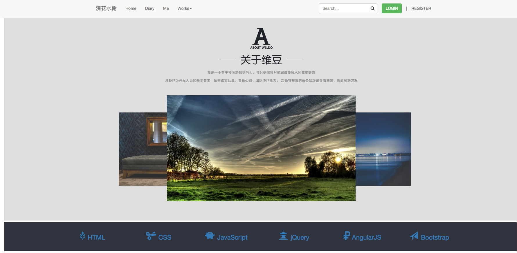
轮播效果:自动轮播,鼠标悬停会有左、右箭头,可进行手动轮播
轮播部分页面代码如下:
<div id="myself" class="me">
    <div id="aboutme">
        <img src="img/aboutme.png">
    </div>
    <p>我是一个善于接收新知识的人,并时刻保持对前端最新技术的高度敏感</p>
    <p>具备作为开发人员的基本要求:做事踏实认真、责任心强、团队协作能力。
        对领导布置的任务始终追寻着高效、高质解决方案
    </p>
    <div class="wrap">
        <div class="slidepic" id="slidepic">
            <ul>
                <li style="z-index: 2;  450px; height: 253px; left: -166px; top: 0px; opacity: 0;"     ><img src="../img/lb1.jpg"  style=" 100%; height: 100%;"    ></li>
                <li style="z-index: 3;  450px; height: 253px; left: -166px; top: 79px; opacity: 0.8;"  ><img src="../img/lb2.jpg"  style=" 100%; height: 100%;" ></li>
                <li style="z-index: 4;  650px; height: 365px; left: 0px; top: 20px; opacity: 1;"       ><img src="../img/lb3.jpg"  style=" 100%; height: 100%;"      ></li>
                <li style="z-index: 3;  450px; height: 253px; left: 390px; top: 79px; opacity: 0.8;"   ><img src="../img/lb4.jpg"  style=" 100%; height: 100%;"  ></li>
                <li style="z-index: 2;  450px; height: 253px; left: 390px; top: 0px; opacity: 0;"      ><img src="../img/lb5.jpg"  style=" 100%; height: 100%;"     ></li>
            </ul>
            <div class="toggle" style="display: none;">
                <a href="javascript:;" class="prev"></a>
                <a href="javascript:;" class="next"></a>
            </div>
        </div>
    </div>
</div>
c
       样式如下(引入bootstrap,代码未优化,请自行整理):
.wrap {
     650px;
    height: 365px;
    margin-top: 10px;
    margin-left: auto;
    margin-right: auto;
}
.slidepic {
    position: relative;
    height: 365px;
}
.toggle {
    position: absolute;
    z-index: 10;
     100%;
    height: 100%;
    display: none;
}
.toggle a {
    position: absolute;
    left: -100px;
    top: 40%;
     76px;
    height: 112px;
    background: url(/img/prev.png) 0 0 no-repeat;
}
.me{
    margin: 0;
    padding: 0;
    font-size: 12px;
    color: #666;
    text-align:center;
    padding-top:15px;
}
.slidepic>ul>li{
    display: list-item;
    text-align: -webkit-match-parent;
}
#myself {
    position: relative;
     100%;
    height: 700px;
    overflow: hidden;
    background-color: #DEDEDE;
}
.slidepic ul {
    position: absolute;
    left: 0;
    top:0px;
    z-index: 1;
    list-style-type: none;
}
ul,menu,dir {
    display: block;
    list-style-type: disc;
    -webkit-margin-before: 1em;
    -webkit-margin-after: 1em;
    -webkit-margin-start: 0px;
    -webkit-margin-end: 0px;
    -webkit-padding-start: 40px;
}
.toggle .next{
    right:0px;
    left:670px;
    background-image: url(/img/next.png);
}
div {
    display: block;
}
body {
    overflow-x: hidden;
}
div#aboutme, div#case1 {
     292px;
    height: 127px;
    margin: 20px auto;
    margin-bottom: 20px;
}
#myself p, #case p {
     800px;
    margin: 0px auto;
    text-align: center;
    margin-top: 10px;
    color: #8C8C8C;
}
.slidepic li {
    position: absolute;
     450px;
    height: 253px;
    left: 0px;
    top: 0;
    background-color: #6475ae;
    list-style-type: none;
}

    代码段如下(引入jquery):
$(function(){
    var $slidepic = $('#slidepic');
    var aLi = $slidepic.find('li');
    var timer = null;
    var off = true;
    //定义li定位数据
    var pos = [
        {
            450,
            height:253,
            left:-166,
            top:0,
            opacity:0,
            z:2
        },
        {
            450,
            height:253,
            left:-166,
            top:79,
            opacity:0.8,
            z:3
        },
        {
            650,
            height:365,
            left:0,
            top:20,
            opacity:1,
            z:4
        },
        {
            450,
            height:253,
            left:390,
            top:79,
            opacity:0.8,
            z:3
        },
        {
            450,
            height:253,
            left:390,
            top:0,
            opacity:0,
            z:2
        }
    ]
    //设置li定位
    fnMove()
    //上一个按钮
    $slidepic.find('.prev').on('click',function(){
        if(off){
            off = false;
            fnMove(true)
        }
    })
    //下一个按钮
    $slidepic.find('.next').on('click',function(){
        if(off){
            off = false;
            fnMove(false)
        }
    })
    //li运动函数
    function fnMove(b){
        if(typeof(b) != 'undefined'){         //判断参数有没有传,没有就设置li位置,传了就是按钮点击
            if(b){
                pos.push(pos.shift())
            }else{
                pos.unshift(pos.pop())
            }
        }
        $.each(pos, function(i, val) {
            aLi.eq(i).css('zIndex',pos[i].z).stop().animate(pos[i],500,function(){
                off = true;
            });
        });
    }
    //开启定时器自动播放
    timer = setInterval(function(){
        fnMove(true)
    },3000)
    //暂停继续播放,显示隐藏左右切换按钮
    $slidepic.hover(function(){
        clearInterval(timer)
        $(this).find('.toggle').fadeIn();
    },function(){
        clearInterval(timer)
        timer = setInterval(function(){
            fnMove(true)
        },5000)
        $(this).find('.toggle').fadeOut();
    })
})

   大气美观的轮播图~