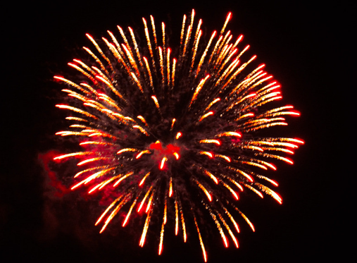
烟花特效,比较简单,直接贴代码了……

<!DOCTYPE html>
<html lang="en">
<head>
    <meta charset="UTF-8">
    <title>css3实现烟花特效</title>
    <style>
        * {
            margin: 0;
            padding: 0;
        }
        html{
             100%;
            height: 100%;
        }
        body{
             100%;
            height: 100%;
        }
        #container{
             100%;
            height: 100%;
            background-color: black;
            position: relative;
        }
        #fireworks{
            position: absolute;
            left: 50%;
            margin-left: -250px;
            bottom: 60%;
            margin-bottom: -180px;
            transform: scale(0);
            animation: fireworks 5s 3s;
        }

        @keyframes fireworks {
            0%{
                transform: scale(0);
            }
            80%{
                transform: scale(1);
            }
            100%{
                opacity: 0;
            }
        }
        #firecracker{
            position: absolute;
            left: 50%;
            bottom: 0%;
            margin-left: -4px;
            animation: firecracker 3s forwards;
        }

        @keyframes firecracker {
            0%{
                transform: scale(1);
                bottom: 0%;
            }
            100%{
                bottom: 60%;
                transform: scale(0);
            }
        }
    </style>
</head>
<body>
<div id="container">
    <div id="fireworks"><img src="imgs/fireworks.png" alt=""></div>
    <div id="firecracker"><img src="imgs/firecracker.png" alt="" width="8px"></div>
</div>
</body>
</html>