一、浏览器支持
表中的数字指定完全支持该属性的第一个浏览器版本。(来源于百度)
数字后面的 -webkit- 或者 -moz- 使用时需要指定前缀。
| 属性 | Chrome | Firefox | Safari | Opera | IE |
|---|---|---|---|---|---|
| linear-gradient | 26.0 10.0 -webkit- | 10.0 | 16.0 3.6 -moz- | 6.1 5.1 -webkit- | 12.1 11.1 -o- |
| radial-gradient | 26.0 10.0 -webkit- | 10.0 | 16.0 3.6 -moz- | 6.1 5.1 -webkit- | 12.1 11.6 -o- |
| repeating-linear-gradient | 26.0 10.0 -webkit- | 10.0 | 16.0 3.6 -moz- | 6.1 5.1 -webkit- | 12.1 11.1 -o- |
| repeating-radial-gradient | 26.0 10.0 -webkit- | 10.0 | 16.0 3.6 -moz- | 6.1 5.1 -webkit- | 12.1 11.6 -o- |
二、CSS3 线性渐变(向下/向上/向左/向右/倾斜)
要创建线性渐变,必须定义至少两个颜色停止。颜色停止是你想要渲染平滑过渡之间的颜色。 您还可以设置一个起始点和一个方向(或角度)和渐变效果。
语法:
background: linear-gradient(direction, color-stop1, color-stop2, ...);
html代码:
<!DOCTYPE html>
<html lang="en">
<head>
  <meta charset="UTF-8">
  <title>项目</title>

</head>
<body>

  <div id="grad1"></div>
</body>
</html>
例如:
线性渐变 - 上到下
显示从顶部开始的线性渐变。它从开始的红色,过渡到黄色:
<style>
    #grad1 {
        height: 200px;
        background: blue; /* 对于那些不支持渐变的浏览器 */
        background: -webkit-linear-gradient(blue, yellow); /* Safari 5.1 到 6.0 */
        background: -o-linear-gradient(blue, yellow); /* Opera 11.1 到 12.0 */
        background: -moz-linear-gradient(blue, yellow); /* Firefox 3.6 到 15 */
        background: linear-gradient(blue, yellow); /* 标准语法 (必须是最后一个) */
    }
</style>

线性渐变 - 左到右
例如:
显示从左开始的线性渐变。它从开始的红色,过渡到黄色
<style>
    #grad1 {
        height: 200px;
        background: blue; /* 对于那些不支持渐变的浏览器 */
        background: -webkit-linear-gradient(left, blue , yellow); /* Safari 5.1 到 6.0 */
        background: -o-linear-gradient(right, blue, yellow); /* Opera 11.1 到 12.0 */
        background: -moz-linear-gradient(right, blue, yellow); /* Firefox 3.6 到 15 */
        background: linear-gradient(to right, blue , yellow); /* 标准语法 (必须是最后一个) */
    }
</style>

线性渐变 - 对角线
可以通过指定水平和垂直起始位置来实现对角线渐变。
下面的示例显示从左上角开始的线性渐变(到右下角)。它开始红色,过渡到黄色:
<style>
    #grad1 {
        height: 200px;
        background: blue; /*对于那些不支持渐变的浏览器 */
        background: -webkit-linear-gradient(left top, blue, yellow); /* Safari 5.1 到 6.0 */
        background: -o-linear-gradient(bottom right, blue, yellow); /* Opera 11.1 到 12.0 */
        background: -moz-linear-gradient(bottom right, blue, yellow); /* Firefox 3.6 到 15 */
        background: linear-gradient(to bottom right, blue, yellow); /* 标准语法(必须是最后一个) */
    }
</style>

1. 使用角度
如果你想在渐变方向上有更多的控制,你可以定义一个角度,而不是预定的方向(下、上、左、右等)。
语法
background: linear-gradient(angle, color-stop1, color-stop2);
下面的示例演示如何使用在线性渐变上使用角度:
例如:
#grad {
   100%;
  height: 100px;
  background: blue; /* 对于那些不支持渐变的浏览器 */
  background: -webkit-linear-gradient(-90deg, blue, yellow); /*  Safari 5.1 到 6.0 */
  background: -o-linear-gradient(-90deg, blue, yellow); /*  Opera 11.1 到 12.0 */
  background: -moz-linear-gradient(-90deg, blue, yellow); /*  Firefox 3.6 到 15 */
  background: linear-gradient(-90deg, blue, yellow); /*  标准语法 */
}

2. 使用多个停止颜色
下面的示例显示一个具有多个停止颜色的线性渐变(从上到下)
例如:
#grad {
  background: blue; /* 对于那些不支持渐变的浏览器 */
  background: -webkit-linear-gradient(blue, yellow, green); /*  Safari 5.1 到 6.0 */
  background: -o-linear-gradient(blue, yellow, green); /*  Opera 11.1 到 12.0 */
  background: -moz-linear-gradient(blue, yellow, green); /*  Firefox 3.6 到 15 */
  background: linear-gradient(blue, yellow, green); /* 标准语法 */
}

下面实例演示了如何使用彩虹颜色和一些文本来创建一个线性渐变(从左到右)
渐变背景
例如:
#grad {
  background: blue; /*对于那些不支持渐变的浏览器 */
  /*  Safari 5.1 到 6.0 */
  background: -webkit-linear-gradient(left,red,orange,yellow,green,blue,indigo,violet);
  /*  Opera 11.1 到 12.0 */
  background: -o-linear-gradient(left,red,orange,yellow,green,blue,indigo,violet);
  /*  Fx 3.6 到 15 */
  background: -moz-linear-gradient(left,red,orange,yellow,green,blue,indigo,violet);
  /* Standard syntax */
  background: linear-gradient(到 right, red,orange,yellow,green,blue,indigo,violet);
}

3. 使用的透明度
CSS3 渐变也支持透明度,可以用来创建淡入淡出效果。
添加透明度,我们用rgba()函数来定义停止颜色。在rgba()函数的最后一个参数可以从0到1的值,并定义颜色的透明度:0表示完全透明,1表示完全的颜色(不透明度)。
下面的示例显示从左开始的线性渐变。它开始完全透明,过渡到全红色:
#grad {
  background: blue; /*  不支持渐变的浏览器 */
  background: -webkit-linear-gradient(left,rgba(255,0,0,0),rgba(255,0,0,1)); /*Safari 5.1-6*/
  background: -o-linear-gradient(right,rgba(255,0,0,0),rgba(255,0,0,1)); /*Opera 11.1-12*/
  background: -moz-linear-gradient(right,rgba(255,0,0,0),rgba(255,0,0,1)); /*Fx 3.6-15*/
  background: linear-gradient(to right, rgba(255,0,0,0), rgba(255,0,0,1)); /*Standard*/
}

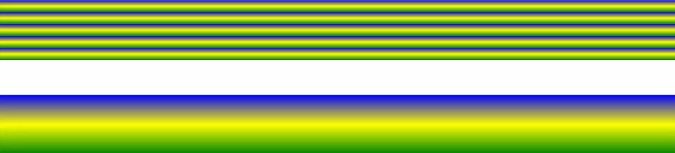
4. 重复线性渐变
repeating-linear-gradient() 函数用于重复线性渐变:
例如:
#grad {
  background: blue; /*  不支持渐变的浏览器 */
  /* Safari 5.1 到 6.0 */
  background: -webkit-repeating-linear-gradient(blue, yellow 10%, green 20%);
  /* Opera 11.1 到 12.0 */
  background: -o-repeating-linear-gradient(blue, yellow 10%, green 20%);
  /* Firefox 3.6 到 15 */
  background: -moz-repeating-linear-gradient(blue, yellow 10%, green 20%);
  /* Standard syntax */
  background: repeating-linear-gradient(blue, yellow 10%, green 20%);
}
https://www.houdianzi.com/zhlogo/ 珠海logo设计
三、CSS3 径向渐变 (由中心定义)
径向渐变是由其中心定义的。
要创建径向渐变,还必须定义至少两个停止颜色。
语法
background: radial-gradient(shape size at position, start-color, ..., last-color);
径向渐变-均匀的间隔停止颜色 (默认)
下面的示例显示一个径向渐变,其颜色间隔均匀:
#grad {
  background: blue; /*  browsers that do not support gradients */
  background: -webkit-radial-gradient(blue, yellow, green); /* Safari 5.1 到 6.0 */
  background: -o-radial-gradient(blue, yellow, green); /*  Opera 11.6 到 12.0 */
  background: -moz-radial-gradient(blue, yellow, green); /*  Firefox 3.6 到 15 */
  background: radial-gradient(blue, yellow, green); /* Standard syntax */
}

径向渐变-不同间隔的停止颜色
下面的例子显示了一个具有不同间距的颜色渐变的径向渐变:
#grad {
  background: blue; /*不支持渐变的浏览器 */
  background: -webkit-radial-gradient(blue 5%, yellow 15%, green 60%); /* Safari 5.1-6.0 */
  background: -o-radial-gradient(blue 5%, yellow 15%, green 60%); /*  Opera 11.6-12.0 */
  background: -moz-radial-gradient(blue 5%, yellow 15%, green 60%); /*  Firefox 3.6-15 */
  background: radial-gradient(blue 5%, yellow 15%, green 60%); /* Standard syntax */
}

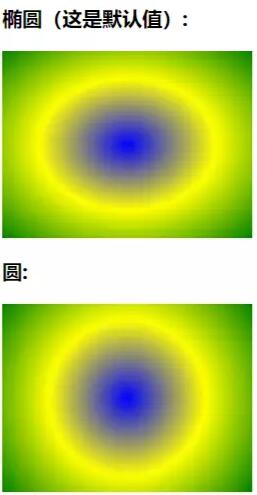
1. 设置形状
形状参数定义形状。它可以取值圆或椭圆。默认值为椭圆形。
下面的例子显示了一个圆形的径向渐变:
<!DOCTYPE html>
<html lang="en">
  <head>
    <meta charset="UTF-8">
    <title>项目</title>
    <style>
      #grad1 {
        height: 150px;
         200px;
        background: -webkit-radial-gradient(blue, yellow, green);
        /*  Safari 5.1 到 6.0 */
        background: -o-radial-gradient(blue, yellow, green);
        /*  Opera 11.6 到 12.0 */
        background: -moz-radial-gradient(blue, yellow, green);
        /*  Fx 3.6 到 15 */
        background: radial-gradient(blue, yellow, green);
        /* 标准语法(必须是最后一个) */
      }

      #grad2 {
        height: 150px;
         200px;
        background: -webkit-radial-gradient(circle, blue, yellow, green);
        /*  Safari 5.1 到 6.0 */
        background: -o-radial-gradient(circle, blue, yellow, green);
        /*  Opera 11.6 到 12.0 */
        background: -moz-radial-gradient(circle, blue, yellow, green);
        /*  Fx 3.6 到 15 */
        background: radial-gradient(circle, blue, yellow, green);
        /* 标准语法(必须是最后一个) */
      }
</style>
  </head>
  <body>

    <h3>径向渐变-形状</h3>

    <p><strong>椭圆(这是默认值):</strong></p>
    <div id="grad1"></div>

    <p><strong>圆:</strong></p>
    <div id="grad2"></div>

    <p><strong>注意:</strong> Internet Explorer 9 和早期的版本不支持渐变。</p>

  </body>
</html>
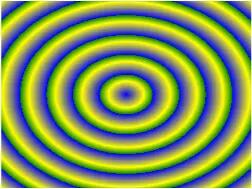
2. 重复径向渐变
repeating-radial-gradient() 函数用于重复径向渐变:
例如:
#grad {
  background: blue; /*不支持渐变的浏览器*/
  /*  Safari 5.1 到 6.0 */
  background: -webkit-repeating-radial-gradient(blue, yellow 10%, green 15%);
  /*  Opera 11.6 到 12.0 */
  background: -o-repeating-radial-gradient(blue, yellow 10%, green 15%);
  /*  Firefox 3.6 到 15 */
  background: -moz-repeating-radial-gradient(blue, yellow 10%, green 15%);
  /* Standard syntax */
  background: repeating-radial-gradient(blue, yellow 10%, green 15%);
}
四、总结
本文基于html基础, 通过对css中渐变效果做了详细的讲解,介绍来了常见的两种渐变方式。通过丰富的案例让大家能够更好的去了解,去体会渐变的用法,希望可以帮助大家更好的学习。