Bootstrap is a popular, open source framework. Complete with pre-built components it allows web designers of all skill levels to quickly build a site.
The only drawback I can find to Bootstrap is that it is built on Less. Less is a CSS preprocessor, and although I could learn Less, I prefer Sass. Normally the fact that it is based on Less would exclude me as a user of Bootstrap, as I do no write plain CSS anymore. Fortunately Bootstrap now comes with a official Sass port of the framework, bootstrap-sass. If you are not familiar with Bootstrap implementing the Sass version can be a little tricky. In this article I will show you how to configure and customize Bootstrap with Sass.
Installation
There are multiple ways to obtain and install bootstrap-sass
Download
You can download bootstrap-sass from the Bootstrap download page. Once you have it downloaded extract the contents of the file to the folder you are going to create your project in.
Compass
If you are using Compass then you’ll have Ruby installed. With Ruby installed we can use gems, in this case the bootstrap-sass gem. To install:
gem install bootstrap-sassIf you have an existing Compass project and want to add bootstrap-sass, run this command:
compass install bootstrap -r bootstrap-sassIf you want to start a new Compass project with bootstrap-sass use:
compass create my-new-project -r bootstrap-sass --using bootstrapBower
We can also install it with the package manager Bower. To me this option is the best as the other options install a lot of ‘fluff’ that will confuse someone not familiar with Bootstrap. To install with Bower make sure you are in the folder where you want to create your project and run:
bower install bootstrap-sassConfiguration
Once we have installed our desired version of bootstrap-sass we need to configure our project. The type of install we performed will determine where the files we need are located.
Download
The download includes a lot of folders that we will not need if we aren’t using Rails. The only folder we need is the assets folder. We can copy the contents of this folder to the root of our project or use it as is. If you intend to use Javascript components you will have to manually download jQuery.
Compass
Using the Compass version creates a styles.scss and _bootstrap-variables.scss file. Folders for fonts, javascript, sass, and stylesheets are created. The important thing to note is that styles.scss imports Bootstrap as a whole, there is no way to pick and choose what Bootstrap components you want to use. You will also have to download jQuery.
Bower
An install from Bower includes everything you need for Bootstrap, even jQuery. All components installed are located in the bower_components directory.
Setup
Once we have Bootstrap installed we need to setup our project to use it. The first thing we want to do is create folders for sass and stylesheets (the Compass setup has already created these). The sass folder will hold our scss files while stylesheets will be where compiled css will be stored. After that create a file named app.scss inside the sass folder. If we are using Compass this file has already been created as styles.scss
The app.scss file (or styles.scss in Compass) is used to import bootstrap components. For example:
Download
@import "bootstrap-sass-3.3.4/assets/stylesheets/bootstrap";Compass
@import "bootstrap";Bower
@import "../bower_components/bootstrap-sass/assets/stylesheets/bootstrap";The next thing we want to do is navigate to the Bootstrap folder and find the stylesheets folder. Inside of stylesheets there is a bootstrap folder. Copy the _variables.scss file to your sass folder. Rename the file to _customVariables.scss. Add an import statement for _customVariables.scss to app.scss. Make sure to import _customVariables.scss first for reasons I will explain in a moment.
If you are using Compass you can skip this step as the _bootstrap-variables file serves the same purpose. The file has already been imported into styles.scss for you. If you are using Compass with Bower it is advisable to import bootstrap-compass.scss.
The last import is an optional _custom.scss file. Many people will include custom css rules directly after their import statements or in their app.scss file, but I prefer to separate any custom rules into their own partial. At any rate our app.scss should have three import statements now (or four if using Compass).
@import "customVariables";
@import "../bower_components/bootstrap-sass/assets/stylesheets/bootstrap";
@import "../bower_components/bootstrap-sass/assets/stylesheets/bootstrap-compass";
@import "custom";
Notice we import our _customVariables.scss file first. The reason being is all of Bootstrap’s variables are set to default! values,so we need to override these values by importing our variables first.
Customize
When we edit variables it is advisable to make a copy of the original and change the copy. After copying, comment out the original variable. That way we can go back to what it was previously set to in case we don’t like the result. For example lets say we wanted to change the base font size to 20px. First we will look in our _customVariable.scss file. The variables are broken down by section, we are looking for the Typography section. There we want the $font-size-base:14px !default; variable. Copy and paste and comment out the original. After that it is as simple as changing the value to 20px.
//$font-size-base:14px !default;
$font-size-base:20px !default;
As you can see I have commented out the original variable and changed the copy.
When trying to customize Bootstrap bear in mind there are a lot of variables to deal with. When looking for a variable to change it is advisable to make full use of your text editors search feature. It is also a good idea to look over the _customVariables.scss file and get familiar with the variables present.
Another effective method for finding what variables you need to change is to look at the raw scss files that make up Bootstrap before they are compiled. From there we can see what variables are used in that module. For example lets say I am not happy with the color of the .navbar-default element. Instead of me trying to figure out what variable I need to change I can look inside of the _navbar.scss file. I scroll down (or use my search function) to find a reference to a color variable.
// Default navbar
.navbar-default {
    background-color: $navbar-default-bg;
    border-color: $navbar-default-border;

.navbar-brand {
    color: $navbar-default-brand-color;
    &:hover,
    &:focus {
    color: $navbar-default-brand-hover-color;
    background-color: $navbar-default-brand-hover-bg;
    }
}
From looking at this rule I determine the variable I need to change is $navbar-default-bg. I would then go into my _customVariables.scss and copy/comment out original variable and create my own.
When using bootstrap-sass you also have the advantage of being able to use and look at the mixins included with Bootstrap. My first article for Sitepoint was about 5 useful mixins in Bootstrap, so it’s no secret I am a fan of the Bootstrap mixins. Not only will they help with understanding how Bootstrap fits together, they may actually help you build your site. For example looking at @mixin make-row:
@mixin make-row($gutter: $grid-gutter-width) {
    margin-left:  ($gutter / -2);
    margin-right: ($gutter / -2);
    @include clearfix;
}
From this mixin we can see what variables affect our row. We now know we can alter the $grid-gutter-width to make changes to the margins of a row. Also we see that the clearfix mixin has been included. We can also look that over to see what that affects.
Conclusion
Using Bootstrap can be complicated especially for someone that is not familiar with the framework. With the methods I demonstrated you should be able to get Bootstrap setup with Sass and customize the framework with ease. Finding the variables you need to change should be more manageable now that you know what to look for. Just remember your text editors search functions are your friend, and when in doubt looking at the mixins can help.
Version 3 of Twitter Bootstrap is a major change from all its past versions. It is a mobile-first framework and can claim to be one of the best CSS frameworks for building responsive website designs.
In my last article I focused on building responsive websites using Twitter Bootstrap 2. From that, you should have an idea of how Bootstrap works.
Since Twitter Bootstrap 3 is a mobile-first framework, by default whatever you design or create will be mobile compatible or responsive. Isn’t that cool?
Getting Started
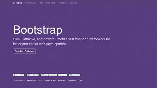
Twitter Bootstrap has a new website design which is itself built using the Bootstrap 3 framework.
You can download the archive file here. Once you unzip the archive file, you will see lots of files and folders that are not required for our tutorial. Jump directly into the dist directory and copy all the folders to a new destination, which will be your project home.
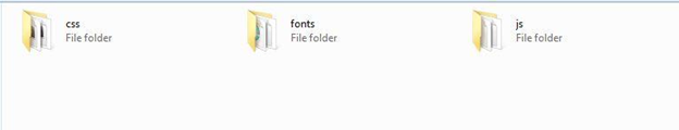
Now, we have three directories, so let’s look at each of them. The css folder contains four CSS files: bootstrap.css, bootstrap.min.css, bootstrap-theme.css and bootstrap-theme.min.css.
Our main CSS file is bootstrap.css, and we must include that in all our HTML pages. bootstrap.min.css is just the minified version of bootstrap.css. It is needed when we are actually deploying our application online. Bootstrap-theme.css is the additional CSS file, which is optional for you to use. It gives 3D effects on the buttons and some other elements. Similarly, bootstrap-theme.min.css is the minified CSS file of bootstrap-theme.css.
The biggest difference between Bootstrap 2 and Bootstrap 3 is the use of font files instead of flat images to showcase various image icons. This has a couple of advantages.
- Consumes less bandwidth, speeds up the website
- The font icons are responsive and resizable
These font icons are called Glyphicons, named after the company that gave those icons for free to Twitter Bootstrap.
Moving on to the js folder, we have two files named bootstrap.js and bootstrap.min.js. These files contains bootstrap’s main JavaScript libraries for things like carousels, drop down menus, search auto suggest and many other powerful JavaScript functionalities. We will use the minified version when the application is ready for deployment.
So what exactly we are going to build?
In this article, we are going to build a static landing page using Twitter Bootstrap 3, which will be called “Rental Vacations”. Have a look at the demo page first.
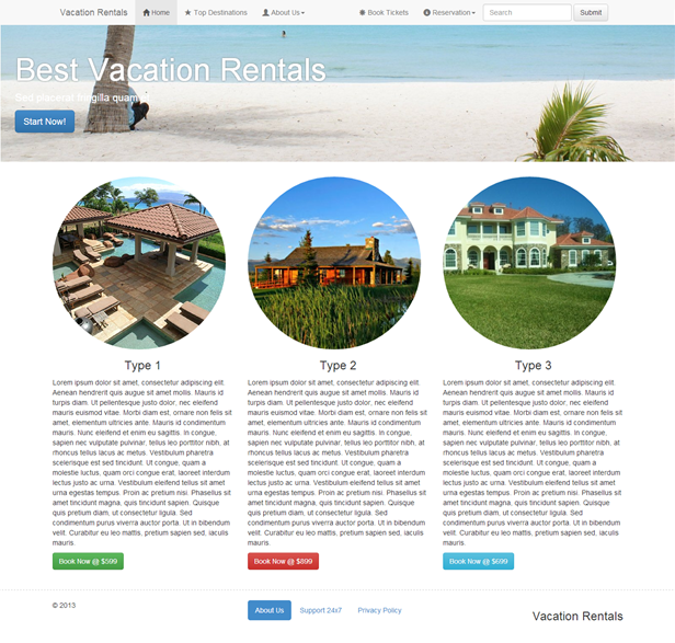
Resize your browser window and you’ll see some amazing transformations in the layout of the webpage. It adjusts to the size of the window. You will also notice that the menu bar is hiding automatically into a nice touch-compatible menu.
So we are going to build this! Excited? Yeah … me, too!
The structure
Bootstrap 3 understands HTML5 elements, so we need to add appropriate an doctype tag onto our webpage. Let’s go ahead and create a new HTML page. After that, add the following doctype tag.
<!DOCTYPE html>Now we will add the basic tags that are present in every HTML document.
<html>
  <head>
	<title>Bootstrap 101 Template</title>
	<meta name="viewport" content="width=device-width, initial-scale=1.0">
	<!-- Bootstrap -->
	<link href="css/bootstrap.min.css" rel="stylesheet" media="screen">
  </head>

  <body>
	<h1>Hello, world!</h1>

 	<script src="//code.jquery.com/jquery.js"></script>
  	<script src="js/bootstrap.min.js"></script>
  </body>
</html>
Looking inside the <head>, we have the title tag which is pretty basic to understand. It gives a title to the page.
Then we have the meta tag, which is very important to understand when using Twitter Bootstrap 3. Since this version of Bootstrap is built to be compatible with various types of devices (mobiles, tablets, desktops, retina displays, etc), you need to let the browser know that it has to scale your webpage appropriately on every device.
The viewport meta tag does this. Here, we have set the initial content-width to the width of the device and scaled it one time only.
After setting the viewport meta tag, we have imported the document version of Twitter Bootstrap 3 CSS file, bootstrap.css. This file is completely self-explanatory. It has commented description just above each tag style. If you ever want to know what any class in Bootstrap does, just open your bootstrap.css file, find the respective tag and read the documented comment above it.
Let’s move on to the body tag of the above HTML snippet. Just for the sake of output we have written “Hello, world” inside the h1 tag. Then we have included the required JavaScript files from the js folder. Make sure that these JavaScript files are included on every page that you use. Twitter Bootstrap 3 documentations recommend including all the JavaScript at the end of the page.
Diving Into Twitter Bootstrap 3
Now that we have our basic structure ready, we will move on to adding different components into our webpage. These components are by far the most important part of every website that we see every day. I am going to divide the webpage shown in the demo page into various parts as shown below.
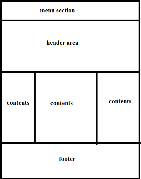
Menu Section
Designing a menu in Twitter Bootstrap 3 is the easiest thing that can happen in the world of web designing. It is that easy. Let’s start building a menu for our webpage.
We need correct markup here too. A major difference in Twitter Bootstrap 3 from its predecessor is that the menu is by default responsive and gets a new look in smaller devices. Since we have the entire CSS ready in our bootstrap.css file, we just have to add the correct markup and correct classes to each element.
Go inside the body tag of your HTML file and add the following markup first.
<nav class="navbar-wrapper navbar-default navbar-fixed-top" role="navigation">
</nav>
Since, Bootstrap is HTML 5 compatible, we will be using the <nav> tag for our navigation menu. Let’s understand each class applied to it. navbar-wrapper class, as the name suggests, is the wrapper to the menu items. navbar-default gives the background color to the menu and also applies a border to it. navbar-fixed-top helps to make the menu bar fixed at the top of the page even if we are scrolling. If you don’t want a fixed top menu, then you can remove that class.
Moving on, add the following snippet inside the <nav> element.
<nav class="navbar-wrapper navbar-default navbar-fixed-top" role="navigation">
      	<div class="container">
      	  <div class="navbar-header">
            <a class="navbar-brand" href="#">Vacation Rentals</a>
      	  </div>
        </div>
The container div makes sure that your content is aligned, with a decent margin from each side of the webpage and is also centered on the browser screen. The navbar-header div is used for branding purposes. I have added a link with the class navbar-brand to display the name of the website.
Now add the following code outside the navbar-header div.
<div class="collapse navbar-collapse navbar-ex1-collapse">
	<div class="collapse navbar-collapse">
            <ul class="nav navbar-nav">
              <li class="active"><a href="#"><span class="glyphicon glyphicon-home"></span> Home</a></li>
              <li><a href="#"><span class="glyphicon glyphicon-star"></span> Top Destinations</a></li>
              <li class="dropdown">
                <a href="#" class="dropdown-toggle" data-toggle="dropdown"><span class="glyphicon glyphicon-user"></span> About Us<b class="caret"></b></a>
                <ul class="dropdown-menu">
                  <li><a href="#">Company Details</a></li>
                  <li><a href="#">Contact Us</a></li>
                </ul>
              </li>
            </ul>
            <form class="navbar-form navbar-right" role="search">
              <div class="form-group">
                <input type="text" class="form-control" placeholder="Search">
              </div>
              <button type="submit" class="btn btn-default">Submit</button>
            </form>
            <ul class="nav navbar-nav navbar-right">
              <li><a href="#"><span class="glyphicon glyphicon-asterisk"></span> Book Tickets</a></li>
              <li class="dropdown">
                <a href="#" class="dropdown-toggle" data-toggle="dropdown"><span class="glyphicon glyphicon-info-sign"></span> Reservation<b class="caret"></b></a>
                <ul class="dropdown-menu">
                  <li><a href="#">Cancel</a></li>
                  <li><a href="#">Confirm</a></li>
                </ul>
              </li>
            </ul>
          </div><!-- /.navbar-collapse →
The above code is the main content of our menu. navbar-collapse is applied to make the menu touch-compatible and also to change its form for smaller devices. The contents inside are pretty easy to understand. We have used basic ul and li tags for listing menu items. There’s also a form that is classed navbar-right for pulling it to the right of the navigation bar. And finally I have shown the basic structure to place a drop down menu inside the navigation.
The most important thing here is to remember the classes used for displaying particular kinds of elements in Twitter Bootstrap. You can also refer to their documentation, which is highly recommended whenever you are in any kind of confusion.
So we are finally done with the navigation menu. Let’s move on to building the rest of the body parts.
Header Area
Bootstrap 3 gives a highly usable class called jumbotron that can be used to display large headers and contents. This is mostly used in product selling websites. For that, we need to add the following markup.
<div class="container-fluid">
        <div class="jumbotron">
            <h1>Best Vacation Rentals</h1>
            <p>Sed placerat fringilla quam et.</p>
            <a class="btn btn-primary btn-lg">Start Now!</a>
        </div>
     	</div>
The basic difference between container class and container-fluid class is that the former is centered to the body of the browser with some decent width, while the latter one is set to 100% width of the browser.
Then we have the jumbotron div element and inside it we have placed a h1 tag, a p tag and finally a fancy button. Refresh your browser and see the header area. Awesome!
The Contents area
Now we have a challenge. We need to divide the content area into three equal areas and place them at the side of each other. This is called the Bootstrap 3 grid system.
You may have heard that Twitter Bootstrap is a 12 grid system. That is indeed 100% true. It divides the screen into 12 equal parts and we need to specify which HTML element occupies which parts of the grid. So in short any element will occupy a minimum of one grid in the grid system.
Let’s see the markup first.
<div class="container">
          <div class="row">
            <div class="col-md-4">
              <a href="#"><img class="img-responsive img-circle" src="images/feat1.jpg"></a>
              <h3 class="text-center">Type 1</h3>
              <p>Dummy Text..</p>
              <a href="#" class="btn btn-success">Book Now @ $599</a>
            </div>

            <div class="col-md-4">
              <a href="#"><img class="img-responsive img-circle" src="images/feat2.jpg"></a>
              <h3 class="text-center">Type 2</h3>
              <p>Dummy Text..</p>
              <a href="#" class="btn btn-danger">Book Now @ $899</a>
            </div>

            <div class="col-md-4">
              <a href="#"><img class="img-responsive img-circle" src="images/feat3.jpg"></a>
              <h3 class="text-center">Type 3</h3>
              <p>Dummy Text ...</p>
              <a href="#" class="btn btn-info">Book Now @ $699</a>
            </div>
          </div>
        </div>
Firstly, I am using container here instead of container-fluid. Then I have defined a row of siblings. In our case, there are three div elements that are contained inside a single row. So we start a new row by adding a new div with class row.
The row now has three more div tags with the class col-md-4. The number 4 in the class tells us that it occupies four grids. So three sibling divs with four grids each will occupy 12 grids, which is perfectly fine.
Make sure you are not specifying more than 12 grids in a single row else your design will break down. Next, the col-md-* tells us that in the medium screened devices (≥992px), the siblings will be placed side to each other while in smaller devices they’ll stack on top of one another.
We also have classes for small screen (col-sm-*) and extra small screen (col-xs-*). I hope you have now basic understanding of Twitter Bootstrap’s grid system.
Since we have each sibling div placed appropriately, it is now time to populate them with some content. In our case, the content is unique for each one of them, with different images.
<div class="col-md-4">
              <a href="#"><img class="img-responsive img-circle" src="images/feat1.jpg"></a>
              <h3 class="text-center">Type 1</h3>
              <p>Dummy Text ...</p>
              <a href="#" class="btn btn-success">Book Now @ $599</a>
            </div>
The image added has class img-responsive that makes it fit to the size of the parent div irrespective of its own size. The image is responsive to the size of each sibling div. Then we have a normal h3 tag and p tags. You can populate the p tag in any manner you wish. In my demo page I have used the auto generated Lorem Ipsum text. Then finally, I have added a link that looks like a button. With the class btn you can give the look of a button to any a element.
btn-success is used to make it look green in color. There are other classes as well, like btn-info, btn-default, btn-warning and btn-danger.
Footer Area
The footer is area is again similar to the content area. Here’s the markup.
<footer>
<div class="container">
<div class="row">
<div class="col-md-4">© 2013</div>
<div class="col-md-4">
<ul class="nav nav-pills">
<li class="active"><a href="#">About Us</a></li>
<li><a href="#">Support 24x7</a></li>
<li><a href="#">Privacy Policy</a></li>
</ul>
</div>
<div class="col-md-4">
<h3 class="text-right">Vacation Rentals</h3>
</div>
</div>
</div>
</footer>We have used the HTML5 footer tag. Then a container div and a row. Then we’ve divided the whole area into three equal sections with 12 grids system in mind. Then we populated each sub division.
Some more Bootstrap 3 classes
.pre-scrollable
If you are using the <pre> tag, you can use .pre-scrollable to add scrollbars when the content inside it is too large. You can use it to show codes snippets too.
.table
If you are using the <table> tag, you can use the .table class to make it look bit more fancy in the Bootstrap style.
.pull-left & .pull-right
As the name suggests, it pulls the element to the left and right hand side of the screen.
.clearfix
This class is used to clear the float on any element.
So this was the “get-me-started” tutorial to Twitter Bootstrap 3. The main motive was to make you understand on how Bootstrap works. As you might have seen I haven’t written a single line of CSS code. Twitter Bootstrap handles it on its own with its predefined set of CSS and JS files.
One of the main disadvantage of Twitter Bootstrap is that it isn’t backwards compatible. So, if your website is built with Bootstrap 2 and if you replace all the CSS and JS files with that of Bootstrap 3, the website design will break down. They have made some changes to the CSS class naming and have improved the responsive nature of the resulting websites.
You can also add custom CSS to your website. Create your own CSS file with any name, for example customstyles.css, and import the bootstrap CSS into it. Then define your own style by using an appropriate element class or id. In this demo, I have used customstyle.css to change the background of the jumbotron element.
Here’s the demo page again.
So that was it! I hope you have enjoyed reading and learning about Twitter Bootstrap 3. Leave your comments or feedback below to communicate with me.
Update On Navbar
There are few more things that I had initially missed to make the navigation bar responsive. The whole navigation bar for Twitter Bootstrap should be like this:
<nav class="navbar-wrapper navbar-default navbar-fixed-top" role="navigation">
    <div class="container">
          <!-- Brand and toggle get grouped for better mobile display -->
          <div class="navbar-header">
            <button type="button" class="navbar-toggle" data-toggle="collapse" data-target=".navbar-ex1-collapse">
              <span class="sr-only">Toggle navigation</span>
              <span class="icon-bar"></span>
              <span class="icon-bar"></span>
              <span class="icon-bar"></span>
            </button>
            <a class="navbar-brand" href="#">Vacation Rentals</a>
          </div>

          <!-- Collect the nav links, forms, and other content for toggling -->
          <div class="collapse navbar-collapse">
            <ul class="nav navbar-nav">
              <li class="active"><a href="#"><span class="glyphicon glyphicon-home"></span> Home</a></li>
              <li><a href="#"><span class="glyphicon glyphicon-star"></span> Top Destinations</a></li>
              <li class="dropdown">
                <a href="#" class="dropdown-toggle" data-toggle="dropdown"><span class="glyphicon glyphicon-user"></span> About Us<b class="caret"></b></a>
                <ul class="dropdown-menu">
                  <li><a href="#">Company Details</a></li>
                  <li><a href="#">Contact Us</a></li>
                </ul>
              </li>
            </ul>
            <form class="navbar-form navbar-right" role="search">
              <div class="form-group">
                <input type="text" class="form-control" placeholder="Search"/>
              </div>
              <button type="submit" class="btn btn-default">Submit</button>
            </form>
            <ul class="nav navbar-nav navbar-right">
              <li><a href="#"><span class="glyphicon glyphicon-asterisk"></span> Book Tickets</a></li>
              <li class="dropdown">
                <a href="#" class="dropdown-toggle" data-toggle="dropdown"><span class="glyphicon glyphicon-info-sign"></span> Reservation<b class="caret"></b></a>
                <ul class="dropdown-menu">
                  <li><a href="#">Cancel</a></li>
                  <li><a href="#">Confirm</a></li>
                </ul>
              </li>
            </ul>
          </div><!-- /.navbar-collapse -->
        </div>
        </nav>
The navbar is divided into two sections:
- Navbar header
- Navbar contents
The navbar-header contains the website branding and hidden triple bars which is viewed only when the webpage is viewed on smaller device. The text Toggle navigation is also important for screen reader devices.
I hope this will fix the problem that several of you pointed out. Thanks for reading.
Comments on this article are closed. Have a question about Twitter Bootstrap? Why not ask it on our forums?
Learn to build websites with Bootstrap from the ground up with our best-selling guide, Jump Start Bootstrap. It’s yours for free with a Learnable trial.