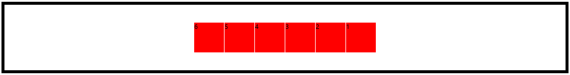
1.按比例分配
<!DOCTYPE html>
<html lang="en">
<head>
    <meta charset="UTF-8">
    <title>Document</title>
    <style>
        .box{
            border: 10px solid #000;
            height: 100px;
            padding: 10px;
            font-size: 20px;
            display: -webkit-box;
        }
        .box div{
            height: 100px;
            background: red;
            border: 1px solid #fff;
        }
        .box div:nth-of-type(1){-webkit-box-flex:1;}
        .box div:nth-of-type(2){-webkit-box-flex:2;}
        .box div:nth-of-type(3){-webkit-box-flex:3;}
        .box div:nth-of-type(4){-webkit-box-flex:4;}
        .box div:nth-of-type(5){-webkit-box-flex:5;}
        .box div:nth-of-type(6){-webkit-box-flex:6;}
    </style>
</head>
<body>
    <div class="box">
        <div>1</div>
        <div>2</div>
        <div>3</div>
        <div>4</div>
        <div>5</div>
        <div>6</div>
    </div>
</body>
</html>
运行结果为:

计算公式:子元素的尺寸值=盒子的尺寸/所有子元素box-flex属性值的和*子元素的box-flex属性值
同时:也可以设置定宽,剩下的再按照这个规则去计算
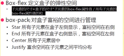
2.box-pack对盒子富裕空间进行管理
效果类似右浮动
<!DOCTYPE html>
<html lang="en">
<head>
    <meta charset="UTF-8">
    <title>Document</title>
    <style>
        .box{
            border: 10px solid #000;
            height: 100px;
            padding: 10px;
            font-size: 20px;
            display: -webkit-box;
            -webkit-box-direction:reverse;/*反向处理*/
            -webkit-box-pack:end;/*使其向右*/
        }
        .box div{
            height: 100px;
            background: red;
            width: 100px;
            border: 1px solid #fff;
        }
    </style>
</head>
<body>
    <div class="box">
        <div>1</div>
        <div>2</div>
        <div>3</div>
        <div>4</div>
        <div>5</div>
        <div>6</div>
    </div>
</body>
</html>
中间浮动
<!DOCTYPE html>
<html lang="en">
<head>
    <meta charset="UTF-8">
    <title>Document</title>
    <style>
        .box{
            border: 10px solid #000;
            height: 100px;
            padding: 10px;
            font-size: 20px;
            display: -webkit-box;
            -webkit-box-direction:reverse;/*反向处理*/
            -webkit-box-pack:center;/*使其居中*/
        }
        .box div{
            height: 100px;
            background: red;
            width: 100px;
            border: 1px solid #fff;
        }
    </style>
</head>
<body>
    <div class="box">
        <div>1</div>
        <div>2</div>
        <div>3</div>
        <div>4</div>
        <div>5</div>
        <div>6</div>
    </div>
</body>
</html>
富裕空间在子元素中间平均分配
-webkit-box-pack:justify;/*使其平均分配*/

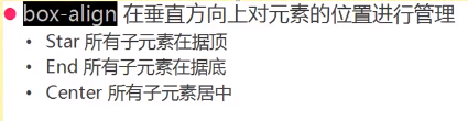
在垂直方向一样
<!DOCTYPE html>
<html lang="en">
<head>
    <meta charset="UTF-8">
    <title>Document</title>
    <style>
        .box{
            border: 10px solid #000;
            height: 200px;
            padding: 10px;
            font-size: 20px;
            display: -webkit-box;
            -webkit-box-direction:reverse;/*反向处理*/
            -webkit-box-pack:center;/*水平居中*/
            -webkit-box-align:center;/*垂直居中*/
        }
        .box div{
            height: 100px;
            background: red;
            width: 100px;
            border: 1px solid #fff;
        }
    </style>
</head>
<body>
    <div class="box">
        <div>1</div>
        <div>2</div>
        <div>3</div>
        <div>4</div>
        <div>5</div>
        <div>6</div>
    </div>
</body>
</html>
运行结果为: