
@keyframes mymove{
from{初始状态属性}
to{结束状态属性}
}
或
@keyframes mymove{
0%{初始状态属性}
50%(中间再可以添加关键帧)
100%{结束状态属性}
}
-
-
检索或设置对象所应用的动画名称
-
必须与规则@keyframes配合使用, eg:@keyframes mymove{} animation-name:mymove;
-
-
animation-duration
-
检索或设置对象动画的持续时间
-
说明:animation-duration:3s; 动画完成使用的时间为3s
-
-
animation-timing-function
-
检索或设置对象动画的过渡类型
-
属性值
-
linear:线性过渡。等同于贝塞尔曲线(0.0, 0.0, 1.0, 1.0)
-
ease:平滑过渡。等同于贝塞尔曲线(0.25, 0.1, 0.25, 1.0)
-
ease-in:由慢到快。等同于贝塞尔曲线(0.42, 0, 1.0, 1.0)
-
ease-out:由快到慢。等同于贝塞尔曲线(0, 0, 0.58, 1.0)
-
ease-in-out:由慢到快再到慢。等同于贝塞尔曲线(0.42, 0, 0.58, 1.0)
-
step-start:马上跳到动画每一结束桢的状态
-
-
-
animation-delay
-
检索或设置对象动画延迟的时间
-
说明:animation-delay:0.5s; 动画开始前延迟的时间为0.5s)
-
-
animation-iteration-count
-
检索或设置对象动画的循环次数
-
属性值
-
animation-iteration-count: infinite | number;
-
infinite:无限循环
-
number: 循环的次数
-
-
-
animation-direction
-
检索或设置对象动画在循环中是否反向运动
-
属性值
-
normal:正常方向
-
reverse:反方向运行
-
alternate:动画先正常运行再反方向运行,并持续交替运行
-
alternate-reverse:动画先反运行再正方向运行,并持续交替运行
-
-
-
animation-play-state
-
检索或设置对象动画的状态
-
属性值
-
animation-play-state:running | paused;
-
running:运动
-
paused: 暂停
-
-
-
简写
animation:动画名称 动画持续时间 动画的过渡类型 延迟的时间 定义循环次数 定义动画方式
animation vs transition
-
相同点:都是随着时间改变元素的属性值。
-
不同点:transition需要触发一个事件(hover事件或click事件等)才会随时间改变其css属性; 而animation在不需要触发任何事件的情况下也可以显式的随着时间变化来改变元素css的属性值,从而达到一种动画的效果,css3的animation就需要明确的动画属性值
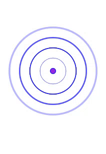
第一个案例代码:原图如下
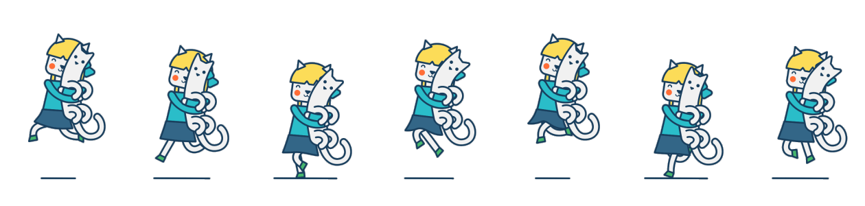
第二个案例代码如下:
如果感觉对自己有帮助,麻烦点一下关注,会一直盒大家分享知识的,谢谢!!!