很多网页都是基于网格设计的,这说明网页是按列来布局的。
原理就是讲网页分成十二列,每列的宽度是8.33%,元素的宽度,用几列来定义,正是因为这一点,才可以做到响应,就是随着窗口宽度的变化,给元素分配不同的列数!
比如:
大于1280px的时候,三个元素,两边的各占三列,中间的占六列
小于1280px大于980px的时候,左边占六列,中间的占六列,右边占十二列(此时右边就换行了)
小于980px的时候,左右中都占十二列,各占一行。
我们怎么获取当前窗口的宽度呢,就需要用到实现响应式的基础:媒体查询
@media only screen and (max-width:xxx)and (min-width:xxx){srules} max-width代表:当前窗口宽度小于max-width时,执行内部代码 min-width:代表窗口宽度大于min-width时候,才会执行内部的代码。
@media (max-device-xxx) and (min-device-xxx){srules} device:加device后,可以获取移动端设备的宽度
orientation:landscape /portrait 前者代表横屏,后者代表竖屏;可以直接用and连接在上面语句中做限制
关键字:
only:代表限定某种设备
(几种常用的设备)all 所有设备 handheld:移动设备 screen:电脑屏幕 tv 电视
and:用来连接条件
not:排除某种设备
明白了这些我们就可以做一个简单的响应式程序
          *{
			box-sizing: border-box;
		}
		.top{
			padding: 8px;
			background: skyblue;
			height: 50px;
		}
		.left>ul{
			list-style-type:none;
		}
		.left>ul>li{
			padding: 8px;
			height: 30px;
			font-size:14px;
			background: deepskyblue;
		}
		.middle{
			padding: 20px;
			text-align: center;
		}
		.right{
			height: 152px;
			padding:16px;
			/*height: 120px;*/
			background: pink;
			/*transition:*/
		}
		.bottom{
			padding: 8px;
			height: 50px;
			background: greenyellow;
		}
		[class *= "col-"]{
			float: left;
		}
		.col-m-1 { 8.33%;}
	    .col-m-2 { 16.66%;}
	    .col-m-3 { 25%;}
	    .col-m-4 { 33.33%;}
	    .col-m-5 { 41.66%;}
	    .col-m-6 { 50%;}
	    .col-m-7 { 58.33%;}
	    .col-m-8 { 66.66%;}
	    .col-m-9 { 75%;}
	    .col-m-10 { 83.33%;}
	    .col-m-11 { 91.66%;}
	    .col-m-12 { 100%;}
	    @media only screen and (max- 1280px) {/*max:宽度小于它,才会执行内部代码  min:宽度大于它就会执行内部代码*/
	    	.col-1 { 8.33%;}
		    .col-2 { 16.66%;}
		    .col-3 { 25%;}
		    .col-4 { 33.33%;}
		    .col-5 { 41.66%;}
		    .col-6 { 50%;}
		    .col-7 { 58.33%;}
		    .col-8 { 66.66%;}
		    .col-9 { 75%;}
		    .col-10 { 83.33%;}
		    .col-11 { 91.66%;}
		    .col-12 { 100%;}
	    }
	    @media only screen and (max-980px ) {
	    	.col-x-1 { 8.33%;}
		    .col-x-2 { 16.66%;}
		    .col-x-3 { 25%;}
		    .col-x-4 { 33.33%;}
		    .col-x-5 { 41.66%;}
		    .col-x-6 { 50%;}
		    .col-x-7 { 58.33%;}
		    .col-x-8 { 66.66%;}
		    .col-x-9 { 75%;}
		    .col-x-10 { 83.33%;}
		    .col-x-11 { 91.66%;}
		    .col-x-12 { 100%;}
	    }
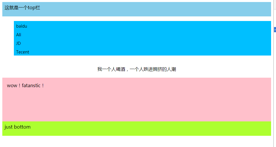
          <div class = "top col-m-12" >
            这就是一个top栏
          </div>
          <div class = "left col-m-3 col-6 col-x-12">
			<ul>
				<li>baidu</li>
				<li>Ali</li>
				<li>JD</li>
				<li>Tecent</li>
			</ul>
		</div>
		<div class = "middle col-m-6 col-6 col-x-12">
			我一个人喝酒,一个人跌进拥挤的人潮
		</div>
		<div class = "right col-m-3 col-12 col-x-12">
			wow!fatanstic!
		</div>
		<div class = "bottom col-m-12">
			just bottom
		</div>
明白了原理之后,这些代码为什么这么写就很容易明白了
需要注意的是:我们给页面所有的原色加样式的时候有这么一句代码:
box-sizing:border-box
正常情况下我们默认的盒模型是 content-box,content-box盒子的宽高为:width+padding+border border-box的盒子的宽高就是我们给他设的width
border-box没有底线,你给我jiaborder padding 我都用自己的地盘来分给它们,content-box会一直向外侵略,占据别的空间。所以我们需要有这样一句代码,保证在给元素加padding或者border的时候就不会导致他的宽度变化。
大于1280px:
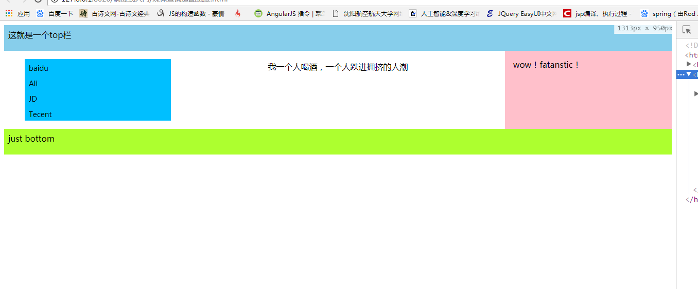
大于980小于1280
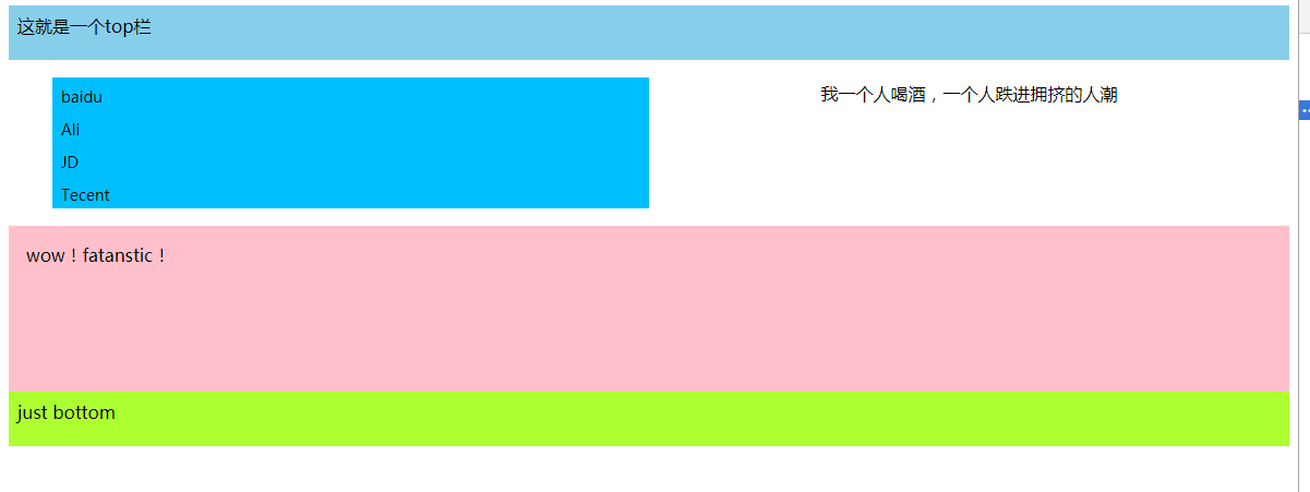
小于980: