这篇文章适合对highcharts已经有一定了解的猿友。
前两天想用highcharts做一个时间图,但是时间轴(x轴)的时间坐标并不是等间隔的,之前一直采用的方法是把时间做成等间隔的,然后没有数据的时间点数据填充为null.这种策略显然不好,LZ想从根本上解决这一问题,让highcharts自己对时间进行处理,思路当然就是借助highcharts本身的机制.(版本:Highcharts-4.2.6)。
翻看highcharts api,xAxis部分的type属性可取值有datetime,点击查看 datetime with irregular intervals例子:

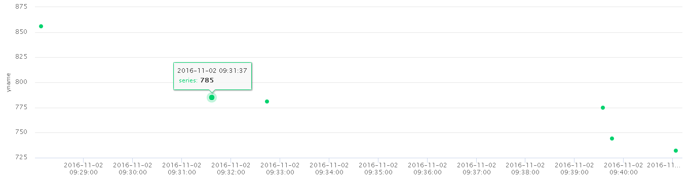
LZ按照这个例子整理了一个基于本地时间的散点图:
<!DOCTYPE html>
<html>
    <head>
    <script src="http://code.jquery.com/jquery-1.8.2.js"></script>
    <script src="https://code.highcharts.com/highcharts.js"></script>
    <script type="text/javascript">
        //数据
        //1.数据格式是这样的,一个时间和一个数据点放在一起。
        //另外,时间以时间戳的形式展示,实际开发中时间往往是以yyyy-MM-dd hh:mi:ss格式存在数据库中,
        //以java为例:从数据库拿到java.util.Date后,直接调用getTime()方法即可。
        var data = [[1478050088000,856],
                    [1478050364000,781],
                    [1478050786000,744],
                    [1478050864000,732],
                    [1478050775000,775],
                    [1478050297000,785]];

        $(function () {
            drawChart();
        });


        function drawChart(){
            //2.highcharts默认使用utc时间格式,关闭utc,使用本地时间
            Highcharts.setOptions({
                   global: {
                       useUTC: false
                   }
            });
            var chartPic = new Highcharts.Chart({
                colors: ["#01D26D"],
                chart: {
                    renderTo: 'content',
                    type: 'scatter',
                    zoomType: 'xy',
                },
                title: {
                    text: ''
                },
                subtitle: {
                    text: ''
                },
                exporting: {
                    enabled:false//右上角打印等信息
                },
                credits:{
                     enabled:false //禁用版权信息
                },
                tooltip: {
                    headerFormat: '<span style="color:{series.color};"></span><span>{point.key}</span>',
                    pointFormat: '<table>'+
                                 '<tr><td style="color:{series.color};">{series.name}:</td>' +
                                 '<td><b>{point.y:.0f}</b></td></tr>',
                    footerFormat:'</table>',
                    shared: true,
                    useHTML: true,
                    xDateFormat:'%Y-%m-%d %H:%M:%S '
                },
                //3.type:"datetime"
                xAxis: {
                    type:"datetime",
                    dateTimeLabelFormats: {
                        millisecond: '%Y-%m-%d %H:%M:%S',
                        second: '%Y-%m-%d %H:%M:%S',
                        minute: '%Y-%m-%d %H:%M:%S',
                        hour: '%Y-%m-%d %H:%M:%S',
                        day: '%Y-%m-%d %H:%M:%S',
                        month: '%Y-%m-%d %H:%M:%S',
                        year: '%Y-%m-%d %H:%M:%S'
                    }

                },
                yAxis: {
                    title: {
                        text: 'yname'
                    },
                    plotLines: [{
                        value: 0,
                         1,
                        color: '#808080'
                    }]
                },
                legend: {
                    layout: 'vertical',
                    align: 'center',
                    verticalAlign: 'bottom',
                    borderWidth: 0
                },
                series: [{
                    name:'series',
                    data:data
                        }]
            });
        }

        </script>
    </head>

    <body style="text-align: center;">
        <div id="content" style="100%;min- 310px;margin: 0 auto"></div>
    </body>
</html>
效果图:
生平第一次写博客,这样讲不知道大家能不能看懂。