新弹性盒水平垂直居中参考:http://www.cnblogs.com/ooo0/p/7562884.html
新旧弹性盒样式参考:http://www.cnblogs.com/ooo0/p/7562906.html
移动端利用-webkit-box水平垂直居中
-webkit-box的属性:
-webkit-box-orient(父):horizontal在水平行中从左向右排列子元素;vertical从上向下垂直排列子元素。
-webkit-box-pack(父):start水平居左对齐;end水平居右对齐;center水平居中;justify两端对齐。
-webkit-box-align(父):start居顶对齐;end居底对齐;center垂直居中;stretch拉伸到与父容器等高。
-webkit-box-flex(子):用来让子容器针对父容器的宽度按一定规则进行划分。
代码:
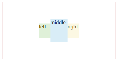
<!DOCTYPE html>
<html>

    <head>
        <meta charset="utf-8">
        <meta name="viewport" content="width=device-width,initial-scale=1,minimum-scale=1,maximum-scale=1,user-scalable=no" />
        <title></title>
        <link href="../../flex.css" rel="stylesheet" />
        <style type="text/css">
            .outer {
                height: 200px;
                border: 1px #F2DEDE solid;
            }

            .flex {
                display: box; /*旧弹性盒布局*/
            }

            .ai-c {
                -webkit-box-align: center;/*水平居中*/
            }

            .jc-c {
                -webkit-box-pack: center; /*垂直居中*/
            }

        </style>
    </head>

    <body>

        <div class="outer flex ai-c jc-c">
            <div class="inner" style="background: #DFF0D8;40px;height:50px;">left</div>
            <div class="inner" style="background: #D9EDF7;60px;height:80px;">middle</div>
            <div class="inner" style="background: #FCF8E3;40px;height:50px;">right</div>
        </div>

    </body>

</html>
效果:
参考地址: