在微信浏览器中,分享弹窗高度适配,原理就是使弹窗高度由内容撑开,主要应用于分享内容为一张很长的图片时,当图片过长,在小屏手机上显示不完全时,等比缩小一定尺寸使其能完全显示,大屏手机则按照原图尺寸显示。
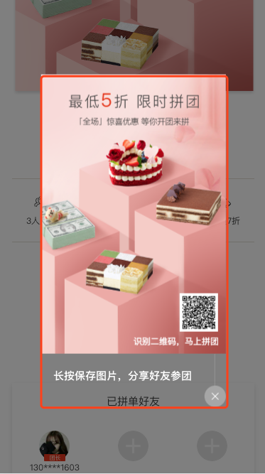
效果图如下:
实现过程如下:
1. html结构
<section v-show="isShare" class="canvas_share">
    <div class="share_wrap">
        <div id="canvas_area" class="top">
            <img class="share_bg" :src="groupInfo.sharePic" alt="">
            <img class="share_code" :src="qcode" alt="">
            <p>识别二维码,马上拼团</p>
        </div>
        <div class="bottom">
            <span>长按保存图片,分享好友参团</span>
            <img @click="closeShare" src="<?= $staticUrl.'images/group/close.png' ?>" alt="">
        </div>
    </div>
</section>
2. css样式
.canvas_share {
    position: fixed;
    left: 0;
    top: 0;
    width: 100%;
    height: 100%;
    background-color: rgba(0, 0, 0, 0.5);
    z-index: 20;
    .share_wrap {
        position: absolute;
        left: 50%;
        top: 50%;
        transform: translate(-50%, -50%);
        -webkit-transform: translate(-50%, -50%);
        .top {
            width: 100%;
            height: 86%;
            position: relative;
            img.share_bg {
                width: 100%;
                height: 100%;
                position: absolute;
                left: 0;
                top: 0;
            }
            img.share_code {
                position: absolute;
                bottom: 7.8%;
                right: -6%;
                width: 54px;
                height: 54px;
                -webkit-transform: translateX(-50%);
                -moz-transform: translateX(-50%);
                -ms-transform: translateX(-50%);
                -o-transform: translateX(-50%);
                transform: translateX(-50%);
            }
            p {
                position: absolute;
                bottom: 2%;
                right: 4%;
                color: @color-white;
            }
        }
        .bottom {
            width: 100%;
            height: 14%;
            text-align: center;
            span {
                display: inline-block;
                color: @color-white;
                font-size: .15rem;
                font-weight: bolder;
                margin-top: .2rem;
            }
            img {
                float: right;
                width: .3rem;
                height: .75rem;
            }
        }
    }
}
3. js逻辑
以iphone6为基准,以下描述均已px为单位,设备物理像素高667*2,微信浏览器头部导航32*2,现设计稿要求弹窗内容为:头部分享图+bottom关闭按钮,总高度为1000+150=1150,我们需要计算两个比例,C1 = 弹窗总高度 /(设备物理像素高-微信浏览器头部导航高度); C2 = 弹窗总宽度 / 弹窗总高度,则适配逻辑如下:
var windowHeight = $(window).height(), shareWrapHeight, shareWrapWidth;
if (windowHeight > 弹窗总高度/2) {
    shareWrapHeight = 弹窗总高度/2 * C1;
    shareWrapWidth = 弹窗总高度/2 * C1 * C2;
} else {
    shareWrapHeight = windowHeight * C1;
    shareWrapWidth = windowHeight * C1 * C2;
}
$('.share_wrap').css({
    "width": shareWrapWidth + "px",
    "height": shareWrapHeight + "px"
})