前言:将当前元素的父元素设置为flex布局方式,会自动对子元素进行伸缩布局
下面将通过以下html文档对flex布局进行讲解:
<!DOCTYPE html>
<html lang="en">
<head>
    <meta charset="UTF-8">
    <title>flex 布局</title>
    <style>
        *{
            margin: 0;
            padding: 0;
        }
        .box{
            width: 600px;
            height: 200px;
            background: #eee;
            margin:10px auto;
        }
        .box div{
            width: 150px;
            height: 150px;
            border:2px solid orange;
            font-size: 48px;
            color: red;
            text-align: center;
        }
    </style>
</head>
<body>
    <div class="box">
        <div class="box1">1</div>
        <div class="box2">2</div>
        <div class="box3">3</div>
    </div>
</body>
</html>
下面开始flex属性样式讲解:
|
样式描述 |
样式表现 | 属性值 |
| 一.主轴的方向: | ||
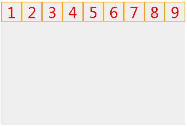
|
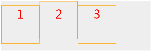
初始情况下布局是这样的: |
 |
.box{ width: 600px; height: 200px; background: #eee; margin:10px auto; } .box div{ width: 150px; height: 150px; border:2px solid orange; |
|
当父元素添加display:flex;属性时,布局发生变化:
|
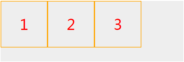 |
.box{ display:flex; } |
|
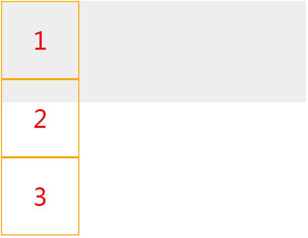
当父元素设置display:flex;时:
|
 |
.box{ display: flex; flex-direction: column; } |
|
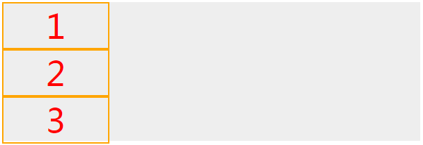
当父元素设置display:flex;时:
|
 |
.box{ display: flex; flex-direction: column; } |
|
当父元素设置display:flex;时:
|
 |
.box{ height: 600px; display: flex; flex-direction: column-reverse; } |
| 二.主轴的内容布局方式(主轴设置从左到右,默认贴靠上边): | ||
| 布局贴靠左边 |  |
.box{ display: flex; justify-content: flex-start; } |
| 布局贴靠右边 | 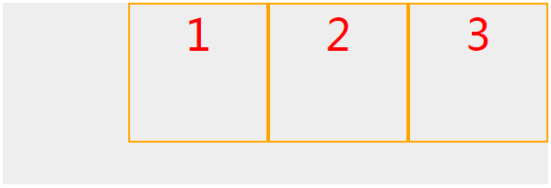 |
.box{ display: flex; justify-content: flex-end; } |
| 布局居中 | 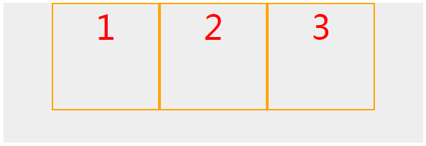 |
.box{ display: flex; justify-content: center; } |
| 布局居中分布 , 等距分开 , 与父元素有间距 | 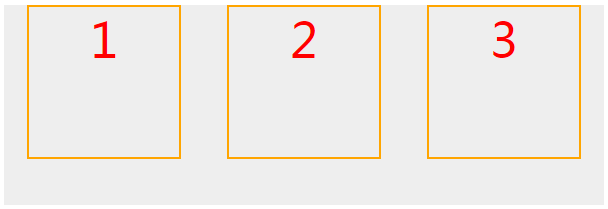 |
.box{ display: flex; justify-content: space-around; } |
| 布局居中分布 , 等距分开 , 与父元素无间距 | 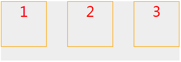 |
.box{ display: flex; justify-content: space-between; } |
| 三.侧轴方向的内容布局方式(主轴设置从左到右,默认贴靠左边): | ||
| 布局贴靠上边(默认值) |  |
.box{ display: flex; align-items: flex-start; } |
| 布局贴靠下边 |  |
.box{ display: flex; align-items: flex-end; } |
|
布局与文字基准线对齐 |
 |
.box{ display: flex; align-items: baseline; } |
| 当子元素没有设置高度时,布局竖直方向高度拉伸填充(默认值) |  |
.box{ display: flex; align-items: stretch; } .box div{ height:auto; } |
| 三.控制主轴元素换行: | ||
|
主轴不换行状态下:(默认) flex-wrap:nowrap; |
|
.box{ height: 400px; display: flex; } .box div{ height: 60px; } |
| 主轴换行: | 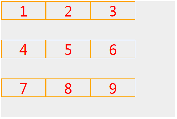 |
.box{ height: 400px; display: flex; flex-wrap: wrap; } .box div{ height: 60px; } |
| 四.换行后侧轴方向的布局(换行情况下,主轴多行从左到右,从上到下,默认贴靠右边): | ||
| 布局贴靠上边 | 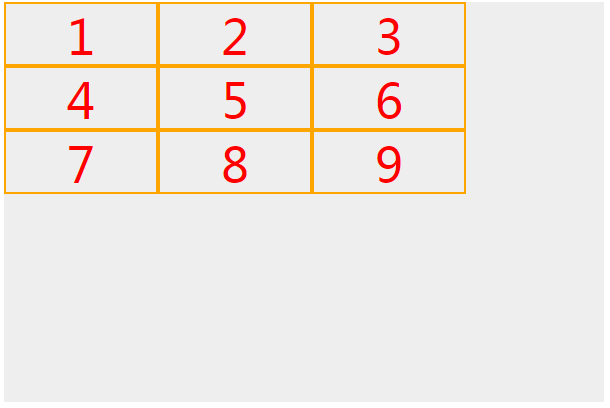 |
.box{ height: 400px; display: flex; flex-wrap: wrap; align-content: flex-start; } .box div{ height: 60px; } |
| 布局贴靠下边 | 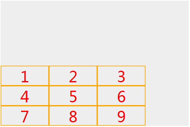 |
.box{ height: 400px; display: flex; flex-wrap: wrap; align-content: flex-end; } .box div{ height: 60px; } |
| 布局在竖直方向上垂直居中 |  |
.box{ height: 400px; display: flex; flex-wrap: wrap; align-content: flex-center; } .box div{ height: 60px; } |
| 布局在竖直方向上等距分开,且与父元素有间距 | 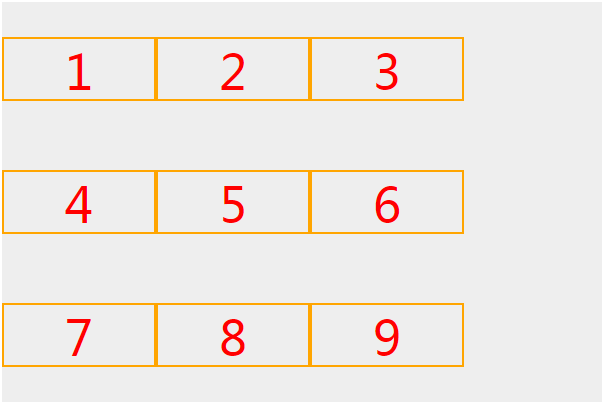 |
.box{ height: 400px; display: flex; flex-wrap: wrap; align-content: space-around; } .box div{ height: 60px; } |
| 布局在竖直方向上等距分开,且与父元素有间距 | |
.box{ height: 400px; display: flex; flex-wrap: wrap; align-content: space-around; } .box div{ height: 60px; } |
| 布局在竖直方向上等距分开,且与父元素无间距 |  |
.box{ height: 400px; display: flex; flex-wrap: wrap; align-content: space-between; } .box div{ height: 60px; } |
| 五.经典布局方式: | ||
| 双飞翼布局 |  |
.box{ display: flex; } .box div{ height: auto } .box .box1{ width: 100px; } .box .box2{ flex: 1; } .box .box3{ width: 100px; } |