1.圆角边框简介
就是通过border-radius属性对元素的四个角进行设置{属性不具有继承性}。
border-radius有四个属性分别是top,left,right,bottom,可以进行设置像素。也可以直接设置一个值四边都是相等的。
<!DOCTYPE html>
<html lang="en">
<head>
<meta charset="UTF-8">
<title>Document</title>
<style type="text/css">
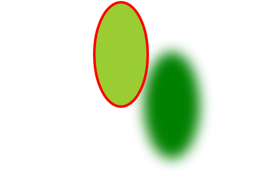
div{border: 5px solid red;
border-radius: 50px;
50px;
height: 100px;
background-color: yellowgreen;
margin:auto;
box-shadow: 100px 100px 40px green;}
</style>
</head>
<body>
<div></div>
</body>
</html>
也可以同时设置两个值border-radius: 50px 99px;对应的分别是上下是50px,左右是99px。 也可以设置三个值按顺时针设置border-radius: 50px 99px 40px;其中的上面是50px,左面右面是99px,底边是40px。
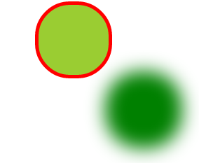
2.也可以使用border-radius:r来设置圆形这里的r是指半径的大小(有长度单位),要创建圆形应该设置r的值为元素的高度和长度的一半。当高宽相等时这种取值的方法就是圆形改变宽和高就朝着椭圆形发展了。
<!DOCTYPE html>
<html lang="en">
<head>
	<meta charset="UTF-8">
	<title>Document</title>
	<style type="text/css">
	div{border: 5px solid red;
		border-radius: 50%;
		 100px;
		height: 100px;
		background-color: yellowgreen;
		margin:auto;
		box-shadow: 100px 100px 40px green;}
	</style>
</head>
<body>
<div></div>

</body>
</html>
圆形:

椭圆形;