1,图文混排布局
   img {
        float: right;
    }
    p {
        font-size: 32px;
    }
<div class="sec">
    <img src="penguin.png" alt="penguin">
    <p>With no change in the rule, the more you grow the more envious you be123  123132312...</p>
</div>
2,题图文字布
    .sec {
        background: #EEEEEE;
        padding: 90px 50px 30px;
        margin-top: 150px;
        position: relative;
        border-top: 10px solid #399;
    }
    img {
        margin-top: -220px;
    }
    p {
        font-size: 32px;
    }

<div class="sec">
    <img src="penguin.png" alt="penguin">
    <p>With no change in the rule, the more you grow the more envious you be...</p>
</div>

3,Hero Unit 图标题文混排
.description{
	980px;
	height:380px;
	background:#F39C12;
    text-align: center;
    padding: 45px 60px;
    box-sizing: border-box;
}
h1{
  color: #FFFFFF;
  margin:15px auto;
  font-size: 56px;
}
p{
	color:rgba(255,255,255,.7);
}

<div class="description">
  <img src="comment.png" alt="comment">
  <h1>Lioness of Gir</h1>
  <p>Monkeys swing merrily from tree to tree. Deer, wild, boars, and antelopes roam freely among the clump of trees. If you were to go deep into the fores5, you might even see a majestic lion, stalking its prey. This is the Gir forest in Gujarat, the only reserve forest in Asia where you can still see the king of the forest walking around.</p>
</div>
.description{
	980px;
	height:380px;
	background:#F39C12;
    text-align: center;
    padding: 45px 60px;
    box-sizing: border-box;
    position: relative;
}
img, .content {
  position: absolute;
  top:50%;
  transform: translateY(-50%);
}
img {  left:10%;}
.content{
  left:30%;
   60%;
}
h1{
  color: #FFFFFF;
  margin:15px auto;
  font-size: 56px;
}
p{
	color:rgba(255,255,255,.7);
}
  <img src="comment.png" alt="comment">
   <div class="content">
     <h1>Lioness of Gir</h1>
     <p>Monkeys swing merrily from tree to tree. Deer, wild, boars, and antelopes roam freely among the clump of trees. If you were to go deep into the fores5, you might even see a majestic lion, stalking its prey. This is the Gir forest in Gujarat, the only reserve forest in Asia where you can still see the king of the forest walking around.</p>
   </div>

4,两列均分布局
 * {
            margin: 0;
            padding: 0;
        }
        section {
             980px;
            background: #f5f5f5;
            box-shadow: 0 0 1px rgba(0, 0, 0, .3) inset;
            box-sizing: border-box;
            padding: 40px;
        }
        article {
             49%;
            float: left;
            position: relative;
        }
        article:nth-child(2) {
            margin-left: 2%;
        }
        h1 {
            font-size: 32px;
            margin-bottom: 15px;
        }
        p {
            font-size: 15px;
            color: #777777;
        }
        h1, p{
             65%;
            margin-left:35%;
        }
        img {
            position: absolute;
            top: 0;
        }
        .clearfix:before, .clearfix:after {
            content: "";
            display: table;
        }
        .clearfix:after {
            clear: both;
        }

<section class="clearfix">
    <article>
        <h1>Rip Van winkle</h1>
        <p>Many years ago, at the foothills of the Kaatskill (Kat-skill) mountains, was a little village. In the village
            lived a simple, good-natured fellow named Rip Van Winkle. He was a kind neighbour, ready to help
            anyone. </p>
        <img src="head1.png" alt="picture of Rip Van winkle">
    </article>
    <article>
        <h1>Robinson Crusoe</h1>
        <p>As Rip and his companion reached them, they stopped playing and stared at Rip with a fixed gaze. Rip was
            really frightened. His companion emptied the contents of the barrel into glasses and made Rip drink it.</p>
        <img src="head2.png" alt="picture of Rip Van winkle">
    </article>
</section>
5,格子布局
      section {
             500px;
            background: #FFF;
        }
        article {
            box-sizing: border-box;
             250px;
            height: 250px;
            padding: 20px;
            text-align: center;
            float: left;
            border-bottom: 1px solid rgba(0, 0, 0, .2);
            border-right: 1px solid rgba(0, 0, 0, .2);
        }
        article:nth-child(odd){
            border-left: 1px solid rgba(0, 0, 0, .2);
        }
        article:nth-child(-n+2){
            border-top: 1px solid rgba(0, 0, 0, .2);
        }
        article:nth-child(2) {
            height: 500px;
            padding-top: 150px;
        }
        article:nth-child(3) {
            margin-top: -250px;
        }
        article h1 {
            font-size: 32px;
            margin:10px 0 ;
            color :#666666;
        }
        article P {
            font-size: 15px;
            margin-bottom:10px;
            color:#999;
        }


<section>
    <article>
        <h1>Ulysses</h1>
        <p>Soaring through the galaxies</p>
        <img src="pic1.png" alt="image of Ulysses">
    </article>
    <article>
        <h1>Dallas</h1>
        <p>Rollin' down to Dallas</p>
        <img src="pic2.png" alt="image of Dallas">
    </article>
    <article>
        <h1>McKay</h1>
        <p>McKay and his best friend</p>
        <img src="pic3.png" alt="image of McKay">
    </article>
</section>
6,多列等高布局
body {
	margin:50px;
	font-family:'Helvetica Neue';
	font-size:24px;
	line-height:1.5;
}
#container{
	100%;
  overflow: hidden;
}
.col{
	33.33%;
	float:left;
	text-align:center;
	box-sizing:border-box;
	padding:20px;
	color:#FFF;
	background:#2980B9;
    padding-bottom: 500px; /*使用内边距高度增加500px*/
    margin-bottom: -500px;/*利用负margin抵消增加的500px*/
}
.col img{
	30%;
	margin-top:30px;
}
.col:nth-child(2){
	background:#3498DB;
}
.col:nth-child(3){
	background:#67aeef;
}

<div id="container">
  <div class="col">
    <img src="trend.png">
    <h1>Trend</h1>
    <p>The tool refers to periodic trends for collecting and analyzing weak signals and trends in chemistry.</p>
  </div>
  <div class="col">
    <img src="user.png">
    <h1>User</h1>
    <p>User namespaces are now fully implemented as of document is obsolete.</p>
  </div>
  <div class="col">
    <img src="picture.png">
    <h1>Picture</h1>
    <p>Taking good pictures is something anyone can do with any camera, if you practice enough and avoid some common mistakes..</p>
  </div>
</div>

7,两列自适应布局 左侧固定右侧自适应
* {
margin: 0;
padding: 0;
}
body {
margin: 50px;
}
.row {
100%;
background: #000;
position: relative;
padding-left: 300px;
box-sizing: border-box;
}
.side {
position: absolute;
left: 0;
300px;
height: 500px;
background: #c0392B;
padding: 50px;
}
.main {
100%;
height: 500px;
background: #E74C3C;
padding: 100px;
}
.side, .main {
text-align: center;
font-family: "Comic Sans MS",cursive;
color: #fff;
box-sizing: border-box;
}
.main h1 {
font-size: 82px;
}
.main p {
font-size: 26px;
}
.side button {
background: #F39C12;
border:none;
border-radius: 4px;
padding:5px 40px;
margin-top:30px;
font-size: 18px;
}
<div class="row">
<div class="side">
<img src="side.png" alt="order">
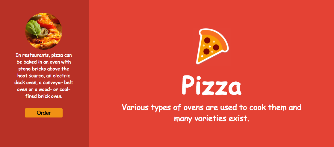
<p>In restaurants, pizza can be baked in an oven with stone bricks above the heat source, an electric deck oven,
a conveyor belt oven or a wood- or coal-fired brick oven.</p>
<button>Order</button>
</div>
<div class="main">
<img src="pizza.png" alt="pizza">
<h1>Pizza</h1>
<p>Various types of ovens are used to cook them and many varieties exist.</p>
</div>
8,三列自适应布局
左右固定,中间自适应(圣杯布局)
body {
margin:50px;
min-950px;
}
#container {
padding-left: 350px;
padding-right:250px;
}
#left {
background: #16A085;
350px;
margin-left: -100%;
position: relative;
right: 350px;
}
#main {
background: #1ABC9C;
100%;
}
#right {
background: #14856d;
250px;
margin-right: -250px;
}
.col {
float: left;
height: 500px;
color: #FFFFFF;
font-family:Georgia,"Times New Roman",Times,Serif;
font-size: 23px;
line-height: 1.5;
padding:30px 50px;
box-sizing: border-box;
}
.col img {
float: left;
margin: 20px;
}
<div id="container">
<div id="main" class="col">
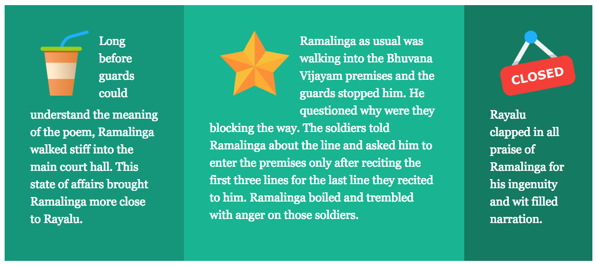
<img src="star.png">
<p>Ramalinga as usual was walking into the Bhuvana Vijayam premises and the guards stopped him. He questioned why were they blocking the way. The soldiers told Ramalinga about the line and asked him to enter the premises only after reciting the first three lines for the last line they recited to him. Ramalinga boiled and trembled with anger on those soldiers. </p>
</div>
<div id="left" class="col">
<img src="drink.png">
<p>Long before guards could understand the meaning of the poem, Ramalinga walked stiff into the main court hall. This state of affairs brought Ramalinga more close to Rayalu.</p>
</div>
<div id="right" class="col">
<img src="closed.png">
<p>Rayalu clapped in all praise of Ramalinga for his ingenuity and wit filled narration. </p>
</div>
</div>
圣杯布局
    body {
        background:#FFF;
        margin:50px;
        min-950px;
        font-family:Georgia, "Times New Roman", Times, serif;
        font-size:23px;
        line-height:1.5;
    }
    #container{
        100%;
        color:#FFF;
    }
    #left{
        background:#16A085;
        350px;
        margin-left:-100%;
    }
    #main{
        background:#1ABC9C;
        100%;
        height:500px;
    }
    #right{
        background:#14856d;
        250px;
        margin-left: -250px;
    }
    #content{
        margin:0 250px 0 350px;
    }
    .col{
        text-align:left;
        padding:30px 50px;
        box-sizing:border-box;
        float:left;
        height:500px;
    }
    .col img{
        float:left;
        margin:20px;
    }

<div id="container">
  <div id="main" class="col">
    <div id="content">
      <img src="star.png">
      <p>Ramalinga as usual was walking into the Bhuvana Vijayam premises and the guards stopped him. He questioned why were they blocking the way. The soldiers told Ramalinga about the line and asked him to enter the premises only after reciting the first three lines for the last line they recited to him. Ramalinga boiled and trembled with anger on those soldiers. </p>
    </div>
  </div>
  <div id="left" class="col">
    <img src="drink.png">
    <p>Long before guards could understand the meaning of the poem, Ramalinga walked stiff into the main court hall. This state of affairs brought Ramalinga more close to Rayalu.</p>
  </div>
  <div id="right" class="col">
    <img src="closed.png">
    <p>Rayalu clapped in all praise of Ramalinga for his ingenuity and wit filled narration. </p>
  </div>
</div>
双飞翼布局和圣杯布局的实现效果完全一样,不同在于圣杯布局需要修改父元素的padding值,而双飞翼布局可以回避掉padding设置,改为使用margin值,在低版本浏览器能够避免一些额外的hack代码。双飞翼的缺点是在页面添加了一项额外的DOM层级。
9,瀑布流布局
瀑布流适合于小数据块,每个数据块内容相近切地位平等。以下实现方式使用column属性,需要较高浏览器的支持,这种数据加载方式是自上而下的排列,适合一次性加载的场景
body {
	background:#95A5A6;
	margin:50px;
}
#container{
	960px;
	margin:0 auto;
}
.col{
	-webkit-column-count: 3;
	-webkit-column-gap: 10px;
	-webkit-column-fill: auto;
	-moz-column-count: 3;
	-moz-column-gap: 10px;
	-moz-column-fill: auto;
	column-count: 3;/*设置总列数为3*/
	column-gap: 10px;/*列与列之间的距离为10像素*/
	column-fill: auto;/*按顺序队列进行填充*/
}
.pic{
	display: inline-block;
	box-sizing:border-box;
	300px;
	background:#FFF;
	padding:20px;
	box-shadow:0 0 5px rgba(0,0,0,.5);
	margin-bottom:20px;
	-webkit-column-break-inside: avoid;
	-moz-column-break-inside: avoid;
	column-break-inside: avoid;
}
.pic img{
	260px;
}

<div id="container">
  <div class="col">
    <div class="pic">
      <img src="images/1.jpg">
      <p>In sagittis sit amet lacus non luctus. In hac habitasse platea dictumst. Donec consequat felis odio, non mollis ipsum dictum blandit.</p>
    </div>
    <div class="pic">
      <img src="images/2.jpg">
      <p>Vestibulum sapien elit, malesuada in augue quis, ultrices volutpat massa.</p>
    </div>
  </div>