方案一
.x {
            border: solid 1px red;
            width: 100px;
            height: 100px;
            position: relative;
            background-color: transparent;
        }

            .x:before {
                position: absolute;
                top: 0px;
                right: 0;
                left: 0;
                bottom: 0;
                border-bottom: 100px solid red;
                border-left: 100px solid transparent;
                content: "";
            }

            .x:after {
                position: absolute;
                left: 1px;
                right: 0;
                top: 1px;
                bottom: 0;
                border-bottom: 99px solid white;
                border-left: 99px solid transparent;
                content: "";
            }

        .f {
            border: solid 1px red;
            width: 100px;
            height: 100px;
            position: relative;
            background-color: transparent;
        }

            .f:before {
                position: absolute;
                top: 0px;
                right: 0;
                left: 0;
                bottom: 0;
                border-bottom: 100px solid red;
                border-right: 100px solid transparent;
                content: "";
            }

            .f:after {
                position: absolute;
                left: 0;
                right: 1px;
                top: 1px;
                bottom: 0;
                border-bottom: 99px solid white;
                border-right: 99px solid transparent;
                content: "";
            }
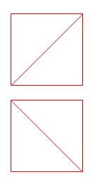
x 是 斜线, f 是反斜线。
图:
附:CSS 图形:
css3激发想象/css3各种图形 http://www.cnblogs.com/wwcherish/archive/2012/09/18/2690336.html
CSS3机器猫: http://keleyi.com/keleyi/phtml/html5/3.htm
方案二
background-image: url('data:image/svg+xml;utf8,<svg xmlns="http://www.w3.org/2000/svg" width="100%" height="100%"><line x1="0" y1="0" x2="100%" y2="100%" stroke="black" stroke-width="1"/></svg>');