引:http://www.haorooms.com/post/css_div_juzhong
固定高宽div垂直居中
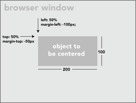
如上图,固定高宽的很简单,写法如下:
position: absolute;
left: 50%;
top: 50%;
200px;
height:100px;
margin-left:-100px;
margin-top:-50px;
其中margin-left为宽一半数值的负数,margin-top为高一半数值的负数。
不固定高宽div垂直居中的方法
1.方法一:伪元素(看不见的伪元素)和 inline-block / vertical-align 可以搞定居中
<div class="block" style="height: 300px;">
    <div class="centered">
        <h1>haorooms案例题目</h1>
        <p>haorooms案例内容,haorooms案例内容haorooms案例内容haorooms案例内容haorooms案例内容haorooms案例内容haorooms案例内容haorooms案例内容haorooms案例内容</p>
    </div>
</div>

.block {
  text-align: center;
}

/* The ghost, nudged to maintain perfect centering */
.block:before {
  content: ' ';
  display: inline-block;
  height: 100%;
  vertical-align: middle;
}

/* The element to be centered, can
   also be of any width and height */
.centered {
  display: inline-block;
  vertical-align: middle;
}
2.方法二:div样式设置成table
<div class="something-semantic">
   <div class="something-else-semantic">
       Unknown stuff to be centered.
   </div>
</div>
.something-semantic {
   display: table;
    100%;
}
.something-else-semantic {
   display: table-cell;
   text-align: center;
   vertical-align: middle;
}

<!--[if lte IE 7]>
<style type="text/css">
div.something-semantic{ position:relative; }
div.something-else-semantic{ position:absolute; left:50%;top:50%; }
</style> <![endif]-->
3.css3中使用 Flexbox 的居中布局
.vertical-container {
  height: 300px;
  display: -webkit-flex;
  display:         flex;
  -webkit-align-items: center;
          align-items: center;
  -webkit-justify-content: center;
          justify-content: center;
}
在父元素上面