一.使用
实例:
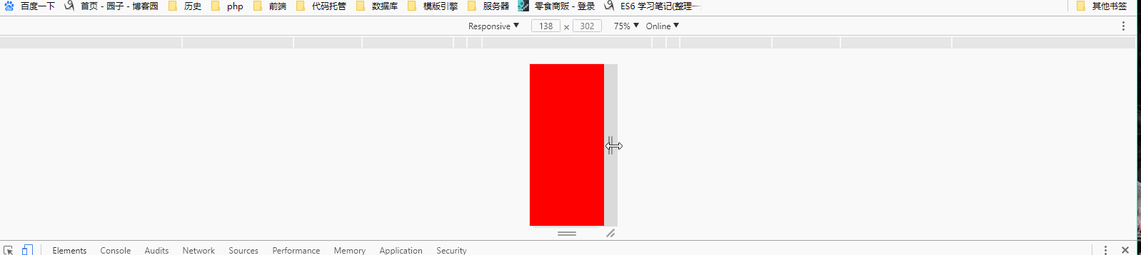
 1 <!DOCTYPE html>
 2 <html lang="en">
 3 <head>
 4     <meta charset="UTF-8">
 5     <meta name="viewport"
 6           content="width=device-width, user-scalable=no, initial-scale=1.0, maximum-scale=1.0, minimum-scale=1.0">
 7     <title>Title</title>
 8     <!--使用媒体查询
 9     1.媒体查询主要就是用来查询当前设备的宽度(高度),根据结果动态的设置样式
10     2.所以:媒体查询的实现的方式就是样式-->
11     <style>
12         /*媒体查询的细节--重点理解和掌握 (前提是判断最小值,并且从小到大进行判断.如果是判断最大值,就应该从大到小写)
13         1.向上兼容:在窄屏设置的样式。默认在大屏也会存在
14         2.向下覆盖:宽屏的样式设置会覆盖窄屏的样式设置  1000*/
15         body{
16             background-color: red;
17         }
18         /*@media screen and  (max- 768px){
19             body{
20                 background-color: green;
21             }
22         }
23         @media screen and  (max- 992px){
24             body{
25                 background-color: blue;
26             }
27         }
28         @media screen and  (max- 1200px){
29             body{
30                 background-color: blue;
31             }
32         }*/
33         /*
34         需求:设置在不同屏幕宽度时,页面的背景色
35             1. w < 768px  red
36             2. 768 <= w < 992 green
37             3. 992 <= w < 1200 blue
38             4. w >= 1200 pink
39          */
40         @media screen and  (max- 1200px){
41             body{
42                 background-color: blue;
43             }
44         }
45         @media screen and  (max- 992px){
46             body{
47                 background-color: green;
48             }
49         }
50         @media screen and  (max- 768px){
51             body{
52                 background-color: pink;
53             }
54         }
55     </style>
56 </head>
57 <body>
58 </body>
59 </html>
二. link引入的时候的not 和 only
a.css文件
1 body{
2     background-color: red;
3 }
b.css文件
1 body{
2     background-color: blue;
3 }
media="only" 的情况:

 1 <!DOCTYPE html>
 2 <html lang="en">
 3 <head>
 4     <meta charset="UTF-8">
 5     <meta name="viewport"
 6           content="width=device-width, user-scalable=no, initial-scale=1.0, maximum-scale=1.0, minimum-scale=1.0">
 7     <link rel="stylesheet" href="a.css">
 8     <link rel="stylesheet" media="only screen and (min-768px) and (max-992px)" href="b.css">
 9     <!--上面的意思是默认是使用a.css的样式,如果屏幕宽度在768px和992px这个区间的话,就会使用b.css这个样式-->
11     <title>Title</title>
12
13 </head>
14 <body>
15
16 </body>
17 </html>
media="not" 取反,和上面的only刚好相反的情况:

 1 <!DOCTYPE html>
 2 <html lang="en">
 3 <head>
 4     <meta charset="UTF-8">
 5     <meta name="viewport"
 6           content="width=device-width, user-scalable=no, initial-scale=1.0, maximum-scale=1.0, minimum-scale=1.0">
 7     <link rel="stylesheet" href="a.css">
 8     <link rel="stylesheet" media="not screen and (min-768px) and (max-992px)" href="b.css">
 9     <!--not and only
10     not:取反:判断不满足条件的情况-->
11     <title>Title</title>
12
13 </head>
14 <body>
15 </body>
16 </html>