1.应用场景
1.1 简介
应用中经常有一张图片和文字同时出现的情况,如下:

- 可以使用一个ImageView + 1个TextView 实现,
- 也可以用一个TextView+它的 drawableLeft、drawableRight、drawableTop、drawableBottom、drawableStart、drawableEnd等属性实现。
使用一个TextView 的方案有一些好处:
- 减少控件数量、减少layout.xml 中元素数量、减少绘制次数,减少内存中的一个控件对象等等。
- 减少ImageView 因未指定 android:contentDescription 属性产生的警告。(设置 --> 无障碍 --> TalkBack ,打开语音朗读功能)
1.2 TextView的子类都可以使用
TextView的子类都可以使用这系列属性。Button、Switch、CheckBox、EditText等等。
2.使用方法
用app:drawableStartCompat系列(gradle-6.5+),不用android:drawableStart,android:drawableLeft系列 。
前者的问题是当前版本暂不支持数据绑定
1     <TextView
2             android:background="@color/f8f8f8"
3             android:text="文本"
4             app:drawableBottomCompat="@drawable/setting2"
5             app:drawableEndCompat="@drawable/ic_setting"
6             app:drawableStartCompat="@mipmap/floweret64"
7             app:drawableTopCompat="@drawable/ic_setting"
8             ...
9      />
效果如下:
3.设置图片尺寸
3.1 使用图片尺寸
图片的大小由图片资源指定且固定,不会跟textview大小变化而变化,不适应按比例显示的方案.
1    <TextView
2             //...
3             android:background="@color/f8f8f8"
4             android:text="文本"
5             app:drawableLeftCompat="@mipmap/setting256"
6             app:layout_constraintStart_toStartOf="parent"
7    />
效果如下:

图片大小256*256像素
3.2 在代码中修改图片尺寸
下面的这个是按照比例显示的
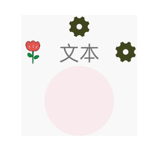
1     <TextView
2             ...
3             android:background="@color/f8f8f8"
4             android:drawablePadding="16dp"
5             android:text="按百分比设置的宽高、在代码中修改它的大小。"
6             app:drawableTopCompat="@drawable/ic_setting"
7             app:layout_constraintHeight_percent="0.12"
8             app:layout_constraintWidth_percent="0.70" />
未在代码中修改大小前的效果如下:
在代码中修改它
 1     fun textViewReSize(){
 2         val drawables = percentTextView.compoundDrawables
 3         val viewWidth = percentTextView.measuredWidth
 4         val viewHeight = percentTextView.measuredHeight
 5         val drawable = drawables[1]
 6         val height = (viewHeight * 0.8f).toInt()
 7         val width = (viewHeight * 0.8f).toInt()
 8         val top = 0
 9         val left = 0
10         drawable.bounds.set(Rect(left,top,left + width,top + height))
11         drawable.invalidateSelf()
12     }
修改后效果如下:

大小对了,但是图片和文本重叠了。在代码中重新指定下 drawablePadding就可以了。
 1     fun textViewReSize(){
 2         val drawables = percentTextView.compoundDrawables
 3         val viewWidth = percentTextView.measuredWidth
 4         val viewHeight = percentTextView.measuredHeight
 5         val drawable = drawables[1]
 6         val height = (viewHeight * 0.8f).toInt()
 7         val width = (viewHeight * 0.8f).toInt()
 8         val top = 0
 9         val left = 0
10         drawable.bounds.set(Rect(left,top,width,height))
11         percentTextView.compoundDrawablePadding = width
12         drawable.invalidateSelf()
13     }
效果如下:
文本和图片不重叠了,但是图片位置不对,Rect(0,0,width,height),为什么会在中间靠后这个位置?
查看下TextView的onDraw函数,关键代码如下
 1  @Override
 2     protected void onDraw(Canvas canvas) {
 3         restartMarqueeIfNeeded();
 4
 5         // Draw the background for this view
 6         super.onDraw(canvas);
 7
 8         final int compoundPaddingLeft = getCompoundPaddingLeft();
 9         final int compoundPaddingTop = getCompoundPaddingTop();
10         final int compoundPaddingRight = getCompoundPaddingRight();
11         final int compoundPaddingBottom = getCompoundPaddingBottom();
12         final int scrollX = mScrollX;
13         final int scrollY = mScrollY;
14         final int right = mRight;
15         final int left = mLeft;
16         final int bottom = mBottom;
17         final int top = mTop;
18         final boolean isLayoutRtl = isLayoutRtl();
19         final int offset = getHorizontalOffsetForDrawables();
20         final int leftOffset = isLayoutRtl ? 0 : offset;
21         final int rightOffset = isLayoutRtl ? offset : 0;
22
23         final Drawables dr = mDrawables;
24         if (dr != null) {
25             /*
26              * Compound, not extended, because the icon is not clipped
27              * if the text height is smaller.
28              */
29
30             int vspace = bottom - top - compoundPaddingBottom - compoundPaddingTop;
31             int hspace = right - left - compoundPaddingRight - compoundPaddingLeft;
32
33             //...
34
35             // IMPORTANT: The coordinates computed are also used in invalidateDrawable()
36             // Make sure to update invalidateDrawable() when changing this code.
37             if (dr.mShowing[Drawables.TOP] != null) {
38                 canvas.save();
39                 canvas.translate(scrollX + compoundPaddingLeft
40                         + (hspace - dr.mDrawableWidthTop) / 2, scrollY + mPaddingTop);
41                 dr.mShowing[Drawables.TOP].draw(canvas);
42                 canvas.restore();
43             }
44
45             //...
46         }
47 ...
坚向的位置没有出错,所以排除 scrollY + mPaddingTop 这句,
通过调试 发现 scrollX 和 compoundPaddingLeft ,它们都是0,所以决定位置的是 (hspace - dr.mDrawableWidthTop) / 2 这句代码。
hspace = right - left - compoundPaddingRight - compoundPaddingLeft
这句代码中compoundPaddingRight 和 compoundPaddingLeft 也是0,
dr.mDrawableWidthTop这句是用了宽度,它的宽度在代码中的设置如下

它就是compundRect.with,最终代码如下
 1     fun textViewReSize(){
 2         val drawables = percentTextView.compoundDrawables
 3         val viewWidth = percentTextView.measuredWidth
 4         val viewHeight = percentTextView.measuredHeight
 5         val drawable = drawables[1]
 6         val height = (viewHeight * 0.8f).toInt()
 7         val width = (viewHeight * 0.8f).toInt()
 8         val top = /*drawable.intrinsicHeight / 2 - height / 2*/ 0
 9         val left = drawable.intrinsicWidth / 2 - width / 2
10         drawable.bounds.set(Rect(left,top,left + width,top + height))
11         drawable.invalidateSelf()
12         percentTextView.compoundDrawablePadding = width
13     }
最终效果:

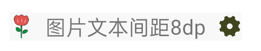
4.设置图片与文本间距
使用 drawablePadding 属性指定文本与图片之间的间距,上下左右只用这一个属性,哪个方向有图片,间距就是该值。
1     <TextView
2
3             android:background="@color/f8f8f8"
4             android:drawablePadding="8dp"
5             android:text="图片文本间距8dp"
6             app:drawableEndCompat="@drawable/ic_setting"
7             app:drawableStartCompat="@mipmap/floweret64"
8             app:layout_constraintStart_toStartOf="parent"
9            ... />
效果如下:
5.着色
在api >= 23 以后,用drawableTint与drawableTintMode 可以给图片着色,
准备的资源如下:
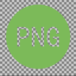
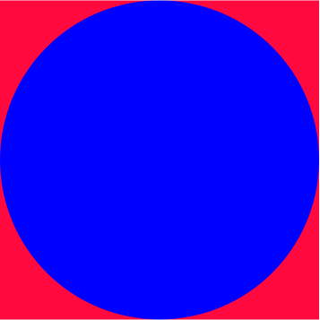

原图a : png #7cba59 原图b:layer-list drawable 填充色:#7F6200EE
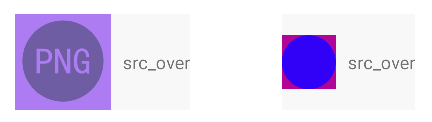
5.1 使用方法
1      <TextView
2             app:drawableStartCompat="@mipmap/png"
3             app:drawableTint="@color/tint"
4             app:drawableTintMode="src_over"
5             />
app:drawableTint指定颜色,app:drawableTintMode 指定着色模式
使用 app:drawableTint系列而不用 android:drawableTint系列。
5.2 drawableTintMode可选的值
src_over 、src_in、src_atop、multiply、screen、add , 含义及源码如下:
 1       <attr name="drawableTintMode">
 2             <!-- The tint is drawn on top of the drawable.
 3                  [Sa + (1 - Sa)*Da, Rc = Sc + (1 - Sa)*Dc] -->
 4             <enum name="src_over" value="3"/>
 5             <!-- The tint is masked by the alpha channel of the drawable. The drawable’s
 6                  color channels are thrown out. [Sa * Da, Sc * Da] -->
 7             <enum name="src_in" value="5"/>
 8             <!-- The tint is drawn above the drawable, but with the drawable’s alpha
 9                  channel masking the result. [Da, Sc * Da + (1 - Sa) * Dc] -->
10             <enum name="src_atop" value="9"/>
11             <!-- Multiplies the color and alpha channels of the drawable with those of
12                  the tint. [Sa * Da, Sc * Dc] -->
13             <enum name="multiply" value="14"/>
14             <!-- [Sa + Da - Sa * Da, Sc + Dc - Sc * Dc] -->
15             <enum name="screen" value="15"/>
16             <!-- Combines the tint and drawable color and alpha channels, clamping the
17                  result to valid color values. Saturate(S + D) -->
18             <enum name="add" value="16"/>
19         </attr>
5.3 src_over
用目标颜色盖在最上层
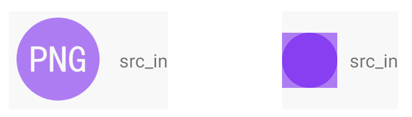
5.4 src_in
给原图轮廓内部非透明部分用颜色填充
5.5 src_atop
给图片的非透明部分上层填充颜色

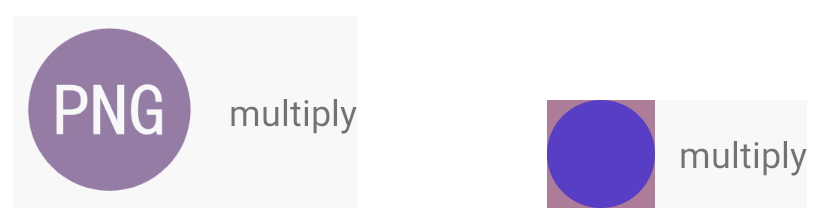
5.6 multiply
图片的颜色和透明通道分别乖以 给定的颜色值。
5.7 screen
[Sa + Da - Sa * Da, Sc + Dc - Sc * Dc] ,这个注释很简单,没看明白。sa,da,sc,dc分别是啥。

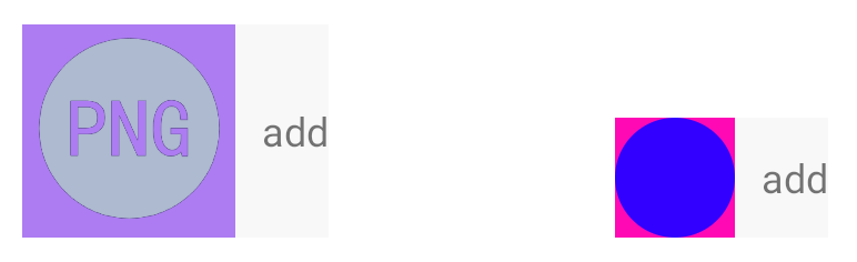
5.8 add
合并图片的颜色、透明通道和给定的颜色值。
6.下载代码
https://github.com/f9q/textDrawable
7.问题
如果项目中多个TextView使用一个png图片,在代码中修改它们的大小有点麻烦。
7.1 解决办法1
可以为每个TextView定义单独的BitmapDrawable,它的大小是固定的,图片引用png,如:
1 <?xml version="1.0" encoding="utf-8"?>
2 <layer-list xmlns:tools="http://schemas.android.com/tools"
3     xmlns:android="http://schemas.android.com/apk/res/android">
4     <item android:width="36dp" android:height="36dp" tools:targetApi="m" tools:ignore="UnusedAttribute">
5         <bitmap android:src="@drawable/logo" />
6     </item>
7 </layer-list>
这种方法的 缺点是要求 api > 22
7.1 解决办法2
给TextView扩展一个方法,在方法里设置drawable的大小。
 1 class MainActivity : AppCompatActivity() {
 2
 3     lateinit var percentTextView : TextView
 4
 5     override fun onCreate(savedInstanceState: Bundle?) {
 6         super.onCreate(savedInstanceState)
 7         setContentView(R.layout.activity_main)
 8         percentTextView = findViewById(R.id.percentTv)
 9         percentTextView.resetDrawableSize()
10     }
11     fun TextView.resetDrawableSize(){
12         this.viewTreeObserver.addOnPreDrawListener(object : ViewTreeObserver.OnPreDrawListener{
13             override fun onPreDraw(): Boolean {
14                 val drawables = compoundDrawables
15                 val viewWidth = measuredWidth
16                 val viewHeight = measuredHeight
17                 val drawable = drawables[1]
18                 val height = (viewHeight * 0.7f).toInt()
19                 val width = (viewHeight * 0.7f).toInt()
20                 val top = /*drawable.intrinsicHeight / 2 - height / 2*/ 0
21                 val left = drawable.intrinsicWidth / 2 - width / 2
22                 drawable.bounds.set(Rect(left,top,left + width,top + height))
23                 compoundDrawablePadding = width
24                 drawable.invalidateSelf()
25                 viewTreeObserver.removeOnPreDrawListener(this )
26                 return true
27             }
28         })
29     }
30 }
7.3 设置文本行间距
文本有多行时,如果默认的行间距不满足需求,通过下面两个属性都可自定义行间距:
- android:lineSpacingExtra 设置行间:,如”2dp”
- android:lineSpacingMultiplier 设置行间距倍数: 如”1.2″