在我们学习css中布局常用到的position,position的含义是指定位类型,取值类型可以有:static、relative、absolute、fixed、inherit和sticky,今天主要是说一下static、relative、absolute、fixed四个的作用和用法。在学习这些之前,我们需要知道标准文档流的概念
标准文档流:标准文档流指在不使用其他与排列和定位相关的特殊CSS规则时,元素的默认排列规则,说白了就是没做改变的页面元素。
一 、static(静态定位)
这是position的默认值,表示没有定位。这个没有什么好说的。
二、absolute(绝对定位)
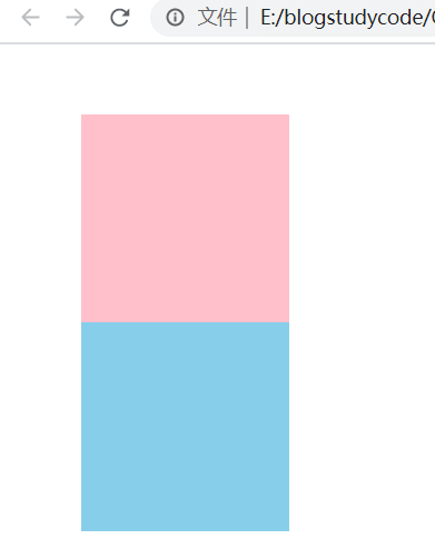
表示采用绝对定位方式,相对于position值不是static的父容器进行定位,该值会使元素脱离文档流,使用该值后可以用left,right,top,bottom对元素进行移动定位,见代码
<!DOCTYPE html>
<html lang="en">
<head>
    <meta charset="UTF-8">
    <meta name="viewport" content="width=device-width, initial-scale=1.0">
    <title>Document</title>
    <style>
        .relative{
             400px;
            height: 300px;
            background-color: pink;
            position: relative;
        }
        .static{
             300px;
            height: 200px;
            background-color: green;
            border: 5px solid #000;
            margin:auto;

        }
        .absolute{
            position:absolute;
            left: 10px;
            top: 0;
             200px;
            height: 200px;
            background-color: skyblue;
        }
    </style>
</head>
<body>
    <div class="relative">
        <div class="static">
            <div class="absolute"></div>
        </div>
    </div>
</body>
</html>
结果:

这里要知道的是body的默认属性position不为static,因为当relative盒子父亲不为static时候,其会相对于body来进行定位
三、relative(相对定位)
表示采用相对定位的方式,相对于元素原本的位置进行定位,该值不会使元素脱离文档流,使用该值后可以用left,right,top,bottom对元素进行移动定位
在这里我们需要知道在relative相对移动后,其实是相对于自己移动了,是视觉上的移动,其实其仍然占有原来的文档流中的位置。
下面我们就来看一下:
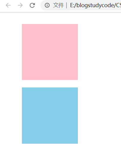
代码:relative移动之前的样子
<!DOCTYPE html>
<html lang="en">
<head>
    <meta charset="UTF-8">
    <meta name="viewport" content="width=device-width, initial-scale=1.0">
    <title>Document</title>
    <style>
        .father{
            margin: 50px 0 0 50px;
        }
        .re1{
             150px;
            height: 150px;
            background-color: pink;
        }
        .re2{
        position:relative;
             150px;
            height: 150px;
            background-color: skyblue;
        }
    </style>
</head>
<body>
<div class="father">
    <div class="re1"></div>
    <div class="re2"></div>
</div>
</body>
</html>
结果:
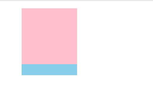
现在我们加上属性:
 .re1{
            position: relative;
            bottom: 20px;
             150px;
            height: 150px;
            background-color: pink;
        }
结果:
可以看出relative在移动后还是还是占有原来的文档流中的位置
注意:absolute定位后,其已经不占有原来的位置,我们把刚才那个relative定位改成absolute定位
 .re1{
            position: absolute;
            top: 20px;
             150px;
            height: 150px;
            background-color: pink;
        }
可以看出已经不占有位置了,skyblue这个div已经移动上去了,其实可以想想浮动的时候也是类似。
四、fixed
表示采用固定定位的方式,相对于浏览器窗口进行定位,并且无论滚动条怎么滚动,使用了该值的元素都始终处于固定位置,该值会使元素脱离文档流,使用该值后可以用left,right,top,bottom对元素进行移动定位
上代码:
<!DOCTYPE html>
<html lang="en">
<head>
    <meta charset="UTF-8">
    <meta name="viewport" content="width=device-width, initial-scale=1.0">
    <title>Document</title>
    <style>
        *{
            padding: 0;
            margin: 0;
        }
        .father{
             100%;
            height: 5000px;
            background-color: pink;

        }
        .fix{
            position:fixed;
            right: 0;
        }

    </style>
</head>
<body>
    <div class="father">
        <div class="fix">
            <img src="https://ss3.bdstatic.com/70cFv8Sh_Q1YnxGkpoWK1HF6hhy/it/u=2513539719,1581894780&fm=26&gp=0.jpg" alt="">

        </div>
    </div>
</body>
</html>
结果:
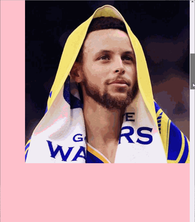
可以看出当鼠标下滑时图片也是固定不动的;