参考了很多大贤的博客,总结尝试后,随笔记录。原帖网址如下:
静默虚空:https://www.cnblogs.com/jingmoxukong/p/7826982.html
Penn000:https://www.cnblogs.com/Penn000/p/6947472.html
温一壶月光:https://www.cnblogs.com/Tangent-1231/p/10393759.html
Trainoo:https://www.cnblogs.com/Trainoo/p/8045340.html
首先,模板要选择darkgreentrip,在此基础上进行修改。
一、页面CSS代码
将以下代码复制粘贴到页面css代码栏中,不同参数代表的页面目标我已经在代码注释里标出来了,自行调节就好,以rgba(255,0,0,0.5)为例,255,0,0表示红色,0.5表示透明度。可使用颜色在线转换器将颜色的16进制转换为rgba格式。
要构想出一个大致的样式,事先想好风格、效果,修改颜色后将代码粘入,最后进行微调。


  1 #home {
  2     margin: 0 auto;/*元素外边距*/
  3      80%;/*原始65*/
  4     min- 980px;/*页面顶部的宽度*/
  5     background-color: rgba(254,254,254, 0.5);/*页面背板颜色,建议如果有背景图片的话,透明度高一些,不会遮挡*/
  6     padding: 30px;
  7     margin-top: 50px;
  8     margin-bottom: 50px;
  9     box-shadow: 0 2px 6px rgba(255,0,0,0.7);/*背板边缘光晕*/
 10 }
 11 body {
 12     background:rgba(154,252,0,0.05);/*网页背景颜色*/
 13     background-position: 50% 5%;
 14     background-size: cover;
 15 }
 16 #blogTitle {
 17     height: 90px;
 18     clear: both;
 19     background-color: rgba(245, 245, 245, 0);/*名字栏背景颜色,建议为白色,其他颜色有点怪,不好协调*/
 20 }
 21 #blogTitle h1 {
 22     font-size: 36px;
 23     font-weight: bold;
 24     line-height: 1.8em;/*原始 1.6em*/
 25     margin-top: 10px;/*原始 15px */
 26     color: #548B54;
 27 }
 28 #blogTitle h2 {
 29     font-weight: normal;
 30     font-size: 17px;/*原始 16px ;font-size: 1.0rem;*/
 31     line-height: 1.8;
 32     color: #111;
 33     font-weight: bold;
 34     text-align: right;
 35     float: right;
 36 }
 37 #navigator{
 38     background-color: rgba(255,0,0,0.8);/*主页面大标题框颜色*/
 39 }
 40 #navList a:link, #navList a:visited, #navList a:active{
 41     color: #eee;
 42     font-size: 18px;
 43     font-weight: bold;
 44 }
 45 .blogStats{
 46     color: #eee;
 47 }
 48 .postTitle {
 49     border-left: 8px solid rgba(255,0,0, 0.8);/*随笔小标题前小方块颜色*/
 50     margin-left: 10px;
 51     margin-bottom: 10px;
 52     font-size: 20px;
 53     float: right;
 54      100%;
 55     clear: both;
 56 }
 57 .postTitle a:link, .postTitle a:visited, .postTitle a:active {
 58     color: #FF0000;/*随笔小标题颜色*/
 59     transition: all 0.4s linear 0s;
 60 }
 61 .postTitle a:hover {
 62     margin-left: 10px;
 63     color: #030303;/*随笔小标题鼠标点击时颜色颜色*/
 64     text-decoration: none;
 65 }
 66 .postCon {
 67     float: right;
 68     line-height: 1.5em;
 69      100%;
 70     clear: both;
 71     padding: 10px 0;
 72 }
 73
 74 .day .postTitle a {
 75     padding-left: 10px;
 76 }
 77 .day {
 78     background: rgba(255,255,255,0.5);/*纯白*/
 79 }
 80 /*文章附加信息*/
 81 .postDesc {
 82     background: url(images/posted_time.png) no-repeat 0 1px;
 83     color: #030303;
 84     float: left;
 85      100%;
 86     clear: both;
 87     text-align: left;
 88     font-family: "微软雅黑" , "宋体" , "黑体" ,Arial;
 89     font-size: 13px;
 90     padding-right: 20px;/*5px  padding-left: 90px;posted 发表时间左边距离*/
 91     margin-top: 20px;
 92     line-height: 1.8;
 93     padding-bottom: 35px;
 94 }
 95 .newsItem, .catListEssay, .catListLink, .catListNoteBook, .catListTag, .catListPostCategory,
 96 .catListPostArchive, .catListImageCategory, .catListArticleArchive, .catListView,
 97 .catListFeedback, .mySearch, .catListComment, .catListBlogRank, .catList, .catListArticleCategory ,#blog-calendar
 98 {
 99     background: rgba(255, 255, 255, 0.5);/*侧边栏小背板颜色*/
100     margin-bottom: 35px;
101     word-wrap: break-word;
102 }
103
104 .CalTitle{
105     background:  rgba(255, 255, 255, 0.5);/*日历栏标题栏颜色*/
106 }
107 .catListTitle{
108     background-color: rgba(255,0,0,0.8);/*侧边栏标题框颜色*/
109 }
110
111 #topics{
112     background: rgba(255, 255, 255, 0.5);
113 }
114
115 .c_ad_block{
116     display: none;
117 }
118
119 #tbCommentBody{
120      100%;
121     height: 200px;
122     background: rgba(255, 255, 255, 0.5);
123 }
124
125 #q{background: rgba(255, 255, 255, 0);}
126
127 .CalNextPrev{background: rgba(255, 255, 255, 0);}
128
129 .cnblogs_code{
130     background: rgba(255, 255, 255, 0);
131 }
132
133 .cnblogs_code div{
134     background: rgba(255, 255, 255, 0);
135 }
136
137 .cnblogs_code_toolbar{
138     background: rgba(255, 255, 255, 0);
139 }
140 #main{min- 640px;}
141 .entrylist{
142     background: rgba(255, 255, 255, 0.5);
143 }
二、博客侧边栏设置(先申请js权限)
1.添加右下角的返回顶部图标(小火箭),可更改12行的图片链接修改图标样式:
 1 <style>
 2 #back-top {
 3      position: fixed;
 4      bottom: 10px;
 5      right: 5px;
 6      z-index: 99;
 7 }
 8 #back-top span {
 9       50px;
10      height: 64px;
11      display: block;
12      background:url(http://images.cnblogs.com/cnblogs_com/seanshao/855033/o_rocket.png) no-repeat center center;
13 }
14 #back-top a{outline:none}
15 </style>
16 <script type="text/javascript">
17 $(function() {
18     // hide #back-top first
19     $("#back-top").hide();
20     // fade in #back-top
21     $(window).scroll(function() {
22         if ($(this).scrollTop() > 500) {
23             $('#back-top').fadeIn();
24         } else {
25             $('#back-top').fadeOut();
26         }
27     });
28     // scroll body to 0px on click
29     $('#back-top a').click(function() {
30         $('body,html').animate({
31             scrollTop: 0
32         }, 800);
33         return false;
34     });
35 });
2.添加侧边栏头像,第三行的图片链接换成自己的:
1 </script>
2 <p id="back-top" style="display:none"><a href="#top"><span></span></a></p>
3 <img src="https://ss3.bdstatic.com/70cFv8Sh_Q1YnxGkpoWK1HF6hhy/it/u=2178320981,2144335976&fm=26&gp=0.jpg" alt="Penn000" class="img_avatar" width="210px" height="210px" style="border-radius:10%">
3.添加公告栏时钟控件特效:
1 <embed wmode="transparent" src="https://files.cnblogs.com/files/jingmoxukong/honehone_clock_tr.swf" quality="high" bgcolor="#FDF6E3" width="230" height="110" name="honehoneclock" align="middle" allowscriptaccess="always" type="application/x-shockwave-flash" pluginspage="http://www.macromedia.com/go/getflashplayer">
三、页首HTML代码
1.右上角Github链接,可进入http://tholman.com/github-corners/自行更改角标样式(需将第一行的GitHub链接改成自己的):
1 <!-- github  -->
2 <a href="https://github.com/MenxinJie" class="github-corner" aria-label="View source on Github"><svg width="80" height="80" viewBox="0 0 250 250" style="fill:#FD6C6C; color:#fff; position: absolute; top: 0; border: 0; right: 0;" aria-hidden="true"><path d="M0,0 L115,115 L130,115 L142,142 L250,250 L250,0 Z"></path><path d="M128.3,109.0 C113.8,99.7 119.0,89.6 119.0,89.6 C122.0,82.7 120.5,78.6 120.5,78.6 C119.2,72.0 123.4,76.3 123.4,76.3 C127.3,80.9 125.5,87.3 125.5,87.3 C122.9,97.6 130.6,101.9 134.4,103.2" fill="currentColor" style="transform-origin: 130px 106px;" class="octo-arm"></path><path d="M115.0,115.0 C114.9,115.1 118.7,116.5 119.8,115.4 L133.7,101.6 C136.9,99.2 139.9,98.4 142.2,98.6 C133.8,88.0 127.5,74.4 143.8,58.0 C148.5,53.4 154.0,51.2 159.7,51.0 C160.3,49.4 163.2,43.6 171.4,40.1 C171.4,40.1 176.1,42.5 178.8,56.2 C183.1,58.6 187.2,61.8 190.9,65.4 C194.5,69.0 197.7,73.2 200.1,77.6 C213.8,80.2 216.3,84.9 216.3,84.9 C212.7,93.1 206.9,96.0 205.4,96.6 C205.1,102.4 203.0,107.8 198.3,112.5 C181.9,128.9 168.3,122.5 157.7,114.1 C157.9,116.9 156.7,120.9 152.7,124.9 L141.0,136.5 C139.8,137.7 141.6,141.9 141.8,141.8 Z" fill="currentColor" class="octo-body"></path></svg></a><style>.github-corner:hover .octo-arm{animation:octocat-wave 560ms ease-in-out}@keyframes octocat-wave{0%,100%{transform:rotate(0)}20%,60%{transform:rotate(-25deg)}40%,80%{transform:rotate(10deg)}}@media (max-500px){.github-corner:hover .octo-arm{animation:none}.github-corner .octo-arm{animation:octocat-wave 560ms ease-in-out}}</style>
四、页脚HTML代码
1.页面背景特效,线条随鼠标移动:
 1 <script>
 2 !function(){
 3  function n(n,e,t){
 4  return n.getAttribute(e)||t
 5  }
 6  function e(n){
 7  return document.getElementsByTagName(n)
 8  }
 9  function t(){
10  var t=e("script"),o=t.length,i=t[o-1];
11  return{
12  l:o,z:n(i,"zIndex",-1),o:n(i,"opacity",.5),c:n(i,"color","0,0,0"),n:n(i,"count",99)
13  }
14  }
15  function o(){
16  a=m.width=window.innerWidth||document.documentElement.clientWidth||document.body.clientWidth,
17  c=m.height=window.innerHeight||document.documentElement.clientHeight||document.body.clientHeight
18  }
19  function i(){
20  r.clearRect(0,0,a,c);
21  var n,e,t,o,m,l;
22  s.forEach(function(i,x){
23  for(i.x+=i.xa,i.y+=i.ya,i.xa*=i.x>a||i.x<0?-1:1,i.ya*=i.y>c||i.y<0?-1:1,r.fillRect(i.x-.5,i.y-.5,1,1),e=x+1;e<u.length;e++)n=u[e],
24  null!==n.x&&null!==n.y&&(o=i.x-n.x,m=i.y-n.y,
25  l=o*o+m*m,l<n.max&&(n===y&&l>=n.max/2&&(i.x-=.03*o,i.y-=.03*m),
26  t=(n.max-l)/n.max,r.beginPath(),r.lineWidth=t/2,r.strokeStyle="rgba("+d.c+","+(t+.2)+")",r.moveTo(i.x,i.y),r.lineTo(n.x,n.y),r.stroke()))
27  }),
28  x(i)
29  }
30  var a,c,u,m=document.createElement("canvas"),
31  d=t(),l="c_n"+d.l,r=m.getContext("2d"),
32 x=window.requestAnimationFrame||window.webkitRequestAnimationFrame||window.mozRequestAnimationFrame||window.oRequestAnimationFrame||window.msRequestAnimationFrame||
33  function(n){
34  window.setTimeout(n,1e3/45)
35  },
36  w=Math.random,y={x:null,y:null,max:2e4};m.id=l,m.style.cssText="position:fixed;top:0;left:0;z-index:"+d.z+";opacity:"+d.o,e("body")[0].appendChild(m),o(),window.onresize=o,
37  window.onmousemove=function(n){
38  n=n||window.event,y.x=n.clientX,y.y=n.clientY
39  },
40  window.onmouseout=function(){
41  y.x=null,y.y=null
42  };
43  for(var s=[],f=0;d.n>f;f++){
44  var h=w()*a,g=w()*c,v=2*w()-1,p=2*w()-1;s.push({x:h,y:g,xa:v,ya:p,max:6e3})
45  }
46  u=s.concat([y]),
47  setTimeout(function(){i()},100)
48  }();
49  </script>
2.鼠标点击爆炸动画(这个我自己没用)
1 /* 点击爆炸效果*/
2 <canvas class="fireworks" style="position: fixed; left: 0px; top: 0px; z-index: 1; pointer-events: none;  1440px; height: 451px;" width="2880" height="902"></canvas>
3 <script type="text/javascript" src="//cdn.bootcss.com/animejs/2.2.0/anime.min.js"></script>
4 <script type="text/javascript">
5 "use strict";function updateCoords(e){pointerX=(e.clientX||e.touches[0].clientX)-canvasEl.getBoundingClientRect().left,pointerY=e.clientY||e.touches[0].clientY-canvasEl.getBoundingClientRect().top}function setParticuleDirection(e){var t=anime.random(0,360)*Math.PI/180,a=anime.random(50,180),n=[-1,1][anime.random(0,1)]*a;return{x:e.x+n*Math.cos(t),y:e.y+n*Math.sin(t)}}function createParticule(e,t){var a={};return a.x=e,a.y=t,a.color=colors[anime.random(0,colors.length-1)],a.radius=anime.random(16,32),a.endPos=setParticuleDirection(a),a.draw=function(){ctx.beginPath(),ctx.arc(a.x,a.y,a.radius,0,2*Math.PI,!0),ctx.fillStyle=a.color,ctx.fill()},a}function createCircle(e,t){var a={};return a.x=e,a.y=t,a.color="#F00",a.radius=0.1,a.alpha=0.5,a.lineWidth=6,a.draw=function(){ctx.globalAlpha=a.alpha,ctx.beginPath(),ctx.arc(a.x,a.y,a.radius,0,2*Math.PI,!0),ctx.lineWidth=a.lineWidth,ctx.strokeStyle=a.color,ctx.stroke(),ctx.globalAlpha=1},a}function renderParticule(e){for(var t=0;t<e.animatables.length;t++){e.animatables[t].target.draw()}}function animateParticules(e,t){for(var a=createCircle(e,t),n=[],i=0;i<numberOfParticules;i++){n.push(createParticule(e,t))}anime.timeline().add({targets:n,x:function(e){return e.endPos.x},y:function(e){return e.endPos.y},radius:0.1,duration:anime.random(1200,1800),easing:"easeOutExpo",update:renderParticule}).add({targets:a,radius:anime.random(80,160),lineWidth:0,alpha:{value:0,easing:"linear",duration:anime.random(600,800)},duration:anime.random(1200,1800),easing:"easeOutExpo",update:renderParticule,offset:0})}function debounce(e,t){var a;return function(){var n=this,i=arguments;clearTimeout(a),a=setTimeout(function(){e.apply(n,i)},t)}}var canvasEl=document.querySelector(".fireworks");if(canvasEl){var ctx=canvasEl.getContext("2d"),numberOfParticules=30,pointerX=0,pointerY=0,tap="mousedown",colors=["#FF1461","#18FF92","#5A87FF","#FBF38C"],setCanvasSize=debounce(function(){canvasEl.width=2*window.innerWidth,canvasEl.height=2*window.innerHeight,canvasEl.style.width=window.innerWidth+"px",canvasEl.style.height=window.innerHeight+"px",canvasEl.getContext("2d").scale(2,2)},500),render=anime({duration:1/0,update:function(){ctx.clearRect(0,0,canvasEl.width,canvasEl.height)}});document.addEventListener(tap,function(e){"sidebar"!==e.target.id&&"toggle-sidebar"!==e.target.id&&"A"!==e.target.nodeName&&"IMG"!==e.target.nodeName&&(render.play(),updateCoords(e),animateParticules(pointerX,pointerY))},!1),setCanvasSize(),window.addEventListener("resize",setCanvasSize,!1)}"use strict";function updateCoords(e){pointerX=(e.clientX||e.touches[0].clientX)-canvasEl.getBoundingClientRect().left,pointerY=e.clientY||e.touches[0].clientY-canvasEl.getBoundingClientRect().top}function setParticuleDirection(e){var t=anime.random(0,360)*Math.PI/180,a=anime.random(50,180),n=[-1,1][anime.random(0,1)]*a;return{x:e.x+n*Math.cos(t),y:e.y+n*Math.sin(t)}}function createParticule(e,t){var a={};return a.x=e,a.y=t,a.color=colors[anime.random(0,colors.length-1)],a.radius=anime.random(16,32),a.endPos=setParticuleDirection(a),a.draw=function(){ctx.beginPath(),ctx.arc(a.x,a.y,a.radius,0,2*Math.PI,!0),ctx.fillStyle=a.color,ctx.fill()},a}function createCircle(e,t){var a={};return a.x=e,a.y=t,a.color="#F00",a.radius=0.1,a.alpha=0.5,a.lineWidth=6,a.draw=function(){ctx.globalAlpha=a.alpha,ctx.beginPath(),ctx.arc(a.x,a.y,a.radius,0,2*Math.PI,!0),ctx.lineWidth=a.lineWidth,ctx.strokeStyle=a.color,ctx.stroke(),ctx.globalAlpha=1},a}function renderParticule(e){for(var t=0;t<e.animatables.length;t++){e.animatables[t].target.draw()}}function animateParticules(e,t){for(var a=createCircle(e,t),n=[],i=0;i<numberOfParticules;i++){n.push(createParticule(e,t))}anime.timeline().add({targets:n,x:function(e){return e.endPos.x},y:function(e){return e.endPos.y},radius:0.1,duration:anime.random(1200,1800),easing:"easeOutExpo",update:renderParticule}).add({targets:a,radius:anime.random(80,160),lineWidth:0,alpha:{value:0,easing:"linear",duration:anime.random(600,800)},duration:anime.random(1200,1800),easing:"easeOutExpo",update:renderParticule,offset:0})}function debounce(e,t){var a;return function(){var n=this,i=arguments;clearTimeout(a),a=setTimeout(function(){e.apply(n,i)},t)}}var canvasEl=document.querySelector(".fireworks");if(canvasEl){var ctx=canvasEl.getContext("2d"),numberOfParticules=30,pointerX=0,pointerY=0,tap="mousedown",colors=["#FF1461","#18FF92","#5A87FF","#FBF38C"],setCanvasSize=debounce(function(){canvasEl.width=2*window.innerWidth,canvasEl.height=2*window.innerHeight,canvasEl.style.width=window.innerWidth+"px",canvasEl.style.height=window.innerHeight+"px",canvasEl.getContext("2d").scale(2,2)},500),render=anime({duration:1/0,update:function(){ctx.clearRect(0,0,canvasEl.width,canvasEl.height)}});document.addEventListener(tap,function(e){"sidebar"!==e.target.id&&"toggle-sidebar"!==e.target.id&&"A"!==e.target.nodeName&&"IMG"!==e.target.nodeName&&(render.play(),updateCoords(e),animateParticules(pointerX,pointerY))},!1),setCanvasSize(),window.addEventListener("resize",setCanvasSize,!1)};
6 </script>
五、2019/10/8更新!!!
上面的代码做出来的页面已经没在用了,补充两个新的页面,其中页面CSS代码(三)参考自夏日浅笑https://www.cnblogs.com/summertime-wu。
下载压缩包后,将里面的分别将代码刷入对应位置,即可呈现。
注意事项:修改网页小图标时,先找到你的目标,然后在图片在网页上转换成icon格式,并上传到博客园文件 里,复制链接,替换即可。
1.页面css代码(二)
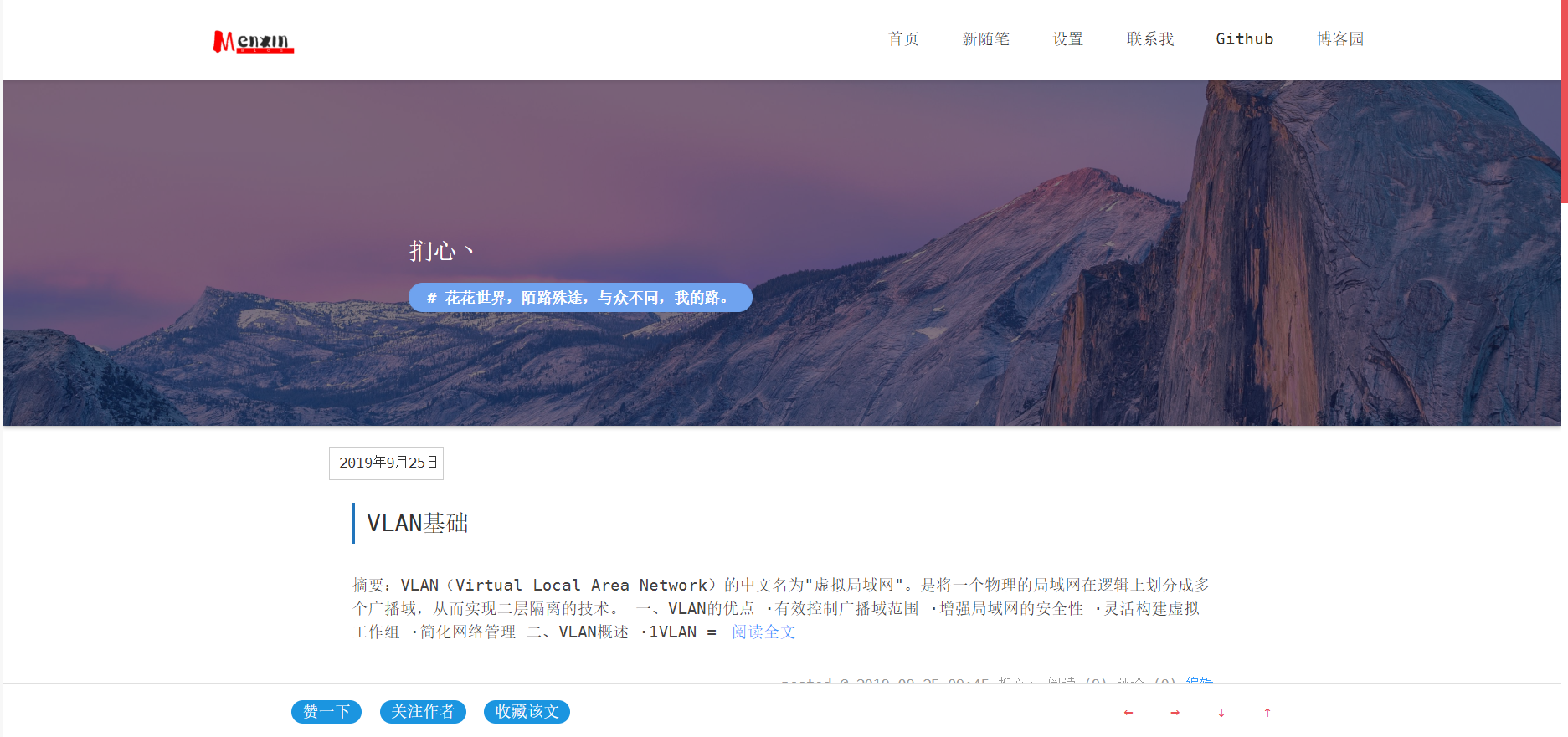
点我下载,效果图:
2.页面css代码(三)
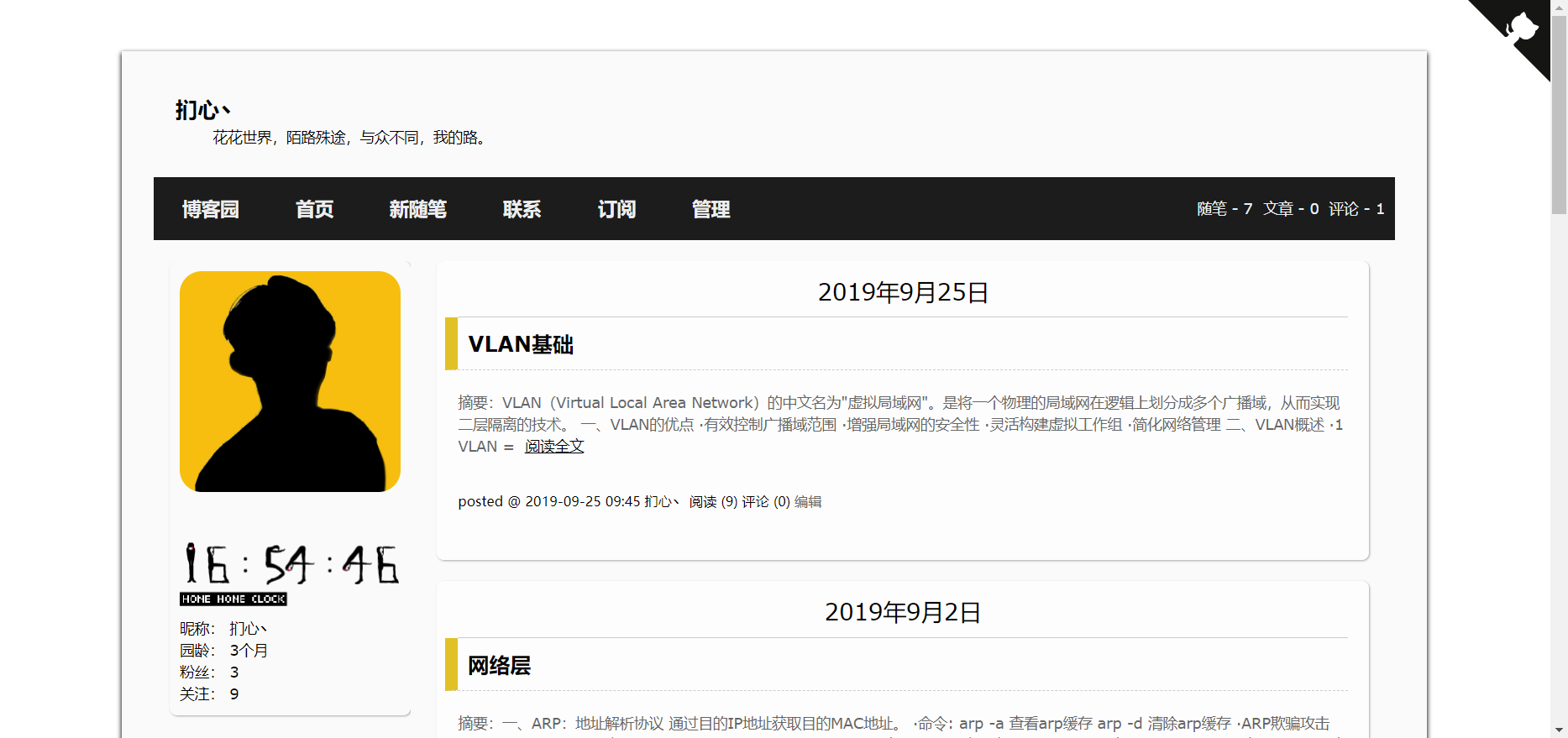
点我下载,效果图: