line-block代替float布局;
我们先看看float的一些特性(特征)
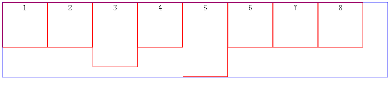
当我们改变浏览器的大小会出现这样的效果:

或则这样:
有时候,我们希望,以第一排最高的元素为换行基准时,我们就可以使用display:inline-block属性了滴呀
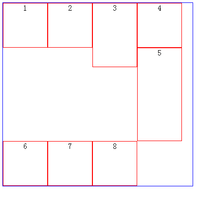
效果图

不能发现上图中有一个bug,那就是每个元素之间都有空白,解决方法;已经在我们另外一篇博客中记录了
这样的布局算是完成了,接下来,我们看如何实现两端对齐的效果滴啊
具体应用实例一(text-align:center)
css
 .container{
     width:100%;
     height:40px;
     padding:0;
     margin:0;
     list-style:none;
     background:#eee;
     text-align:center;
 }
 .liStyle{
     color:white;
     width:14px;
     height:14px;
     margin:15px 5px 0 5px;
     background:red;
     display:inline-block;
     cursor:pointer;
 }
html
 <ul class="container">
  <li class="liStyle">1</li>
  <li class="liStyle">2</li>
  <li class="liStyle">3</li>
  <li class="liStyle">4</li>
  <li class="liStyle">5</li>
  <li class="liStyle">6</li>
 </ul>
效果:

text-align
text-align是用于文字对齐的
接下来,我们看实例:
html
<div class="box1">There is clearly a need for CSS to be taken seriously by graphic artists. The Zen Garden aims to excite, inspire, and encourage participation. To begin, view some of the existing designs in the list. Clicking on any one will load the style sheet into this very page. The code remains the same, the only thing that has changed is the external .css file. Yes, really
</div>

<div class="box2">There is clearly a need for CSS to be taken seriously by graphic artists. The Zen Garden aims to excite, inspire, and encourage participation. To begin, view some of the existing designs in the list. Clicking on any one will load the style sheet into this very page. The code remains the same, the only thing that has changed is the external .css file. Yes, really
</div>

<div class="box3">There is clearly a need for CSS to be taken seriously by graphic artists. The Zen Garden aims to excite, inspire, and encourage participation. To begin, view some of the existing designs in the list. Clicking on any one will load the style sheet into this very page. The code remains the same, the only thing that has changed is the external .css file. Yes, really
</div>

<div class="box4">There is clearly a need for CSS to be taken seriously by graphic artists. The Zen Garden aims to excite, inspire, and encourage participation. To begin, view some of the existing designs in the list. Clicking on any one will load the style sheet into this very page. The code remains the same, the only thing that has changed is the external .css file. Yes, really
</div>
css
.box1{ width:500px; line-height:20px; margin:10px auto; background-color:#cdd; text-align:justify}
.box2{ width:500px; line-height:20px; margin:10px auto; background-color:#cdd; text-align:left;}
.box3{ width:500px; line-height:20px; margin:10px auto; background-color:#cdd; text-align:right;}
.box4{ width:500px; line-height:20px; margin:10px auto; background-color:#cdd; text-align:center;}
效果:

ps:有些人在测试text-align:justify的时候,发现无效,那是因为,文字还没有容器一行那么宽;
所以,至少要超过一行才能看到text-align:justify的效果滴呀
text-align:justify display:inline-block实现两端对齐
<!DOCTYPE HTML>
<html>
    <head>
        <title>文本两端对齐 by hongchenok</title>
        <meta http-equiv="Content-Type" content="text/html; charset=UTF-8">
        <style>
            .box{
                width:50%;
                padding:20px;
                margin:20px auto;
                background-color:#f0f3f9;
                text-align:justify;
                text-justify:distribute-all-lines;/*ie6-8*/
            }
            .list{
                width:120px;
                display:inline-block;
                *display: inline;
                *zoom:1;
                padding-bottom:20px;
                text-align:center;
                vertical-align:top;
            }
            .justify_fix{
                display:inline-block;
                *display: inline;
                *zoom:1; width:100%;
                height:0;
                overflow:hidden;
            }

            .list_head{
                height: 50px;
                width: 50px;
                background-color: red;
                float: left;
            }

            .list_content{
                width: 70px;
                height: 50px;
                float: left;
            }
            .clearfix:after {
                content: ".";
                display: block;
                height: 0;
                clear: both;
                visibility: hidden;
            }
            * html .clearfix {height: 1%;}
        </style>

    </head>
    <body>
        <div class="box">
            <div class="list clearfix">
                <div class="list_head"></div>

            </div>
            <div class="list clearfix">
                <div class="list_head"></div>

            </div>

            <span class="justify_fix"></span>
        </div>
        <div class="box">
            <div class="list clearfix">
                <div class="list_head"></div>

            </div>
            <div class="list clearfix">
                <div class="list_head"></div>

            </div>
            <div class="list clearfix">
                <div class="list_head"></div>

            </div>
            <div class="list clearfix">
                <div class="list_head"></div>

            </div>
            <span class="justify_fix"></span>
        </div>

    </body>
</html>
效果:
