CSS3边框
兼容性:

实例一:

实例二:(单独的设置四个角)左上角、右上角、右下角、左下角(顺时针顺序)
也可以单独的设置某个角:
border-top-left-radius:10px;
border-top-right-radius:20px;
border-bottom-right-radius:30px;
border-bottom-left-radius:40px;

圆角的实质:

实例三:(所以我们可以这样设置值滴呀)

同样的,我们可以设置两组值:border-radius: 100px 25px 80px 5px / 45px 25px 30px 15px;
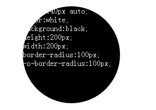
实例四:(用它来直接画圆,其实就是四个半圆组成的)
实例五:(空心圆)
.radius{
    margin:40px auto;
    height:200px;
    width:200px;
    border:2px solid red;
    border-radius:100px;
    -o-border-radius:100px;

}
效果:

如果把border改成:border:2px dashed red; 那么就会出现虚心圆;
效果:

还有半圆:
.radius{
    margin:40px auto;
    color:white;
    height:200px;
    width:100px;
    background:black;
    border-radius:100px 0 0 100px;
    -o-border-radius:100px 0 0 100px;

}
效果:

四分一的圆:
.radius{
    margin:40px auto;
    color:white;
    height:200px;
    width:200px;
    background:black;
    border-radius:200px 0 0 0;
    -o-border-radius:200px 0 0 0;

}
效果:

ps:用这个方法来画圆(绘制图形),那可不划算呢;我们还有html中的canvas 和 svg 呢!
边框阴影;

实例四:
border-image:请看另外篇;