先上一张效果图:

以上图是一段时间内黄金价格的波动图。
代码如下:
import datetime as DT
from matplotlib import pyplot as plt
from matplotlib.dates import date2num

data = []
with open("data.txt") as my_file:
    for line in my_file:
        date, price = line.partition("@")[::2]
        data.append((DT.datetime.strptime(date, "%Y-%m-%d %H:%M:%S"), price))

d = [date for (date, value) in data[::8]]
x = [date2num(date) for (date, value) in data]
y = [value for (date, value) in data]

fig = plt.figure()

graph = fig.add_subplot(111)

# Plot the data as a red line with round markers
# graph.plot(x, y, 'r-o')
graph.plot(x, y)

# Set the xtick locations to correspond to just the dates you entered.
graph.set_xticks(x)

# Set the xtick labels to correspond to just the dates you entered.
graph.set_xticklabels(
    [date.strftime("%Y-%m-%d %H:%M:%S") for date in d], rotation=30
)
# plt.grid(True)
plt.xticks(x[::8])
# print [x[f_value] for f_value in range(0, len(x), 8)]
plt.show()
data.txt数据格式如下:
2017-07-29 00:00:02@27567
2017-07-29 03:00:02@27575
2017-07-29 06:00:01@27575
2017-07-29 09:00:01@27575
2017-07-29 12:00:02@27575
2017-07-29 15:00:01@27575
2017-07-29 18:00:01@27575
2017-07-29 21:00:01@27575
相关知识点介绍:
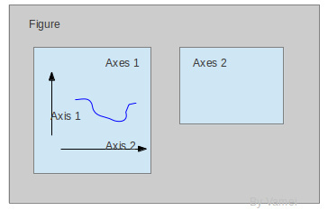
matplotlib中整个图像是一个Figure对象,在Figure对象中可以包含一个,或者多个Axes对象。每个Axes对象都是一个拥有自己坐标系统的绘图区域,多个Axes对象可以绘成一个比较复杂的图,比如共用x-axis的图。其逻辑关系如下:
一个具体的图如下:
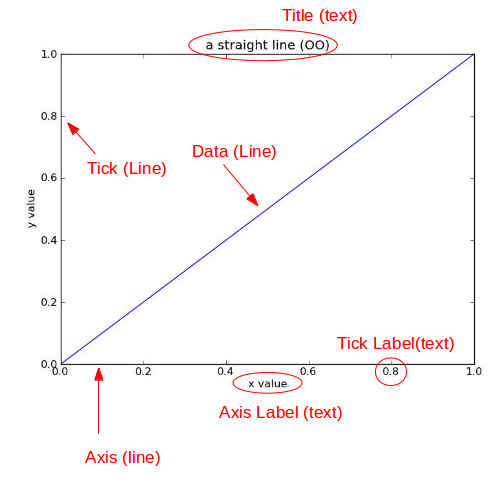
Title为标题。Axis为坐标轴,Label为坐标轴标注。Tick为刻度线,Tick Label为刻度注释,需要注意的是x-axis的ticks(刻度)和x-axis的ticklabels是分开的,ticks就代表x轴的数据,ticklabels表示数据对应的字符串。并不是每个刻度都有字符串对应,ticklabels的密度是可以控制的。往往很密集的刻度会对应合理的字符串便以阅读。
第一个图的x-axis轴对应的是日期,但是x轴必须有数据,因此matplotlib.dates提供了将日期转化为数据的方法date2num, 这个例子中数据是每3小时有一条,但是显示的时候只到天,具体是如下两行代码:
#每8个取一个日期,其实就是一天
d = [date for (date, value) in data[::8]]
#每个日期对应一个值,这样才能定位日期的位置,因此值也是每8个取一个
plt.xticks(x[::8])
获取x轴和y轴的刻度值
x = [date2num(date) for (date, value) in data]
y = [value for (date, value) in data]
创建图像并设置图像位置
fig = plt.figure()
graph = fig.add_subplot(111)
111的意思是把figure也就是图像分成1行1列,放在第一个格子,也就是独占整个图像
#把数据画到图上,r是red的意思,线是红色的,o表示对各个值画一个点。
# graph.plot(x, y, 'r-o')
#默认蓝线不画点
graph.plot(x, y)
# Set the xtick labels to correspond to just the dates you entered.
#设置x轴label,其实就是上面算好的d日期字符串数组,rotation是label的角度
graph.set_xticklabels(
    [date.strftime("%Y-%m-%d %H:%M:%S") for date in d], rotation=20
)
#图表显示网格
plt.grid(True)
#设置图标的标题
plt.title("Gold price trends")
plt.xticks(x[::8])
#设置y轴label
plt.ylabel('Gold price/RMB cents')
#设置x轴label
plt.xlabel('Date time')
#显示图像
plt.show()
这么下来一个简单的图表就画好了,很快很实用吧。
参考链接:
https://segmentfault.com/a/1190000006158803