【文本标签】
在GUI中是常见的小控件,用途非常广
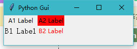
 1 import tkinter as tk
 2 from tkinter import ttk
 3 win=tk.Tk()
 4
 5 win.title('Python Gui')
 6
 7 #win.resizable(0,0) #阻止Python GUI的大小调整
 8
 9 #增加一个文本标签
10 ttk.Label(win,text='A1 Label').grid(column=0,row=0)
11 lab2=ttk.Label(win,text='A2 Label',background='red')
12 lab2.grid(column=1,row=0)
13 ttk.Label(win,text='B1 Label',font=30).grid(column=0,row=1)
14 ttk.Label(win,text='B2 Label',foreground='red').grid(column=1,row=1)
15
16 win.mainloop()
Label是ttk里的一个类,它的标准属性有
activebackground=
What background color to use when the label is active (set with the state option). The default is platform specific. (the option database name is activeBackground, the class is Foreground)
标签处于活动状态时使用的背景颜色(使用状态选项进行设置)。默认是平台特定的。(选项数据库名称是activeBackground,类是Foreground)

activeforeground=
What foreground color to use when the label is active. The default is platform specific. (activeForeground/Background)
激活标签时使用什么前景色。默认是平台特定的。(activeForeground /背景)

anchor=
Controls where in the label the text (or image) should be located. Use one of N, NE, E, SE, S, SW, W, NW, or CENTER. Default is CENTER. (anchor/Anchor)
控件在标签中的文本(或图像)应该位于何处。使用N,NE,E,SE,S,SW,W,NW或CENTER中的一个。默认为中心CENTER


background=
The background color. The default is platform specific. (background/Background)
背景色。默认是同于平台的。

bitmap=
The bitmap to display in the widget. If the image option is given, this option is ignored. (bitmap/Bitmap)
要在小部件中显示的位图。如果给定图像选项,则忽略此选项。


borderwidth=
The width of the label border. The default is system specific, but is usually one or two pixels. (borderWidth/BorderWidth)
标签边框的宽度。默认值是同于系统的,但通常是一个或两个像素。

compound=
Controls how to combine text and image in the label. By default, if an image or bitmap is given, it is drawn instead of the text. If this option is set to CENTER, the text is drawn on top of the image. If this option is set to one of BOTTOM, LEFT, RIGHT, or TOP, the image is drawn besides the text (use BOTTOM to draw the image under the text, etc.). Default is NONE. (compound/Compound)
控制如何将文本和图像组合在标签中。默认情况下,如果给定一个图像或位图,则将其绘制为文本。如果将此选项设置为中心,则在图像顶部绘制文本。如果该选项设置为底部、左侧、右侧或顶部,则除文本之外绘制图像(使用底部绘制文本下的图像等)。默认没有。


cursor=
What cursor to show when the mouse is moved over the label. The default is to use the standard cursor. (cursor/Cursor)
鼠标移动到标签上时显示什么光标。默认值是使用标准游标。


disabledforeground=
What foreground color to use when the label is disabled. The default is system specific. (disabledForeground/DisabledForeground)
当标签被禁用时使用什么前景色。默认值是特定于系统的。


font=
The font to use in the label. The label can only contain text in single font. The default is system specific. (font/Font)
标签中使用的字体。标签只能包含单个字体的文本。默认值是特定于系统的。


foreground=
The label color, used for for text and bitmap labels. The default is system specific. (foreground/Foreground)
标签的颜色,文字和位图的标签。默认的是系统特定的

height=
The height of the label. If the label displays text, the size is given in text units. If the label displays an image, the size is given in pixels (or screen units). If the size is set to 0, or omitted, it is calculated based on the label contents. (height/Height)
highlightbackground=
What color to use for the highlight border when the widget does not have focus. The default is system specific, but usually the same as the standard background color. (highlightBackground/HighlightBackground)
highlightcolor=
What color to use for the highlight border when the widget has focus. The default is system specific. (highlightColor/HighlightColor)
highlightthickness=
The width of the highlight border. The default is 0 (no highlight border). (highlightThickness/HighlightThickness)
image=
The image to display in the widget. The value should be a PhotoImage, BitmapImage, or a compatible object. If specified, this takes precedence over the text and bitmap options. (image/Image)
justify=
Defines how to align multiple lines of text. Use LEFT, RIGHT, or CENTER. Note that to position the text inside the widget, use the anchor option. Default is CENTER. (justify/Justify)
padx=
Extra horizontal padding to add around the text. The default is 1 pixel. (padX/Pad)
pady=
Extra vertical padding to add around the text. The default is 1 pixel. (padY/Pad)
relief=
Border decoration. The default is FLAT. Other possible values are SUNKEN, RAISED, GROOVE, and RIDGE. (relief/Relief)
state=
Label state. This option controls how the label is rendered. The default is NORMAL. Other possible values are ACTIVE and DISABLED. (state/State)
takefocus=
If true, the widget accepts input focus. The default is false. (takeFocus/TakeFocus)
text=
The text to display in the label. The text can contain newlines. If the bitmap or image options are used, this option is ignored. (text/Text)
textvariable=
Associates a Tkinter variable (usually a StringVar) with the label. If the variable is changed, the label text is updated. (textVariable/Variable)
underline=
Used with the text option to indicate that a character should be underlined (e.g. for keyboard shortcuts). Default is -1 (no underline). (underline/Underline)
width=
The width of the label. If the label displays text, the size is given in text units. If the label displays an image, the size is given in pixels (or screen units). If the size is set to 0, or omitted, it is calculated based on the label contents. (width/Width)
wraplength=
Determines when a label’s text should be wrapped into multiple lines. This is given in screen units. Default is 0 (no wrapping). (wrapLength/WrapLength)
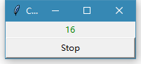
【小程序--来自网络】
运行后自动加1,直到按下stop键
 1 import tkinter as tk
 2
 3 counter = 0
 4 def counter_label(label):
 5   def count():
 6     global counter
 7     counter += 1
 8     label.config(text=str(counter))
 9     label.after(1000, count)
10   count()
11
12
13 root = tk.Tk()
14 root.title("Counting Seconds")
15 label = tk.Label(root, fg="green")
16 label.pack()
17 counter_label(label)
18 button = tk.Button(root, text='Stop', width=25, command=root.destroy)
19 button.pack()
20 root.mainloop()