flex flex-shrink的用法,收缩规则
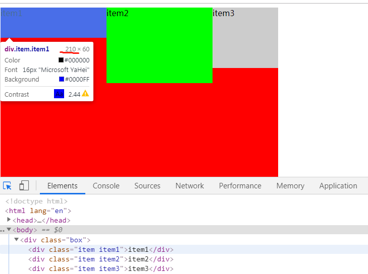
<!doctype html>
<html lang="en">
<head>
    <meta charset="UTF-8">
    <meta name="viewport"
          content="width=device-width, user-scalable=no, initial-scale=1.0, maximum-scale=1.0, minimum-scale=1.0">
    <meta http-equiv="X-UA-Compatible" content="ie=edge">
    <title>flex-grow</title>
    <style>
        .box {
            width: 550px;
            height: 500px;
            background-color: red;
            /*1.开启flex布局
                    flex:块级元素
                  inline-flex:行内元素 */
            display: flex;
        }
        /*
        750px-550=200px
        200/3 =66.666
        250-66.666 =183.33
        */

        /*
        200/(1+1+3) =40;
        250-40=210
        */

        .item {
            width: 250px;
            height: 100px;
        }
        .item1 {
            background-color: blue;
            height: 60px;
            flex-shrink: 1;

        }
        .item2 {
            background-color: #0f0;
            height: 150px;
            flex-shrink: 1;

        }

        .item3 {
            background-color: #ccc;
            height: 120px;
            flex-shrink: 3;
        }

    </style>
</head>
<body>
         <div class="box">
             <div class="item item1">item1</div>
             <div class="item item2">item2</div>
             <div class="item item3">item3</div>
         </div>
</body>
</html>
效果:
ps:
