保持热爱,奔赴山河
目录
可视化图表参数配置
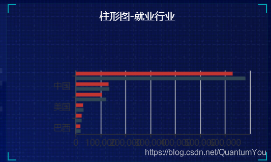
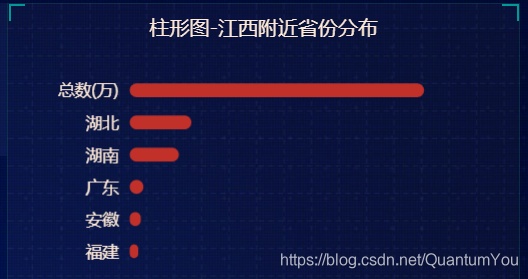
柱状图定制
中间部分html样式
 <div class="no">
                <div class="no-hd">
                    <ul>
                        <li>125811</li>
                        <li>104563</li>
                    </ul>
                </div>
                <div class="no-bd">
                    <ul>
                        <li>前端需求人数</li>
                        <li>市场供应人数</li>
                    </ul>
                </div>
            </div>
            <div class="map">
                <div class="chart"></div>
                <div class="map1"></div>
                <div class="map2"></div>
                <div class="map3"></div>
            </div>
中间部分css样式
要点:
1、字体设置
2、盒子四角短边框设置
3、地图中间动画
/* 声明字体*/
@font-face {
  font-family: electronicFont;
  src: url(../font/DS-DIGIT.TTF);
}
.no {
  background: rgba(101, 132, 226, 0.1);
  padding: 0.1875rem;
  .no-hd {
    position: relative;
    border: 1px solid rgba(25, 186, 139, 0.17);
    &::before {
      content: "";
      position: absolute;
       30px;
      height: 10px;
      border-top: 2px solid #02a6b5;
      border-left: 2px solid #02a6b5;
      top: 0;
      left: 0;
    }
    &::after {
      content: "";
      position: absolute;
       30px;
      height: 10px;
      border-bottom: 2px solid #02a6b5;
      border-right: 2px solid #02a6b5;
      right: 0;
      bottom: 0;
    }
    ul {
      display: flex;
      li {
        position: relative;
        flex: 1;
        text-align: center;
        height: 1rem;
        line-height: 1rem;
        font-size: 0.875rem;
        color: #ffeb7b;
        padding: 0.05rem 0;
        font-family: electronicFont;
        font-weight: bold;
        &:first-child::after {
          content: "";
          position: absolute;
          height: 50%;
           1px;
          background: rgba(255, 255, 255, 0.2);
          right: 0;
          top: 25%;
        }
      }
    }
  }
  .no-bd ul {
    display: flex;
    li {
      flex: 1;
      height: 0.5rem;
      line-height: 0.5rem;
      text-align: center;
      font-size: 0.225rem;
      color: rgba(255, 255, 255, 0.7);
      padding-top: 0.125rem;
    }
  }
}
.map {
  position: relative;
  height: 10.125rem;
  .chart {
    position: absolute;
    top: 0;
    left: 0;
    z-index: 5;
    height: 10.125rem;
     100%;
  }
  .map1,
  .map2,
  .map3 {
    position: absolute;
    top: 50%;
    left: 50%;
    transform: translate(-50%, -50%);
     6.475rem;
    height: 6.475rem;
    background: url(../images/map.png) no-repeat;
    background-size: 100% 100%;
    opacity: 0.3;
  }
  .map2 {
     8.0375rem;
    height: 8.0375rem;
    background-image: url(../images/lbx.png);
    opacity: 0.6;
    animation: rotate 15s linear infinite;
    z-index: 2;
  }
  .map3 {
     7.075rem;
    height: 7.075rem;
    background-image: url(../images/jt.png);
    animation: rotate1 10s linear infinite;
  }

  @keyframes rotate {
    from {
      transform: translate(-50%, -50%) rotate(0deg);
    }
    to {
      transform: translate(-50%, -50%) rotate(360deg);
    }
  }
  @keyframes rotate1 {
    from {
      transform: translate(-50%, -50%) rotate(0deg);
    }
    to {
      transform: translate(-50%, -50%) rotate(-360deg);
    }
  }
}
常用样式(重要)
圆角 距离 高度
1、柱子边框圆角处理
2、柱子间的距离
3、柱子的高度
series : [

itemStyle : {
     barBorderRadius : 20
} ,
barCategoryGap : 50 ,
barWidth : 10
]
标签 颜色 浮动
1、在图像内显示标签
注意: {c} 会自动解析 data 数据
Tips :
字符串模板模板变量有
{a} :系列名
{b} : 数据名
{c} :数据值。
{@xxx}:数据中名为' xxx '的维度的值,如{@ product表示名为' product”的维度的值。
{@[n]}:数据中维度n的值,如{@[3]}`表示维度3的值,从0开始计数
series : [
   label : {
   show : true ,
   position : "inside" ,
   formatter : "{c}%"

}
]
2、常规法改变柱子颜色
注意 属性层次关系
 series: [
      {
        name: '条',
        type: 'bar',
        data: [18203, 23489, 29034, 104970, 131744] ,
        itemStyle :{
          barBorderRadius:20 ,
          color : "#fff"
        }
]
3、运用函数遍历 颜色

var myColor = ["#1089E7","#F57474","#56D0E3","#F88448",
  "#8B78F6"] ;


itemStyle :{
          barBorderRadius:20 ,
          color : function(params){
            return myColor[params.dataIndex] ;
          }
        } ,
4、运用 yAxisIndex 实现类似定位浮动

使用位置 作为 series 的参数
注意 属性位置
series: [
      {
        name: '条',
        type: 'bar',
        yAxisIndex : 0 ,
        data: [70, 34, 68, 78, 69] ,
        itemStyle :{
          barBorderRadius:20 ,
          color : function(params){
            return myColor[params.dataIndex] ;
          }
        } ,


        // 柱子间距离
        barCategoryGap : 50 ,
        barWidth : 10 ,
        label :{
          show : true ,
          position : "inside",
          formatter : "{c}%"
        }
      },

      {
        name: '框',
        type: 'bar',
        barCategoryGap:  50 ,
        barWidth:  15 ,
        data: [100, 100, 100, 100, 100] ,
        yAxisIndex : 1 ,
        itemStyle: {
          color : "none" ,
          borderColor : "#00c1de" ,
          borderWidth : 3 ,
          barBorderRadius: 15 ,

        }

      }
    ]
翻转
注意: 在 Echarts 中默认 y 轴是翻转的
解法: inverse : true
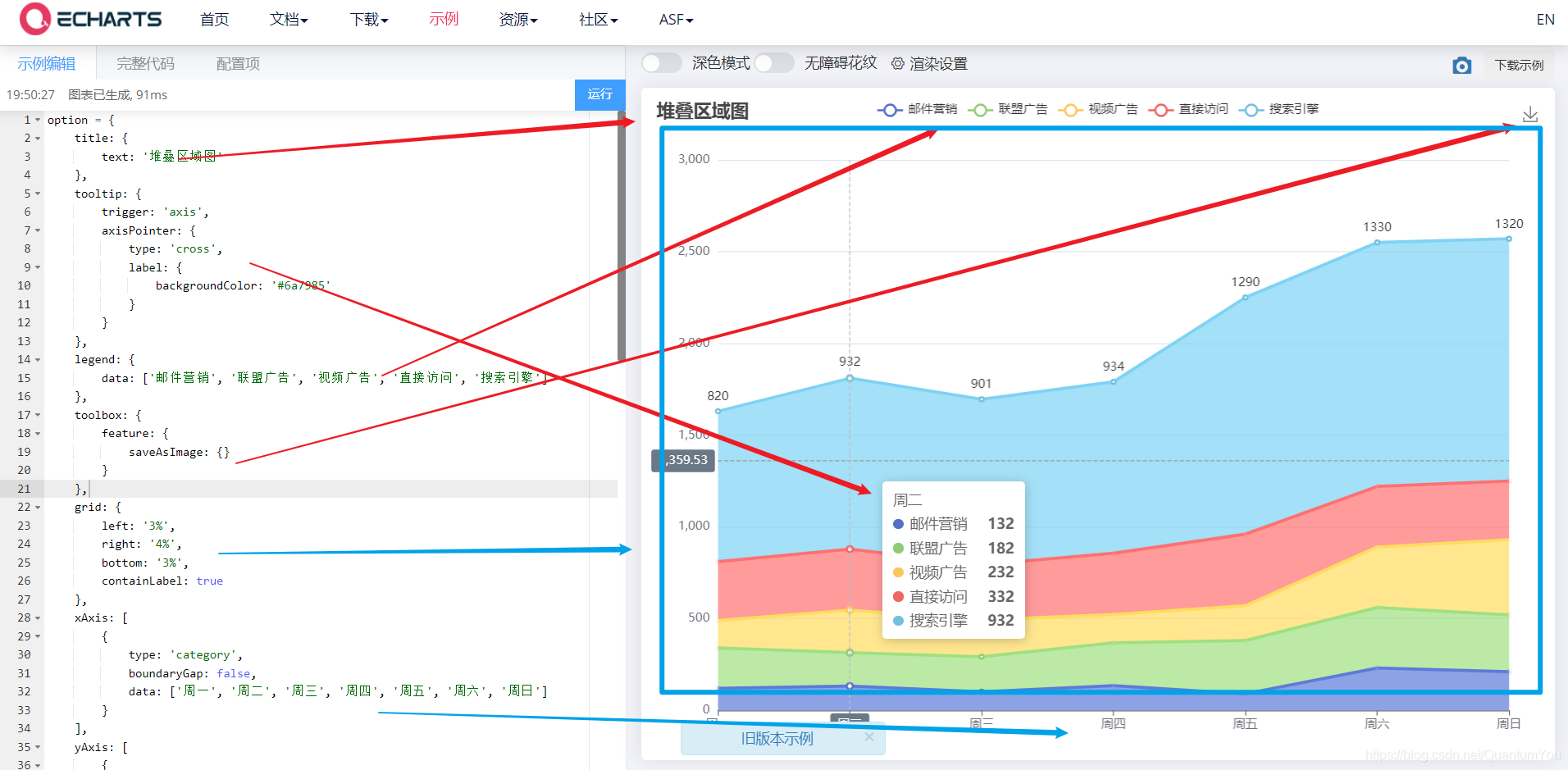
折线图定制
关于折线图位于 矩形框内位置
使用 grid 定制
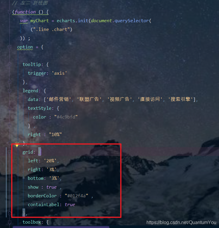
注意: 图标名称对应的字段名相对应,否则无法

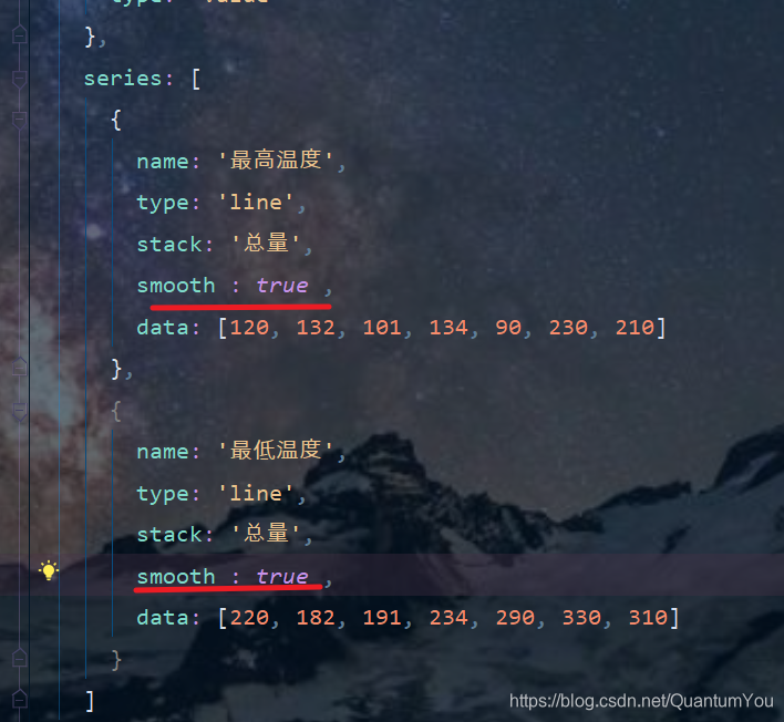
折线平滑显示
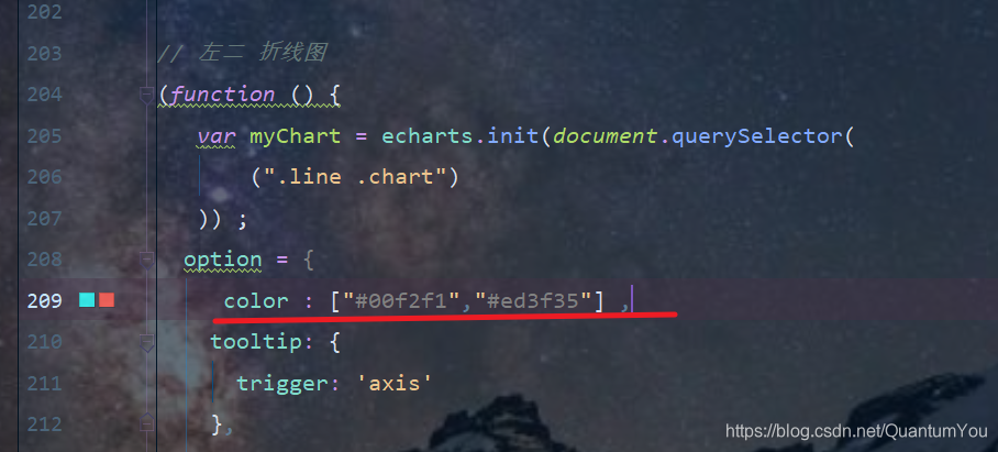
修改折线颜色
图标 Tab栏切换
1、图标样式显示
legend :{

}
如果 series 对象有name值,则 Legend可以不用写data
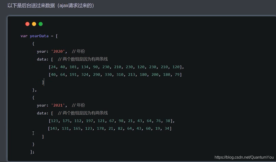
2、tab栏切换事件
点击2020按钮需要把 series第一个对象里面的data换成2020年对象里面 data[0]
点击2020按钮需要把 series第二个对象里面的data换成2020年对象里面data[1]
2021按钮同样道理
核心代码体现

小结