遇到需要实现如下图标

由图形分析,梯形,平行四边形等都可以由矩形变形而来。
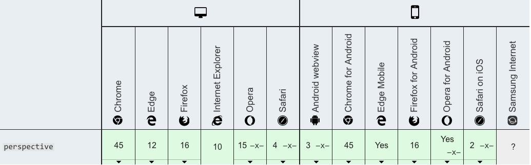
而想要实现梯形,需要进行3D变换,需要使用css3的 perspective属性。
属性 perspective指定了观察者与 z=0 平面的距离,使具有三维位置变换的元素产生透视效果
当为元素定义 perspective 属性时,其子元素会获得透视效果,而不是元素本身。
DEMO:
<!DOCTYPE html>
<html lang="en">
<head>
    <meta charset="UTF-8">
    <meta name="viewport" content="width=device-width, initial-scale=1.0">
    <meta http-equiv="X-UA-Compatible" content="ie=edge">
    <title>Document</title>
    <style>
        body {
            background: #eee;
        }
        .a {
            position: relative;
             40px;
            height: 200px;
            background:transparent;
            /* perspective: 1em; */
        }
        .a::before {
            content: "";
            position: absolute;
            border: 1px solid #ddd;
            background-color: #fff;
            top: 0; right: 0; bottom: 0; left: 0;
            transform: perspective(1em) rotateY(3deg);
            /* transform:  rotateY(3deg); */
        }
        .a:hover:before{
            background-color: transparent;
        }
    </style>
</head>
<body>
    <div class="a"></div>
</body>
</html>
上面代码中的
transform: perspective(1em) rotateY(3deg);
可以由代码中注释的两行代码替换。