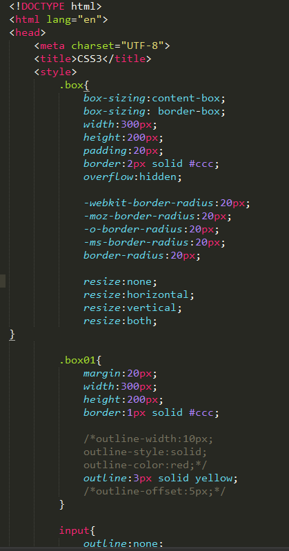
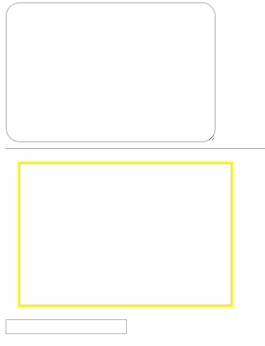
# CSS3 盒子模型
* box-sizing 值 content-box 默认值 包括所有的值 / border-box 只算边框的长与宽
* resize(调节框的大小)
* 值 none不允许 / horizontal调节宽度 / vertical调节高度 / both都可以
* outline轮廓边框 `outline:width style color`
* outline-width
* outline-color
* outline-style 值 同border-style solid / dotted / dashed ...
* outline-offset 是以border边界作为参考点的,从0开始,正值从border边界往外延,负值从border边界往里缩。
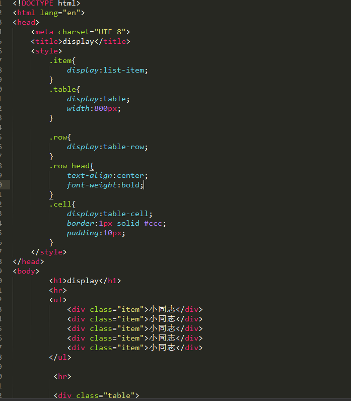
* display: list-item: 指定对象为列表项目
* table-row: 指定对象作为表格行。类同于html标签<tr>
# CSS3 长度单位
### 绝对单位
* em
* mm
* pt
* p
* pc
* q
### 相对单位
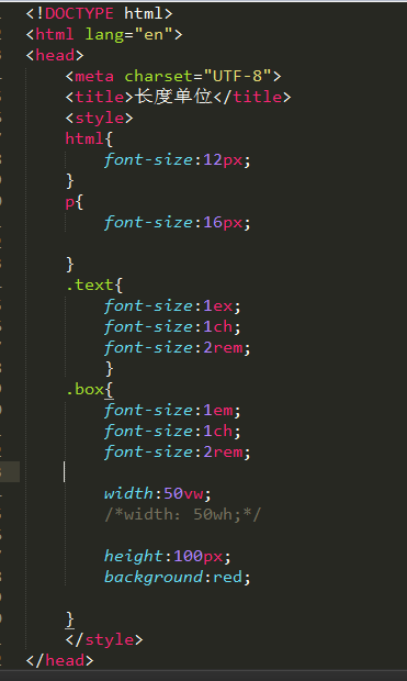
* px
* em
* ex 默认字体大小一半
* rem 相对于根元素 html字体大小 的倍数
* vw 相对于视口的宽度。视口被均分为100单位的vw
* vh 相对于视口的高度。视口被均分为100单位的vh
* vmax
* vmin
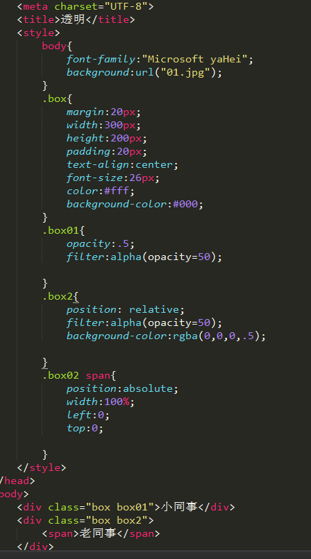
### 设置半透明
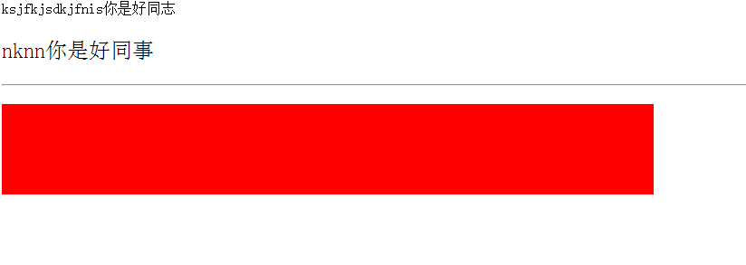
* opacity 0~1之间的小数,不透明度,值越大,越不透明
.box01{
opacity:.5;
filter:alpha(opacity=50);
background-color:rgba(0,0,0,.5);
}
针对i8系统
opacity 效果是字体跟文字全部变透明
rbga 就北京变透明

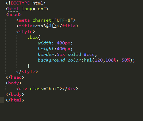
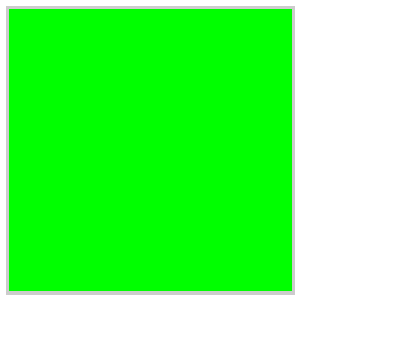
### 颜色值
* hex 16进制
* colorname
* rgb
* rgba
* hsl
* hsla
* transparent
- H:
- Hue(色调)。0(或360)表示红色,120表示绿色,240表示蓝色,也可取其他数值来指定颜色。取值为:0 - 360
- S:
- Saturation(饱和度)。取值为:0.0% - 100.0%
- L:
- Lightness(亮度)。取值为:0.0% - 100.0%
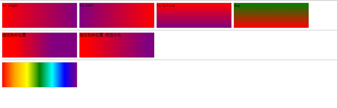
# CSS3 渐变
### 线性渐变
* linear-gradient(方向, 色标1 色标1位置, 色标2, 色标2位置)
* `linear-gradient(to right, red 10px, purple 100px)`
* 方向: to left /to top /to right/to bottom / angle (0-360deg度)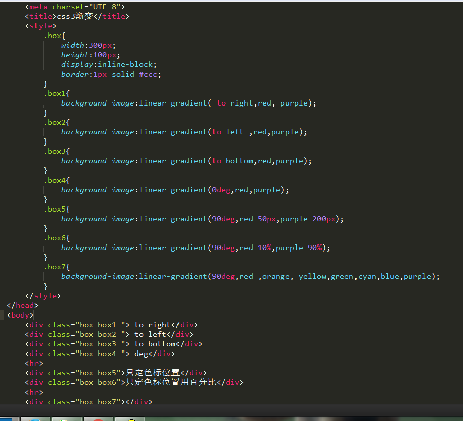
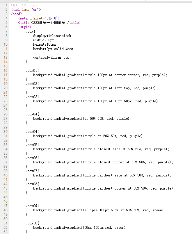
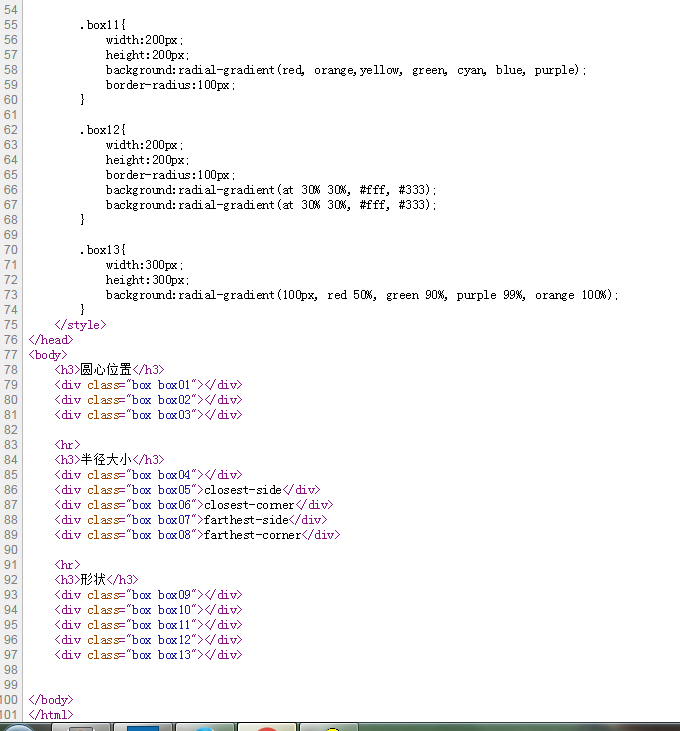
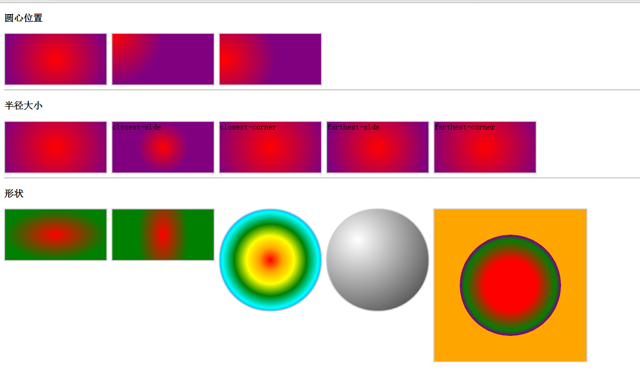
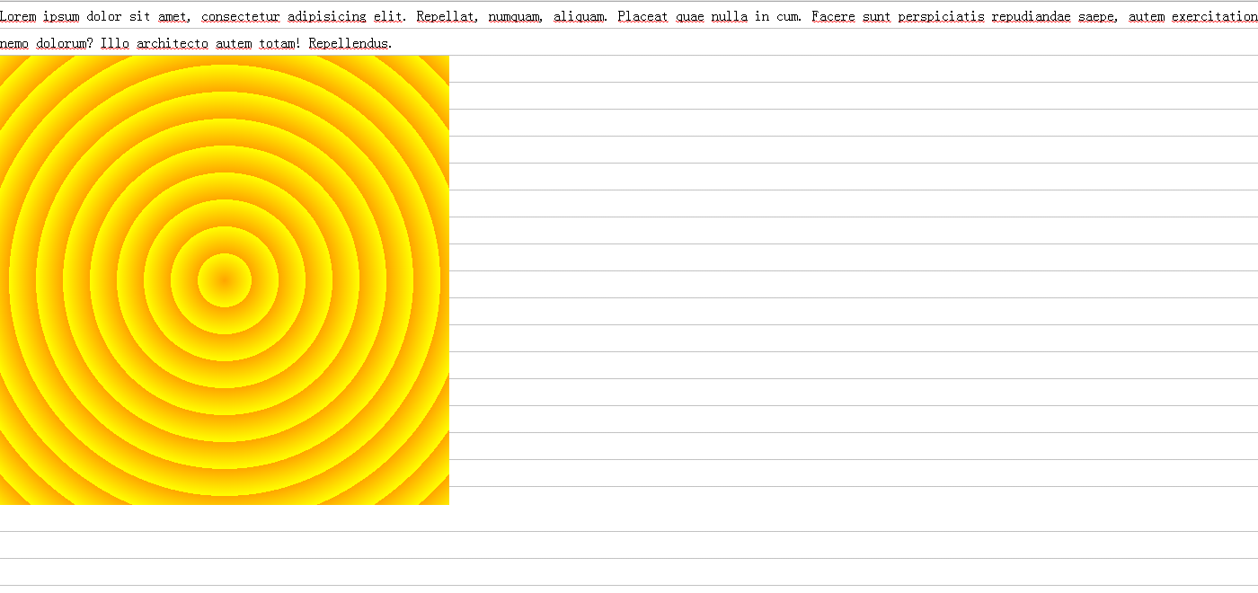
### 径向渐变
* radial-gradient(形状 半径 at 圆心, 色标 色标位置, 色标, 色标位置)
* 形状: ellipse / circle
* 半径: length, 百分比,closest-corner/closest-side/farthest-side/farthest-corner
* 位置 left/center/right top/center/bottom, 像素