demo1:
1.通过设置CSS样式的position属性,z-index属性等实现背景图,转盘图与指针图的层叠摆放;
2、通过设置元素style.transform = "rotate(0deg)"实现旋转效果;
代码:
<!DOCTYPE html>
<html lang="en">
<head>
    <meta charset="UTF-8">

    <title>转盘抽奖</title>

    <style>
        #bg {
             650px;
            height: 600px;
            margin: 0 auto;
            background: url(turntable-bg.jpg) no-repeat;
            position: relative;
        }

        img[src^="pointer"] {
            position: absolute;
            z-index: 10;
            top: 155px;
            left: 247px;
        }

        img[src^="turntable"] {
            position: absolute;
            z-index: 5;
            top: 60px;
            left: 116px;
            transition: all 4s;
        }
    </style>
</head>
<body>
    <div id="bg"><img src="pointer.png" alt="pointer"><img src="turntable.png" alt="turntable"></div>
    <script>
        var oPointer = document.getElementsByTagName("img")[0];
        var oTurntable = document.getElementsByTagName("img")[1];
        var cat = 360/7; //总共7个扇形区域,每个区域角度
        var num = 0; //转圈结束后停留的度数
        var offOn = true; //是否正在抽奖
        oPointer.onclick = function () {
            if (offOn) {//正在抽奖
                oTurntable.style.transform = "rotate(0deg)";
                offOn = !offOn;//转盘停止转动
                ratating();//调用旋转函数
            }
        }
        //旋转
        function ratating() {
            var timer = null;
            var rdm = 0; //随机度数
            clearInterval(timer);
            timer = setInterval(function () {
                if (Math.floor(rdm / 360) < 3) {
                    rdm = Math.floor(Math.random() * 3600);
                    //console.log("rdm:==="+rdm);
                } else {
                    oTurntable.style.transform = oTurntable.style.webkitTransform= "rotate(" + rdm + "deg)";
                    clearInterval(timer);
                    setTimeout(function () {
                        offOn = !offOn;
                        num = rdm % 360;
                        if (num <= cat * 1) {
                            alert("4999元");
                            console.log("rdm=" + rdm + ",num=" + num + "," + "4999元");
                        } else if (num <= cat * 2) {
                            alert("50元");
                            console.log("rdm=" + rdm + ",num=" + num + "," + "50元");
                        } else if (num <= cat * 3) {
                            alert("10元");
                            console.log("rdm=" + rdm + ",num=" + num + "," + "10元");
                        } else if (num <= cat * 4) {
                            alert("5元");
                            console.log("rdm=" + rdm + ",num=" + num + "," + "5元");
                        }
                        else if (num <= cat * 5) {
                            alert("免息服务");
                            console.log("rdm=" + rdm + ",num=" + num + "," + "免息服务");
                        }
                        else if (num <= cat * 6) {
                            alert("提交白金");
                            console.log("rdm=" + rdm + ",num=" + num + "," + "提交白金");
                        }
                        else if (num <= cat * 7) {
                            alert("未中奖");
                            console.log("rdm=" + rdm + ",num=" + num + "," + "未中奖");
                        }
                    }, 4000);
                }
            }, 30);
        }
    </script>
</body>
</html>
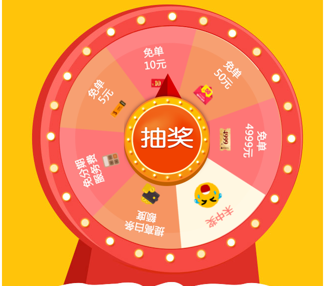
运行效果:点击抽奖转盘旋转
素材:
demo2:
涉及知识点:
贝塞尔曲线
cubic-bezier还是比较少用到,PC端中,有浏览器不兼容。但是手机端中,可以使用并带来炫酷的动画及体验。
- 缓动函数速查表: http://www.xuanfengge.com/easeing/easeing/
- Ceaser: http://xuanfengge.com/easeing/ceaser/
- cubic-bezier:http://cubic-bezier.com/
cubic-bezier即为贝塞尔曲线中的绘制方法。图上有四点,P0-3,其中P0、P3是默认的点,对应了[0,0], [1,1]。而剩下的P1、P2两点则是我们通过cubic-bezier()自定义的。cubic-bezier(x1, y1, x2, y2) 为自定义,x1,x2,y1,y2的值范围在[0, 1];
在CSS3中,常用的几个动画效果,用cubic-bezier表示分别为:
ease: cubic-bezier(0.25, 0.1, 0.25, 1.0)
linear: cubic-bezier(0.0, 0.0, 1.0, 1.0)
ease-in: cubic-bezier(0.42, 0, 1.0, 1.0)
ease-out: cubic-bezier(0, 0, 0.58, 1.0)
ease-in-out: cubic-bezier(0.42, 0, 0.58, 1.0)
CSS3中,动画属性为transition,常用动画如下:
.demo2{
top: 100px;
-webkit-transition: all 600ms cubic-bezier(0.47, 0, 0.745, 0.715);
transition: all 600ms cubic-bezier(0.47, 0, 0.745, 0.715);
}
代码:
<!DOCTYPE html>
<html lang="en">
<head>
<meta charset="UTF-8">
<title>转盘抽奖</title>
<meta name="viewport" content="width=device-width, user-scalable=no, initial-scale=1.0, maximum-scale=1.0, minimum-scale=1.0">
<meta http-equiv="X-UA-Compatible" content="IE=edeg">
<!-- 浏览器兼容版本 -->
<style>
* {
margin: 0;
padding: 0;
}
div{
}
.rotate_con {
margin: 50px auto;
320px;
height: 320px;
}
.rotate_row {
display: flex;
display: -webkit-flex;
height: 33.3333333%;
}
.rotate_item {
flex: 0 0 33.3333333%;
-webkit-flex: 0 0 33.3333333%;
line-height: 106.666666px;
text-align: center;
background: yellow;
padding: 1px;
border: 1px solid #fff;
box-sizing: border-box;
}
.item_start {
position: relative;
background-color: #FF5E5E;
color: #FFFFFF;
font-weight: bold;
cursor: pointer;
border-radius: 50%;
}
.item_start:active {
background: #ED745B;
}
.rotate {
position: absolute;
5px;
height: 106px;
top: -53px;
left: 53px;
background: yellowgreen;
transform: rotateZ(0deg);
transform-origin: left bottom;
-webkit-transform-origin: left bottom;
transition: all 1.5s cubic-bezier(0.25, 0.1, 0.25, 1);
}
.item_active {
border-color: red;
}
</style>
</head>
<body>
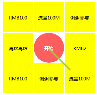
<div class="rotate_con">
<div class="rotate_row">
<div class="rotate_item">
RMB100
</div>
<div class="rotate_item">
流量100M
</div>
<div class="rotate_item">
谢谢参与
</div>
</div>
<div class="rotate_row">
<div class="rotate_item">
再接再厉
</div>
<div class="rotate_item item_start" id="start">
开始
<div class="rotate" id="rotate_zhen">
</div>
</div>
<div class="rotate_item">
RMB2
</div>
</div>
<div class="rotate_row">
<div class="rotate_item">
RMB100
</div>
<div class="rotate_item">
谢谢参与
</div>
<div class="rotate_item">
流量100M
</div>
</div>
</div>
<script>
//获取对象
var getid = function(id) {
return document.getElementById(id);
};
//按照旋转顺序的数组
var context = ["流量100M", "谢谢参与", "RMB2", "流量100M", "谢谢参与", "RMB100", "再接再厉", "RMB100"];
var deg = 45, //旋转的默认角度360/8
numdeg = 0, //记录上次旋转停止时候的角度
num = 0, //记录旋转后数组的位置
isRotated = false; //判断是否在进行中
window.onload = function() {
var zhen = getid("rotate_zhen");
getid("start").addEventListener('click', function() {
if(isRotated) return; //如果正在旋转退出程序
isRotated = true;
var index = Math.floor(Math.random() * 8); //得到0-7随机数
num = index + num; //得到本次位置
numdeg += index * deg + Math.floor(Math.random() * 3 + 1) * 360;
zhen.style.webkitTransform = zhen.style.transform = "rotateZ(" + numdeg + "deg)";
setTimeout(function() {
if(num >= 8) { //如果数组位置大于7就重新开始
num = num % 8;
}
alert(context[num]);
isRotated = false; //旋转改为false说明没有旋转
}, 1700)
}, false)
}
</script>
</body>
</html>
素材链接: 链接:https://pan.baidu.com/s/1W_PVCQkZTWMx3M_KrrfPhQ 密码:1nwq