CSS变形
transform
transform:none|<transform-function>+
rotate()
rotate()
rotate(<angle>);
/*示例如下*/
transform:rotate(45deg);
transform:rotate(-60deg);
translate()
translate()
translate(<translation-value>[<translation-value>]?)
translateX(<translation-value>)/* 沿X轴移动 */
translateY(<translation-value>)/* 沿Y轴移动 */
/*示例如下*/
transform:translate(50px);/* ? */
transform:translate(50px,20%);
transform:translateX(-50px);
transform:translateY(20%);
scale()
scale()
scale(<number>[,<number>]?)
scaleX(<number>)
scaleY(<number>)
/*示例如下*/
transform:scale(1.2);
transform:scale(1,1.2);
transform:scaleX(1.2);
transform:scaleY(1.2);
skew()
skew()
skew(<angle>[,<angel>]?)
skewX(<angle>)
skewY(<angle>)
/*示例如下*/
transform:skew(30deg);
transform:skew(30deg,30deg);
transform:skewX(30deg);
transform:skewY(30deg);
组合
/*组合动作*/
transform:<transform-function>+
transform:translate(50%) rotate(45deg);
/*多个transform的值不能随意移动*/
/*设置坐标轴的原点位置*/
transform-origin
transform-origin:[left|center|right|top|bottom|<percentage>|<length>]|[left|center|right|<percentage>|<length>][top|center|bottom|<percentage>|<length>]<length>?|[center|[left|right]]&&[center|[top|bottom]]<length>?
/*示例如下*/
transform-origin:50% 50%;
transform-origin:0 0;
transform-origin:20%;
transform-origin:right 50px 20px;
perspective
/*透视*/
perspective
perspective:none|<length>
/*实例*/
perspective:none;
perspective:2000px;
perspective:500px;

perspective-origin
perspective-origin:[left|center|right|top|bottom|<percentage>|<length>]|[left|center|right|<percentage>|<length>][top|center|bottom|<percentage>|<length>]|[center|[left|right]]&&[center|[top|bottom]]
/*实例*/
perspective-origin:50% 50%;
perspective-origin:left bottom;
perspective-origin:50% -800px;
3D变形
/*3D*/
translate3d()
translate3d(<translation-value>,<translation-value>,<length>)
---
translateX(<translation-value>)
translateY(<translation-value>)
translateZ(<length>)
---
transform:translate3d(10px,20%,50px);

scale3d()
scale3d(<number>,<number>,<number>)
---
scaleX(<number>)
scaleY(<number>)
sclaeZ(<number>)
---
transform:scale3d(1.2,1.2,1);
transform:scaleZ(5);
.m-demo-1 pre{transform:scaleZ(5) translateZ(100px);}

rotate3d()
rotate3d(<number>,<number>,<number>,<angle>)
---
rotateX(<angle>)
rotateY(<angle>)
rotateZ(<angle>)
---
transform:rotate3d(1,0,0,45deg);
transform:rotate3d(0,1,0,45deg);
transform:rotate3d(1,1,1,45deg);
/*组合元素*/
transform-style
transform-style:flat|preserve-3d
/*实例*/
transform-style:preserve-3d;/*子元素保留其3D位置*/
backface-visibility
/*背面不可见*/
backface-visibility
backface-visibility:visible|hidden
CSS动画
transition
transition
transition-property
transition-property:none|<single-transition-property>[,<single-transition-property>]*
<single-transition-property> = all | <IDENT>
/*实例*/
transition-property:none;
transition-property:all;
transition-property:left;
transition-property:left,color;
transition-duration
transition-duration:<time>[,<time>]*
/*实例*/
transition-duration:0s;
transition-duration:1s;
transition-duration:1s,2s,3s;
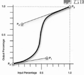
transition-timing-function
transition-timing-function:<single-transition-timing-function>[,<single-transition-timing-function>]*
---
<single-transition-timing-functiong> = ease|linear|ease-in|ease-out|ease-in-out|cubic-bezier(<nuber>,<number>,<nuber>,<number>)|step-start|step-end|steps(<interger>[,[start|end]]?)
---
/*实例*/
transition-timing-function:ease;
transition-timing-function:cubic-bezier(0.25,0.1,0.25,1);
transition-timing-function:linear;
transition-timing-function:cubic-bezier(0,0,1,1);
transition-delay
transition-delay:<time>[,<time>]*
transition-delay:0s;
transition-delay:1s;
transition-delay:1s,2s,3s;
transition
transition:<sigle-transition>[,<single-transition>]*
---
<single-transition> = [none|<single-transition-property>]||<time>||<single-transition-timing-function>||<time>
---
transition:none;
transition:left 2s ease 1s,color 2s;
Animation
Animation

animation-name
animation-name:<single-animation-name>[,<single-animation-name>]*
<single-animation-name> = none|<IDENT>
/*实例*/
animation-name:none;
animation-name:abc;
animation-name:abc,abcd;

animation-duration
animation-duration:<time>[,<time>]*
/*实例*/
animation-duration:0s;
animation-duration:1s;
animation-duration:1s,2s,3s;

animation-timing-function
animation-timing-function:<single-timing-function>[,<single-timing-function>]*
<single-timing-function> = <single-transition-timing-function>
/*实例*/
animation-timing-function:ease;
animation-timing-function:cubic-bezier(0.25,0.1,0.25,1);
animation-timing-function:linear;
animation-timing-function:cubic-bezier(0,0,1,1);

animation-iteration-count
animation-iteration-count:<single-animation-iteration-count>[,<single-animation-iteration-count>]*
<single-animation-iteration-count> = infinite|<number>
/*实例*/
animation-iteration-count:1;
animation-iteration-count:infinite;
animation-iteration-count:1,2,infinite;

animation-direction
animation-direction:<single-animation-direction>[,<single-animation-direction>]*
<single-animation-direction> = normal|reverse|alternate|alternate-reverse
/*实例*/
animation-direction:reverse;
animation-direction:alternate;
animation-direction:alternate-reverse;

animation-play-state
animation-play-state:<single-animation-play-state>[,<single-animation-play-state>]*
<single-animation-play-state> = running|paused
/*实例*/
animation-play-state:running;
animation-play-state:paused;
animation-play-state:running,paused;

animation-delay
animation-delay:<time>[,<time>]*
/*实例*/
animation-delay:0s;
animation-delay:1s;
animation-delay:1s,2s,3s;

animation-fill-mode
animation-fill-mode:<single-animation-fill-mode>[,<single-animation-fill-mode>]*
<single-animation-fill-mode> = none|backwards|forwards|both
/*实例*/
animation-fill-mode:none;
animation-fill-mode:forwards;
animation-fill-mode:forwards,backwards;

animation
/*animation-->@keyframes-->transform-->transition:translate/rotate*/
animaiton:<single-animation>[,<single-animation>]*
<single-animation> = <single-animation-name>||<time>||<single-animation-timing-function>||<time>||<single-animation-iteration-count>||<single-animation-direction>||<single-animation-fill-mode>||<single-animation-play-state>
/*实例*/
animation:none;
animation:abc 2s ease 0s 1 normal none running;
animation:abc 2s;
animation:abc 1s 2s both,abcd 2s both;
@keyframes
@keyframes

@keyframes abd{
    from
    to
}

/*实例*/
@keyframes abc{
    from{opacity:1;height:100px;}
    to{opcity:0.5;height:200px;}
}
@keyframes abc{
    0%{opacity:1;height:100px;}
    100%{opacity:0.5;height:200px;}
}
@keyframes flash{
    0%,50%,100%{opacity:1;}
    25%,75%{opacity:0;}
}
/*调用*/
animation:abc 0.5s both;
animation:flash 0.5s both;
animation:abc 0.5s both,flash 0.5s both;