/* 固定用法, 多行溢出显示省略号,最好不要设置height,让height自适应 */
.div {
  overflow: hidden;
  text-overflow: ellipsis;
  white-space: normal !important;
  display: -webkit-box;
  -webkit-line-clamp: 2;
  -webkit-box-orient: vertical;
  word-wrap: break-word;
}
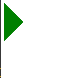
css三角形
.box {
  0px;
  height:0px;
  border-top:50px solid transparent;
  border-right:50px solid transparent;
  border-bottom:50px solid transparent;
  border-left:50px solid green;
}
backface-visibility,指定当元素背向观察者时是否可见
<!DOCTYPE html>
<html lang="en">
<head>
  <meta charset="UTF-8">
  <title>backface-visibility</title>
  <style>
    /* backface-visibility,指定当元素背面朝向观察者时是否可见。 */
    .box {
       100px;
      height: 100px;
    }
    .box1 {
      background-color: rgba(0,255,255, .4);
    }
    .box2 {
      transform: rotateY(180deg);
      background-color: blue;
    backface-visibility: hidden;
    }
  </style>
</head>
<body>
  <div class="wrap">
    <div class="box box1">box1</div>
    <div class="box box2">box2</div>
  </div>
</body>
</html>
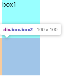
第二个div元素的backface-visibility属性设置为'hidden',所以应该是不可见的
transform-style,设置元素的子元素是位于3D空间还是平面空间。  值:flat | preserve-3d


css文字描边
text-shadow: #000 1px 0 0, #000 0 1px 0, #000 -1px 0 0, #000 0 -1px 0;