传统方法正方形用固定的形式写 直接长=宽写固定的值如下
-
.box{
-
200px;
-
height: 200px;
-
background: pink;
-
color: #666;
-
}
但是很多情况下,在移动端的设计里,图片的宽度随着不同的移动设备进行改变的,这个时候就需要用到自适应的正方形的实现。
下面介绍两种比较简单的实现方法:
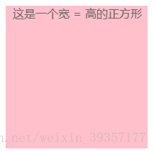
方法一:CSS3 vw 单位,vw是相对于视口的宽度。视口被均分为100单位的vw。1vw = 1% viewport width
-
.box{
-
20%;//20vw也可以
-
height: 20vw;
-
background: pink;
-
}
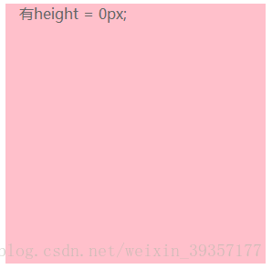
方法二:设置盒子的padding-bottom样式,让盒子的padding-bottom和盒子的宽度一样,同时设置heigh = 0px;
-
-
<html>
-
<head>
-
<meta charset="utf-8">
-
<meta http-equiv="X-UA-Compatible" content="IE=edge">
-
<title></title>
-
<link rel="stylesheet" href="">
-
</head>
-
<style>
-
*{
-
margin: 0;
-
padding: 0;
-
}
-
.box{
-
20%;
-
/* 设置height为0 ,避免盒子被内容撑开多余的高度 */
-
height: 0px;
-
/* 把盒子的高撑开,
-
和width设置同样的固定的宽度或者百分比 ,
-
百分比相对的是父元素盒子的宽度 */
-
padding-bottom: 20%;
-
background: pink;
-
color: #666;
-
}
-
</style>
-
<body>
-
<div class="box">
-
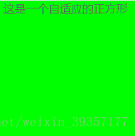
<p> 这是一个自适应的正方形</p>
-
</div>
-
</body>
-
</html>

要注意的是,如果这里没有写height:0px;当盒子里面有内容的时候,盒子会被内容撑大

如果把padding-bottom改成padding-top会出现什么现象?
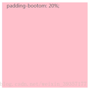
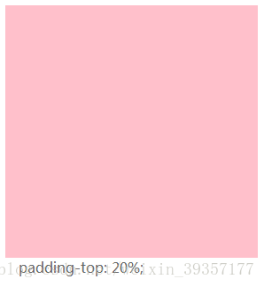
可以看出来在正方形中有内容的时候,内容会现实在正方形外面,这是因为默认文字是从左到右,从上到下的排列,所以paddin-top以后文字会在正方形外面,所以这里的paddin-bottom和padding-top并不能混用
另外因为盒子设置了heigh:0px;导致该元素里面再有子元素的时候,就无法正常设置高度。所以我们需要用到position: absolute;使当前内容脱离文档流,那么内容的高度百分比参照的就是父级的宽度
-
*{
-
margin: 0;
-
padding: 0;
-
}
-
.box{
-
20%;
-
/* 设置height为0 ,避免盒子被内容撑开多余的高度 */
-
height: 0px;
-
/* 把盒子的高撑开,
-
和width设置同样的固定的宽度或者百分比 ,
-
百分比相对的是父元素盒子的宽度 */
-
padding-bottom: 20%;
-
background: pink;
-
color: #666;
-
position: relative;
-
overflow: hidden;
-
}
-
p{
-
position: absolute;
-
100%;
-
height: 100%;
-
background: yellow;
-
}
这样子盒子里面的内容就把正方形占满啦