左中右三栏布局,左右两栏宽度固定(要想不固定将宽度值改为百分值即可),中间栏宽度自适应。
方法一(圣杯布局)
<!DOCTYPE html>
<html>
<head>
    <meta charset="utf-8">
    <meta http-equiv="X-UA-Compatible" content="IE=edge">
    <title>圣杯布局</title>
    <link rel="stylesheet" href="">
    <style>
        body {
            margin: 0;
            min-width: 550px;
        }
        #header,#footer {
            width: 100%;
            height: 40px;
            background: #666;
        }
        #container {
            padding-left: 200px;
            padding-right: 150px;
        }
        #container .column {
            position: relative;
            float: left;
            height: 200px;
        }
        #center {
            width: 100%;
            background: orange;
        }
        #left {
            width: 200px;
            right: 200px;
            margin-left: -100%;
            background: green;
        }
        #right {
            width: 150px;
            margin-right: -150px;
            background: pink;
        }
        #footer {
            clear: both;
        }
    </style>
</head>
<body>
    <div id="header"></div>
    <div id="container">
        <div id="center" class="column">center</div>
        <div id="left" class="column">left</div>
        <div id="right" class="column">right</div>
    </div>
    <div id="footer"></div>
</body>
</html>

圣杯布局的原理就是当子元素处于浮动状态时,设置负margin,子元素会叠盖到兄弟元素之上。
代码分析
步骤1: 创建框架
<div id="header"></div><div id="container"></div><div id="footer"></div>
为容器container添加左内边距为左栏的宽度,右内边距为右栏的宽度
#container {
  padding-left: 200px;   /* LC width */
  padding-right: 150px;  /* RC width */
}
布局看起来会是这个样子:

步骤2: 添加列
    <div id="header"></div>
    <div id="container">
        <div id="center" class="column">center</div>
        <div id="left" class="column">left</div>
        <div id="right" class="column">right</div>
    </div>
    <div id="footer"></div>
接下来添加宽度和浮动,且为footer清除浮动
#container .column {
  float: left;
}
#center {
  width: 100%;
}
#left {
  width: 200px;  /* LC width */
}
#right {
  width: 150px;  /* RC width */
}
#footer {
  clear: both;
}
center宽100%是指容器container的宽度(不包括padding),三列现在按顺序排队,因为center占用100%的可用空间,left和right只能被换到下一行。效果如下:

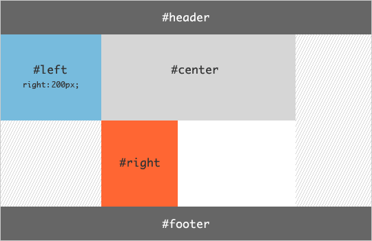
步骤3: 将左栏left推进center左侧区域
#left {
  width: 200px;        /* LC width */
  margin-left: -100%;
}
把left拉到最容器最左边,使用margin-left:-100%

#container .columns {
  float: left;
  position: relative;
}
#left {
  width: 200px;        /* LC width */
  margin-left: -100%;
  right: 200px;        /* LC width */
}
将left推到容器左内边距区域,使用相对定位
步骤4: 将右栏right推进center右侧区域
#right {
  width: 150px;          /* RC width */
  margin-right: -150px;  /* RC width */
}
也可以利用步骤3的方法
#right {
    width: 150px;
    margin-left: -150px;
    right: -150px;
}

步骤5:设计优化
如果调整浏览器窗口的大小使center小于left,在标准浏览器中布局会被破坏。在body上设置一个min-width来解决这个问题。
最小宽度为 2倍的left宽度+right宽度
body {
  min-width: 550px;  /* 2x LC width + RC width */
}
利用padding和margin正负相消实现多列等高(padding补偿法)
首先把列的padding-bottom设为一个足够大的值,再把列的margin-bottom设一个与前面的padding-bottom的正值相抵消的负值,父容器设置超出隐藏,这样子父容器的高度就还是它里面的列没有设定padding-bottom时的高度,当它里面的任一列高度增加了,则父容器的高度被撑到它里面最高那列的高度,其他比这列矮的列则会用它们的padding-bottom来补偿这部分高度差。因为背景是可以用在padding占用的空间里的,而且边框也是跟随padding变化的,所以就成功的完成了一个障眼法。
#container {
  overflow: hidden;
}
#container .column {
  padding-bottom: 20010px;  /* X + padding-bottom */
  margin-bottom: -20000px;  /* X */
}
#footer {
  position: relative;
}
方法二:(box-sizing法)
<!DOCTYPE html>
<html>
<head>
    <meta charset="utf-8">
    <meta http-equiv="X-UA-Compatible" content="IE=edge">
    <title>圣杯布局</title>
    <link rel="stylesheet" href="">
    <style>
        .content {
            width: 80%;
            margin: 0 auto;
        }
        .main {
            width: 100%;
            height: 200px;
            float: left;
            background: orange;
            box-sizing: border-box;
            padding-left: 200px;
            padding-right: 200px;
        }
        .left {
            width: 200px;
            height: 200px;
            background: red;
            float: left;
            margin-left: -100%;
        }
        .right {
            width: 200px;
            height: 200px;
            background: blue;
            float: left;
            margin-left: -200px;
        }
    </style>
</head>
<body>
    <div class="content">
        <div class="main">Main</div>
        <div class="left"></div>
        <div class="right"></div>
    </div>
</body>
</html>
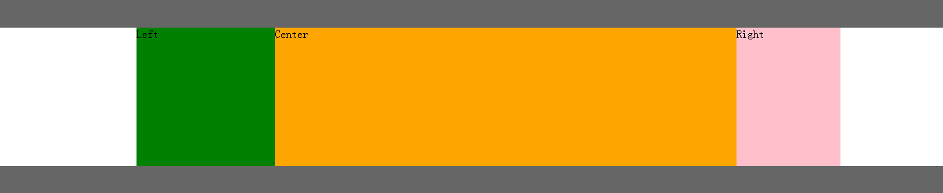
 方法三(双飞翼布局)
增加一个div,不用相对布局,只用到了浮动和负边距,这就是我们所说的双飞翼布局。
去掉了左右栏的相对定位,去掉包裹层padding,以中间栏新增div的margin代替
<!DOCTYPE html>
<html>
<head>
    <meta charset="utf-8">
    <meta http-equiv="X-UA-Compatible" content="IE=edge">
    <title>双飞翼布局</title>
    <link rel="stylesheet" href="">
    <style>
        body {
            margin: 0;
        }
        .header, .footer {
            width: 100%;
            height: 40px;
            background: #666;
        }
        .container {
            padding-left: 200px;
            padding-right: 150px;
        }
        .left {
            width: 200px;
            float: left;
            margin-left: -100%;
            background: green;
            height: 200px;
        }
        .center {
            width: 100%;
            float: left;
            height: 200px;
        }
        .right {
            width: 150px;
            float: left;
            margin-left: -150px;
            background: pink;
            height: 200px;
        }
        .inner {
            margin-left: 200px;
            margin-right: 150px;
            background: orange;
        }
        .footer {
            clear: both;
        }
    </style>
</head>
<body>
    <div class="header"></div>
    <div class="container">
        <div class="center">
            <div class="inner">Center</div>
        </div>
        <div class="left">Left</div>
        <div class="right">Right</div>
    </div>
    <div class="footer"></div>
</body>
</html>
方法四(浮动法)
左右两列分别左浮动和右浮动并给一个固定宽度,中间不浮动,也不设定宽度。
中间那列需要把左右两个外边距分别设为左右两列的宽度,center要放到left和right的后面
<!DOCTYPE html>
<html>
<head>
    <meta charset="utf-8">
    <meta http-equiv="X-UA-Compatible" content="IE=edge">
    <title>宽度自适应布局</title>
    <link rel="stylesheet" href="">
    <style>
        body {
            margin: 0;
        }
        .left {
            width: 200px;
            height: 200px;
            float: left;
            background: pink;
        }
        .center {
            background: #ccc;
            height: 200px;
            margin-left: 200px;
            margin-right: 100px;
        }
        .right {
            width: 100px;
            height: 200px;
            background: orange;
            float: right;
        }
    </style>
</head>
<body>
    <div class="container">
        <div class="left">Left</div>
        <div class="right">Right</div>
        <div class="center">Center</div>
    </div>
</body>
</html>
方法五(绝对定位法)
实现要点:左栏left、右栏right设为绝对定位,分别设置width。左栏设置left和top,右栏设置right和top。自适应的中间栏设置为相对定位,设置margin:0 200px。
<!DOCTYPE html>
<html>
<head>
    <meta charset="utf-8">
    <meta http-equiv="X-UA-Compatible" content="IE=edge">
    <title></title>
    <link rel="stylesheet" href="">
    <style>
        body {
            margin: 0;
        }
        .header {
            height: 42px;
            background: #666;
        }
        .left {
            width: 200px;
            height: 200px;
            background: orange;
            position: absolute;
            top: 42px;
            left: 0;
        }
        .center {
            height: 200px;
            background: #ddd;
            margin-right: 200px;
            margin-left: 200px;
            position: relative;
            top: 0;
        }
        .right {
            width: 200px;
            height: 200px;
            background: red;
            position: absolute;
            top: 42px;
            right: 0;
        }
    </style>
</head>
<body>
    <div class="header"></div>
    <div class="container">
        <div class="center">Center</div>
        <div class="left">Left</div>
        <div class="right">Right</div>
    </div>
</body>
</html>
方法六(flex布局)
容器displsy:flex; left,right栏定宽,center栏flex:1;自适应
<!DOCTYPE html>
<html>
<head>
    <meta charset="utf-8">
    <meta http-equiv="X-UA-Compatible" content="IE=edge">
    <title>js</title>
    <link rel="stylesheet" href="">
    <style>
        body {
            margin: 0;
        }
        header, footer {
            width: 100%;
            height: 40px;
            background: #eee;
        }
        .container {
            display: flex;
        }
        .center {
            flex: 1;
            background: rgb(33,111,11);
        }
        .left, .right {
            flex: 0 12em;
        }
        .right {
            background: rgb(111,22,33);
        }
        .left {
            background: rgb(11,11,123);
        }
    </style>
</head>
<body>
    <header>Header</header>
    <div class="container">
        <div class="left">Left</div>
        <div class="center">Center</div>
        <div class="right">Right</div>
    </div>
    <footer>Footer</footer>
</body>
</html>
参考:
http://alistapart.com/article/holygrail
http://www.cnblogs.com/2050/archive/2012/07/30/2614852.html
http://www.cnblogs.com/ljchow/archive/2010/07/27/1785632.html