1.首先安装
cnpm install echarts -S
(可能会出现报错情况,查看node是不是符合,node_modules删除重新下载)
2.main.js引入
import echarts from "echarts";
Vue.prototype.$echarts = echarts;(原型,在需要的地方引入
let myChart = this.$echarts.init(document.getElementById("myChart"));
)3.
<div id="myChart" :style="{ '300px', height: '300px'}"></div>
4.
引入
import echarts from "echarts";
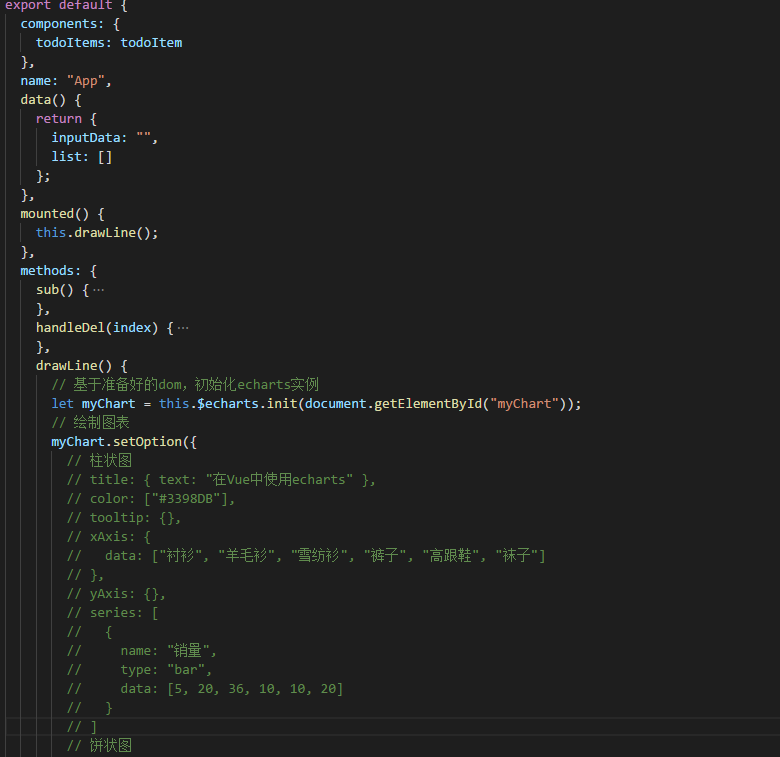
<script>
import todoItem from "./components/listItem"; //引入listItem组件
import echarts from "echarts";
export default {
components: {
todoItems: todoItem
},
name: "App",
data() {
return {
inputData: "",
list: []
};
},
mounted() {
this.drawLine();
},
methods: {
drawLine() {
// 基于准备好的dom,初始化echarts实例
let myChart = this.$echarts.init(document.getElementById("myChart"));
// 绘制图表
myChart.setOption({
// 柱状图
// title: { text: "在Vue中使用echarts" },
// color: ["#3398DB"],
// tooltip: {},
// xAxis: {
// data: ["衬衫", "羊毛衫", "雪纺衫", "裤子", "高跟鞋", "袜子"]
// },
// yAxis: {},
// series: [
// {
// name: "销量",
// type: "bar",
// data: [5, 20, 36, 10, 10, 20]
// }
// ]
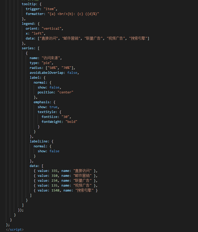
// 饼状图
tooltip: {
trigger: "item",
formatter: "{a} <br/>{b}: {c} ({d}%)"
},
legend: {
orient: "vertical",
x: "left",
data: ["直接访问", "邮件营销", "联盟广告", "视频广告", "搜索引擎"]
},
series: [
{
name: "访问来源",
type: "pie",
radius: ["50%", "70%"],
avoidLabelOverlap: false,
label: {
normal: {
show: false,
position: "center"
},
emphasis: {
show: true,
textStyle: {
fontSize: "30",
fontWeight: "bold"
}
}
},
labelLine: {
normal: {
show: false
}
},
data: [
{ value: 335, name: "直接访问" },
{ value: 310, name: "邮件营销" },
{ value: 234, name: "联盟广告" },
{ value: 135, name: "视频广告" },
{ value: 1548, name: "搜索引擎" }
]
}
]
});
}
}
};
</script>