@
Matplotlib → 一个python版的matlab绘图接口,以2D为主,支持python、numpy、pandas基本数据结构,运营高效且有较丰富的图表库
import numpy as np
import pandas as pd
import matplotlib.pyplot as plt
# 导入相关模块
一、Matplotlib图表各个部分详解
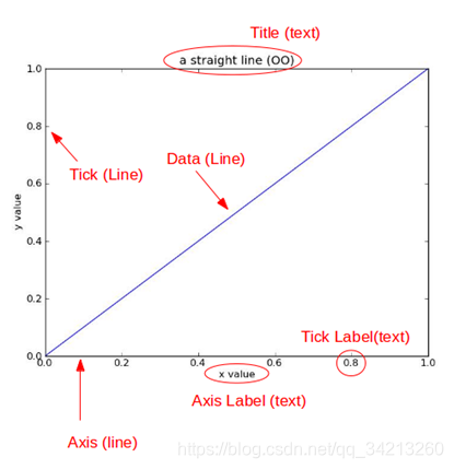
title为图像标题,Axis为坐标轴, Label为坐标轴标注,Tick为刻度线,Tick Label为刻度注释
二、图表窗口
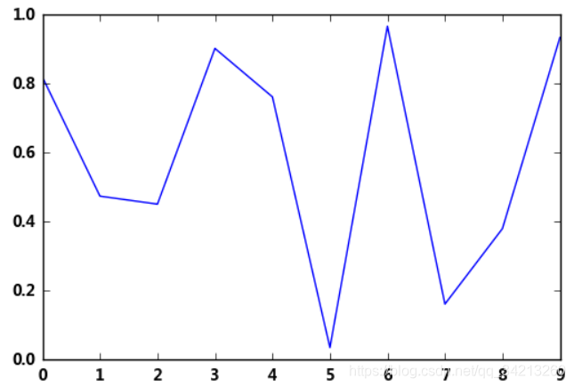
2.1 直接生成图表 plt.show()
plt.plot(np.random.rand(10)) # 折线图
plt.show()
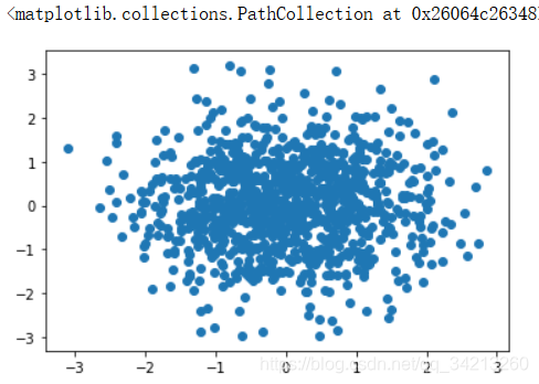
2.2 魔法函数,嵌入图表%matplotlib inline
					使用魔法函数后,就不用plt.show()也能显示图表了
			  魔法函数只有一种可以生效,运行完一个要使用另一个必须重启程序
%matplotlib inline
x = np.random.randn(1000)
y = np.random.randn(1000)
plt.scatter(x,y) #二维散点图
# <matplotlib.collections.PathCollection at ...> 代表该图表对象
2.3 魔法函数,弹出可交互的matplotlib窗口
这种窗口可在绘图后做一定调整与交互
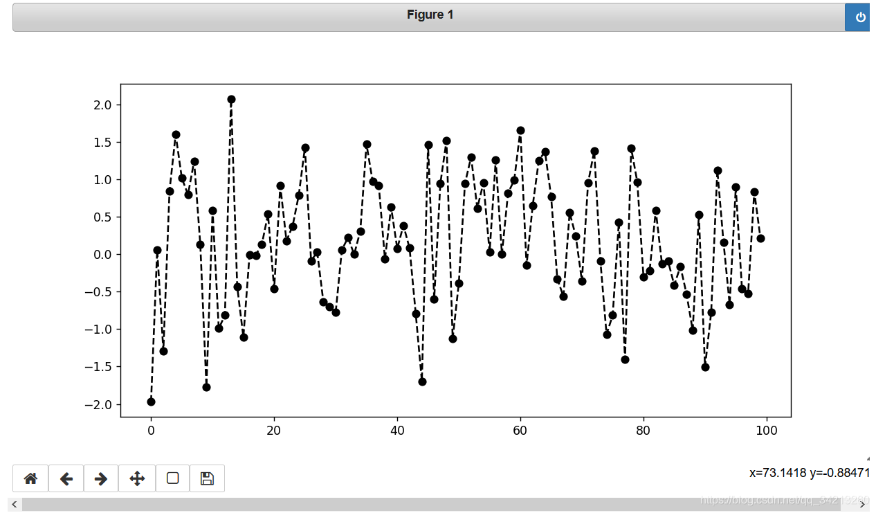
%matplotlib notebook
s = pd.Series(np.random.randn(100))
s.plot(style = 'k--o',figsize=(10,5))
2.4 魔法函数,弹出matplotlib控制台
控制台的效果和matlab内的弹出窗口一样
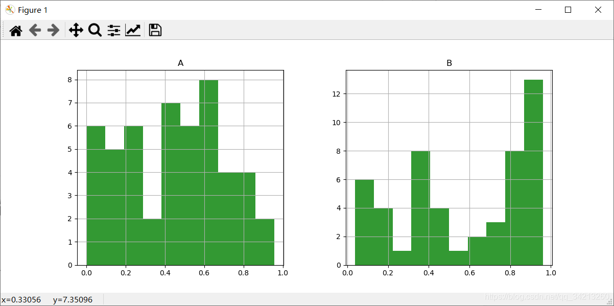
%matplotlib qt5
df = pd.DataFrame(np.random.rand(50,2),columns=['A','B'])
df.hist(figsize=(12,5),color='g',alpha=0.8) # 直方图
2.5 关闭窗口和清空图表内容
`#plt.close()
# 关闭窗口

#plt.gcf().clear()
# 清空图表内内容`
三、图表的基本元素
3.1图名,图例,轴标签,轴边界,轴刻度,轴刻度标签等
df = pd.DataFrame(np.random.rand(10,2),columns=['A','B'])
fig = df.plot(figsize=(6,4))
# figsize:创建图表窗口,设置窗口大小
# 创建图表对象,并赋值与fig

plt.title('Interesting Graph - Check it out')  # 图名
plt.xlabel('Plot Number')  # x轴标签
plt.ylabel('Important var') # y轴标签

plt.legend(loc = 'upper right')
# 显示图例,loc表示位置
# 'best'         : 0, (only implemented for axes legends)(自适应方式)
# 'upper right'  : 1,
# 'upper left'   : 2,
# 'lower left'   : 3,
# 'lower right'  : 4,
# 'right'        : 5,
# 'center left'  : 6,
# 'center right' : 7,
# 'lower center' : 8,
# 'upper center' : 9,
# 'center'       : 10,

plt.xlim([0,12])  # x轴边界(最小刻度到最大刻度的范围)
plt.ylim([0,1.5])  # y轴边界
plt.xticks(range(10))  # 设置x刻度
plt.yticks([0,0.2,0.4,0.6,0.8,1.0,1.2])  # 设置y刻度

#刻度标签应该与刻度一致
fig.set_xticklabels("%.1f" %i for i in range(10))  # x轴刻度标签
fig.set_yticklabels("%.2f" %i for i in [0,0.2,0.4,0.6,0.8,1.0,1.2])  # y轴刻度标签
# 范围只限定图表的长度,刻度则是决定显示的标尺 → 这里x轴范围是0-12,但刻度只是0-9,刻度标签使得其显示1位小数
# 轴标签则是显示刻度的标签

print(fig,type(fig))
# 查看表格本身的显示方式,以及类别
3.2 网格、刻度、注释参数设置
# 其他元素可视性
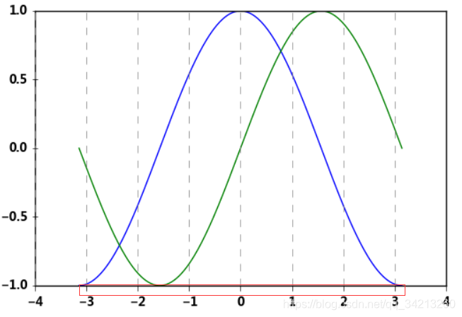
# 通过ndarry创建图表
x = np.linspace(-np.pi,np.pi,256,endpoint = True)
c, s = np.cos(x), np.sin(x)
plt.plot(x, c)
plt.plot(x, s)
# 显示网格
# linestyle:线型
# color:颜色
# linewidth:宽度
# axis:x,y,both,显示x/y/两者的格网
plt.grid(True, linestyle = "--",color = "gray", linewidth = "0.5",axis = 'x')
# 刻度显示
plt.tick_params(bottom='on',top='off',left='on',right='off')
# 设置刻度的方向,in,out,inout
# 这里需要导入matploltib,而不仅仅导入matplotlib.pyplot
import matplotlib
matplotlib.rcParams['xtick.direction'] = 'out'
matplotlib.rcParams['ytick.direction'] = 'inout'
frame = plt.gca()# 获取当前子图
# 关闭坐标轴
#plt.axis('off')
# x/y 轴不可见
#frame.axes.get_xaxis().set_visible(False)
#frame.axes.get_yaxis().set_visible(False)
刻度方向就是刻度是否凸出图标边框这部分
# 注解

df = pd.DataFrame(np.random.randn(10,2))
df.plot(style = '--o')
plt.text(5,0.5,'hahaha',fontsize=10)
# 注解 → 横坐标,纵坐标,注解字符串
3.3 线型 linestyle
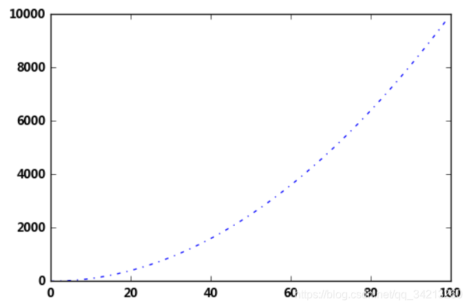
plt.plot([i**2 for i in range(100)],
        linestyle = '-.',linewidth=0.5)
# '-'       solid line style
# '--'      dashed line style
# '-.'      dash-dot line style
# ':'       dotted line style
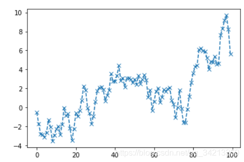
3.4 点型 marker
s = pd.Series(np.random.randn(100).cumsum())
s.plot(linestyle = '--',
      marker = 'x')
# '.'       point marker
# ','       pixel marker
# 'o'       circle marker
# 'v'       triangle_down marker
# '^'       triangle_up marker
# '<'       triangle_left marker
# '>'       triangle_right marker
# '1'       tri_down marker
# '2'       tri_up marker
# '3'       tri_left marker
# '4'       tri_right marker
# 's'       square marker
# 'p'       pentagon marker
# '*'       star marker
# 'h'       hexagon1 marker
# 'H'       hexagon2 marker
# '+'       plus marker
# 'x'       x marker
# 'D'       diamond marker
# 'd'       thin_diamond marker
# '|'       vline marker
# '_'       hline marker
3.5 color参数
plt.hist(np.random.randn(100),
        color = 'g',alpha = 0.8)
# alpha:0-1,透明度
# 常用颜色简写:red-r, green-g, black-k, blue-b, yellow-y

df = pd.DataFrame(np.random.randn(1000, 4),columns=list('ABCD'))
df = df.cumsum()
df.plot(style = '--.',alpha = 0.8,colormap = 'GnBu')
# colormap:颜色板,包括:
# Accent, Accent_r, Blues, Blues_r, BrBG, BrBG_r, BuGn, BuGn_r, BuPu, BuPu_r, CMRmap, CMRmap_r, Dark2, Dark2_r, GnBu, GnBu_r, Greens, Greens_r,
# Greys, Greys_r, OrRd, OrRd_r, Oranges, Oranges_r, PRGn, PRGn_r, Paired, Paired_r, Pastel1, Pastel1_r, Pastel2, Pastel2_r, PiYG, PiYG_r,
# PuBu, PuBuGn, PuBuGn_r, PuBu_r, PuOr, PuOr_r, PuRd, PuRd_r, Purples, Purples_r, RdBu, RdBu_r, RdGy, RdGy_r, RdPu, RdPu_r, RdYlBu, RdYlBu_r,
# RdYlGn, RdYlGn_r, Reds, Reds_r, Set1, Set1_r, Set2, Set2_r, Set3, Set3_r, Spectral, Spectral_r, Wistia, Wistia_r, YlGn, YlGnBu, YlGnBu_r,
# YlGn_r, YlOrBr, YlOrBr_r, YlOrRd, YlOrRd_r, afmhot, afmhot_r, autumn, autumn_r, binary, binary_r, bone, bone_r, brg, brg_r, bwr, bwr_r,
# cool, cool_r, coolwarm, coolwarm_r, copper, copper_r, cubehelix, cubehelix_r, flag, flag_r, gist_earth, gist_earth_r, gist_gray, gist_gray_r,
# gist_heat, gist_heat_r, gist_ncar, gist_ncar_r, gist_rainbow, gist_rainbow_r, gist_stern, gist_stern_r, gist_yarg, gist_yarg_r, gnuplot,
# gnuplot2, gnuplot2_r, gnuplot_r, gray, gray_r, hot, hot_r, hsv, hsv_r, inferno, inferno_r, jet, jet_r, magma, magma_r, nipy_spectral,
# nipy_spectral_r, ocean, ocean_r, pink, pink_r, plasma, plasma_r, prism, prism_r, rainbow, rainbow_r, seismic, seismic_r, spectral,
# spectral_r ,spring, spring_r, summer, summer_r, terrain, terrain_r, viridis, viridis_r, winter, winter_r
详细参数见:https://download.csdn.net/download/qq_34213260/12534748
3.6 style参数,相当于包含linestyle,marker,color
ts = pd.Series(np.random.randn(1000).cumsum(), index=pd.date_range('1/1/2000', periods=1000))
ts.plot(style = '--g.',grid = True)
# style → 风格字符串,这里包括了linestyle(-),color(g),marker(.)
3.7 整体风格样式
import matplotlib.style as psl
print(plt.style.available)# 查看样式列表

psl.use('ggplot')
ts = pd.Series(np.random.randn(1000).cumsum(), index=pd.date_range('1/1/2000', periods=1000))
ts.plot(style = '--g.',grid = True,figsize=(10,6))


# 一旦选用样式后,所有图表都会有样式,重启后才能关掉
四、子图
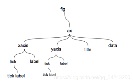
在matplotlib中,整个图像为一个Figure对象。在Figure对象中可以包含一个或者多个Axes对象。每个Axes(ax)对象都是一个拥有自己坐标系统的绘图区域
plt.figure, plt.subplot
4.1 子图创建
- 方法一
# 子图创建1 - 先建立子图然后填充图表
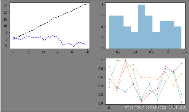
fig = plt.figure(figsize=(10,6),facecolor = 'gray')
ax1 = fig.add_subplot(2,2,1) # 第一行的左图
plt.plot(np.random.rand(50).cumsum(),'k--')
plt.plot(np.random.randn(50).cumsum(),'b--')
# 先创建图表figure,然后生成子图,(2,2,1)代表创建2*2的矩阵表格,然后选择第一个,顺序是从左到右从上到下
# 创建子图后绘制图表,会绘制到最后一个子图
# 也可以直接在子图后用图表创建函数直接生成图表
ax2 = fig.add_subplot(2,2,2) # 第一行的右图
ax2.hist(np.random.rand(50),alpha=0.5)
ax4 = fig.add_subplot(2,2,4) # 第二行的右图
df2 = pd.DataFrame(np.random.rand(10, 4), columns=['a', 'b', 'c', 'd'])
ax4.plot(df2,alpha=0.5,linestyle='--',marker='.')
- 方法二
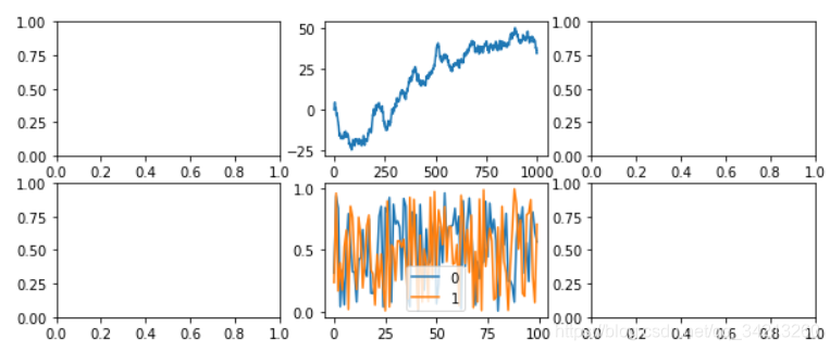
# 子图创建2 - 创建一个新的figure,并返回一个subplot对象的numpy数组 → plt.subplot

fig,axes = plt.subplots(2,3,figsize=(10,4))
ts = pd.Series(np.random.randn(1000).cumsum())
print(axes, axes.shape, type(axes))
# 生成图表对象的数组

ax1 = axes[0,1]
ax1.plot(ts)
df = pd.DataFrame(np.random.rand(100,2))
df.plot(ax=axes[1,1])
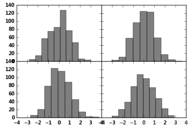
4.2 plt.subplots子图参数调整
# plt.subplots,参数调整

fig,axes = plt.subplots(2,2,sharex=True,sharey=True)
# sharex,sharey:是否共享x,y刻度

for i in range(2):
    for j in range(2):
        axes[i,j].hist(np.random.randn(500),color='k',alpha=0.5)
plt.subplots_adjust(wspace=0,hspace=0)
# wspace,hspace:用于控制子图间隔的宽度和高度的百分比,比如subplot之间的间距
五、基本图标类型绘制
图表类别:线形图、柱状图、密度图,以横纵坐标两个维度为主
同时可延展出多种其他图表样式
plt.plot(kind='line', ax=None, figsize=None, use_index=True, title=None, grid=None,
legend=False, style=None, logx=False, logy=False, loglog=False, xticks=None, yticks=None,
xlim=None, ylim=None,  rot=None, fontsize=None, colormap=None, table=False, yerr=None,
xerr=None, label=None, secondary_y=False, **kwds)
默认是折线图
5.1 Series直接生成图表
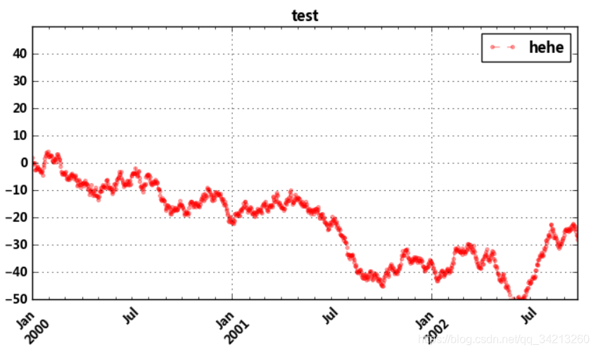
ts = pd.Series(np.random.randn(1000), index=pd.date_range('1/1/2000', periods=1000))
ts = ts.cumsum()
ts.plot(kind='line',
       label = 'hehe',
       style = '--g.',
       color = 'red',
       alpha = 0.4,
       use_index = True,
       rot = 45,
       grid = True,
       ylim = [-50,50],
       yticks = list(range(-50,50,10)),
       figsize = (8,4),
       title = 'test',
       legend = True)
#plt.grid(True, linestyle = "--",color = "gray", linewidth = "0.5",axis = 'x')  # 网格
plt.legend()
# Series.plot():series的index为横坐标,value为纵坐标
# kind → line,bar,barh...(折线图,柱状图,柱状图-横...)
# label → 图例标签,Dataframe格式以列名为label
# style → 风格字符串,这里包括了linestyle(-),marker(.),color(g)
# color → 颜色,有color指定时候,以color颜色为准
# alpha → 透明度,0-1
# use_index → 将索引用为刻度标签,默认为True
# rot → 旋转刻度标签,0-360
# grid → 显示网格,一般直接用plt.grid
# xlim,ylim → x,y轴界限
# xticks,yticks → x,y轴刻度值
# figsize → 图像大小
# title → 图名
# legend → 是否显示图例,一般直接用plt.legend()
# 也可以 → plt.plot()
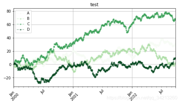
5.2 Dataframe直接生成图表
df = pd.DataFrame(np.random.randn(1000, 4), index=ts.index, columns=list('ABCD'))
df = df.cumsum()
df.plot(kind='line',
       style = '--.',
       alpha = 0.4,
       use_index = True,
       rot = 45,
       grid = True,
       figsize = (8,4),
       title = 'test',
       legend = True,
       subplots = False,
       colormap = 'Greens')
# subplots → 是否将各个列绘制到不同图表,默认False
# 也可以 → plt.plot(df)
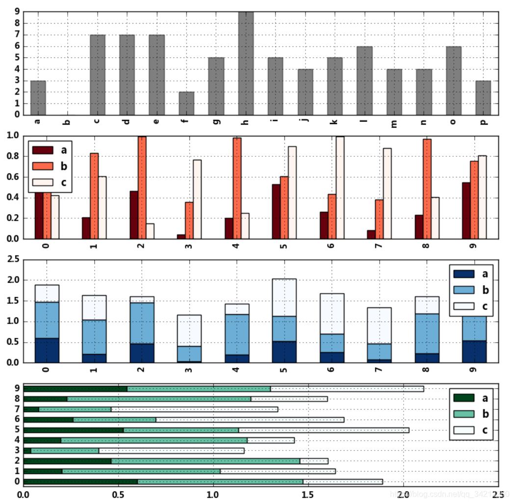
5.3 柱状图与堆叠图
fig,axes = plt.subplots(4,1,figsize = (10,10))
s = pd.Series(np.random.randint(0,10,16),index = list('abcdefghijklmnop'))
df = pd.DataFrame(np.random.rand(10,3), columns=['a','b','c'])

s.plot(kind='bar',color = 'k',grid = True,alpha = 0.5,ax = axes[0])  # ax参数 → 选择第几个子图
# 单系列柱状图方法一:plt.plot(kind='bar/barh')

df.plot(kind='bar',ax = axes[1],grid = True,colormap='Reds_r')
# 多系列柱状图

df.plot(kind='bar',ax = axes[2],grid = True,colormap='Blues_r',stacked=True)
# 多系列堆叠图
# stacked → 堆叠

df.plot.barh(ax = axes[3],grid = True,stacked=True,colormap = 'BuGn_r')
# 新版本plt.plot.<kind>
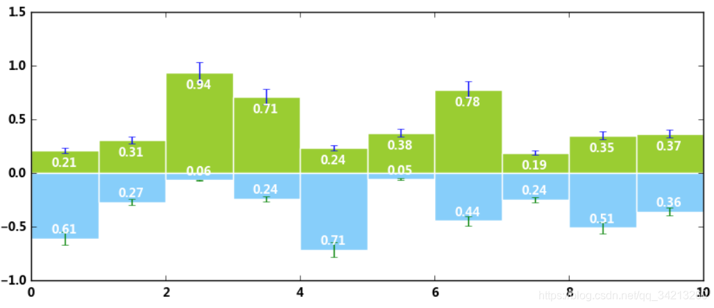
plt.figure(figsize=(10,4))
x = np.arange(10)
y1 = np.random.rand(10)
y2 = -np.random.rand(10)

plt.bar(x,y1,width = 1,facecolor = 'yellowgreen',edgecolor = 'white',yerr = y1*0.1)
plt.bar(x,y2,width = 1,facecolor = 'lightskyblue',edgecolor = 'white',yerr = y2*0.1)
# x,y参数:x,y值
# width:宽度比例
# facecolor柱状图里填充的颜色、edgecolor是边框的颜色
# left-每个柱x轴左边界,bottom-每个柱y轴下边界 → bottom扩展即可化为甘特图 Gantt Chart
# align:决定整个bar图分布,默认left表示默认从左边界开始绘制,center会将图绘制在中间位置
# xerr/yerr :x/y方向error bar

for i,j in zip(x,y1):
    plt.text(i+0.3,j-0.15,'%.2f' % j, color = 'white')
for i,j in zip(x,y2):
    plt.text(i+0.3,j+0.05,'%.2f' % -j, color = 'white')
# 给图添加text
# zip() 函数用于将可迭代的对象作为参数,将对象中对应的元素打包成一个个元组,然后返回由这些元组组成的列表。
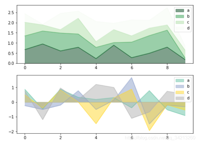
5.4 面积图
fig,axes = plt.subplots(2,1,figsize = (8,6))
df1 = pd.DataFrame(np.random.rand(10, 4), columns=['a', 'b', 'c', 'd'])
df2 = pd.DataFrame(np.random.randn(10, 4), columns=['a', 'b', 'c', 'd'])

df1.plot.area(colormap = 'Greens_r',alpha = 0.5,ax = axes[0])
df2.plot.area(stacked=False,colormap = 'Set2',alpha = 0.5,ax = axes[1])
# 使用Series.plot.area()和DataFrame.plot.area()创建面积图
# stacked:是否堆叠,默认情况下,区域图被堆叠
# 为了产生堆积面积图,每列必须是正值或全部负值!
# 当数据有NaN时候,自动填充0,所以图标签需要清洗掉缺失值
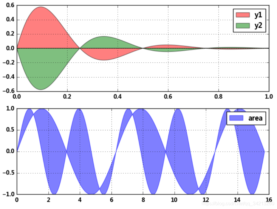
5.5 填图
fig,axes = plt.subplots(2,1,figsize = (8,6))

x = np.linspace(0, 1, 500)
y1 = np.sin(4 * np.pi * x) * np.exp(-5 * x)
y2 = -np.sin(4 * np.pi * x) * np.exp(-5 * x)
axes[0].fill(x, y1, 'r',alpha=0.5,label='y1')
axes[0].fill(x, y2, 'g',alpha=0.5,label='y2')
# 对函数与坐标轴之间的区域进行填充,使用fill函数
# 也可写成:plt.fill(x, y1, 'r',x, y2, 'g',alpha=0.5)

x = np.linspace(0, 5 * np.pi, 1000)
y1 = np.sin(x)
y2 = np.sin(2 * x)
axes[1].fill_between(x, y1, y2, color ='b',alpha=0.5,label='area')
# 填充两个函数之间的区域,使用fill_between函数

for i in range(2):
    axes[i].legend()
    axes[i].grid()
# 添加图例、格网
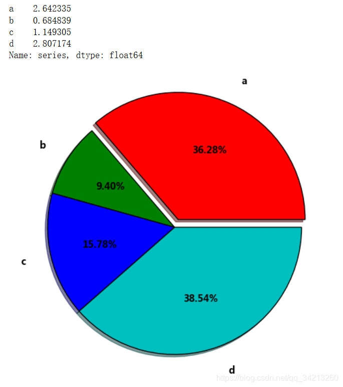
5.6 饼图 plt.pie()
# plt.pie(x, explode=None, labels=None, colors=None, autopct=None, pctdistance=0.6, shadow=False, labeldistance=1.1, startangle=None,
# radius=None, counterclock=True, wedgeprops=None, textprops=None, center=(0, 0), frame=False, hold=None, data=None)

s = pd.Series(3 * np.random.rand(4), index=['a', 'b', 'c', 'd'], name='series')
plt.axis('equal')  # 保证长宽相等
plt.pie(s,
       explode = [0.1,0,0,0],
       labels = s.index,
       colors=['r', 'g', 'b', 'c'],
       autopct='%.2f%%',
       pctdistance=0.6,
       labeldistance = 1.2,
       shadow = True,
       startangle=0,
       radius=1.5,
       frame=False)
print(s)
# 第一个参数:数据
# explode:指定每部分的偏移量
# labels:标签
# colors:颜色
# autopct:饼图上的数据标签显示方式
# pctdistance:每个饼切片的中心和通过autopct生成的文本开始之间的比例
# labeldistance:被画饼标记的直径,默认值:1.1
# shadow:阴影
# startangle:开始角度
# radius:半径
# frame:图框
# counterclock:指定指针方向,顺时针或者逆时针
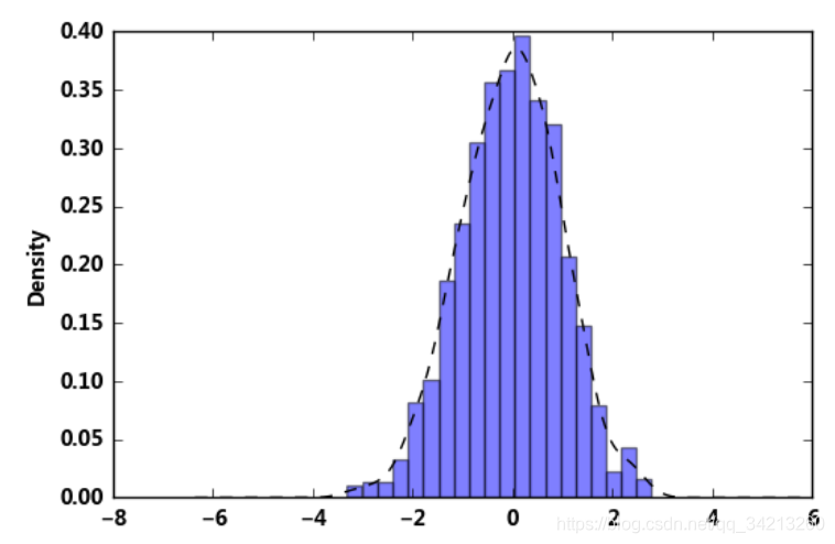
5.7 直方图+密度图
s = pd.Series(np.random.randn(1000))
s.hist(bins = 20,
       histtype = 'bar',
       align = 'mid',
       orientation = 'vertical',
       alpha=0.5,
       normed =True)
# bin:箱子的宽度
# normed 标准化
# histtype 风格,bar,barstacked,step,stepfilled
# orientation 水平还是垂直{‘horizontal’, ‘vertical’}
# align : {‘left’, ‘mid’, ‘right’}, optional(对齐方式)

s.plot(kind='kde',style='k--')
# 密度图
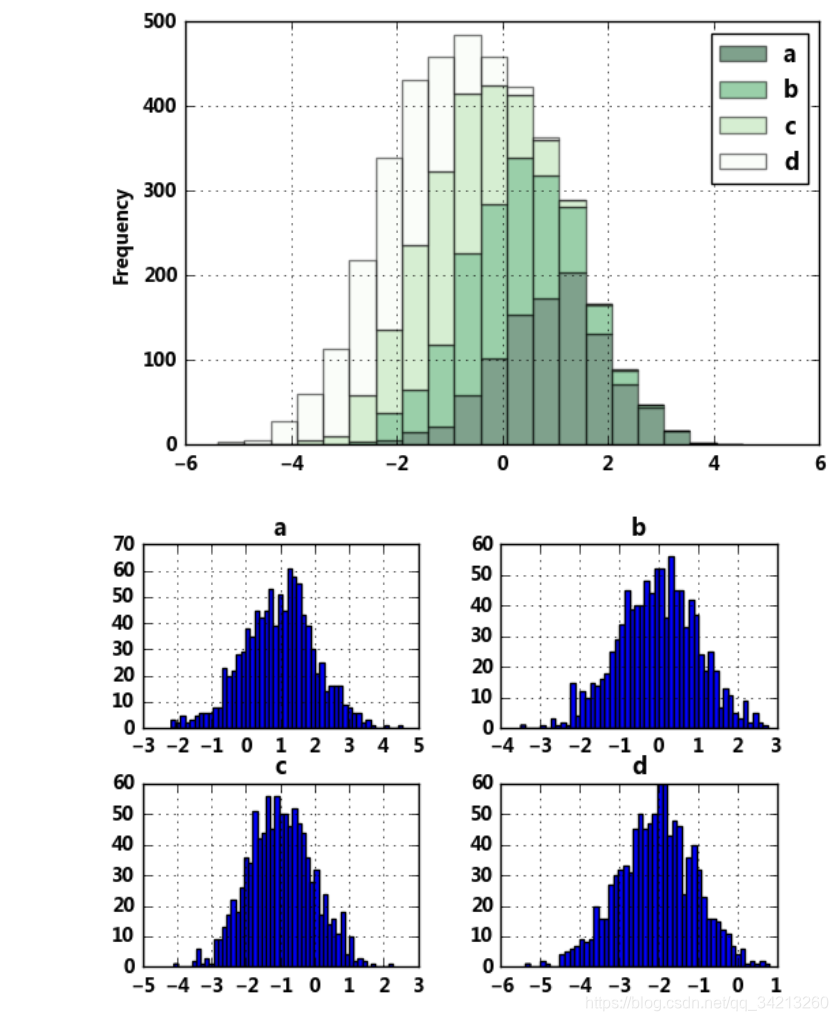
5.8 堆叠直方图
plt.figure(num=1)
df = pd.DataFrame({'a': np.random.randn(1000) + 1, 'b': np.random.randn(1000),
                    'c': np.random.randn(1000) - 1, 'd': np.random.randn(1000)-2},
                   columns=['a', 'b', 'c','d'])
df.plot.hist(stacked=True,
             bins=20,
             colormap='Greens_r',
             alpha=0.5,
             grid=True)
# 使用DataFrame.plot.hist()和Series.plot.hist()方法绘制
# stacked:是否堆叠

df.hist(bins=50)
# 生成多个直方图
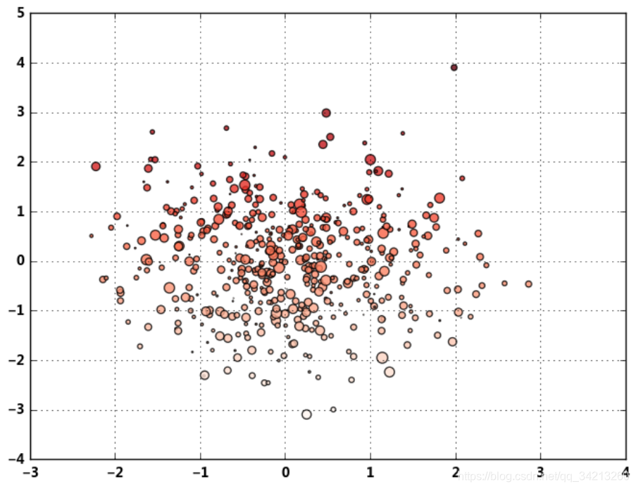
5.9 plt.scatter()散点图
# plt.scatter(x, y, s=20, c=None, marker='o', cmap=None, norm=None, vmin=None, vmax=None,
# alpha=None, linewidths=None, verts=None, edgecolors=None, hold=None, data=None, **kwargs)

plt.figure(figsize=(8,6))
x = np.random.randn(1000)
y = np.random.randn(1000)
plt.scatter(x,y,marker='.',
           s = np.random.randn(1000)*100,
           cmap = 'Reds',
           c = y,
           alpha = 0.8,)
plt.grid()
# s:散点的大小
# c:散点的颜色
# vmin,vmax:亮度设置,标量
# cmap:colormap
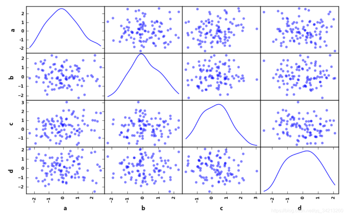
5.10 pd.scatter_matrix()散点矩阵
# pd.scatter_matrix(frame, alpha=0.5, figsize=None, ax=None,
# grid=False, diagonal='hist', marker='.', density_kwds=None, hist_kwds=None, range_padding=0.05, **kwds)

df = pd.DataFrame(np.random.randn(100,4),columns = ['a','b','c','d'])
pd.scatter_matrix(df,figsize=(10,6),
                 marker = 'o',
                 diagonal='kde',
                 alpha = 0.5,
                 range_padding=0.1)
# diagonal:({‘hist’, ‘kde’}),必须且只能在{‘hist’, ‘kde’}中选择1个 → 每个指标的频率图
# range_padding:(float, 可选),图像在x轴、y轴原点附近的留白(padding),该值越大,留白距离越大,图像远离坐标原点
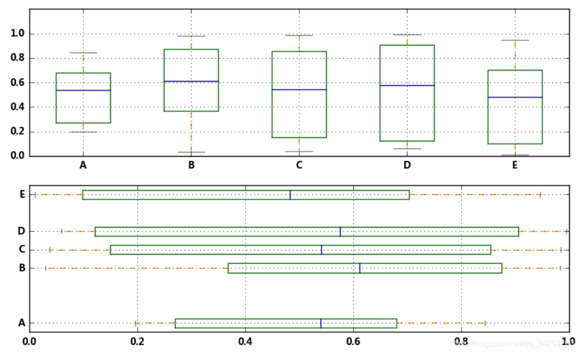
5.11 箱型图
- 方法1
# plt.plot.box()绘制

fig,axes = plt.subplots(2,1,figsize=(10,6))
df = pd.DataFrame(np.random.rand(10, 5), columns=['A', 'B', 'C', 'D', 'E'])
color = dict(boxes='DarkGreen', whiskers='DarkOrange', medians='DarkBlue', caps='Gray')
# 箱型图着色
# boxes → 箱线
# whiskers → 分位数与error bar横线之间竖线的颜色
# medians → 中位数线颜色
# caps → error bar横线颜色

df.plot.box(ylim=[0,1.2],
           grid = True,
           color = color,
           ax = axes[0])
# color:样式填充

df.plot.box(vert=False,
            positions=[1, 4, 5, 6, 8],
            ax = axes[1],
            grid = True,
           color = color)
# vert:是否垂直,默认True
# position:箱型图占位
- 方法2
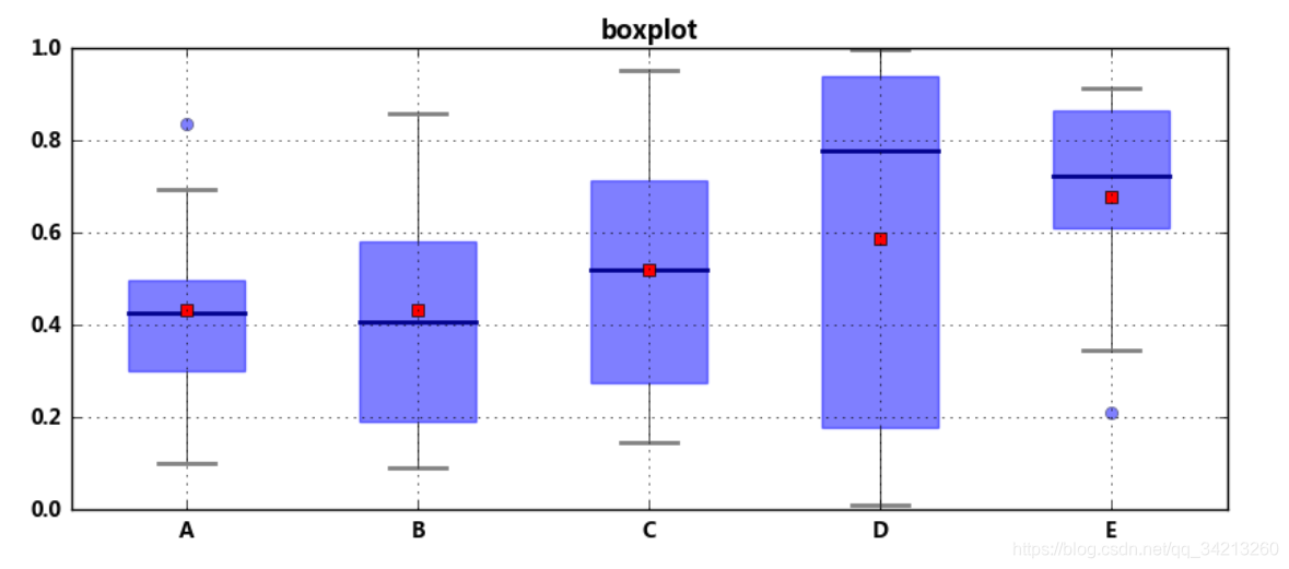
# plt.boxplot()绘制
# pltboxplot(x, notch=None, sym=None, vert=None, whis=None, positions=None, widths=None, patch_artist=None, bootstrap=None,
# usermedians=None, conf_intervals=None, meanline=None, showmeans=None, showcaps=None, showbox=None, showfliers=None, boxprops=None,
# labels=None, flierprops=None, medianprops=None, meanprops=None, capprops=None, whiskerprops=None, manage_xticks=True, autorange=False,
# zorder=None, hold=None, data=None)

df = pd.DataFrame(np.random.rand(10, 5), columns=['A', 'B', 'C', 'D', 'E'])
plt.figure(figsize=(10,4))
# 创建图表、数据

f = df.boxplot(sym = 'o',  # 异常点形状,参考marker
               vert = True,  # 是否垂直
               whis = 1.5,  # IQR,默认1.5,也可以设置区间比如[5,95],代表强制上下边缘为数据95%和5%位置
               patch_artist = True,  # 上下四分位框内是否填充,True为填充
               meanline = False,showmeans=True,  # 是否有均值线及其形状
               showbox = True,  # 是否显示箱线
               showcaps = True,  # 是否显示边缘线
               showfliers = True,  # 是否显示异常值
               notch = False,  # 中间箱体是否缺口
               return_type='dict'  # 返回类型为字典
              )
plt.title('boxplot')
print(f)

for box in f['boxes']:
    box.set( color='b', linewidth=1)        # 箱体边框颜色
    box.set( facecolor = 'b' ,alpha=0.5)    # 箱体内部填充颜色
for whisker in f['whiskers']:
    whisker.set(color='k', linewidth=0.5,linestyle='-')
for cap in f['caps']:
    cap.set(color='gray', linewidth=2)
for median in f['medians']:
    median.set(color='DarkBlue', linewidth=2)
for flier in f['fliers']:
    flier.set(marker='o', color='y', alpha=0.5)
# boxes, 箱线
# medians, 中位值的横线,
# whiskers, 从box到error bar之间的竖线.
# fliers, 异常值
# caps, error bar横线
# means, 均值的横线,
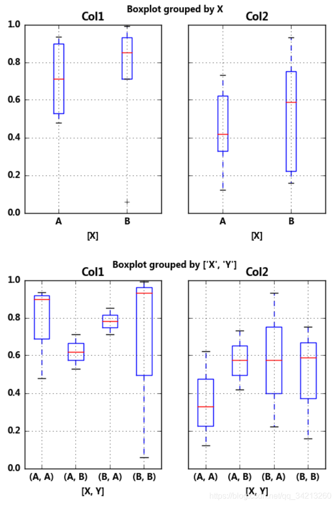
- 方法3
# plt.boxplot()绘制
# 分组汇总

df = pd.DataFrame(np.random.rand(10,2), columns=['Col1', 'Col2'] )
df['X'] = pd.Series(['A','A','A','A','A','B','B','B','B','B'])
df['Y'] = pd.Series(['A','B','A','B','A','B','A','B','A','B'])
print(df.head())
df.boxplot(by = 'X')
df.boxplot(column=['Col1','Col2'], by=['X','Y'])
# columns:按照数据的列分子图
# by:按照列分组做箱型图
六、图表保存输出
plt.savefig('C:/Users/iHJX_Alienware/Desktop/pic.png',
            dpi=400,
            bbox_inches = 'tight',
            facecolor = 'g',
            edgecolor = 'b')
# 可支持png,pdf,svg,ps,eps…等,以后缀名来指定
# dpi是像素分辨率
# bbox_inches:图表需要保存的部分。如果设置为‘tight’,则尝试剪除图表周围的空白部分。
# facecolor,edgecolor: 图像的背景色,默认为‘w’(白色)
打赏
码字不易,如果对您有帮助,就打赏一下吧O(∩_∩)O