对数据表格应用样式
1、表格特有的元素
- caption:基本上用做表格的标题。summary:可应用于表格的标签,用来描述表格的内容(与image的alt文本相似)
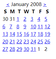
<table class="cal" summary="A calandar style date picker"> <caption> <a href="#" class="prev"><</a> January 2008 <a href="#" class="next">></a> </caption> </table>
-
thead、tbody和tfoot使开发人员能够将表格划分为逻辑部分,可以将所有列标题放在thead元素中,这样可以对这个特殊区域单独应用样式。如果使用thead或tfoot元素,那么必须至少使用一个tbody元素。在一个表格中只能使用一个thead和tfoot元素,但是可以使用多个tbody将复杂的表格划分为更容易管理的几个部分。
行和列标题应该使用th标记而不是td,但是如果某些内容既是数据又是标题,那么它仍然应该使用td,表格标题可以设置值为row或col的scope属性,定义他们是行标题还是列标题,它们还可以设置值rowgroup或colgroup,表示他们与多行或多列相关
<thead>
    <tr>
        <th scope="col">S</th>
        <th scope="col">M</th>
        <th scope="col">T</th>
        <th scope="col">W</th>
        <th scope="col">T</th>
        <th scope="col">F</th>
        <th scope="col">S</th>
    </tr>
</thead>
- col和colgroup:tr能狗对整行应用样式,但是很难对整列应用样式。colgroup能够对使用col元素定义的一个或多个列进行分组,但是支持col和colgroup元素的浏览器并不多
<colgroup>
  <col id="sun" />
  <col id="mon" />
  <col id="tue" />
  <col id="wed" />
  <col id="thur" />
  <col id="fri" />
  <col id="sat" />
</colgroup>
2、数据表格标记
下面代码可以创建出一个日历表格的基本轮廓:
<table class="cal" summary="A calandar style date picker"> <caption> <a href="#" class="prev"><</a> January 2008 <a href="#" class="next">></a> </caption> <colgroup> <col id="sun" /> <col id="mon" /> <col id="tue" /> <col id="wed" /> <col id="thur" /> <col id="fri" /> <col id="sat" /> </colgroup> <thead> <tr> <th scope="col">S</th> <th scope="col">M</th> <th scope="col">T</th> <th scope="col">W</th> <th scope="col">T</th> <th scope="col">F</th> <th scope="col">S</th> </tr> </thead> <tbody> <tr> <td>30</td> <td>31</td> <td><a href="#">1</a></td> <td><a href="#">2</a></td> <td><a href="#">3</a></td> <td><a href="#">4</a></td> <td><a href="#">5</a></td> </tr> <tr> <td><a href="#">6</a></td> <td><a href="#">7</a></td> <td class="selected"><a href="#">8</a></td> <td><a href="#">9</a></td> <td><a href="#">10</a></td> <td><a href="#">11</a></td> <td><a href="#">12</a></td> </tr> <tr> <td><a href="#">13</a></td> <td><a href="#">14</a></td> <td><a href="#">15</a></td> <td><a href="#">16</a></td> <td><a href="#">17</a></td> <td><a href="#">18</a></td> <td><a href="#">19</a></td> </tr> <tr> <td><a href="#">20</a></td> <td><a href="#">21</a></td> <td><a href="#">22</a></td> <td><a href="#">23</a></td> <td><a href="#">24</a></td> <td><a href="#">25</a></td> <td><a href="#">26</a></td> </tr> <tr> <td><a href="#">27</a></td> <td><a href="#">28</a></td> <td><a href="#">29</a></td> <td><a href="#">30</a></td> <td><a href="#">31</a></td> <td>1</td> <td>2</td> </tr> </tbody> </table>
结果如下:
3、对表格应用样式
- border-collapse:设置表格的边框是否被合并为一个单一的边框,还是象在标准的 HTML 中那样分开显示。
separate时:
值 描述 separate 默认值。边框会被分开。不会忽略 border-spacing 和 empty-cells 属性。 collapse 如果可能,边框会合并为一个单一的边框。会忽略 border-spacing 和 empty-cells 属性。 inherit 规定应该从父元素继承 border-collapse 属性的值。 collapse时:
border-spacing:该属性指定分隔边框模型中单元格边界之间的距离。在指定的两个长度值中,第一个是水平间隔,第二个是垂直间隔。除非 border-collapse 被设置为 separate,否则将忽略这个属性。尽管这个属性只应用于表,不过它可以由表中的所有元素继承。
值 描述 length length 规定相邻单元的边框之间的距离。使用 px、cm 等单位。不允许使用负值。
如果定义一个 length 参数,那么定义的是水平和垂直间距。
如果定义两个 length 参数,那么第一个设置水平间距,而第二个设置垂直间距。
inherit 规定应该从父元素继承 border-spacing 属性的值。
CSS规范有两个表格边框模型:单独的和叠加的。单独模型:在各个单元周围有边框;叠加模型:单元格共享边框。用border-collapse属性来设置。
在本例中希望使用双边框创建斜面效果,所以将border-collapse设置为separate,然后让表格中的所有文本居中,删除默认的内边距和外边距。使用border-spacing控制按元个之间的距离。
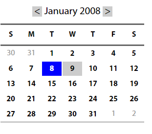
4、添加视觉样式
让表格标题更像常规的标题:增加自豪并粗体,通过垂直内边距增加标题上下的空间。
.cal caption {
    font-size: 1.25em;
    padding-top: 0.692em;
    padding-bottom: 0.692em;
    background-color: #d4dde6;
}
确定月份两边的前一个和下一个链接的位置:
.cal caption[rel="prev"] {
    float: left;       /*向左浮动*/
    margin-left: 0.2em;     /*设置水平外边距*/
}
.cal caption[rel="next"] {
    float: right;       /*向右浮动*/
    margin-lright: 0.2em;    /*设置水平外边距*/
}
.cal caption a:link,
.cal caption a:visited {
    text-decoration: none;
    color: #333;
    padding: 0 0.2em;    /*内边距让点击区域更突出*/
}
.cal caption a::hover,
.cal caption a::active,
.cal caption a::focus {
    background-color: #6d8ab7;    /*悬停等操作时改变背景颜色*/
}
区别表格标题的第一行:背景较浅,添加下划线,文本略小:
.cal thead th {
    background-color: #d4dde6;
    border-bottom: 1px solid #a9bacb;
    font-size: 0.875em;
}
设置表格体的文本是灰色的,表示不可以选择它们,为文本设置文本阴影:
.cal tbody {
    color: #a4a4a4;
    text-shadow: 1px 1px 1px white;

}
.cal tbody td {
    border-top: 1px solid #e0e0e1;
    border-right: 1px solid #9f9fa1;
    border-bottom: 1px solid #acacad;
    border-left: 1px solid #dfdfe0;
}
.cal tbody a {
    display: block;
    text-decoration: none;
    color: #333;

    font-weight: bold;
    padding: 0.385em 0.692em 0.308em 0.692em;
}
.cal tbody a:hover,
.cal tbody a:focus,
.cal tbody a:active,
.cal tbody .selected a:link,
.cal tbody .selected a:visited,
.cal tbody  .selecteda:hover,
.cal tbody  .selected a:focus,
.cal tbody .selected a:active {
    background-color: #6d8ab7;
    color: white;
  text-shaow:1px 1px 2px #22456b
}
一个总的CSS样式:
<style type="text/css">

body {
    font-family: "myriad pro", arial, helvetica, sans-serif;
  font-size:16px;
  line-height:1.125em; /* Baseline grid of 18px */
}


/* tables may still need 'cellspacing="0"' in the markup */
table.cal {
    border-collapse: collapse;
    border-spacing: 0;
    text-align: center;
    border-bottom: 1px solid #666;
}

.cal caption {
    font-size:1.3em;
    padding-top: 0.692em; /* 9px */
    padding-bottom: 0.692em; /* 9px */
}


.cal thead th {
    border-top: 3px solid #666;
    border-bottom: 3px solid #666;
    padding-top: 0.692em; /* 9px */
    padding-bottom: 0.692em; /* 9px */
}


/* @group Header */

.cal caption a:link,
.cal caption a:visited,
.cal caption a:hover,
.cal caption a:active,
.cal caption a:focus {
    background-color: #CCC;
    text-decoration: none;
    color: black;
    padding: 0 0.2em;
}

.cal caption a:hover,
.cal caption a:active,
.cal .caption a:focus {
    background-color: blue;
    color: white;
}

/* @end */

/* @group Days */

.cal tbody {
    color: #999;
}

.cal tbody a:link,
.cal tbody a:visited,
.cal tbody a:hover,
.cal tbody a:focus,
.cal tbody a:active {
    display: block;
    text-decoration: none;
    color: black;
    font-weight: bold;
    padding: 0.385em 0.692em 0.308em 0.692em; /* 5px 9px 4px 9px */
}

.cal tbody a:hover,
.cal tbody a:focus,
.cal tbody a:active {
    /*outline: 1px solid #ccc;*/
    background-color: #CCC;
    color: black;
}

.cal tbody .selected a:link,
.cal tbody .selected a:visited,
.cal tbody  .selecteda:hover,
.cal tbody  .selected a:focus,
.cal tbody .selected a:active {
    background-color: blue;
    color: white;
}

</style>
结果为:
简单的表格布局
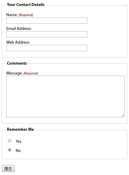
1、有用的表单元素
- fieldset:对相关的信息块进行分组(上图中有两个fieldset,一个用于联系人详细信息,一个用于注释)。lengend设置fieldset的标题
- 表单标签label:阅读器会正确的将表单元素和它的标签关联起来。将表单元素和它的标签关联的两种方式:
<!--控件和标签关联需要id属性,将表单数据发送回服务器需要name属性-->

<!--隐式方式:把表单元素嵌套在label元素中-->
<label>email <input name="email" type="text"/><label>

<!--显式方式:把label的for属性值设置为控件的id值-->
<label for="email" >email <label>
<input name="email" id="email" type="text"/>
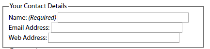
2、基本布局
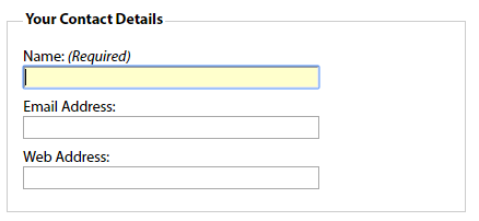
<fieldset>
    <legend>Your Contact Details</legend>   <!--为fieldset设置标题-->
    <div>
    <label for="author">Name: <em class="required">(Required)</em></label>  <!--em强调斜体,for和id的值相同-->
    <input name="author" id="author" type="text" />
    </div>

    <div>
    <label for="email">Email Address:</label> <!--for和id的值相同-->
    <input name="email" id="email" type="text" />
    </div>

    <div>
    <label for="url">Web Address:</label> <!--for和id的值相同-->
    <input name="url" id="url" type="text" />
    </div>
</fieldset>
没有应用样式:
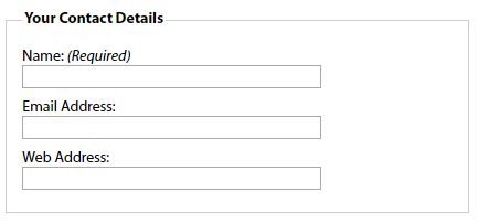
应用样式:
fieldset {
    margin: 1em 0; /*使用外边距进行垂直分隔*/
    padding: 1em;
    border : 1px solid #ccc;
}

legend {
    font-weight: bold; /*加粗legend元素*/
}

label {
    display: block; /*标签在默认情况下是行内元素,将他们的display设置为block会使它们产生自己的块框,使输入元素转到下一行*/
    cursor: pointer;  /*设置标签的光标样式*/
}

input {
  width: 20em; /*显式设置输入框的宽度,使其一致*/
}
结果:
3、其他元素
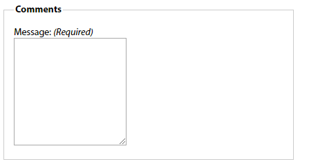
文本区域:
<fieldset>
    <legend>Comments</legend>
    <div>
    <label for="text">Message: <em class="required">(Required)</em></label>
    <textarea name="text" id="text" cols="20" rows="10"></textarea>
    </div>
</fieldset>
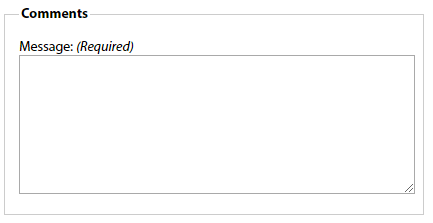
应用样式:
textarea {
    width: 100%;
    height: 10em;
}
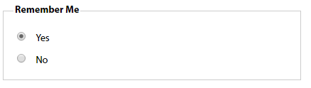
单选按钮和复选框:通常不把标签放在上方,而是放在右边。上述的代码将所有的输入框宽度都设置为20em,为区别输入元素,最好的办法是给它们分配一个类:例如给单选按钮分配类名radio
<fieldset id="remember-me">
    <legend>Remember Me</legend>
    <div>
<!--通过让标签围绕控件让标签和控件出现在同一行-->
        <label for="remember-yes"><input id="remember-yes" class="radio" name="remember" type="radio" value="yes" />Yes</label>
    </div>
    <div>
        <label for="remember-no"><input id="remember-no" class="radio" name="remember" type="radio" value="no" checked="checked" />No</label>
    </div>
</fieldset>

应用样式:
input.radio, input.submit {
  width: auto;      <!--将单选按钮的宽度设置为auto,覆盖前面对输入元素的设置-->
}

#remember-me .radio {
    margin-right: 1em;  <!--在单选按钮中添加一点外边距,使得标签之间提供适当的距离-->
}
4、修饰
元素获得焦点时改变背景颜色,帮助用户找到要填写的表单域:
input[type="text"]:focus, textarea:focus {
    background: #ffc;
}
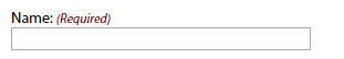
必填域:可在必填域的旁边放上有样式的文本或星号,适合这一信息的元素是em和strong,对这一信息应用样式:
label .required {
    font-size: 0.75em;     <!--减小字号-->
    color:#760000;      <!--让文本变为红色-->
}
总代码:
<!DOCTYPE html>
<html lang="en">
<head>
    <meta charset="UTF-8">
    <title>Title</title>
<style type="text/css">
body {
    font: 62.5%/1 "Myriad Pro", Frutiger, "Lucida Grande", "Lucida Sans", "Lucida Sans Unicode", Verdana, sans-serif;
}

form {
  font-size: 1.4em;
    width: 30em;
}

/* fieldset styling */
fieldset {
    margin: 1em 0; /*  space out the fieldsets a little*/
    padding: 1em;
    border : 1px solid #ccc;
}

/* legend styling */
legend {
    font-weight: bold;
}

form div {
    padding: 0.4em 0;
}

/* style for  labels */
label {
    display: block;
    cursor: pointer;
}

 /*style for required labels */
label .required {
    font-size: 0.75em;
    color:#760000;
}

input {
  width: 20em;
}

textarea {
    width: 100%;
    height: 10em;
}

input.radio, input.submit {
  width: auto;
}

#remember-me .radio {
    margin-right: 1em;
}

/* style form elements on focus */
input[type="text"]:focus, textarea:focus {
    background: #ffc;
}
</style>
</head>

<body>
<form id="comments_form" action="#" method="post">
<fieldset>
    <legend>Your Contact Details</legend>
    <div>
      <label for="author">Name: <em class="required">(Required)</em></label>
      <input name="author" id="author" type="text" />
    </div>
    <div>
      <label for="email">Email Address:</label>
      <input name="email" id="email" type="text" />
    </div>
    <div>
      <label for="url">Web Address:</label>
      <input name="url" id="url" type="text" />
    </div>
</fieldset>
<fieldset>
    <legend>Comments</legend>
    <div>
      <label for="text">Message: <em class="required">(Required)</em></label>
      <textarea name="text" id="text" cols="20" rows="10"></textarea>
    </div>
</fieldset>
<fieldset id="remember-me">
    <legend>Remember Me</legend>
    <div>
        <label for="remember-yes"><input id="remember-yes" class="radio" name="remember" type="radio" value="yes" />Yes</label>
    </div>
    <div>
        <label for="remember-no"><input id="remember-no" class="radio" name="remember" type="radio" value="no" checked="checked" />No</label>
    </div>
</fieldset>
<div>
  <input id="submit" class="submit" name="submit" type="submit"/>
</div>
</form>
</body>
</html>
复杂的表单布局
将标签个表单元素水平布置:
与上述示例不同的地方:将标签向左浮动,并为标签设置宽度,让所有表单元素排齐
label {
    float: left;
    width: 10em;
}
如果表单标签可能跨多行,应该清理div容器,避免它们干扰下一组标签和弄乱布局。
form div {
    clear: left;        /*clear规定元素的哪一侧不允许其他元素浮动*/
}
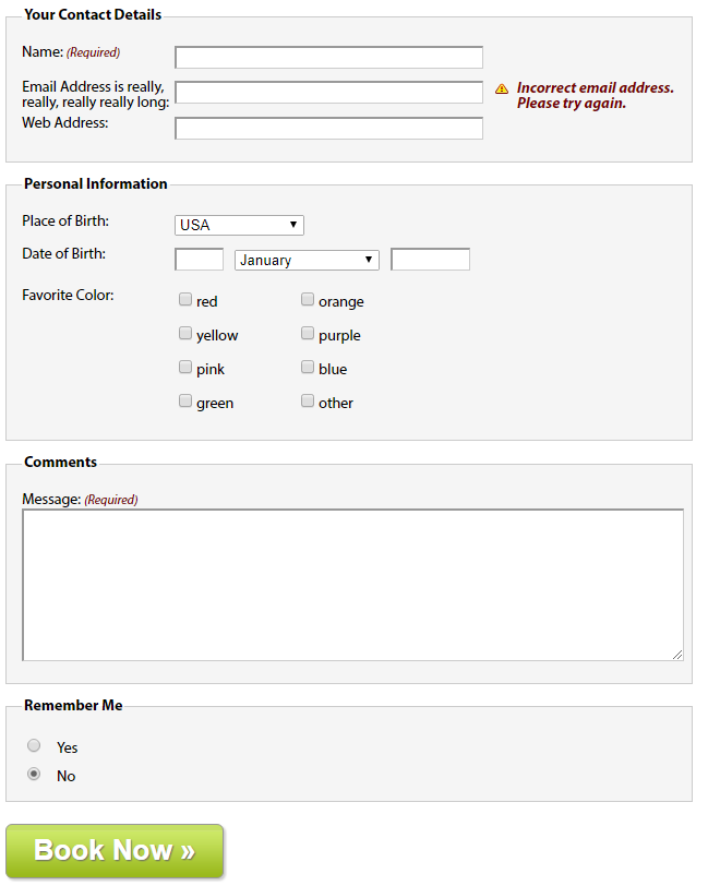
1、可访问的数据输入元素(Personal Information中的Date of Birth部分)
<div>
    <label for="dateOfBirth">Date of Birth:</label>
    <input name="dateOfBirth" id="dateOfBirth" type="text"  />

    <label id="monthOfBirthLabel" for="monthOfBirth">Month of Birth:</label>
    <select name="monthOfBirth" id="monthOfBirth">
      <option value="1">January</option>
      <option value="2">February</option>
      <option value="3">March</option>
    </select>

    <label id="yearOfBirthLabel" for="yearOfBirth">Year of Birth:</label>
    <input name="yearOfBirth" id="yearOfBirth" type="text" />
</div>
在收集日期信息的表单元素中,不希望月和年的标签显示:需要隐藏Month of Birth和Year of Birth标签
- 将标签的display属性设置为none会阻止标签的显示,但是也会阻止屏幕阅读器访问它们
- 通过值较大的负文本缩进将标签定位到屏幕外,并将标签的宽度设置为零。
#monthOfBirthLabel, #yearOfBirthLabel {
    text-indent: -1000em;
    width: 0;
}
单独设置各个表单控件的尺寸,并用外边距控制它们的水平边距:
#dateOfBirth {
    width: 3em;
    margin-right: 0.5em;
}

#monthOfBirth {
    width: 10em;
    margin-right: 0.5em;
}

#yearOfBirth {
    width: 5em;
}
2、多列复选框(Personal Information中的Favorite Color部分)
将大的复选框组或单选按钮创建成两列:
为创建列效果,要将复选框分成两组,每一组放在一个div中各有一个col类,然后将这两个div放在一个具有描述性ID的fieldset中。
<fieldset id="favoriteColor">
  <h2>Favorite Color:</h2>
  <div class="col">
    <div>
        <label><input class="checkbox" id="red" name="red" type="checkbox" value="red" />red</label>
    </div>
    <div>
        <label><input class="checkbox" id="yellow" name="yellow" type="checkbox" value="yellow" />yellow</label>
    </div>
    <div>
        <label><input class="checkbox" id="pink" name="pink" type="checkbox" value="pink" />pink</label>
    </div>
    <div>
        <label><input class="checkbox" id="green" name="green" type="checkbox" value="green" />green</label>
    </div>
  </div>

  <div class="col">
    <div>
        <label><input class="checkbox" id="orange" name="orange" type="checkbox" value="orange" />orange</label>
    </div>
    <div>
        <label><input class="checkbox" id="purple" name="purple" type="checkbox" value="purple" />purple</label>
    </div>
    <div>
        <label><input class="checkbox" id="blue" name="blue" type="checkbox" value="blue" />blue</label>
    </div>
    <div>
        <label><input class="checkbox" id="other" name="other" type="checkbox" value="other" />other</label>
    </div>
  </div>
</fieldset>
因为之前已经创建了基本的fieldset样式,所以需要先覆盖这些样式,将内边距和外边距设置为零,去掉边框设置背景颜色为透明:
#favoriteColor {
    margin: 0;
    padding: 0;
    border: none;
    background: transparent;
}
将标题用作标签:
#favoriteColor h2 {
    width: 10em;
    float: left;
    font-size: 1em;
    font-weight: normal;
}
将两个div向左浮动,创建出两列的布局:
#favoriteColor .col {
    width: 8em;
    float: left;
    clear: none; /*因为在表单中的所有div在默认情况下已经被清理了,所以需要用clear: none覆盖那个声明*/
}
复选框的标签不需要浮动,需要覆盖那个声明:
#favoriteColor label {
    float: none;
}
3、提交按钮
通常使用一个type值为submit的input元素,也可以使用button元素替代input元素
<div>
    <button type="submit">Book Now »</button>
</div>
<style>
button {
  width: 200px;
  height: 50px;
  border: 1px solid #989898;
   -moz-border-radius: 6px;
   -webkit-border-radius: 6px;
   border-radius: 6px;
   background: url(img/button-bg.png) #c5e063 bottom left repeat-x;
  -moz-box-shadow: 2px 2px 2px #ccc;
  -webkit-box-shadow: 2px 2px 2px #ccc;
  box-shadow: 2px 2px 2px #ccc;
   color: #fff;
   font-size: 26px;
   font-weight: bold;
   text-shadow: 1px 1px 1px #666;
}
</style>
4、表单反馈(Your Contact Details中的email部分)
反馈信息突出显示忘了填写或填写错误的域:常用方法是在域的旁边添加一个错误信息。
将反馈文本放在一个em中,将这个em放在源代码中文本输入元素的后面,为使其正确排列,em和前面的input元素要浮动。许多阅读器会忽略表单元素之间的文本,除非把文本挡在标签中,为避免此问题,最好的方法是将错误信息放在表单标签中,然后使用css进行定位:
<div>
    <label for="email">Email Address is really, really, really really long: <em class="feedback">Incorrect email address. Please try again.</em></label>
    <input name="email" id="email" type="text" />
</div>
对其应用样式:
form div {
    position: relative;  /*为对em进行定位,需要将表单中所有段落的position设置为relative,从而创建一个新的定位上下文*/
    width: 100%;
    padding: 0.4em 0;
    clear: both;
}
label .feedback {
    position: absolute;     /*对em进行绝对定位,让它出现在文本输入元素的右边*/
    left: 30em;     /*标签宽度为10em,文本框宽度为20em,所以em的左位置设置为30em*/
    right: 0;
    top: 0.5em;
    font-weight: bold;
    color:#760000;
    padding-left: 20px;
    background: url(img/error.png) no-repeat left top;
}
总的代码:
<!DOCTYPE html>
<html lang="en">
<head>
    <meta charset="UTF-8">
    <title>Title</title>
<style type="text/css">
<!--

body {
    font: 62.5%/1 "Myriad Pro", Frutiger, "Lucida Grande", "Lucida Sans", "Lucida Sans Unicode", Verdana, sans-serif;
}

.clear {
  clear: both;
}

form {
  font-size: 1.4em;
    width: 45em;
}

/* fieldset styling */
fieldset {
    margin: 1em 0; /*  space out the fieldsets a little*/
    padding: 1em;
    border : 1px solid #ccc;
    background-color:#F5F5F5
}

/* legend styling */
legend {
    font-weight: bold;
}

form div {
  position: relative;
    width: 100%;
    padding: 0.4em 0;
    clear: both;
}

/* style for  labels */
label {
    float: left;
    clear: left;
    width: 10em;
}

/* style for required labels */
label .required {
    font-size: 0.83em;
    color:#760000;
}

/* style error messages */
label .feedback {
    position: absolute;
    left: 31em;
  right: 0;
    top: 0.5em;
    font-weight: bold;
    color:#760000;
    padding-left: 20px;
    background: url(img/error.png) no-repeat left top;
}

/* :KLUDGE: Explicitly set the width for IE6- */
* html .feedback{
  width: 10em;
}

input {
  width: 20em;
    font-size: inherit;
}

input[type="text"], textarea {
    border-top: 2px solid #999;
    border-left: 2px solid #999;
    border-bottom: 1px solid #ccc;
    border-right: 1px solid #ccc;
}

input.radio, input.checkbox, input.submit {
  width: auto;
}

/* style form elements on focus */
input:focus, textarea:focus {
    background: #ffc;
}


textarea {
    width: 100%;
    height: 10em;
}

/* Date of Birth form styling */

#monthOfBirthLabel, #yearOfBirthLabel {
  text-indent: -1000em;
    width: 0;
}

#dateOfBirth {
  width: 3em;
    margin-right: 0.5em;
}

#monthOfBirth {
  width: 10em;
    margin-right: 0.5em;
}

#yearOfBirth {
  width: 5em;
}

/* Color form styling */
#favoriteColor {
  margin: 0;
    padding: 0;
    border: none;
    background: transparent;
}

#favoriteColor h2 {
  width: 10em;
    float: left;
    font-size: 1em;
    font-weight: normal;
}

#favoriteColor .col {
  width: 8em;
    float: left;
    clear: none;
}

#favoriteColor label {
    float: none;
}

#remember-me .radio {
    margin-right: 1em;
}

/* Button styling */

button {
  width: 200px;
  height: 50px;
  border: 1px solid #989898;
   -moz-border-radius: 6px;
   -webkit-border-radius: 6px;
   border-radius: 6px;
   background: url(img/button-bg.png) #c5e063 bottom left repeat-x;
  -moz-box-shadow: 2px 2px 2px #ccc;
  -webkit-box-shadow: 2px 2px 2px #ccc;
  box-shadow: 2px 2px 2px #ccc;
   color: #fff;
   font-size: 26px;
   font-weight: bold;
   text-shadow: 1px 1px 1px #666;
}

</style>
</head>
<body>
<form id="comments_form" action="#" method="post">

<fieldset>
    <legend>Your Contact Details</legend>
    <div>
    <label for="author">Name: <em class="required">(Required)</em></label>
    <input name="author" id="author" type="text" />
    </div>

    <div>
    <label for="email">Email Address is really, really, really really long: <em class="feedback">Incorrect email address. Please try again.</em></label>
    <input name="email" id="email" type="text" />
    </div>

    <div>
    <label for="url">Web Address:</label>
    <input name="url" id="url" type="text" />
    </div>
</fieldset>

<fieldset>
    <legend>Personal Information</legend>

    <div>
    <label for="author">Place of Birth: </label>
    <select>
  <option value="USA" selected="selected">USA</option>
  <option value="UK">United Kingdom</option>
  </select>
    </div>

    <div>
    <label for="dateOfBirth">Date of Birth:</label>
  <input name="dateOfBirth" id="dateOfBirth" type="text"  />

  <label id="monthOfBirthLabel" for="monthOfBirth">Month of Birth:</label>
  <select name="monthOfBirth" id="monthOfBirth">
  <option value="1">January</option>
  <option value="2">February</option>
  <option value="3">March</option>
  </select>

  <label id="yearOfBirthLabel" for="yearOfBirth">Year of Birth:</label>
  <input name="yearOfBirth" id="yearOfBirth" type="text" />
    </div>

    <fieldset id="favoriteColor">
    <h2>Favorite Color:</h2>

    <div class="col">
    <div>
    <label><input class="checkbox" id="red" name="red" type="checkbox" value="red" />red</label>
    </div>

    <div>
    <label><input class="checkbox" id="yellow" name="yellow" type="checkbox" value="yellow" />yellow</label>
    </div>

    <div>
    <label><input class="checkbox" id="pink" name="pink" type="checkbox" value="pink" />pink</label>
    </div>

    <div>
    <label><input class="checkbox" id="green" name="green" type="checkbox" value="green" />green</label>
    </div>
  </div>

    <div class="col">
    <div>
    <label><input class="checkbox" id="orange" name="orange" type="checkbox" value="orange" />orange</label>
    </div>

    <div>
    <label><input class="checkbox" id="purple" name="purple" type="checkbox" value="purple" />purple</label>
    </div>

    <div>
    <label><input class="checkbox" id="blue" name="blue" type="checkbox" value="blue" />blue</label>
    </div>

    <div>
    <label><input class="checkbox" id="other" name="other" type="checkbox" value="other" />other</label>
    </div>
  </div>
    </fieldset>


</fieldset>

<fieldset>
    <legend>Comments</legend>
    <div>
    <label for="text">Message: <em class="required">(Required)</em></label>
    <textarea name="text" id="text" cols="20" rows="10"></textarea>
    </div>
</fieldset>

<fieldset id="remember-me">
    <legend>Remember Me</legend>
        <div>
        <label for="remember-yes"><input id="remember-yes" class="radio" name="remember" type="radio" value="yes" />Yes</label>
        </div>

        <div>
        <label for="remember-no"><input id="remember-no" class="radio" name="remember" type="radio" value="no" checked="checked" />No</label>
        </div>

</fieldset>

<div>
<button type="submit">Book Now »</button>
</div>

</form>
</body>
</html>