盒子模型
<html lang="en">
<head>
    <meta charset="UTF-8">
    <style>
        div{
            background-color: red;
            text-align: justify;        /*width和height指的是内容的宽和高*/
            margin: 50px;
            border: 10px solid yellow;
            padding: 20px;
        }
    </style>
    <title>盒子模型</title>
</head>
<body>
<!--margin:外边距  影响当前盒子和其他盒子的距离
            1个值:四个方向采用相同的值
            2个值:上下 左右
            3个值:上   左右  下
            4个值:按照顺时针顺序,上右下左
            margin:0px auto
        border:边框
        padding:内边距     内容和边框之间的距离

        外边距,边框和内边距都会影响内容区的宽度

        content:内容区-->

<div id="div1">

    盒子模型盒子模型盒子模型盒子模型盒子模型盒子模型
    盒子模型盒子模型盒子模型盒子模型盒子模型盒子模型
    盒子模型盒子模型盒子模型盒子模型盒子模型盒子模型


</div>
</body>
</html>
结果图:

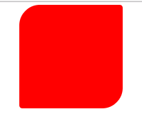
圆角弧度
<html lang="en">
<head>
    <meta charset="UTF-8">
    <style>
        #div1{
            width: 300px;
            height: 300px;
            background-color: red;
            margin: 0 auto;
            border-radius: 60px 10px;/*同样可以有四个值,与margin相似,但两个为对角线对应*/
        }
    </style>
    <title>圆角弧度</title>
</head>
<body>

<div   id="div1" >

</div>

</body>
</html>
结果图:
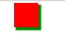
盒子阴影
<html lang="en">
<head>
    <meta charset="UTF-8">
    <style>
        div{
            width: 100px;
            height: 100px;
            background-color: red;
            margin: 0 auto;
            /*1:x轴方向的偏移
              2:y轴方向的偏移
              3:模糊范围
              4:阴影扩展范围
              5:阴影颜色*/
            box-shadow: 10px 10px 5px 3px green;/*在box-shadow:inset表示阴影向外侧走*/
        }
    </style>
    <title>盒子阴影</title>
</head>
<body>
<div>

</div>
</body>
</html>
结果图:
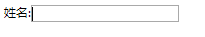
轮廓线
<html lang="en">
<head>
    <meta charset="UTF-8">
    <style>
        input:focus{
            outline:none;/*点击输入时不会出现轮廓线*/

        }
    </style>
    <title>轮廓线</title>
</head>
<body>

    姓名:<input type="text">


</body>
</html>
结果图:
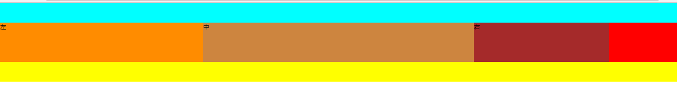
浮动问题
<html lang="en">
<head>
    <meta charset="UTF-8">
    <style>
        *{
            padding: 0;
            margin: 0;
        }

        #header{
            height: 80px;
            background-color: aqua;

        }
        #main{
           /* height: 200px;*/
           background-color: red;
           /* overflow: hidden;*//*第三种方法解决浮动问题*/
        }
        #footer{
            height: 80px;
            background-color: yellow;
        }
        #div1{
            float: left;
            width:30%;
            height: 160px;
            background-color: darkorange;
        }
        #div2{
            float: left;
            width:40%;
            height: 160px;
            background-color:peru;
        }
        #div3{
            float: left;
            width:20%;
            height: 160px;
            background-color: brown;
        }
        /*#div4{
            clear: both;
        }*/
        .cleanfix{
            zoom: 1;/*兼容模式,使cleanfix:after能在ie5之类的低版本浏览器上实现效果*/
        }
        .cleanfix:after{
            content: "";
            display: table;  /*可以解决浮动问题,同第一种方法*/
            clear: both;
        }
    </style>
    <title>浮动问题</title>
</head>
<body>
<div>
    <div id="header"></div>
    <div id="main" class="cleanfix">
        <div id="div1">左</div>
        <div id="div2">中</div>
        <div id="div3">右</div>
       <!-- <div id="div4">加的div</div>解决浮动看不了main高度问题:第一种方法-->

    </div>
    <div id="footer"></div>
</div>
</body>
</html>
结果图:
怪异盒子模型
<html lang="en">
<head>
    <meta charset="UTF-8">
    <style>
        *{
            padding: 0;
            margin: 0;
        }
        #left{
            height: 100px;
            width: 20%;
            background-color: darkorange;
            float: left;
            border: 10px solid darkblue;
            box-sizing: border-box;/*内容区为20%-10x2*/
        }
        #center{
            height: 100px;
            width: 60%;
            background-color: aqua;
            float: left;
        }
        #right{
            height: 100px;
            width: 20%;
            background-color: bisque;
            float: left;
        }
    </style>
    <title>怪异盒子模型</title>
</head>
<body>

<div>
    <div id="left"></div>
    <div id="center"></div>
    <div id="right"></div>
</div>


</body>
</html>
结果图:

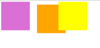
相对定位
<html lang="en">
<head>
    <meta charset="UTF-8">
    <style>
        #left{
            height: 200px;
            width:200px;
            background-color: orchid;
            float: left;
        }
        /*相对定位:
            1.相对于自己原来的位置进行定位
            2.移动以后自己原来的位置不会被其他元素占用*/
        #center{
            height:200px;
            width: 200px;
            background-color: orange;
            float: left;
            position: relative;
            top: 20px;
            left: 50px;
            z-index: -1;
        }
        #right{
            height: 200px;
            width: 200px;
            background-color: yellow;
            float: left;
            z-index: 3;/*z-index:代表z轴的位置,可以让right覆盖住center*/
        }
    </style>
    <title>相对定位</title>
</head>
<body>
    <div id="left"></div>
    <div id="center"></div>
    <div id="right"></div>

</body>
</html>
结果图:
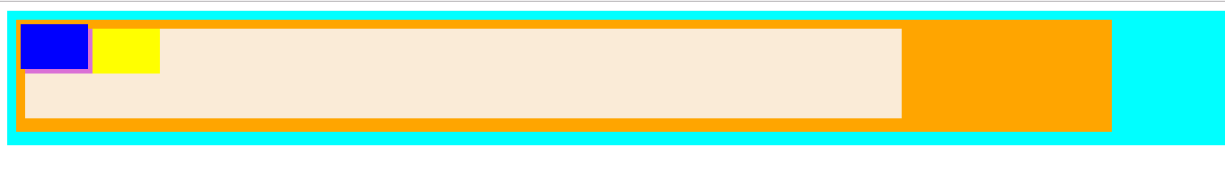
绝对定位
<html lang="en">
<head>
    <meta charset="UTF-8">
    <style>
        * {
            padding: 0;
            margin: 0;
        }

        #div1 {
            height: 300px;
            background-color: aqua;
            margin: 20px 0 0 20px;
            overflow: hidden;

        }

        #div2 {
            height: 250px;
            width: 90%;
            background-color: orange;
            margin: 20px 0 0 20px;
            overflow: hidden;
            position: relative;

        }

        #div3 {
            height: 200px;
            width: 80%;
            background-color: antiquewhite;
            margin: 20px 0 0 20px;
        }

        #left {
            height: 100px;
            width: 150px;
            background-color: orchid;
            float: left;
        }

        #center {
            height: 100px;
            width: 150px;
            background-color: blue;
            float: left;
            position: absolute;
            top: 10px;
            left: 10px;

        }

        #right {
            height: 100px;
            width: 150px;
            background-color: yellow;
            float: left;
        }

    </style>
    <title>绝对定位</title>
</head>
<body>

<!--绝对定位:
    1.相对于:离它最近的,并且使用了定位的父元素
             如果没有符合的,最后以body为基准。
    2.元素原来的空间会被其他元素占用-->

<div id="div1">
    <div id="div2">
        <div id="div3">
            <div id="left"></div>
            <div id="center"></div>
            <div id="right"></div>
        </div>
    </div>
</div>


</body>
</html>
结果图: