需求为一个简单的scroll效果,侧边选项卡跟随屏幕向下拖动变颜色的。点击侧边选项卡,跳转到相应模块。
索性上网找了一下类似的效果。附带源码地址 https://blog.csdn.net/dream_fa/article/details/72842193
原有样式与js确实有点欠妥,所以进行了简单修改。
需要注意的是js代码中。取得网页被卷去的高的时候,并未考虑兼容性的问题。以至于可能影响整体效果。
eg:// var scroH=document.body.scrollTop;
var scroH = document.documentElement.scrollTop || document.body.scrollTop;
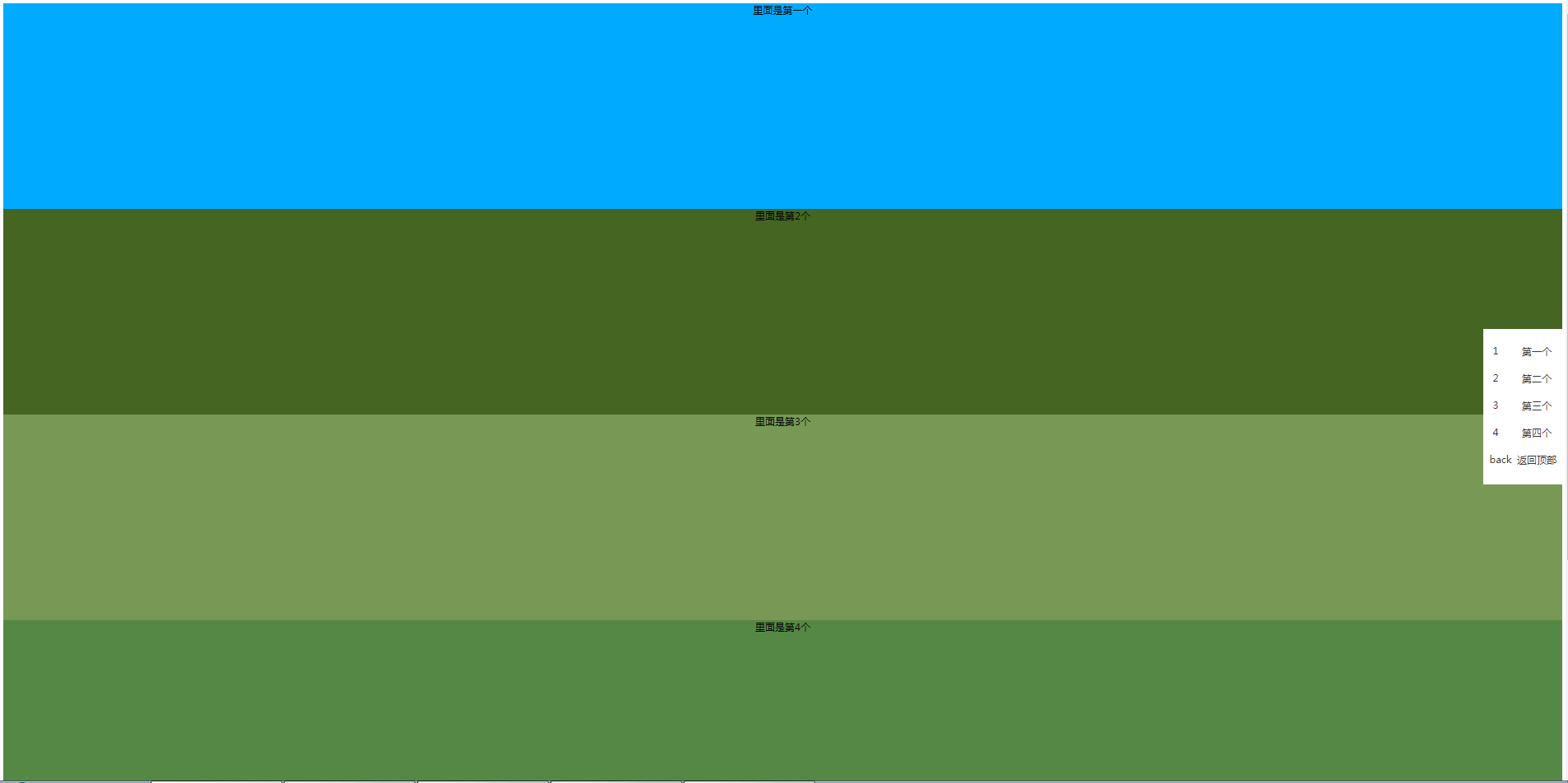
实现后效果如下:
HTML代码如下
<section class="demo1">
里面是第一个
</section>
<section class="demo2">
里面是第2个
</section>
<section class="demo3">
里面是第3个
</section>
<section class="demo4">
里面是第4个
</section>
<section class="footer">
底部
</section>
<section class="menu">
<ul>
  <li>
    <a href="###"><i>1</i><label>第一个</label></a>
    <a href="###"><i>2</i><label>第二个</label></a>
    <a href="###"><i>3</i><label>第三个</label></a>
    <a href="###"><i>4</i><label>第四个</label></a>
    <a href="###"><i>back</i><label>返回顶部</label></a>
  </li>
</ul>
</section>
CSS代码如下
header{width: 100%; height: 300px;}
.demo1, .demo2 ,.demo3, .demo4{width: 100%; height: 500px; text-align: center;}
.demo1{background-color: #00aaff;}
.demo2{background-color: #446622;}
.demo3{background-color: #779955;}
.demo4{background-color: #558844;}
/**这块根据自己项目来进行定位***/
.menu{width:200px;overflow: hidden;position: fixed; top: 50%; margin-top: -150px; background: #fff; right: 0px;display: block;}
.menu ul{ list-style: none; padding-left: 0px;}
.menu ul li{width: 100%; height: 100%;}
.menu ul li a{display: inline-block;width: 100%; height: 60px; line-height: 60px;color: #333}

.menu ul li a i{display: inline-block;width:30px; height: 30px; float: left; text-align: center;line-height: 30px;
 font-style:normal;background: #fff; margin:15px 15px;}

.menu ul li a label{display: inline-block;width: 140px; height: 60px; float: right; text-align: center;line-height: 60px;cursor: pointer;}

.menu ul li a.active{color: red}
.footer{background-color:#145214;width: 100%; height: 600px}
JS代码如下
<script src="jquery-1.12.3.js"></script>

<script>
$(function(){
// 获取菜单栏到顶部的距离
var navH=$(".menu").offset().top;
$(window).scroll(function(){
// 获取滚动条滑动距离
//让菜单栏距离顶部300时候显示默认隐藏,
// var scroH=document.body.scrollTop;

var scroH = document.documentElement.scrollTop || document.body.scrollTop;

//为了兼容性
console.log(top)
if(scroH>=300){
$(".menu").css({"display":"block"});
}else{
$(".menu").css({"display":"none"}) ;
}
if(scroH>=0 && scroH<500){
$(".menu ul li a:first-child").addClass("active").siblings().removeClass("active");
}else if(scroH>=500 && scroH<1000){
$(".menu ul li a:nth-child(2)").addClass("active").siblings().removeClass("active");
}else if(scroH>=1000 && scroH<1500){
$(".menu ul li a:nth-child(3)").addClass("active").siblings().removeClass("active");
}else if(scroH>=1500 && scroH<2000){
$(".menu ul li a:nth-child(4)").addClass("active").siblings().removeClass("active");
}

})
$(".menu ul li a:first-child").click(function(){
$('body,html').animate({scrollTop:300},400);
})
$(".menu ul li a:nth-child(2)").click(function(){
$('body,html').animate({scrollTop:800},500);
})
$(".menu ul li a:nth-child(3)").click(function(){
$('body,html').animate({scrollTop:1300},500);
})
$(".menu ul li a:nth-child(4)").click(function(){
$('body,html').animate({scrollTop:1800},500);
})
$(".menu ul li a:last-child").click(function(){
$('body,html').animate({scrollTop:0},500);
})
})
</script>