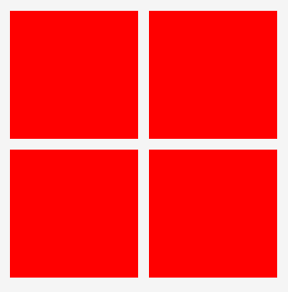
第一种写法:
wxml:
  <view class="page_first">
    <view class="page_li" wx:for="{{4}}"></view>
  </view>

wxss:
  .page_first{padding: 30rpx;box-sizing: border-box;display: flex;flex-wrap: wrap;}
  .page_first .page_li{ 48%;margin-right: 4%;padding-bottom: 48%;background: red;margin-bottom: 30rpx;}
  .page_first .page_li:nth-child(2n){margin-right: 0;}
第二种写法:
wxml:
 <view class="page_two">
    <view class="page_li" wx:for="{{4}}"></view>
 </view>

wxss:
  .page_two{padding: 30rpx;box-sizing: border-box;display: flex;flex-wrap: wrap;justify-content: space-between;}
  .page_two .page_li{ calc(50vw - 45rpx);padding-bottom: 48%;background: green;margin-bottom: 30rpx;}
第三种写法:
wxml:
 <view class="page_three">
    <view class="page_li" wx:for="{{4}}"></view>
 </view>

wxss:

 .page_three{padding: 30rpx;box-sizing: border-box;display: flex;flex-wrap: wrap;}
 .page_three .page_li{ 47.5%;padding-bottom: 47.5%;background: yellowgreen;margin-bottom: 30rpx;}
 .page_three .page_li:not(:nth-child(2n)){margin-right: calc(5% / 1);}
第四种写法:
wxml:
 <view class="page_four">
    <view class="page_li" wx:for="{{4}}"></view>
 </view>

wxss:

 .page_four{padding: 30rpx;box-sizing: border-box;display: grid;grid-template-columns: 47.5% 47.5%;grid-gap: 30rpx 5%;}
 .page_four .page_li{ 100%;background: gold;padding-bottom: 100%;}
第五种写法:(建议只在偶数的情况下使用)
wxml:
 <view class="page_five">
	<view class="page_li" wx:for="{{4}}"></view>
 </view>

wxss;
 .page_five{padding: 30rpx;box-sizing: border-box;columns: 2;column-gap: 30rpx;}
 .page_five .page_li{ 100%;background: cornflowerblue;padding-bottom: 100%;margin-bottom: 30rpx;}