css的导入方式
内联样式
<div class="item" style=" 100px;height: 100px;background-color: red;"></div>
嵌入样式


<!DOCTYPE html>
<html>
<head>
    <title>css样式</title>
    <!-- style标签引入样式 -->
    <style type="text/css" media="screen">
        .item{
            width: 100px;
            height: 100px;
            background-color: red;
        }
    </style>
</head>
<body>
    <div class="item"></div>
</body>
</html>
外联样式
 <!--外链式-->
    <link rel="stylesheet" href="./1.css">
css选择器
id选择器(ID唯一)
#a{color: red;}
class选择器
.a{color: green;}
class属性如果有多个,要用空格分隔。如class="a1 a2"
标签(元素)选择器
p{color: red;}
通用选择器
/*去除浏览器的默认样式*/
*{ margin: 0;padding: 0;}
分组选择器
h1,h2 {color: red;}
后代选择器
/*ul标签里面的所有li标签*/
ul li{color: red;}
属性选择器
input[name="derek"]{ width: 100px;}
组合选择器
子选择器 div>p
/*选择所有父级是 <div> 的 <p> 元素*/
div>p {color: red;}
相邻选择器 div+p
/*选择所有同级相邻的元素,且<div>之后 的<p> 元素*/
div+p { color: red;}
兄弟选择器 div~p
/*div后面所有的兄弟p标签*/
div~p {color: red;}
伪元素及伪类选择器
伪元素
after属性before属性
<!DOCTYPE html>
<html>
<head>
    <title>伪类选择器</title>
    <style type="text/css" media="screen">

        .item{
            width: 200px;
            height: 200px;
            background-color: yellow;
        }

         /*p:after和p:before分别用来向后和向前插入元素*/
        p:after{
            content: '!';
        }
        p:before{
            content: '#';
        }
    </style>
</head>
<body>
    <p class="a1">There's no place I'd rather be</p>
    <div class="item"></div>
</body>
</html>
伪类
hover属性:鼠标悬停之后发生变化。
/* 未访问的链接 */
a:link {color: #FF0000}

/* 已访问的链接 */
a:visited {color: #00FF00}

/* 鼠标移动到链接上 */
a:hover {color: #FF00FF}

/* 选定的链接 */
a:active {color: #0000FF}
<input> 聚点
/*input输入框获取焦点时样式*/
input:focus {
  outline: none;
  background-color: #eee;
}
CSS3伪类选择器
nth-child(n)
注意: 1、tag:nth-child(n)选择器匹配父元素中的第n个子元素。
2、n可以是一个数字,一个关键字,或者一个公式。
/*选取父标签下第二个li标签*/
li:nth-child(2) {color:red;}
拓展:nth-child(2n) 表示选择列表中的偶数标签;nth-child(2n-1)表示选择列表中的奇数标签。
first-child、last-child
/*first-child表示选择列表中的第一个标签*/
li:first-child{color:red;}

/*last-child表示选择列表中的最后一个标签*/
li:last-child{color:pink;}
nth-of-type(n)
注意:tag:nth-of-type(n)选择器匹配父元素中的第n个同类型子元素。
nth-of-type(n)与nth-child(n)区别
<!DOCTYPE html>
<html>
<head>
    <meta charset="utf-8">
    <title></title>
    <style type="text/css" media="screen">
    h1,div{float: left;}
        div{
            width: 100px;
            height: 100px;
            background-color: yellow;
        }
        /*父元素下的第二个子元素*/
        .box:nth-child(2){
            background-color: red;
        }
        /*父元素下的第二个匹配的子元素(div)*/
        .box:nth-of-type(2){
            background-color: blue;
        }
    </style>
</head>
<body>
    <h1>1</h1>
    <div class="box"></div>
    <h1>2</h1>
    <div class="box"></div>
    <h1>3</h1>
    <div class="box"></div>
</body>
</html>
结果:

总结:nth-child(n)选取的是父标签下第n个子元素,nth-of-type(n)选取父标签下第n个匹配标签的子元素。
first-of-type、last-of-type
/*first-of-type表示选择列表中的第一个li标签*/
li:first-of-type{color:red;}

/*last-of-type表示选择列表中的最后一个li标签*/
li:last-of-type{color:pink;}
css权重(优先级)
CSS权重指的是样式的优先级,有两条或多条样式作用于一个元素,权重高的那条样式对元素起作用,权重相同的,后写的样式会覆盖前面的样式。
内联样式>id选择器>class选择器>元素选择器>继承
!important方式来强制让样式生效,但并不推荐使用。
!important,加在样式属性值后,权重值为 10000
内联样式的权重为1000
id选择器的权重为100
class、伪类和属性选择器的权重为10
标签和伪元素选择器的权重为1
通用选择器(*)、子选择器(>)、相邻选择器(+)、同胞选择器(~)(继承)样式权重0
文字及颜色
font-family(字体)
font-family: "楷体", "微软雅黑";
font-size
/*给首字母设置样式*/
p:first-letter {
  font-size: 48px;
  color: red;
}
font-weight
| 属性 | 描述 |
| normal | 默认值。定义标准的字符。 |
| bold | 定义粗体字符。 |
| bolder | 定义更粗的字符。 |
| lighter | 定义更细的字符。 |
| inherit | 规定应该从父元素继承字体的粗细。 |
font-style
       /*设置字体是否倾斜   normal正常,*/
            font-style: normal;
            /*设置字体是否倾斜   italic 倾斜*/
            font-style: italic;
color
color 设置文字的颜色,如: color:red;
颜色表示
rgb(0,0,255)
rgba(0,0,255,0.3) 最后一个0.3是透明度(取值0~1)
     /*1.单词来表示颜色*/
        background-color: red;

        /*2.十六进制表示颜色,以#号开始,00 00 00 红 绿 蓝 00~ff(黑到白)*/
        background-color: #00f;

        /*3.使用rgb模式,取值范围0~255*/
        background-color: rgb(0,0,255);

        /*4.rgba()模式,最后一个是透明度,取值范围是0~1的小数,0代表完全透明,1代表不透明*/
        background-color: rgba(0,0,255,0.5);
文本、阴影
text-align
| 值 | 描述 |
| left | 默认,左对齐 |
| right | 右对齐 |
| center | 水平居中对齐 |
| justify | 两端对齐 |
line-height (行高)
line-height:200px; (200px是块标签的高度,这时文本会垂直居中)
line-height:100%; (默认,基于当前字体尺寸的百分比行间距)
text-decoration
| 值 | 描述 |
| none | 默认。定义标准的文本。 |
| underline | 定义文本下的一条线。 |
| overline | 定义文本上的一条线。 |
| line-through | 定义穿过文本下的一条线。 |
| inherit | 继承父元素的text-decoration属性的值。 |
text-indent
首行空两个字符
/*首行空两个字符*/
p{text-indent:2em}
/*字体大小16px*/
p {text-indent: 32px;}
text-overflow
设置一行文字宽度超过容器宽度时的显示方式,如:text-overflow:clip 将多出的文字裁剪掉 text-overflow:ellipsis 将多出的文字显示成省略号。
<!DOCTYPE html>
<html>
<head>
<meta charset="utf-8">
<title></title>
<style>
.test
{
    white-space:nowrap;
    width:12em;
    overflow:hidden;
    border:1px solid red;
}
</style>
</head>
<body>

<p>以下 div 容器内的文本无法完全显示,可以看到它被裁剪了。</p>

<div class="test" style="text-overflow:ellipsis;">This is some long text that will not fit in the box</div>
<div class="test" style="text-overflow:clip;">This is some long text that will not fit in the box</div>

</body>
</html>
white-space
用来设置文本不换行,如:white-space:nowrap 设置文本不换行 一般与text-overflow和overflow属性配合使用来让一行文字超出宽度时显示省略号。
/*设置表格列不换行*/
table td {
 white-space: nowrap;
}
text-shadow
text-shadow文本阴影
text-shadow: 5px 5px 5px #FF0000; (水平阴影,垂直阴影,模糊度,颜色)
box-shadow
box-shadow盒子阴影
/*设置阴影 x轴偏移,y轴偏移,透明度,扩散度,颜色 inset内阴影*/
box-shadow: 10px 10px 20px 10px blue inset;

box-shadow: 10px 10px 50px 10px blue ;
边框、背景
border边框
border-width 边框宽度 ;border-color 边框颜色
border-top 上边框 ; border-bottom 下边框
border-left 左边框 ; border-right 右边框
border 同时设置四个边框
border: 1px solid red;
border-style
| 值 | 描述 |
| none | 无边框 |
| dotted | 点状虚线边框 |
| dashed | 块状虚线边框 |
| solid | 实线边框 |
border-radius圆角边框
border-radius: 10px 20px 50px 60px;(上右下左)
border-radius: 50%; 圆
background背景
background-color 设置背景颜色
/*背景颜色*/
background-color: red;
background-image 设置背景图片地址
/*背景图片*/
background-image: url('1.jpg');
background-repeat 设置背景图片如何重复平铺
/*
 背景重复
 repeat(默认):背景图片平铺排满整个网页
 repeat-x:背景图片只在水平方向上平铺
 repeat-y:背景图片只在垂直方向上平铺
 no-repeat:背景图片不平铺
*/

/*图片过小会填充重复的,去重*/
background-repeat: no-repeat;
background-position 设置背景图片的位置
/*背景位置*/
background-position: right top;
background-position: 200px 200px;
background-size 设置背景图片尺寸大小
/*设置图片尺寸的大小*/
background-size: 50% 50%;
background
/*背景不重复,背景和盒子右中对齐*/
background:red url('1.jpg') no-repeat right center;
盒子模型
概念
把元素叫做盒子,设置对应的样式分别为:盒子的宽度(width)、盒子的高度(height)、盒子的边框(border)、盒子内的内容和边框之间的间距(padding)、盒子与盒子之间的间距(margin)。
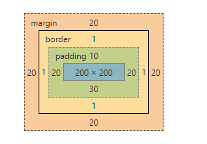
margin外边距
margin:10px 20px; (上下,左右)
margin:10px 20px 30px; (上,左右,下)
margin:10px 20px 30px 40px; (上,右,下,左)
.test {
  margin-top:5px;
  margin-right:10px;
  margin-bottom:15px;
  margin-left:20px;
}

/*简写:上右下左*/
.test {
  margin: 5px 10px 15px 20px;
}
盒子居中
.mycenter {
  margin: 0 auto;
}
padding内填充
.test {
  padding-top: 5px;
  padding-right: 10px;
  padding-bottom: 15px;
  padding-left: 20px;
}
/*简写:上右下左*/
.padding-test { padding: 5px 10px 15px 20px; }
注意:盒子大小==盒子实际大小 + 边框 + padding
box-sizing
box-sizing: border-box; 改变元素距离的内容和间距,不改变盒子的大小
    .box{
        padding: 20px;
        /*改变元素距离的内容和间距,不改变盒子的大小*/
        box-sizing: border-box;
    }
display
概念
通过设置display属性改变元素(标签)的类型(块元素、内联元素、内联块元素)。
| display属性 | 状态 |
| none | 元素隐藏且不占位置 |
| block | 元素以块元素显示 |
| inline | 元素以内联元素显示 |
| inline-block | 元素以内联块元素显示 |
浮动、定位
普通流定位 static(默认方式)
普通流定位又称文档流定位,是指盒子按照html标签编写的顺序依次从上到下,从左到右排列,块元素占一行,行内元素在一行之内
从左到右排列,先写的先排列,后写的排在后面,每个盒子都占据自己的位置。
浮动的特性
1、浮动元素有左浮动(float:left)和右浮动(float:right)两种
2、浮动的元素会向左或向右浮动,碰到父元素边界、浮动元素、未浮动的元素才停下来
3、相邻浮动的块元素可以并在一行,超出父级宽度就换行
4、浮动让行内元素或块元素自动转化为行内块元素
5、浮动元素后面没有浮动的元素会占据浮动元素的位置,没有浮动的元素内的文字会避开浮动的元素,形成文字饶图的效果
6、父元素内整体浮动的元素无法撑开父元素,需要清除浮动
7、浮动元素之间没有垂直margin的合并
浮动定位 float
left:向左浮动
right:向右浮动
clear属性
| clear属性 | 说明 |
| left | 在左侧不允许浮动元素 |
| right | 在右侧不允许浮动元素 |
| both | 在左右两侧均不允许浮动元素 |
| none | 默认值。允许浮动元素出现在两侧 |
| inherit | 规定应该从父元素继承 clear 属性的值 |
解决父标签塌陷方案一(清除浮动)
.clearfix:after {
  content: "";
  display: block;
  clear: both;
}
相对定位 relative
position : relative
配合着 偏移属性(top/right/bottom/left)实现位置的改变
特点:元素会相对于它原来的位置偏移某个距离,改变元素位置后,元素原本的空间依然会被保留。
绝对定位 absolute
position :absolute
配合着 偏移属性(top/right/bottom/left)实现位置的固定
特点:
1、脱离文档流-不占据页面空间
2、通过偏移属性固定元素位置
3、相对于最近的已定位的祖先元素实现位置固定
4、如果没有已定位祖先元素,那么就相对于最初的包含块(body,html)去实现位置的固定语法。
固定定位 fixed
position :fixed
配合着 偏移属性(top/right/bottom/left)实现位置的固定
将元素固定在页面的某个位置处,不会随着滚动条而发生位置移动。
overflow溢出
溢出
| 值 | 描述 |
| visible | 默认值。内容不会被修剪,会呈现在元素框之外。 |
| hidden | 内容会被修剪,并且其余内容是不可见的。 |
| scroll | 内容会被修剪,但是浏览器会显示滚动条以便查看其余的内容。 |
| auto | 如果内容被修剪,则浏览器会显示滚动条以便查看其余的内容。 |
| inherit | 规定应该从父元素继承 overflow 属性的值。 |
解决父标签塌陷方案二(溢出清除浮动)
/*父标签*/
.box{
        width: 500px;
        border: 2px black solid;
        /*清除浮动,结束浮动,浮动隐藏*/
        overflow: hidden;
    }
z-index层叠、opacity透明度
z-index属性
设置对象的层叠顺序,数值大的会覆盖在数值小的标签之上。z-index 仅能在定位元素上奏效。(左右浮动不是定位)
#a1{
  z-index: 999;
}

#a1{
  z-index: 998;
}
opacity属性
用来定义透明效果。取值范围是0~1,0是完全透明,1是完全不透明。(文字也会透明)
cursor属性、动画
cursor属性
cursor属性定义了鼠标指针放在一个元素边界范围内时所用的光标形状。
| 属性 | 描述 |
| crosshair | 光标呈现为十字线。 |
| pointer | 光标呈现为指示链接的指针(一只手) |
| text | 此光标指示文本。 |
| wait | 此光标指示程序正忙(通常是一只表或沙漏)。 |
transition过渡动画
transition: property duration timing-function delay; 属性(必须)、时间(必须)、速率、延迟
property方向,默认为all(所有属性都将获得过渡效果)。
duration时间以秒为单位(S)或毫秒(ms)。
timing-function速率
linear(默认,以相同速度开始至结束的过渡效果)
ease(慢速开始,然后变快,然后慢速结束的过渡效果)
cubic-bezier(n,n,n,n)(自定义速率,n的值是 0 至 1 之间的数值)
delay值是指以秒为单位(S)或毫秒(ms)。
如,transition:width 2s; 两秒内逐步改变宽度。
<!DOCTYPE html>
<html>
<head>
<meta charset="utf-8">
<title></title>
<style>
div
{
    width:100px;
    height:100px;
    background:red;
    transition:width 2s;
    -webkit-transition:width 2s; /* Safari */
}

div:hover
{
    width:300px;
}
</style>
</head>
<body>
<div></div>
<p>鼠标移动到 div 元素上,查看过渡效果。</p>

</body>
</html>
transform 移动动画
transform属性应用于元素的2D或3D转换。这个属性允许你将元素旋转,缩放,移动,倾斜等。
| transform属性 | 描述 |
| translate(x,y) | 沿x,y轴移动 |
| translate3d(x,y,z) | 沿x,y,z轴移动 |
| rotate(angle) | 2D 旋转,在参数中规定角度,如rotate(10deg) |
| rotate3d(x,y,z,angle) | 3D 旋转,在参数中规定角度 |
<!DOCTYPE html>
<html>
<head>
    <meta charset="utf-8">
    <meta http-equiv="X-UA-Compatible" content="IE=edge">
    <title></title>
    <style>
        div{
            width: 200px;
            height: 200px;
            text-align: center;
            line-height: 200px;
            border: 1px solid red;
            margin-top:100px;

        }
        div:hover{
            /*box阴影*/
            box-shadow: 10px 10px 20px 5px blue;
            /*移动方向*/
            transform: translate3d(10px, -20px, 0);
            /*渐变过程*/
            transition: all 600ms;
        }
    </style>
</head>
<body>
    <div>动画实例</div>
</body>
</html>
CSS案例
下拉菜单
<!DOCTYPE html>
<html>
<head>
    <meta charset="utf-8">
    <title>下拉菜单</title>
    <style>
        a{
            text-decoration: none;
            display: block;
            width: 120px;
            height: 40px;
            text-align: center;
            line-height: 40px;
            }

        a:hover {background-color: #ED8A8A}

        .content{

            float: left;
            position: relative;
            width: 100px;
        }

        .item {
            width: 100px;
            height: 50px;
            color: #fff;
            background: #B98FB3;
            text-align: center;
            line-height: 50px;
            cursor: pointer;
        }

        .menu {
        /*隐藏元素*/
               display: none;
               position: absolute;
            background-color: #f9f9f9;
            box-shadow: 0px 8px 16px 0px rgba(0,0,0,0.2);
        }

        .content:hover .menu {
            /*显示菜单*/
            display: block;
        }

        .item:hover{
            background: #CFE2AC;
        }


    </style>
</head>
<body>
<div class="content">
        <div class="item">下拉菜单</div>
        <div class="menu">
        <a href="#" title="">菜单1</a>
        <a  href="#" title="">菜单2</a>
        <a  href="http://www.baidu.com" title="" target="_black">菜单3</a>
        </div>
</div>
</body>
</html>