1.下载
最初是常规方法
pip install pyecharts
发现总是下载失败,网上说是由于墙的原因,下载时会出现断线和速度过慢的问题导致下载失败,所以建议通过清华镜像来进行下载:
pip install -i https://pypi.tuna.tsinghua.edu.cn/simple pyecharts
2.使用
实例:
from pyecharts.charts import Bar
from pyecharts import options as opts

# V1 版本开始支持链式调用
# 你所看到的格式其实是 `black` 格式化以后的效果
# 可以执行 `pip install black` 下载使用
bar = (
    Bar()
    .add_xaxis(["衬衫", "羊毛衫", "雪纺衫", "裤子", "高跟鞋", "袜子"])
    .add_yaxis("商家A", [5, 20, 36, 10, 75, 90])
    .set_global_opts(title_opts=opts.TitleOpts(title="主标题", subtitle="副标题"))
    # 或者直接使用字典参数
    # .set_global_opts(title_opts={"text": "主标题", "subtext": "副标题"})
)
bar.render()

# 不习惯链式调用的开发者依旧可以单独调用方法
bar = Bar()
bar.add_xaxis(["衬衫", "羊毛衫", "雪纺衫", "裤子", "高跟鞋", "袜子"])
bar.add_yaxis("商家A", [5, 20, 36, 10, 75, 90])
bar.set_global_opts(title_opts=opts.TitleOpts(title="主标题", subtitle="副标题"))
bar.render()
这样会在本地自动生成render.html

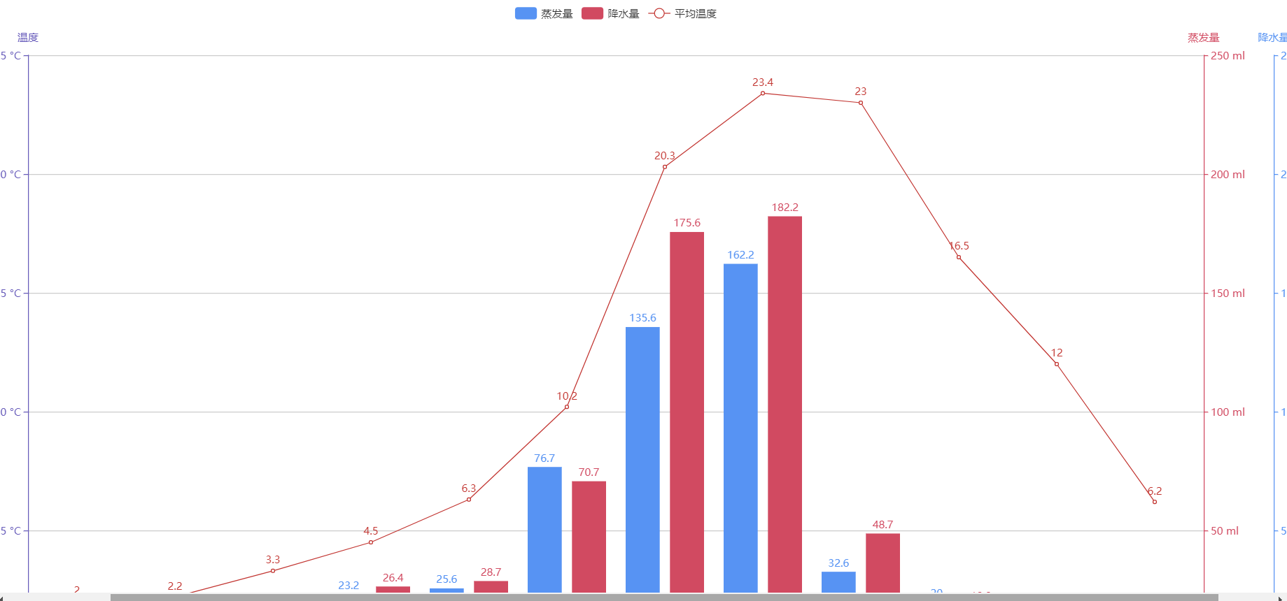
实例2:
#!/usr/bin/env python
# coding=utf-8
from __future__ import unicode_literals

import pyecharts.options as opts
from pyecharts.charts import Bar, Line


colors = ['#5793f3', '#d14a61', '#675bba']
x_data = ['1月', '2月', '3月', '4月', '5月', '6月', '7月', '8月', '9月', '10月', '11月', '12月']
legend_list = ['蒸发量', '降水量', '平均温度']
evaporation_capacity = [2.0, 4.9, 7.0, 23.2, 25.6, 76.7, 135.6, 162.2, 32.6, 20.0, 6.4, 3.3]
rainfall_capacity = [2.6, 5.9, 9.0, 26.4, 28.7, 70.7, 175.6, 182.2, 48.7, 18.8, 6.0, 2.3]
average_temperature = [2.0, 2.2, 3.3, 4.5, 6.3, 10.2, 20.3, 23.4, 23.0, 16.5, 12.0, 6.2]

bar = (
    Bar(init_opts=opts.InitOpts(width="1680px", height="800px"))
    .add_xaxis(
        xaxis_data=x_data
    )
    .add_yaxis(
        series_name="蒸发量",
        yaxis_data=evaporation_capacity,
        yaxis_index=0,
        color=colors[1]
    )
    .add_yaxis(
        series_name="降水量",
        yaxis_data=rainfall_capacity,
        yaxis_index=1,
        color=colors[0]
    )
    .extend_axis(
        yaxis=opts.AxisOpts(
            name="蒸发量",
            type_="value",
            min_=0,
            max_=250,
            position="right",
            axisline_opts=opts.AxisLineOpts(
                linestyle_opts=opts.LineStyleOpts(color=colors[1])
            ),
            axislabel_opts=opts.LabelOpts(
                formatter="{value} ml"
            )
        )
    )
    .extend_axis(
        yaxis=opts.AxisOpts(
            type_="value",
            name="温度",
            min_=0,
            max_=25,
            position="left",
            axisline_opts=opts.AxisLineOpts(
                linestyle_opts=opts.LineStyleOpts(color=colors[2])
            ),
            axislabel_opts=opts.LabelOpts(
                formatter="{value} °C"
            ),
            splitline_opts=opts.SplitLineOpts(
                is_show=True,
                linestyle_opts=opts.LineStyleOpts(
                    opacity=1
                )
            )
        )
    )
    .set_global_opts(
        yaxis_opts=opts.AxisOpts(
            type_="value",
            name="降水量",
            min_=0,
            max_=250,
            position="right",
            offset=80,
            axisline_opts=opts.AxisLineOpts(
                linestyle_opts=opts.LineStyleOpts(color=colors[0])
            ),
            axislabel_opts=opts.LabelOpts(
                formatter="{value} ml"
            ),
        ),
        tooltip_opts=opts.TooltipOpts(
            trigger="axis",
            axis_pointer_type="cross"
        ),
    )
)

line = (
    Line()
    .add_xaxis(
        xaxis_data=x_data
    )
    .add_yaxis(
        series_name="平均温度",
        y_axis=average_temperature,
        yaxis_index=2,
        color=colors[2],
    )
)

bar.overlap(line).render("multiple_y_axes.html")