
对于元素水平居中要分情况分析《文中父盒子代表可被继承的盒子,不针对父,也可能为祖先》:
在标准流中:
一、行内元素水平居中:
1.行内元素水平居中,并不是在自己的css里设置text-align:center;而是在父盒子里设置。
2.父盒子要有一定的宽度,对于没有宽度的盒子来说,让其内部的行内元素水平居中没有任何意义。
<!DOCTYPE html>
<html lang="en">
<head>
    <meta charset="UTF-8">
    <title>Title</title>
    <style>
        div {
            text-align: center;
        }

        /*不是在自的css里写text-align:center;!  是在父盒子里写*/
        /*span {
            text-align: center;
        }*/
    </style>
</head>
<body>
    <div>
        <span>居中</span>
    </div>
</body>
</html>

二、块级元素水平居中:
1.块级元素居中,该块级元素必须要有明确的宽度。
<!DOCTYPE html>
<html lang="en">
<head>
    <meta charset="UTF-8">
    <title>Title</title>
    <style>
        .bookstore {
            height: 30px;
        }
        .book {
            width: 30px;    /*宽度会继承,而高度却不会*/
            height: 30px;
            margin: 0 auto;  /*块级元素居中,该块级元素必须要有宽*/
            background-color: #f0a5a4;
        }
    </style>
</head>
<body>
<div class="bookstore">
    <div class="book">

    </div>
</div>
</body>
</html>

非标准流中:
当一个盒子 浮动/绝对定位/相对定位 不能在使用margin:0 auto;居中了。
浮动的元素水平居中:
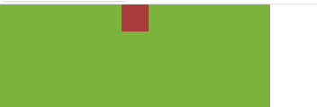
<!DOCTYPE html>
<html lang="en">
<head>
    <meta charset="UTF-8">
    <title>Title</title>
    <style>
        .bookstore {
            height: 40px;
            width: 300px;
            background-color: #7bb33d;
        }
        .book {
            float: left;
            height: 30px;
            width: 30px;        /* 父盒子要有明确的宽度,子盒子也要有 */
            margin-left: 135px;     /*  父盒子宽度/2-浮动盒子宽度/2  */
            background-color: #a83c3a;
        }
    </style>
</head>
<body>
    <div class="bookstore">
        <div class="book">

        </div>
    </div>
</body>
</html>

相对定位盒子水平居中:
《相对定位是相对于自己原来的位置(未定位前的位置),进行位置微调。》
方法1.直接使用相对定位,将left值设置为: 父盒子宽/2-相对定位盒子宽/2
<!DOCTYPE html>
<html lang="en">
<head>
    <meta charset="UTF-8">
    <title>Title</title>
    <style>
        *{
            margin: 0;
            padding: 0;
        }

        .bookstore {
            height: 200px;
            width: 300px;
            background-color: #7bb33d;
        }
        .book {
            height: 30px;
            width: 30px;
            background-color: #a83c3a;
            position: relative;
            top: 0;
            left: 135px;        /*  父盒子宽度/2-相对定位盒子宽度/2  */
        }
    </style>
</head>
<body>
<div class="bookstore">
    <div class="book">

    </div>
</div>
</body>
</html>
方法2.如果使用margin:0 auto;则相对定位的盒子相对像素值必须都为0,如果不为0,则水平位置会和margin:0 auto;叠加
<!DOCTYPE html>
<html lang="en">
<head>
    <meta charset="UTF-8">
    <title>Title</title>
    <style>
        *{
            margin: 0;
            padding: 0;
        }

        .bookstore {
            height: 200px;
            width: 300px;
            background-color: #7bb33d;
        }
        .book {
            height: 30px;
            width: 30px;
            background-color: #a83c3a;
            margin: 0 auto;
            position: relative;
            top: 0;     /* 当相对定位的相对像素值都为0时,matgin:0 auto才居中 */
            left: 0;
        }
    </style>
</head>
<body>
<div class="bookstore">
    <div class="book">

    </div>
</div>
</body>
</html>
如果left值不为0,设置为如下值时,叠加效果(为+往右,为-往左):
 margin: 0 auto;
 position: relative;
 top: 0px;     /* matgin:0 auto与left的叠加效果 */
 left: 50px;

方法3:margin-left : - 盒子自身宽度的一半 ; left : 50%;
<!DOCTYPE html>
<html lang="en">
<head>
    <meta charset="UTF-8">
    <title>Title</title>
    <style>
        *{
            margin: 0;
            padding: 0;
        }

        .bookstore {
            height: 200px;
            width: 300px;
            margin: 50px;
            background-color: #7bb33d;
        }
        .book {
            height: 30px;
            width: 30px;
            background-color: #a83c3a;
            margin-left: -15px;         /*  盒子自身宽度的一半  */
            position: relative;
            top: 0;
            left: 50%;
        }
    </style>
</head>
<body>
<div class="bookstore">
    <div class="book">

    </div>
</div>
</body>
</html>

绝对定位的盒子居中:
《绝对定位的盒子居中时,其父盒子也要定位,否则绝对定位的盒子可能不居中。》【子绝父相】
方法1:
<!DOCTYPE html>
<html lang="en">
<head>
    <meta charset="UTF-8">
    <title>Title</title>
    <style>
        *{
            margin: 0;
            padding: 0;
        }

        .bookstore {
            height: 200px;
            width: 300px;
            margin: 100px;
            background-color: #7bb33d;
            position: relative;
        }
        .book {
            height: 30px;
            width: 30px;
            background-color: #a83c3a;
            /*margin: 0 auto;*/             /*设置不设置都不起任何作用,仅受定位影响*/
            position: absolute;
            top: 0;
            left: 135px;        /*  父盒子宽度/2-相对定位盒子宽度/2  */
        }
    </style>
</head>
<body>
<div class="bookstore">
    <div class="book">

    </div>
</div>
</body>
</html>

方法2:
子绝父相时,使用margin-left : - 自身盒子宽度的一半 ; left : 50%; 也能居中。
固定定位的盒子居中:
固定定位是相对于浏览器窗口的,其居中也是是将其left值设置为浏览器宽度/2-固定定位盒子宽度/2,而且margin:0 auto;对其无效。使用固定定位的时候要在页面加载时获取浏览器的宽度,然后在设置相应的值即可。